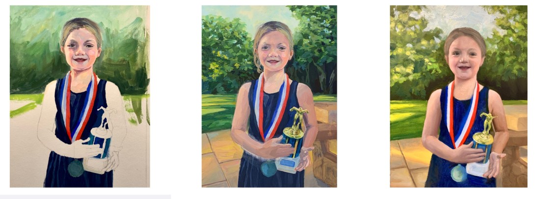
Sadie and the 2021 Swim Trophy, watercolor, 10”x7.5”
My granddaughter Sadie loves to swim (and play soccer, basketball and read books, too). At the end of the season, after winning many races and awards, to fundraise for her team she swims lap after lap and people pledge $ per lap.
Reference photo
Trying to paint Sadie from this photo led to me giving up on oils and going back to watercolor. As was my way with oils, I tried repeatedly, persistently (obsessively?) but couldn’t make it work. This watercolor isn’t perfect, but it captures the joy of the moment and that makes me happy.
With watercolor I’m able to paint to a certain point and then happily call it done. Watercolor doesn’t allow you to keep fiddling forever like oil does.
Final drawing for the painting (after many corrections)
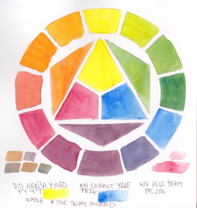
I again used a limited palette because it’s fun to see what I can do with only 3 colors. This time it was DS Hansa Yellow Medium, WN Permanent Alizarin and WN Cobalt Blue.
Test of Limited Palette Primary Triad using DS Hansa Yellow Medium, WN Cobalt Blue and Alizarin Permanent
I used to think it was really weird that artists limited their palettes. I thought one needed every possible color in order to capture color exactly. But now I prefer the harmony a limited palette provides and don’t really care about capturing exactly the colors in real life. I’m not trying to be a photocopier.
While I drew and painted her I thought of her as one of the Quilters of Gee’s Bend, Alabama, women who were direct descendants of the enslaved people who worked the cotton plantation there. I saw a traveling show of their quilts at a local museum years ago.
I painted this after watching a video of master Korean watercolor artist J Hunsung paint her. He didn’t credit* the photographer or model for this reference photo.
*The source photo was taken by photographer Jan Sochor.
Quilt Lady sketch 7×7”
It took three attempts to get the sketch right. I’m learning to take my time and get everything sketched in. And if things don’t quite fit together, fix it, don’t pretend it will be ok as is. Looking at my sketch compared to the reference photo below, I can see I still didn’t get it perfectly, but it felt close enough to go for it.
Initial block in
I was so pleased with these perfect flat washes in my initial block in that I had to share them. In watercolor, getting a flawless flat wash is not easy.
Uncropped painting with limited palette colors in the margin
With each watercolor painting, I’m experimenting with a different limited palette and then adding strokes of the colors used at the bottom of the painting. For this one I used Daniel Smith Quinacridone Gold, Winsor Newton Perylene Magenta, Daniel Smith Indanthrone Blue and a guest appearance in the jewelry only of Daniel Smith Perylene Scarlet. (I know it says DS Perylene on the painting but that’s a mistake.)
Watercolor set up with limited palette
I’m enjoying using fresh from the tube paint in a little porcelain palette instead of the ancient dried up old palette I had been using.
Brazilian Room, Tilden Park, Watercolor, 22 x 30 in
When I received an email from a woman in Switzerland, asking if I’d be interested in a commission to paint the site of her wedding (the Brazilian Room in Tilden Park) as a 10-year anniversary gift for her husband I said an enthusiastic, “Yes!” We agreed I would have the painting completed when she visited the Bay Area a couple of months later so that she could hand carry it back to Switzerland.
Brazilian Room, Tilden Park, Original Photo Reference
I visited the site, took photos and we agreed I would use the one above as reference for the painting. Since I shot the photo in late spring it wouldn’t really match the colors and light of her August wedding so I also used my imagination and memory of the park in summer to capture the warmth and strong light of August in the Bay Area. Below are some of the steps in the painting process.
I’m back on the blog after an intense week spent alternately deep in the bowels of a massive garage clean up/reorganization, and obsessively fighting the acrylic version of the watercolor sketch above. After finishing the garage on Saturday afternoon it was time to clean up in the house and studio and prep for my Sunday morning watercolor class (which went great with a terrific group of artists who left me feeling inspired).
Virtual Paintout: Hawaii
For the Virtual Paintout we went to Hawaii this month via the very cheap Google Air (just kidding—to participate you use Google Maps’ Street View feature to find your painting spot and all travels are virtual). Here’s the original scene:
Hawaii - near West Maui Forest Reserve
The painting got off to a good start with Golden Open Acrylics. I was trying to work from both my watercolor sketch above in which I’d changed the colors, warming up the scene, and also from the Google photo which just has a blur for the foreground. I first painted the gate purple for fun, but nearing completion realized the gate was too prominent and acting as roadblock into the painting so I repainted it green.
Then I started fighting the foreground. Over and over I painted, repainted, scraped, repainted. Here it is in its current state with the foreground (and some of the fence) scraped off again .
Hawaii with Scraped Off Foreground, Acrylic, 11x14"
Part of the problem may be the Utrecht Masters canvas panel that I was experimenting with. The canvas texture is too coarse and too absorbent so first I painted a layer of regular acrylic to smooth it out and reduce the absorbency (which is OK to do according to Golden). But then I had a paint adhesion problem, easily peeling off several layers where I’d painted thickly or repainted over not quite dry paint.
Since I wasted so much time messing with this painting and because I really love the top half of it I just didn’t want to give up. But to enjoy the second half of my vacation I’ve banished it to the closet and have gone back to working on a big watercolor of a tulip that is going great and makes me happy when I paint, not frustrated. I’m becoming convinced that I’m meant to be a watercolor painter and should forget about oils and acrylics.
The Garage
Cody unloading and saying "Bye" to his junk at the dump
When I bought my house 10 years ago it had been a rental for many years before that and the standalone garage probably hadn’t been cleaned forever. Then for 9 years my son used it to dismantle and rebuild his 71 Firebird, leaving grease, car parts, tires, miscellaneous junk, and bondo dust on top of years of grime, cobwebs, and worse (we found a literal rats’ nest made of fluffy chewed up shop towels in one corner behind a piece of plywood but no sign of recent rodents).
After moving most of his stuff out and the initial trip to the dump above, the real clean up began. I hired the smart, hardworking 15-year old boy next door to help me clean and we worked together most of Friday and Saturday. He vacuumed the wood walls and concrete floors after cleaning out the Bondo-filled ShopVac, removed and cleaned all my storage bins from the shelving units and then cleaned the shelving too. Meanwhile I sorted my junk and took a carload to the recycling/donation center and made another pile for the dump.
Finally the garage is ready for its new life as studio annex and multipurpose room. And I’m ready for my last week of vacation which I will fill with art fun, rest and recreation!
Study for Kaiser Garden II, watercolor, 6.5" x 4.5"
There are still openings in my watercolor class starting Sunday, June 27; click here for all the information. Ok, business done, now on to the painting above, another study from photos I took at the Kaiser garden.
I learned the hard way to do a study first, after time and again putting hours, days or weeks into a painting that was doomed from the start.
No matter how skillful the painting technique is, if the composition is bad (the viewer’s eye goes to a bright corner and then right off the painting), or you’re trying to work from a photo that doesn’t have enough information, or your colors or values are uninteresting, the painting isn’t likely to succeed. Sketching exactly what you see is great fun, but sometimes nature requires editing to make it a painting.
What made me want to paint this scene was the water feature and the bird sculpture but when I looked at my photo I saw big problems with the composition:
Original photo, Kaiser garden
There is way too much going on, the two big succulent plants on the bottom left dominate, a big stem above them leads the eye out of the frame, and the composition seems divided right down the middle, vertically. You barely notice the water.
So I spent some time in Photoshop cropping, rearranging and revising things:
Revised Photo Reference, Kaiser Garden II
Before cropping off the left side, I cut out the bird, moved it to the right, tilted it and gave it legs. Then I darkened the remaining succulents on the left and bottom to use them as a frame for the water feature instead of competing with it. When I started sketching the composition in my journal I decided to get rid of the messy tree branches poking in from the right too.
Although Photoshop is great for preparing a photo reference, so are the scissors, glue, sketches and notes that I used pre-Photoshop. Along with learning Photoshop, I’m also trying to become a better photographer and compose more carefully. I can do that with my digital SLR because it has a viewfinder but my carry-everywhere little Panasonic doesn’t. In the bright sun it was impossible to see anything on the LCD screen, so I guess I’m lucky that I got something I could work from at all.
My notes for the painting are in my journal opposite the study, with reminders about colors and things that worked (or didn’t). I’ve transferred the drawing to the canvas and it’s just waiting for its turn at the easel. I have a feeling it’s really meant to be a watercolor, not an acrylic painting, so may do it both ways.
Kaiser Hospital Tulip painting study, watercolor, 4.5" x 6.5"
I accidentally arrived an hour early for a doctor’s appointment at one of Kaiser Oakland’s medical offices that has an amazing hidden garden. The building is an architectural treasure, built around a courtyard in 1912 by Julia Morgan as a hospital and home for unwed mothers (or so I’ve been told). Instead of reading old, germy magazines, I spent the hour in the courtyard sketching, wandering and taking photos.
After working out the composition and colors, I’ve got two paintings ready to start: a full-size watercolor sheet of the above image and a slightly smaller canvas of another garden scene.
Before starting a large painting I like to do a study first, getting to know the image more intimately, and experimenting with pigments and techniques so when I start the real painting I have a plan of action or at least a sense of direction.
Tulip study and notes for painting, journal spread
Since I only recently began experimenting with opaque watercolor pigments after years of using only transparents, I made some discoveries with this study and took notes as I worked. Here are a couple that might be of interest:
Opaque pigments (Cadmiums, Cerulean, Yellow Ochre) are great when putting down an area of strong color and leaving it (such as when painting in my journal). But they lift too easily when adding layers over them, and become thick and unattractive when trying to mix darks. As I learned in oil painting, darks/shadows are best when thin so they don’t draw attention to themselves with texture. Seems to be the case in watercolor as well: better to use staining, transparent darks that won’t lift or get thick. For the dark green areas in the painting I’ll use Sap Green with Sepia and vary with a bit of Indigo, Winsor Violet and/or Alizarin.
The Legion/Utrecht 100% rag watercolor paper I’m using in my journal lifts incredibly easily. This is great when you actually want to lift paint but not so good when you just want to soften an edge and a bunch of paint lifts off instead!
Here are the original reference photo and the Photoshopped version. As you can see I got rid of some distractions and changed the proportions a bit.
Original reference photo of tulip in garden
Photoshopped tulip reference photo
Photoshop CS5 has some great new composition tools, such as “Content-Aware Fill” which I used to fill in the windows, white at top right corner and a tulip on the right margin. You just select and delete sections you want to replace and PS fills them with information from the surrounding area. I also narrowed the image to fit the proportions of the 22×30 watercolor paper using Content-Aware Scaling which preserves the proportions of the important stuff while squeezing in (or stretching) the other stuff.
Toby, Orange Maine Coon Cat, watercolor, 6.5" x 8.5"
This morning a watercolor student brought a photo of her Maine Coon cat and a couple of paintings she’d made of him. Her paintings were delightful and full of personality but she wanted to learn more to enhance her cat-painting abilities.
I thought it might be fun to play a sort of duet with paint, sitting side by side, painting together as if at a piano. I set palette and water between us, pinned the photo to the bulletin board in front of us, and we set up our boards with watercolor paper. I did some “thinking aloud” to demonstrate how I consider various options (glazing, wet-into-wet, layers or direct painting, etc.) to make a plan of attack before starting out. Then I tested out a couple of ideas on a piece of test paper and finally demonstrated one step at a time as she painted along.
We got about 2/3 of the way through painting the kitty before our session was up. I think my student got the help she needed to successfully complete her painting at home and I enjoyed finishing mine this afternoon.
I took some liberties with the background colors as you can see from the reference photo below and I’m not sure you’d necessarily recognize Toby from the painting but I sure had fun painting him.
Reference photo of Toby
Maine Coon Cats
I was curious about the Maine Coon breed (thinking erroneously about raccoons) and found some interesting tidbits. Maine Coons can be the size of small dogs, weighing up to 20 pounds, and are highly intelligent, playful and friendly, with big tufted feet. The legend says that British Captain Charles Coon sailed up and down the New England coasts in the 1800s and took some of his seafaring cats with him when he came into port. Those cats mated with resident felines and people referred to their offspring as “Coon’s cats.”
I had a wonderful afternoon with Casey (of art blog “rue Manuel bis”), her charming husband and delightful daughter on Friday when they were in San Francisco for a brief visit. Casey’s husband was interested in visiting Berkeley so we started our tour of Berkeley at Chez Panisse where we were lucky enough to get lunch reservations.
Although we brought our sketchbooks to share with each other, we didn’t sketch, focusing instead on delicious food and great conversation. I took a photo of this scene in the restaurant as we were leaving. Here is the way it appears in my sketchbook, drawn from the photo on my computer screen:
sketchbook pages
The design at top left is from the lunch menu which I photocopied smaller and glued in the sketchbook. I discovered that my souvenir Chez Panisse postcard is the perfect size to trace around to create a nice margin in this book. To keep it handy I stuck it in the glassine envelope I’d glued in the back of the sketchbook. Things were looking so messy in this sketchbook as I tried to find my way with the new paper and size of sketchbook. Now I’ve found the solution to the messy pages: draw the margins first and stay within them instead of painting to the edge of the page.
911 on Telegraph Ave.
Despite my warning that Berkeley’s Telegraph Avenue is pretty funky, everyone wanted to see the University of California, Berkeley campus and visit the used record and book stores on Telegraph. We walked on campus and then down to the shops where I bought an old Busby Berkeley CD (in honor of my cat of the same name).
On Telegraph I noticed two women who looked like prostitutes wearing outlandish makeup and mini-skirts. We also passed a soapbox preacher ranting (positively) about sex, a lone hare Krishna, sad clumps of young junkies with their pit bulls, the requisite tables of political bumper stickers, a super-stinky homeless guy, a bathing products store, a “head shop” selling hookahs, and someone handing out flyers for a tanning booth.
Heading back to my car we heard shouting. Those same whorish women we’d seen were running from Telegraph towards us on Durant, pursued by several coeds and everyone was screaming. The ho’s were screaming “Don’t touch me! Get away from me!” The coeds were screaming “Give me back my purse! Give me back my sweater!”
We stood there as if watching TV, trying to make sense of it all. The two ho’s jumped into a shiny black car parked right in front of us and slammed the door. The girls continued screaming while a slight young man stood at the driver’s window, saying, “Just give her the purse back.” Finally someone yelled, “Call the police!”
That snapped us out of our confusion and while I dialed 911, Casey had the presence of mind to note the license number of the car and was repeating it over and over. I told the 911 operator what was going on and handed the phone to Casey who gave the license number.
The ho’s threw the empty purse out the car window, revved their engine, and although the girls tried to block them from driving off, managed to speed away. I sure hope they got caught via the license number but I’m guessing the car was just as stolen as the purse, and probably ditched quickly. It was weird and scary, but fortunately nobody was hurt.
It was a more comprehensive tour of Berkeley than I’d intended. We went from the pinnacle of fine dining, to the campus at the center of the city, to the ugly underside of my dear Berzerkeley.
Yesterday’s rainy-day post was a bit dreary so I wanted to post something bright and cheery today. When the first camellia on the bush bloomed I painted her directly in watercolor, without drawing in pencil or pen first. This little vase looks as intended; it is nearly flat in really life, probably intentionally squished by the potter, with just a sort of slot in the top.
I think this sketch makes good use of the watercolor paper in “The Mutt” (the name I’ve stenciled on the outside of the sketchbook I bound with watercolor paper.) I named it that because it’s a little homely and imperfect but still perfectly lovable.
The full page
Here is the page where the above sketch resides. I like to make good use of my sketchbook pages. Lately I’ve been grateful for messed up sketches because they become pages that I use for journaling right over the bad sketch. More about that in another post.
Innocent Vixens, BART riders, sepia pen
And if you were wondering about the post title “Innocent Vixens,” it was from something I heard on the radio. Someone said “innocent victims” and for some reason my mind wandered to “innocent vixens.” It seemed like a concept that might be fun to sketch someday and I wanted to remember it, so into the journal it went, above these innocent (though a bit dorky) BART subway rider guys.
I was surprised to find a variety of colorful teensy flowers growing along the sidewalks on my walk this afternoon in the cool misty weather. It felt so great to be out walking without the icy cold and then pouring rain of the past week and the bright colors were a great bonus.
I felt a little sheepish about picking flowers that didn’t belong to me, but the they were so tiny and since I only took a sprig or two a few inches in length I didn’t think anyone would mind. Some might even have been volunteers (aka weeds?).
When I got home I stuck them in this little glass container some pricey French yogurt had come in (that I bought for the container). Then I got back to working on my website. When I’d finished it was bedtime but I knew these flowers probably wouldn’t last until tomorrow. And I really needed a little fun so I put on a CD and so enjoyed drawing them and painting them.
If you’d like to take a look at my rebuilt website, I’d love your feedback. Although it’s now cleaner and easier to update, I’m disappointed in a couple of features that really bug me. I’ll either get over my perfectionism or sometime later I’ll rebuild it again.
The problem with technology is that by the time you’ve researched the best gizmo, bought it and learned to use it, it’s already obsolete. Aren’t you glad that not everything in life is like that?


, BART riders, sepia pen")

