Portrait of Fiona’s Friend with the Mona Lisa Smile, oil 10×8”
I’m finally back to painting and drawing again after a very long break. For nearly a year I had illustrated my dreams and the daily Wordle and had posted about half of them. Then I burned out.
For the first time in my life I went for months without drawing or painting and for the first time since I started my blog in 2006, I stopped posting to0. I was afraid my passion for painting was gone for good and wondered who I would be without it.
Finally my desire to paint and draw came back (hooray!!!) BUT I was so rusty! Before the burnout I was able to quickly sketch a decent likeness. That was gone (as you can see in some of the failed attempts below!)
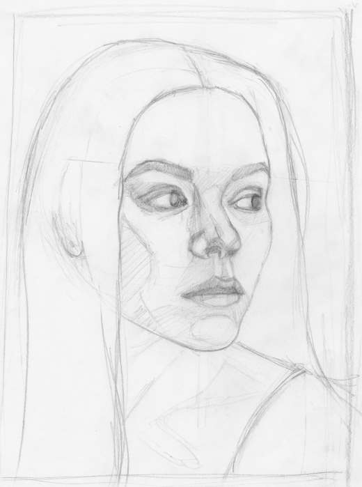
Some of the preliminary sketch starts (that didn’t end up in the trash)
It took more than seven sketch-starts before I kind of remembered how I draw (above).
Final painting and 2 of the failed painting starts
Then it took 5 painting starts before I felt I had a good enough beginning structure to keep going and complete the portrait.
My goal was to capture her Mona Lisa-like smile and I wouldn’t stop until I did.
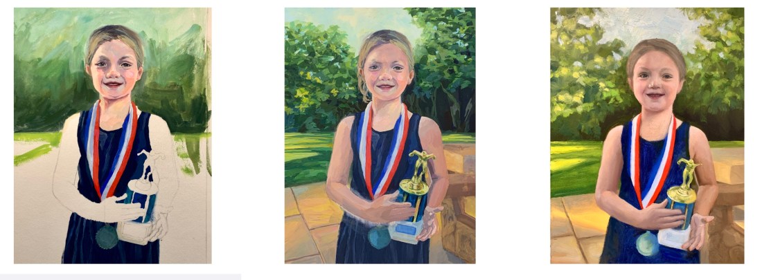
Sadie and the 2021 Swim Trophy, watercolor, 10”x7.5”
My granddaughter Sadie loves to swim (and play soccer, basketball and read books, too). At the end of the season, after winning many races and awards, to fundraise for her team she swims lap after lap and people pledge $ per lap.
Reference photo
Trying to paint Sadie from this photo led to me giving up on oils and going back to watercolor. As was my way with oils, I tried repeatedly, persistently (obsessively?) but couldn’t make it work. This watercolor isn’t perfect, but it captures the joy of the moment and that makes me happy.
With watercolor I’m able to paint to a certain point and then happily call it done. Watercolor doesn’t allow you to keep fiddling forever like oil does.
Final drawing for the painting (after many corrections)
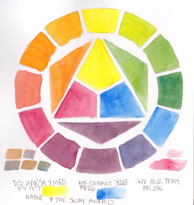
I again used a limited palette because it’s fun to see what I can do with only 3 colors. This time it was DS Hansa Yellow Medium, WN Permanent Alizarin and WN Cobalt Blue.
Test of Limited Palette Primary Triad using DS Hansa Yellow Medium, WN Cobalt Blue and Alizarin Permanent
I used to think it was really weird that artists limited their palettes. I thought one needed every possible color in order to capture color exactly. But now I prefer the harmony a limited palette provides and don’t really care about capturing exactly the colors in real life. I’m not trying to be a photocopier.
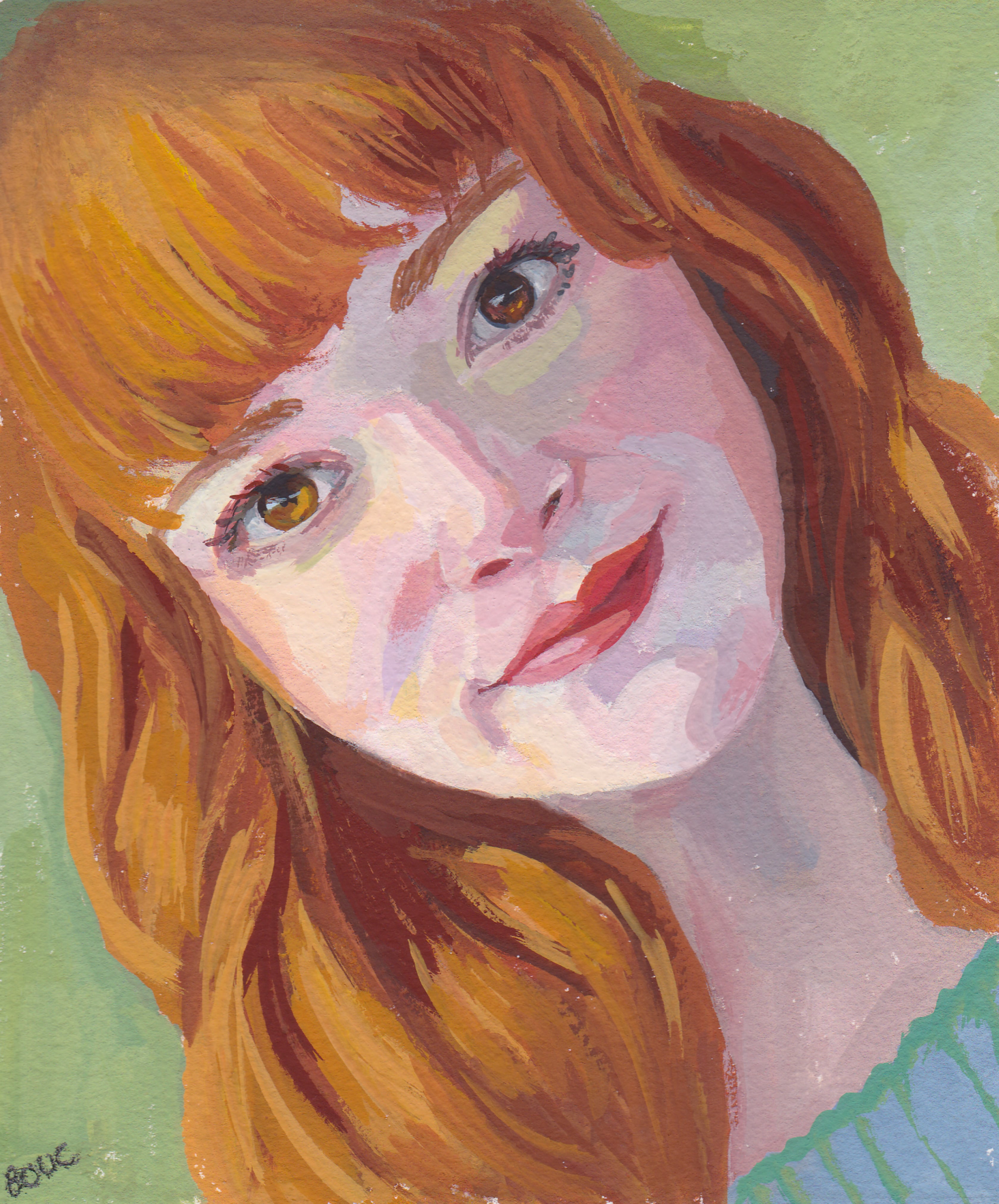
I had so much fun with the painting above and was really happy how it turned out. I’m (slowly) working my way through the Sktchy “30 Faces in 30 Days” gouache and watercolor class, though at the rate I’m going it’s probably going to take me 300 days, not 30 to finish it.
For the painting above, I followed along with Cecile Yadro’s demo. Her style felt very congruent to the way I like to work. You can see the reference photo for this painting on Sktchy here and download Cecile’s free gouache ebook here.
Although it wasn’t mentioned in her lesson, I was especially happy about how I was able to maintain the (high key) value structure while varying the colors and color temperatures within her face, something that clicked for me for the first time.
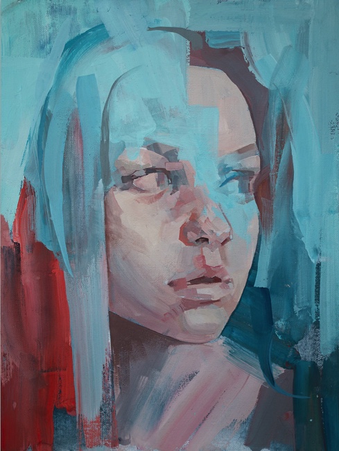
On the other hand, the next lesson was by Russian artist Nicolai Gánichev and his approach, techniques and final painting didn’t appeal to me at all (see his painting below).
Painting by Nicolai Gánichev
Photo Reference from lesson
There seems to be a trend in contemporary art of destructing portraits, smearing paint across the subjects face or wiping off their eyes or mouth. Are the artists just bored with their facility in making portraits and have to show their contempt for skill or for the subject? I don’t get it. Also, the reference photo seemed dark and gloomy to me. I tried it anyway.
My sketch
First painting attempt, ugly and gloomy
I sketched her on Xerox paper and then transferred the drawing to watercolor paper. I tried following along with Nicolai but disliked his process so went off on my own. I ended up hating my first painting (above) so I transferred the drawing again, lightened the photo and discovered she actually might have red hair. I wasn’t having fun so I gave up after the second attempt below and moved on.
My final, still unpleasant, attempt at painting her
This month’s Virtual Paint-Out location is Rio de Janeiro, Brazil. Since I seldom travel I find it so much fun to do so virtually via Google Street View. I love being able to wander, exploring roads to see where they go without fear of getting lost (let alone dealing with airports or spending the money).
Here’s the way the scene looked on Google and then the way I cropped and the way I adjusted it in Photoshop.
Original Google Street View, Rio
Rio Photoshopped for painting
As I do these each month I’ve noticed patterns in the way nicer houses and neighborhoods are near beaches or on top of hills and the poorer neighborhoods are indeed on the wrong side of the tracks.
I’ve also noticed a sense of freedom when painting these since I don’t have so much investment in the outcome. And maybe that’s what led to my liking most of my Virtual Paintout paintings more than the ones I’ve labored over.
Early Morning at Kaiser Garden, oil on canvas, 20x16"
I think I’ve finished this painting (but then I thought that several times before). The last time I thought I was finished, I looked back at the notes I’d written opposite my journal sketch about what interested me in the scene and my goals for the painting. I saw I’d missed a point or two and worked on it some more.
Now I’d really appreciate some honest feedback:
Do you think it’s finished or does it still need something, and if so, what do you suggest to improve it?
This was painted with Holbein Aqua Duo water-soluble oil paints. It’s such a joy to oil paint without odor, to thin paint to a wash without solvents, and to mix water instead of turpentine with the Duo linseed oil to make painting medium. The pigment quality, drying time and consistency is identical to regular oils.
The tulip trees (Saucer Magnolias) and tulips were blooming when we painted at Blake Gardens on a sunny Friday a week ago. Of the multiple sketches and paintings I did of the scene, I think I’m happiest with the one above, done in my journal when I got home, from a combination of memory and photo. I clipped the text from their brochure and pasted it on the journal page.
Here is the final painting and below that are the steps in between:
Blake Tulips & Tulip Tree, Acrylic, 10x8" on Gessobord
After I picked my spot to paint and set up my easel, I did several thumbnail sketches (left below) to plan my composition. While each thumbnail improved on the one before it, none were great compositions and as a result neither was the plein air painting I did on site.
Journal Spread with thumbnails
I was working with Golden Open Acrylics, my first time trying them outdoors. A Golden expert suggested I put a drop of Golden Open Acrylic Thinner atop each blob of paint to keep them moist when painting outdoors. Instead, thinking I was so clever, I mixed about 25% thinner with 75% water in a spray bottle and misted the paints occasionally.
But I should have taken her advice as my method didn’t work. She’d warned me that adding water to the Open paints will make them dry faster, which it did, and they started getting icky-sticky about the time I needed to quit and head for the critique anyway. Indoors they stay wet all day and in a closed palette, for a week or two.
The plein air painting was so UGLY that I’m glad I only expect my plein air paintings to be learning studies. My plein air painting goal is to fully experience and participate in a scene and embed my memories of color, light, texture, sounds and scents.
Plein air study
And there were sounds and scents: not only were the many magnolias overly fragrant, but shortly after I set up, two gardeners fired up a gas-powered industrial-strength chain saw, cut down a huge tree and sawed it to pieces about 20 feet away from me. The sound was horrible and the smell was worse.
Below is a photo taken when I first arrived, cropped into a more pleasing composition. I like the diagonals and the way shapes of shadows and colors lead the eye into and around the painting.
Photo at Blake Gardens
From my watercolor sketch and the photo above, I started working on a studio version of the painting. Below is the underpainting with the main shapes and colors blocked in.
Acrylic under painting
I liked just as it was and was hesitant to paint over it so I left it for a few days before working on it again until it decided it was finished.
Pears on a Blue Plate, Pentel Pocket Brush Pen and gouache, 7x5"
In the week and half since I gave up sugar and Splenda, pears have become my new treat. Not only are they crispy, sweet and delicious but they come in such pretty colors too. This sketch is a celebration of their gifts.
But meanwhile, giving up coffee didn’t go as well….
Busby and the Coffee Buzz
After five days of feeling wiped out, depressed, listless and witless I couldn’t take it anymore and finally had half a cup of coffee. That’s all it took: within a few minutes I was back to my old inspired self again and the blues were gone. Yay!
Maybe I’ll try to quit caffeine when I’m retired in a few years, but for now, each day is too precious to spend feeling like a zombie.
"Sunny Serenade", watercolor, 15.5"x10.5" (click to enlarge)
The editor requested that I name the finished painting (above). Corny painting names are a pet peeve of mine and so I rarely name them. But as I was uploading the image the name “Sunny Serenade” came to me. I know that’s about as sappy a name as you could try to invent, but since it seemed to name itself, so it shall be.
To finish sharing the steps in the painting, here they are in order, continuing from the previous post.
Painting the green leaves, flowers and stems
The next step was to work on all of those leaves, stems, buds and little yellow green flowers. Using a variety of mixed greens, some neutralized with Burnt Sienna, I painted the first layers of the leaves. I also glazed details over the yellow green flowers I’d painted previously.
Adding the darks
I mixed up several puddles of these dark mixtures: Winsor Green, Alizarin Crimson, and Burnt Sienna; Ultramarine Blue and Burnt Sienna; Sap Green and Sepia with a dab of Winsor Red; Winsor Green and Winsor Violet. Then I loaded my brush with one and started painting a section, switching to another one of the puddles as the background colors changed. I was careful to stay within the dark shapes and to negatively paint around lighter shapes. Because watercolor dries lighter, I tried to mix colors that would be dark enough in one layer.
I thought I was finished and signed the painting. The next day I studied the painting with fresh eyes and realized I needed to make some adjustments. I glazed in some more darks on the right of the pitcher and on its handle on the left. I added a middle-dark green mixture to the long leaf that hangs down along the right side of the pitcher and on some other leaves as well. (Compare the pitcher in the top two pictures in this post to see the changes).
While some people have commented that this painting seemed very challenging, in fact an image broken into many small complicated shapes is much easier to paint and more forgiving of “mistakes” than one composed of large simple shapes.
My editor liked the painting and immediately requested the next one, due the end of November. It will be a completely different project: a close up view of some pink orchids with a light background. I will be working much more loosely, mostly wet into wet.
After I started working on a series of paintings in acrylic I realized I needed to learn more about acrylic technique and materials if I wanted to make better progress. Although I’d read several good books and seen a couple of brief demonstrations I needed more.
Although there are hundreds of oil painting and watercolor videos, I could find only a few for acrylics. I rented a couple of awful ones from Netflix and viewed an online video from Artistsnetwork.tv that I found useless. Then I found the video that provided the lessons from which I did the exercises above. The video is “16 Acrylic Painting Techniques: A Studio Workshop with Jackie Miller.” Miller demonstrates and carefully explains how to prepare the support and create each of the 4.5″ square paintings.
I played the DVD on my computer in my studio, and worked along with it, pausing and rewinding as needed. Below are close-ups of the 4.5″ technique squares with a little information about each.
#1: Discrete Brush Strokes
1. Discrete Brush Strokes. Apply a flat, gradated blue background and many layers of individual brush strokes to create optical color mixing (and theoretically the illusion of water and sun reflections).
#2: Stencil and Stamp Painting
2. Stencil and Stamp Painting. Used a variety of materials as stencils, such as plastic embroidery mesh, hardware cloth, plastic decorative stencils. Multiple layers of paint were applied with a stencil brush and with q-tips and a rubber stamp. Fun!
#3: Energized Brush Strokes Alla Prima
3.Energized Brush Strokes Alla Prima. Using glazing liquid to keep paint workable a bit longer, applied layers of brush strokes freely, letting colors blend into each other.
#4: Impasto with Sgraffito
4. Impasto with Sgraffito (scraping). On top of flat underpainting, applied paint mixed with gel medium and before it dried, scraped through it with a variety of implements including popsicle stick, rubber combs, and paint shapers.
#5: Glazing and Scumbling
5. Glazing and Scumbling. Applied underpainting of blue, leaving white hole in the center. Then half the blue was glazed with a very thin layer of the same blue mixed with glazing medium (to see how it enriches the color and removes chalkiness). The center hole was painted red. Then turquoise paint was scumbled (scrubbed with a dry brush) on top of the blue and softly over the edge of the red.
#6: Cross-hatch Brush Stroke
6. Cross-hatch Brush Stroke. I need more practice with this one. A flat, dark underpainting was done first and then the idea was to make brush strokes that cross each other in hundreds of little X’s with a fairly dry brush to create soft gradations with many layers. The original actually looks better than this photo shows because of glare, but I still found it difficult to make those X’s.
#7: Soft-edge & Hard-edge
7. Creating soft- and hard-edged transitions. A dark, flat background was painted first and then the edge of the section at the top left was masked with masking tape and lighter red painted in that area. The transition at the bottom was created with layers and layers of softly scumbled paint lightly scrubbed on with a nearly dry brush, always starting at the corner and moving towards the center so there was less paint on the brush as it approached the transition area.
#8: Glazes, Wipe Removal & Combing
8. Glazes, Wipe Removal & Combing. On top of a flat, mauve background, layers of paint mixed with glazing medium were applied and then wiped back with a damp cloth and combed through using a rubber, multi-sided comb.
#9: Finger Painting & Mixed Media
9. Finger Painting & Mixed Media. Started by finger painting with grey paint (she used Graphite Gray meant to look like graphite) and then added water soluable crayons, Sharpie marker, pencil, layer of acrylic medium, and more crayons and pens, finishing with medium to seal the crayon layer.
#10: Staining
10. Staining. On the video she left this square of the canvas raw, but since I was using watercolor paper, I gessoed the whole sheet and then covered this square with Absorbent Ground Medium which creates an absorbent surface, similar to ungessoed paper. The paint was mixed with a high proportion of water and allowed to move and blend wet into wet. It didn’t work as nicely as watercolor does wet into wet. Mixing more than 25% water with acrylics can cause them to fail to bond with other acrylic layers, but that’s not important when working with an absorbent ground since it will sink ito the fibers.
#11. Alla Prima as Underpainting
11. Alla Prima as Underpainting. The underpainting was created like #3 using bold strokes of paint, wet into wet. When dry it was painted over with various techniques including combing and glazing. On the video she did the over-painting with oil paint. I used acrylic.
#12: Painted Gel Relief
12. Painted Gel Relief. First a a pile of heavy clear gel was applied to the surface and then pushed around and smoothed and shaped with various implements. When it was dry to the touch after 24 hours I painted it with Micaceous Iron Oxide, Copper and Bronze acrylic paint.
#13: Found-Object Collage
13. Found-Object Collage. A flat layer of heavy gel was applied and then random stuff stuck into it (twine, match stick, pennies, plastic stretcher bar “key”, electrical wire thingees, some glitter for texture). When dry it was painted.
#14: Rubber Cement & Tape Masking
14. Rubber Cement & Tape Masking. Rubber cement was applied and when dry, the square was painted. Then rubber cement was removed, another layer of rubber cement painted over a different area, another layer of paint, cement removed. Masking tape applied and then painted over, etc.
#15: Paper and Fabric Collage
15. Paper and Fabric Collage. Acrylic medium was used as an adhesive to attach scraps of fabric, string, lace and paper. When dry the surface was painted using various colors and Iridescent Gold paint.
#16: Water Soluble Crayon
16. Water Soluble Crayon. This was supposed to also include bits of dried acrylic paint film but I didn’t quite see the point of using scraps of dried up paint. I’m not sure I really got the point of drawing with the water soluble crayons and then coating them with acrylic medium (they smear) either, but I gave it a try.
IMPRESSIONS:
I was suprised how much I enjoyed the more abstract, random, textural pieces; a nice respite from my usual striving to capture what I see in a somewhat realistic fashion. I can see many possibilities for exploration with acrylics, but I’m still not convinced of their suitability for my work right now, although I haven’t given up yet. I’ve gone back to working on the paintings in progress with more understanding and skill but still feel like I’m fighting the medium. More about that later.
Rush Ranch Horses, Sepia Copic Multiliner and watercolor wash
Mariah, a wonderful young artist, accompanied me to my plein air group’s paint-out today at Rush Ranch in Suisin City. She was immediately inspired by a spot, sat down and started sketching. I faced the opposite direction and sketched these horses in the corral.
Before we’d left my house, I showed her a book on drawing animals that demonstrated how to first find and assemble the basic shapes contained in the animal (rectangles, circles, triangles) and then refine them. I decided to practice what I preached and did that with the horses. I’d never noticed what big knees horses have before. I sketched with my sepia Copic Multiliner .03 and then added watercolor washes.
Rush Ranch Vista, ink & watercolor wash
The views from Rush Ranch were tremendous. I could have sketched for hours more but we’d arrived late and after our second sketches it was time for the group critique and lunch.
We were late because I got lost yet again (missed the turnoff and drove forever before turning around — and this was with GPS!) My mind had wandered to thinking about the people fishing (and the fish) in the slough off the little bridge we’d just passed so I missed the entrance sign and decided that the GPS telling me I’d arrived was wrong. This was especially stupid since the printed directions from my group said to go over that bridge and then turn right in 3/4 mile.
Instead I drove and drove, went over another bridge and THEN started looking for the turnoff. I went miles past that bridge, eventually arriving at the gate to a “youth correctional facility” (jail for teens) and admitted I’d blown it again. When we finally found our way back and I saw the huge “Rush Ranch” sign, I couldn’t believe I’d missed it.
Well actually I could believe it. I think I could get lost just walking from one room to another these days!