Categories
Flower Art Oil Painting Painting photoshop

Sunflowers in Spaghetti Jar

Sunflowers in Spaghetti Jar, oil on panel, 6x6 inches
Sunflowers in Spaghetti Jar, oil on panel, 6×6 inches

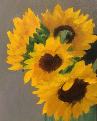
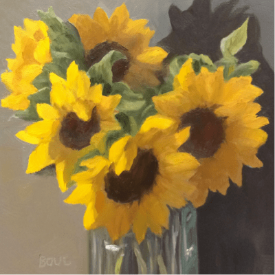
This was supposed to be a quick and easy project that went totally out of control. I wanted to try out Arches Oil Paper and quickly paint a bouquet of sunflowers in a tall glass jar meant for holding spaghetti noodles. I made and transferred a sketch (see below for process) and started painting on the paper, which I absolutely hated. It was dry, absorbent and paint wouldn’t slide or move on it. It just sucked in the paint and I was having no fun. I quit halfway through and cut off the parts of the painting I hadn’t finished. This is where I left it:

Sunflowers in Spaghetti Jar, oi studyl on Arches Oil Paper , 8x10 inches
Session 1: Sunflowers in Spaghetti Jar, oi study on Arches Oil Paper , 8×10 inches

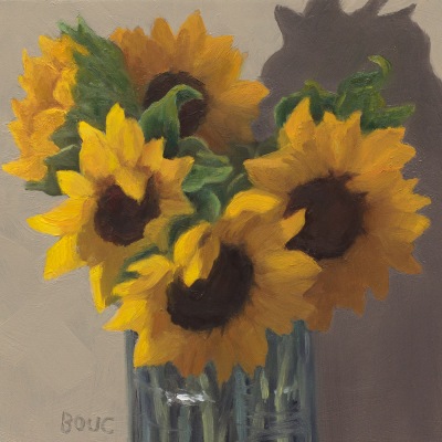
The next day I started over on a 6×6 inch panel that I’d sanded down from a previous failed painting. Again I intended to paint for an hour or two and move on to something else. Instead I worked and reworked over and over until I finally had a painting I could stand to look at (at top of post). Sometimes I think reusing panels is a mistake because the bad juju from the first one hangs around and messes up the next one.

The one nice thing about Arches Oil Paper is that it can be cut down and cropped easily like watercolor paper. Although it does not need to be gessoed I’m going to try gesso on it next time to see if that will make it more enjoyable to use.

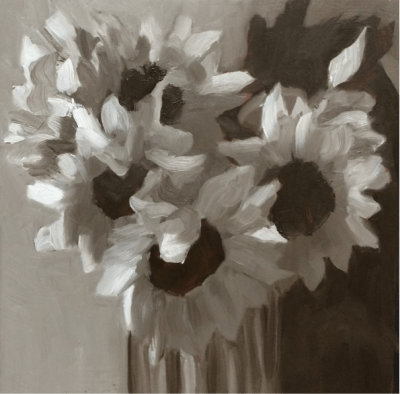
Below are the process photos from start to finish.The painting on paper is Version 1 and on panel is V2. The ones labeled “Photoshopped” were photos of work in progress adjusted in Photoshop to try to solve the problems and then the next image is those changes implemented in the painting. If you’d like more detail about the process you can open this PDF of my full process chart with notes about each step.

Categories
Drawing Oil Painting Painting People People at Work photoshop Portrait Series

Brown Delivers…in the Dark (portrait in oil with steps in the process)

UPS Delivers at Night, Oil on Canvas, 20×16

(Update: This painting won second place for Portrait of the Year on Making a Mark in 2012.)

One night last winter two UPS guys arrived in the dark to deliver a dozen boxes of the flooring materials for my studio. I had started a series of paintings of people at work (still in progress) and asked if I could take their photo to use for a painting. They agreed and were great models!

A couple of months ago he called, asking about the painting, inspiring me to finally finish it. There were some magic moments along the way (see process photos below), such as the one where I did a quick first pass on his hand and then stepped back and said “Wow! That works and I’m not touching it again.”

Since I took the photos at night without flash outside lit only by the fluorescent lights from inside the studio, the photo was dark and the colors were, well, mostly brown. But the UPS slogan is right, BROWN really does deliver! Who knew there were so many shades of brown? I must have mixed a hundred different browns.

Below are photos showing the process of drawing and painting this portrait.

Categories
Art theory Flower Art Oil Painting Painting photoshop Rose

White Roses in Creamery Bottle (and painting process stuff)

White Roses in Creamery Bottle, oil on linen, 8x8"

(Available)

Strauss Family Creamery is a Marin County dairy that produces organic dairy products served in old-fashioned glass bottles from happy cows that graze on sweet grass in the hills by the sea. I enjoy their bottles as much as their cream in my coffee.

I started this painting with a goal to complete it from life in one 3-hour session, as so many plein air artists and daily painters do. I had somehow come to believe that I “should” be painting that way too. But while I met my time goal, I didn’t like the results (see original version below). And that’s when I finally accepted that it’s better to take as much time as a painting needs, and relax and enjoy the process rather than try to rush to keep up with someone else’s “rules.”

If you’re interested in seeing how I got here from there, click “keep reading” and stick around.

Categories
Bookbinding Drawing Illustration Illustration Friday Monoprint Other Art Blogs I Read photoshop Quick Sketch Still Life Virtual Paint-Out

Boring? Not!

Peet's Coffee Corner, El Cerrito, ink & watercolor, 7x5"
View north from Peet's Coffee, El Cerrito, ink & watercolor, 7x5"

At first glance, the corner of San Pablo Avenue and Carlson in El Cerrito is boring, boring, boring: a wide busy avenue with boxy buildings. But when viewed on a lovely summer day from a cafe table outside Peet’s Coffee with pen in hand, it transforms itself into a sketching delight full of fun details and color.

San Pablo Ave. Wells Fargo, El Cerrito, ink & watercolor, 5x7"
View South down San Pablo Ave. Wells Fargo, El Cerrito, ink & watercolor, 5x7"

Looking the other way down San Pablo, the Wells Fargo Bank building holds little hope for drawing inspiration. But start sketching and it too transforms itself. There are trees of all kinds and colors. A cerulean sky with only a hint of clouds, a pink apartment building and a gold dentist office. Sun, shadows, banners.

Not boring! I don’t think I’ve ever felt bored when I was sketching. Years ago a friend told me that when I was sketching I looked like I was roller-skating. Whee! Let’s skate!

Categories
Art theory Flower Art Landscape Painting Photos photoshop Places Sketchbook Pages Watercolor

Study for Tulip Painting in Watercolor

Kaiser Hospital Tulip painting study, watercolor, 4.5" x 6.5"

I accidentally arrived an hour early for a doctor’s appointment at one of Kaiser Oakland’s medical offices that has an amazing hidden garden. The building is an architectural treasure, built around a courtyard in 1912 by Julia Morgan as a hospital and home for unwed mothers (or so I’ve been told). Instead of reading old, germy magazines, I spent the hour in the courtyard sketching, wandering and taking photos.

After working out the composition and colors, I’ve got two paintings ready to start: a full-size watercolor sheet of the above image and a slightly smaller canvas of another garden scene.

Before starting a large painting I like to do a study first, getting to know the image more intimately, and experimenting with pigments and techniques so when I start the real painting I have a plan of action or at least a sense of direction.

Tulip study and notes for painting, journal spread

Since I only recently began experimenting with opaque watercolor pigments after years of using only transparents, I made some discoveries with this study and took notes as I worked. Here are a couple that might be of interest:

  • Opaque pigments (Cadmiums, Cerulean, Yellow Ochre) are great when putting down an area of strong color and leaving it (such as when painting in my journal). But they lift too easily when adding layers over them, and become thick and unattractive when trying to mix darks. As I learned in oil painting, darks/shadows are best when thin so they don’t draw attention to themselves with texture.  Seems to be the case in watercolor as well: better to use staining, transparent darks that won’t lift or get thick. For the dark green areas in the painting I’ll use Sap Green with Sepia and vary with a bit of Indigo, Winsor Violet and/or Alizarin.
  • The Legion/Utrecht 100% rag watercolor paper I’m using in my journal lifts incredibly easily. This is great when you actually want to lift paint but not so good when you just want to soften an edge and a bunch of paint lifts off instead!

Here are the original reference photo and the Photoshopped version. As you can see I got rid of some distractions and changed the proportions a bit.

Original reference photo of tulip in garden
Photoshopped tulip reference photo

Photoshop CS5 has some great new composition tools, such as “Content-Aware Fill” which I used to fill in the windows, white at top right corner and a tulip on the right margin. You just select and delete sections you want to replace and PS fills them with information from the surrounding area. I also narrowed the image to fit the proportions of the 22×30 watercolor paper using Content-Aware Scaling which preserves the proportions of the important stuff while squeezing in (or stretching) the other stuff.

Categories
photoshop Sketchbook Pages Still Life Watercolor

FIGuratively Speaking

Figs on Photoshop Manual, Pencil and watercolor, 6x9

These organic figs were disappointingly tasteless and so they became still life subjects instead of eating objects. I’ve been using the heavy Photoshop manual (seen under the figs)  as a weight on top of the the Fabriano Venezia sketchbook when I scan it. My new copy of Photoshop CS4 doesn’t come with a manual, although there is one online that can be downloaded and saved.

I’m one of those weird people who actually read manuals. When I get a new application I always read the manual first, to find out what the program can do and then I refer to it when I need to figure out how to do one of those things.

I don’t like reading on the computer but I refuse to pay another $55 for a manual that should have been included in the first place. In the meantime, the old manual makes a very nice paperweight or doorstop (or still life holder). 824 pages! And I read/skimmed the whole thing when I got it.

Categories
Animals Drawing photoshop Sketchbook Pages Watercolor

Happy Bird-Day to Me

Happy Bird-Day to Me, pencil, ink & wc 9x12

This morning I made my annual birthday pilgrimage to Fat Apples for a Baked Apple Pancake along with dear friends and family. Then I sketched this little family of California Towhees [update: not robins!] who are living in the small tree outside my bedroom window.

Mom and Pop Towhee take turns guarding the nest,  feeding the babies and shopping for groceries. When one returns with a juicy white worm to feed the babies, the other flies away to gather the next round of grub (literally?). The robins enter the tree from the house side where the branches are more open, which gives me a great view from my bedroom window (except that it’s too shadey in the tree to see their features clearly).

My cats sit on the bed and watch the constant activity all day: the best Kittie TV ever. Sometimes I join them and have been amazed how hard these little birds are working to keep their babies fed.

Fabriano Venezia Sketchbook & Photoshop CS4

This sketch is in the Fabriano 9×6  sketchbook that has been giving me such pleasure when sketching and such pain when scanning. But now I have a solution. I just got the fantastic, super fast, hugely improved new version of Photoshop CS4. After scanning each page of a spread separately, Photoshop will automatically assemble the pages perfectly together as layers/masks in one file, getting rid of the bad stuff,  while lining them up perfectly. For other adjustments, Auto Levels does a great job now, better than all the manual tweaking I’ve done in the past. And a bit of the Dodge tool cleans up any remaining shadows. The new streamlined user interface and adjustment panel are huge timesavers and make image adjustments so much easier and faster.

It was a bit of a splurge, but at $199 (after the $100 off Adobe offers on on any version of Photoshop CS through August) it was so worth it. A happy birthday to me present!

Apple Pancake
Baked Apple Pancake