Categories
Art Drawing Wordles and Pictures

How it Started (Journaling Wordles and Pictures…and Dreams)

Aorta Illustration
Wordle: AORTA

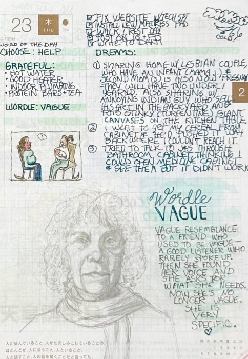
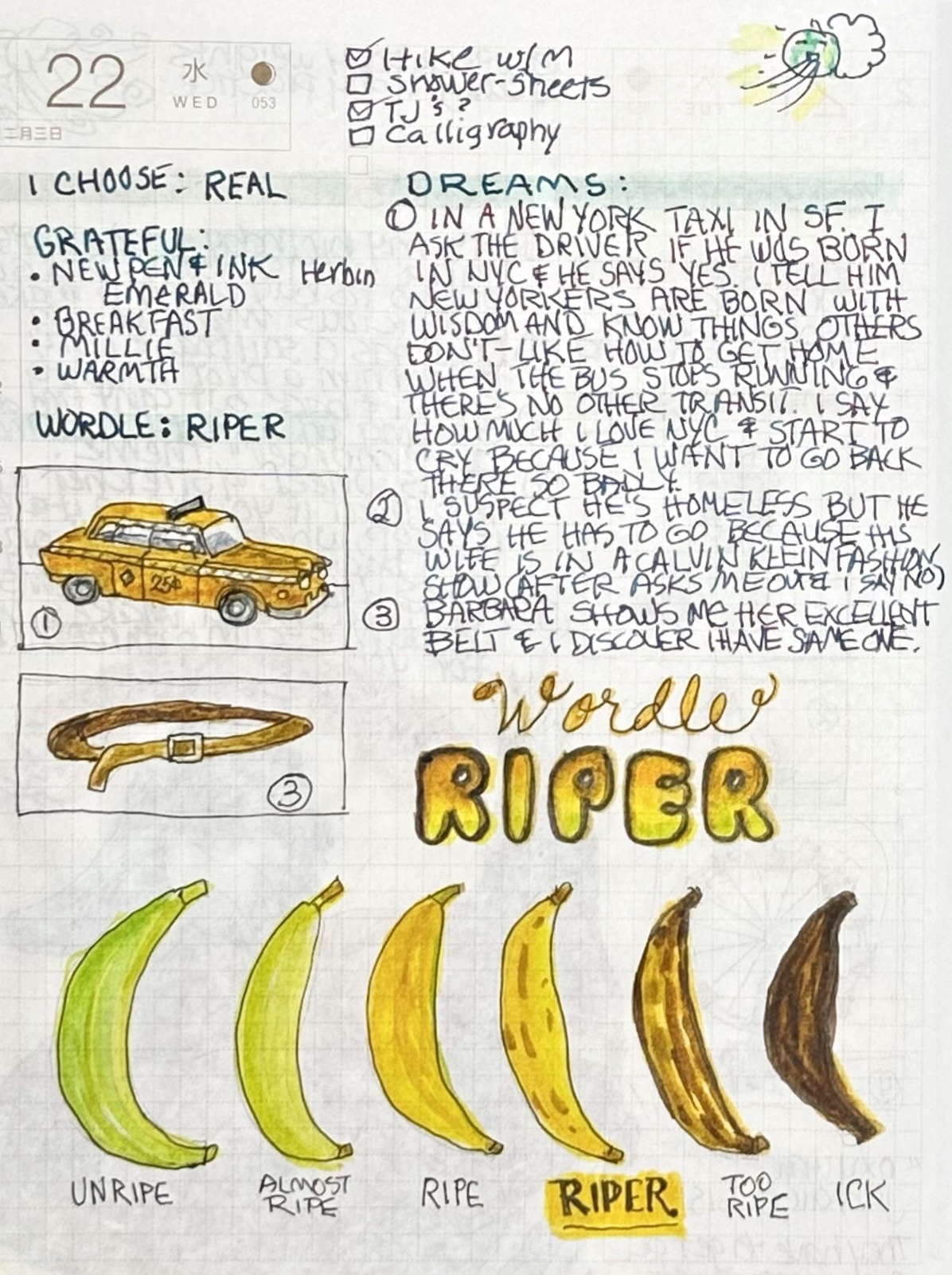
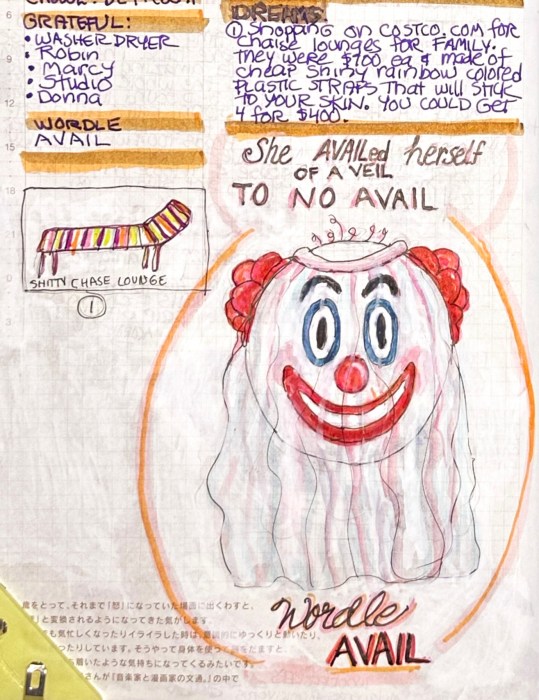
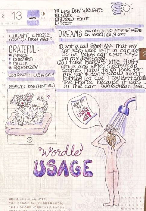
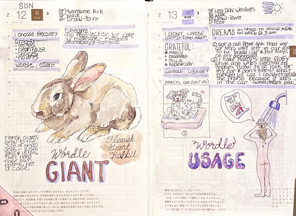
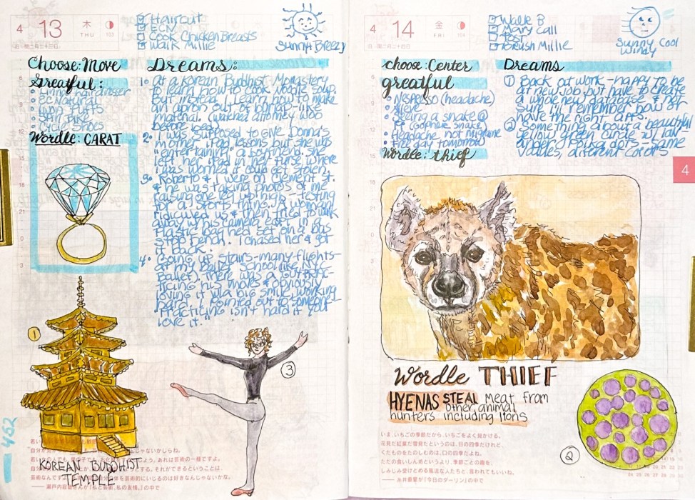
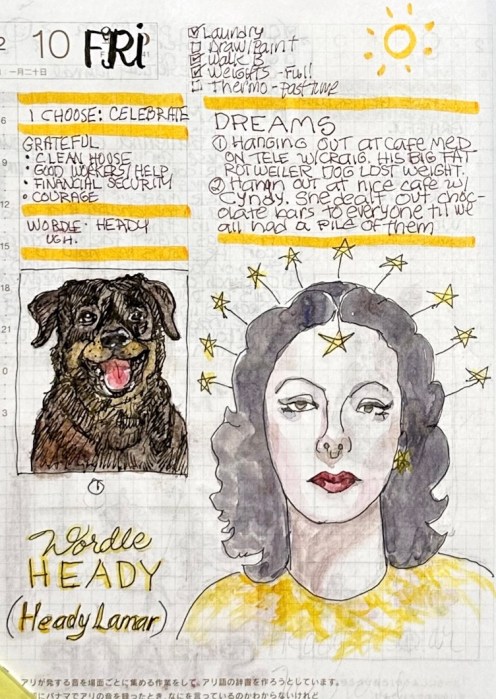
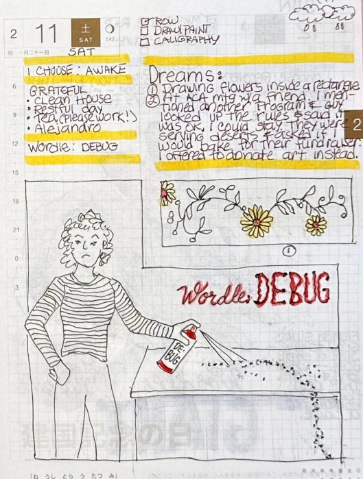
In October 2022 I returned to journaling my dreams along with normal journaling stuff, and then in December I started illustrating the daily Wordle after I solved the puzzle.

This post is a collection of some of those early sketches. After this, I’ll just post 2-page spreads at a time. Sorry to overload with this one but I wanted to try to get caught up.

Dream sketches from October - November 2022

DECEMBER 2022

Wordle: Taper and a sketch of a Tapir
Wordle: TAPER

The day I first illustrated a Wordle. It was TAPER but my one rule: I can do whatever I want. So I went with a Malayan TAPIR.

Wordle: AORTA and dream of a cabbage baby

I cropped and blurred out some stuff for privacy but you still get the wild cabbage-baby dream!

Categories
Art Faces Painting People Portrait Watercolor

Portrait in Pink Poodles and Blue

Portrait in Pink (Poodles) and Blue, watercolor, 10×8”

By the time I was done with the drawing for this painting I was really bored of the subject and couldn’t motivate myself to paint it until the idea of pink poodles prancing on the page popped up.

Those pink poodles reminded me of how much fun I used to have drawing and painting anything that amused me, back in 2006 when I started this blog as a daily sketch journal 17 years ago.

From my crazy dreams to local dive bars to what was in my fridge, it was always fun. I’m doing that kind of sketching again, and will be posting them soon. Meanwhile, back to this silly portrait.

I was super tired the day I painted it and couldn’t come up with an interesting limited palette so I challenged myself with just two colors: WN Permanent Rose and Winsor Blue Green Shade. It wasn’t a great combination for a portrait but it was perfect for pink poodles.

I had a hard time getting an accurate scan of the painting which has a bit more turquoise color in the background and a little warmer color pink on the poodles and her skin. But even the correct colors are still pretty weird.

Sketches, Corrections and Reference Photo

You can click on the image above to see an enlarged version of the preliminary sketches, the corrections needed and the reference photo.

Categories
Art Faces People Sktchy Watercolor

Emily in Watercolor with Odd 3-Pigment Palette

Emily Christen from Sktchy, Watercolor, 10×6”

I watched the interesting class taught by Kirsten Britt on Sktchy and then, as usual, I painted the subject completely differently than was instructed. Kirsten’s work is beautiful but is all about splotches (here’s her version on IG).

3-Pigment Triad, Limited Palette

I used an odd limited palette for this one which made it a little challenging. The pigments are DS Perylene Scarlet, DS Cobalt Teal and WN Raw Sienna. It wasn’t possible to get any real darks so I stuck with a high key painting.

Original sketch, graphite on paper, 10×6”
My check of the sketch in Procreate

I got very close with my sketch, even with the camera distortion; I only needed a few small adjustments.

Work in Progress – First passes of color
Photo reference
Categories
Art Drawing Faces Portrait Sktchy Watercolor

Watercolor Portrait of Ms. Cherry

Watercolor portrait of Tori Cherry
Ms. Tori Cherry, watercolor, 9×7”

I signed up for a Sktchy Watercolor class to see what I could learn from their teachers. I planned to make myself try the teachers’ different approaches and I did attempt the super loose, wet in wet approach Dritan Duro, the teacher for this class demonstrated, but tossed the crappy results and started over, doing things my way.

Color wheel: WN Raw Sienna, WN Perm. Alizarin, Winsor Blue Green Shade

Interestingly, the 3-color limited palette I used for this painting was the same as the one I used for my painting of Dorothy, even though the two women look nothing alike. It’s a fun challenge to work with only a 3-color limited palette. (WN Raw Sienna, WN Perm. Alizarin, Winsor Blue Green Shade).

Freehand sketch, 9×7”

Above is my final sketch and below is my preliminary sketch, scanned into Procreate, with a tracing of the photo over it. I used it to check my drawing and then made the corrections to the final sketch above.

Corrections marked from tracing photo in Procreate over sketch
Tori Cherry, reference photo from Sktchy.
Categories
Art Drawing Faces Painting People Watercolor

Dorothy of Oz: All Grown Up?

Watercolor painting of Dorothy from the Wizard Oz, as an adult, from a photo of a woman at a county fair
Dorothy of Oz, Watercolor on paper, 9”x6.5”

My first thought was, “Dorothy from the Wizard of Oz, all grown up,” and, as the saying goes, “rode hard and put away wet” when I saw the photo (below) on photographer Earthsworld’s Instagram.

Photo reference by Earthsworld, posted with permission

My second thought was “I must paint her!” I contacted Earth (his real name) and he gave me permission to paint from and share his photo. Then, while the painting was in progress I came across the cartoon below on Instagram by artist WadeHate.

Cartoon of Dorothy from the Wizard of Oz as a grown up, smoking a cigarette
Cartoon by WadeHate, posted with permission

It was too perfect, another image of Dorothy all grown up. He was kind enough to give me permission to share this artwork.

Experiments with background color in Procreate.
Bottom left was original before painting background.

The original photograph had a background I didn’t want so I experimented in Procreate with different backgrounds. I probably should have just left the background white (below).

Finished painting except for background.
Also, the limited palette of W&N watercolors notated:
Raw Sienna, Permanent Alizarin, Winsor Blue Green Shade

The deep orange I chose didn’t please me so I tried washing it off. That left an “interesting” peachy color and a paper surface that was not going to respond well to more paint layers. So, peachy pink is how it shall remain.

Painting in Progress, Final Sketch, Sketch check for accuracy in Procreate

When I checked my initial sketch I was delighted to see how close I got on my first try, and how few corrections were needed (above). It’s so nice to see progress, whether it’s in drawing or painting or both. This painting also went really well (except the background).

Categories
Animals Art Ink and watercolor wash Painting

Undersea Birthday

Watercolor sketch of seahorse, colorful fish, and jellyfish
Birthday painting for Sadie, Ink & Watercolor, 4×6”

My granddaughter Sadie can swim like a fish, so for her birthday I painted a little undersea scene for her. I’ve always been intrigued by seahorses so it was fun researching, drawing and then painting one.

Growing up in Southern California, I’ve always felt at home in the water, whether just spending the day in the sun and surf or scuba diving.

If I were ever to marry again (unlikely) I want a scuba wedding. I wonder if guests would be willing to come to a “destination” wedding when the destination was underwater.

Categories
Art Drawing Faces Painting People Portrait Watercolor

Terrible Watercolor Triad, Mean Model

Mean Model, Watercolor portrait of woman, 8.5”x7”
Mean Model, Watercolor, 8.5”x7”

I recently spent a couple weeks working through a Proportions and Rhythms of the Head portrait drawing class created by Bradwynn Jones. I watched him do the demo drawings (mostly while working out on my rower) and then sketched them myself. When I finished all the drawings I transferred them to watercolor paper and started painting them. This is the first one I painted.

Reference Photo of Mean Model

I took an immediate dislike to this model. She was pretty but mean-girl looking to me. I decided to experiment with a triad of colors on her that turned out to be equally unpleasant.

Final Sketch for the painting

Cobalt Violet has very low tinting strength and just sits on top of the paper, so it came right off if I tried to glaze over it. It is both opaque and granulating, causing an unpleasant texture for skin.

Color wheel test of triad limited palette

The QOR Nickle Azo Yellow also had low tinting strength and when mixed with the violet made a yucky brownish color for shadows. The QOR Paynes Grey combined with the yellow made a gross greenish-gold of her hair.

I didn’t really care because, like I said, take that, mean girl!

Also, Payne’s Grey; I’ve never understood why people use it. Most brands make it from black and ultramarine blue and sometimes a bit of violet. I guess it’s a convenience color, but one that would be so easy to make, though I prefer not to use black paint in watercolor.

Do you use Payne’s Grey? If you do please tell me why and which brand you like.

Initial sketch with needed corrections superimposed in Procreate