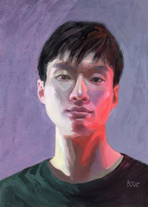
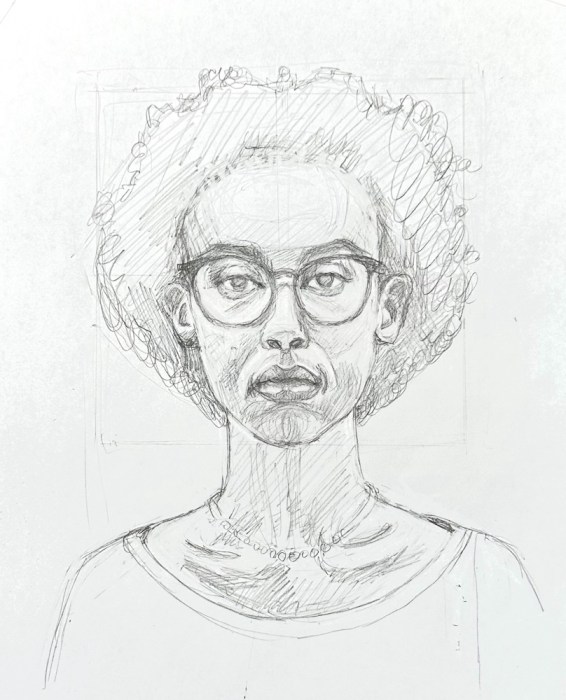
What was I thinking? The reference photo1 had strange lighting. From the left was a cold, greenish light, and from the right a very red light. To make the painting even more “fun,” I chose a weird limited palette2.
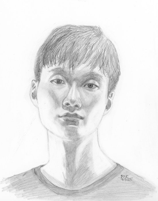
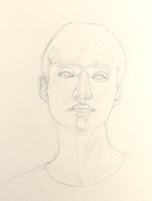
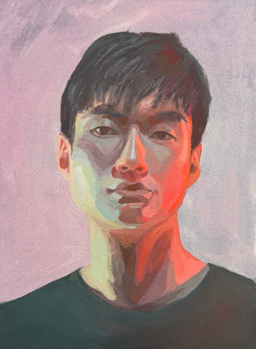
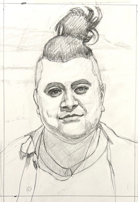
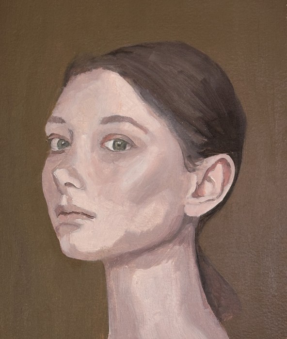
Below are my two preliminary pencil drawings and the painting, second layer done. I should have left it as it was—blocky, but fresh. Instead I labored over it, trying to match values and colors to the original despite the crazy palette.
I forgot how much I love gouache’s immediacy vs. forever fussing and overworking. By the time I decided to stop it was way overcooked and I wanted to start over to get it “right.” I refrained and moved on to the next painting with happier results.
Viridian green (a weak, transparent green), Permanent Rose, Cadmium Red Light, Cadmium Pale and white (from a very old tube with thick sticky paint). No black or other dark colors.↩︎
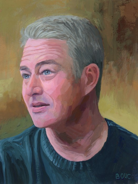
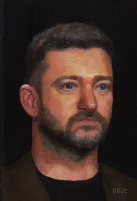
Taylor Kinney as Kelly Severide from Chicago Fire on TV, Gouache on paper 9×7”
I know, this was a silly project. But there’s something about this guy on this show that I find intriguing in an odd sort of way. So I painted him in gouache.
I have no idea what he’s like in real life, but it amuses me how on the show he always has this derpy, slightly perplexed expression, like he isn’t quite sure what’s going on around him. Also that when he started on Chicago Fire he played the angry bad boy and now he plays a kindhearted husband and friend (while still doing all the badass fireman stuff.)
I find it interesting that he was once Lady Gaga’s boyfriend. It’s a little hard to picture them together. She’s such a powerful persona.
Chicago Fire and Chicago Med are both dumb, guilty pleasures I enjoy. My usual TV fare is Britbox European detective shows and Nordic noir.
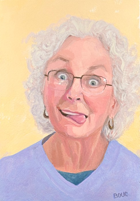
My bestie B was giving away an arm chair and my sister asked for a photo of her sitting in it to get an idea of its size. So she perched in the chair, made a face and took a selfie.
I cropped it down to just her pretty face to try to capture her sense of fun in a painting. After 3 drawings I finally got everything at the right angles. My brain kept trying to straighten everything out and make it symmetrical.
Then came 3 paintings. The first one went directly in the trash. The second one was better but when it reached gouache’s “ugly stage” I lost my confidence and started over again.
This is the third one. I can see a few things I could fix if I kept working on it, but my current goal is to stop painting sooner rather than too late. Also I’m using gouache these days partly because it doesn’t allow the forever fiddling that oil does. At a certain point gouache just says, “Nope” and stops cooperating if you try to keep adding paint or fiddling.
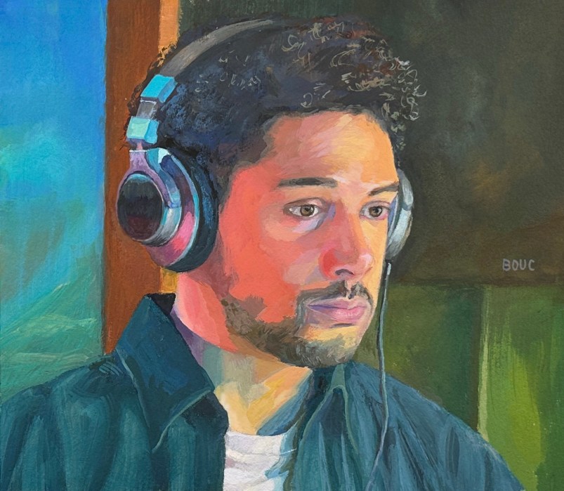
His name isn’t really Brian. I took a photo of him from the TV screen when I watching a European detective show on BritBox because I found the colors mesmerizing.
I don’t remember which show it was, but he was the sweet, smart guy who could always be relied on to find the solutions on his computer. Even though most of those European detective/police procedural shows follow a similar formula, with a similar set of characters (like the sweet IT nerd guy), I still thoroughly enjoy them.
Photo reference from the TV
It was challenging but fun to draw and paint from the above photo reference. I really wanted to capture his sweet expression and the vivid colors. It took me 4 drawings and then starting over after abandoning a painting before I was satisfied. I had such a great time with the headphones! But I got lazy with his shirt and left off the plaid because I was ready to move on.
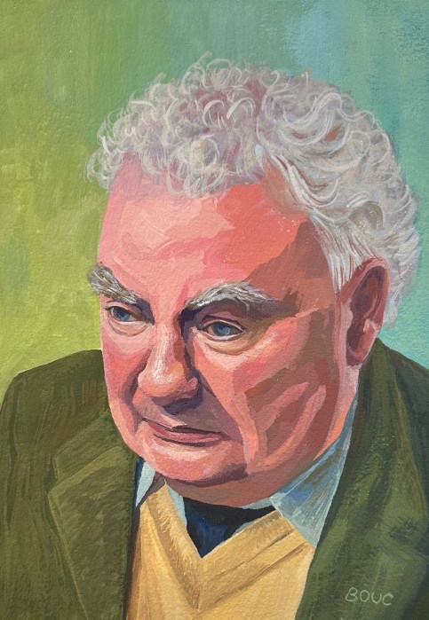
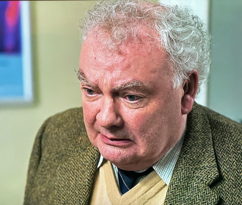
My last painting of 2024 is this gouache painting of a British or Irish character actor from one of the great detective shows on BritBox (but I forget which one).
I tried to do a Google reverse search from the photo I took from the TV (see below) to learn his name but it failed, giving me everything from Donald Trump (?!) to an advertisement for tweed jackets. Do you know who he is?
After dong a couple sketches it was time to paint. I was inspired to use gouache instead of oils because I hate the way my oil paintings almost always end up taking forever and feeling overworked while I try over and over to perfect it.
I don’t do that with gouache, I get more carefree, playful and have fun. It had been nearly a year since I used gouache and it felt like I’d forgotten everything.
This was my get-reacquainted with gouache painting and I’m excited to start the next one, also a still from a TV show.
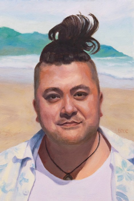
When I saw a photo of this guy, I loved his funny rooster-tail man bun and made him my next portrait victim. I decided he was Hawaiian, gave him a tan and put him in a happy beach scene (see below for the process). It was fun to try to create the effect of bright sun on his shirts.
Original reference photo from Pinterest
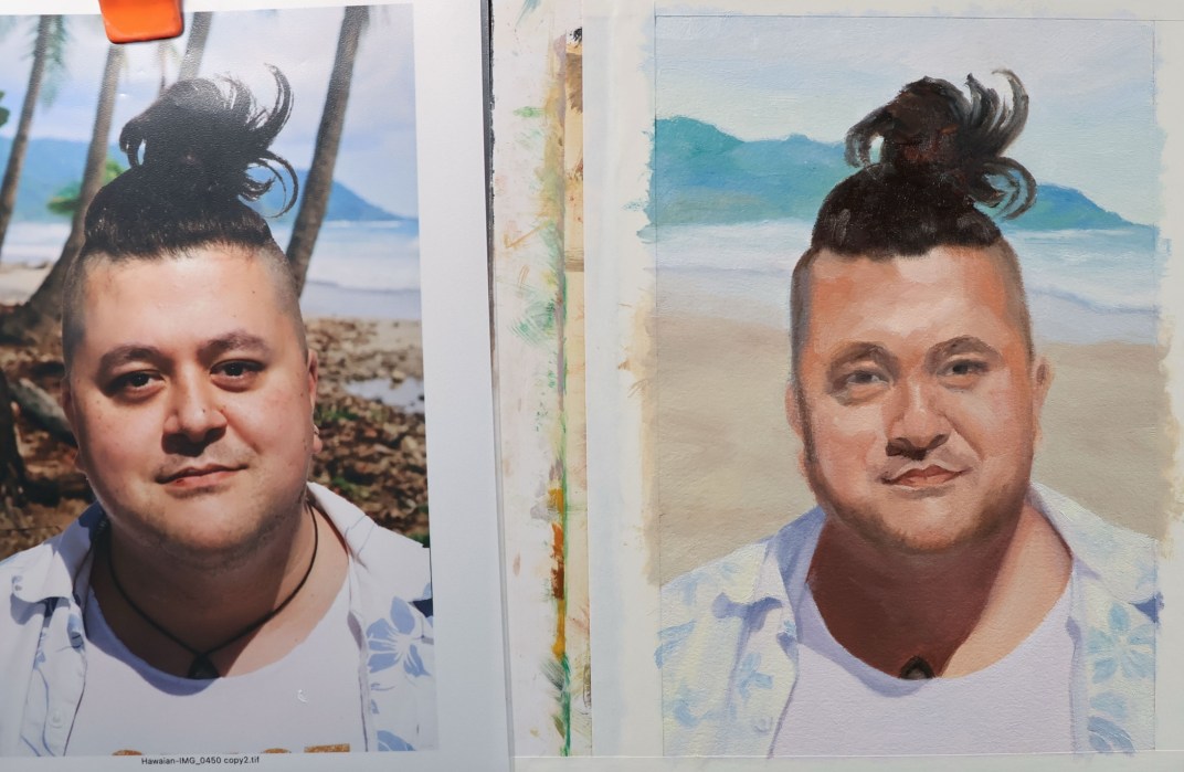
(Left) Combined reference photo; (Right) first layer of oil paint
Above on the left is a composite I assembled in Photoshop for the reference photo. I can’t remember if I found the beach scene on Google or used Photoshop’s AI Generator to create it because I tried so many different things.
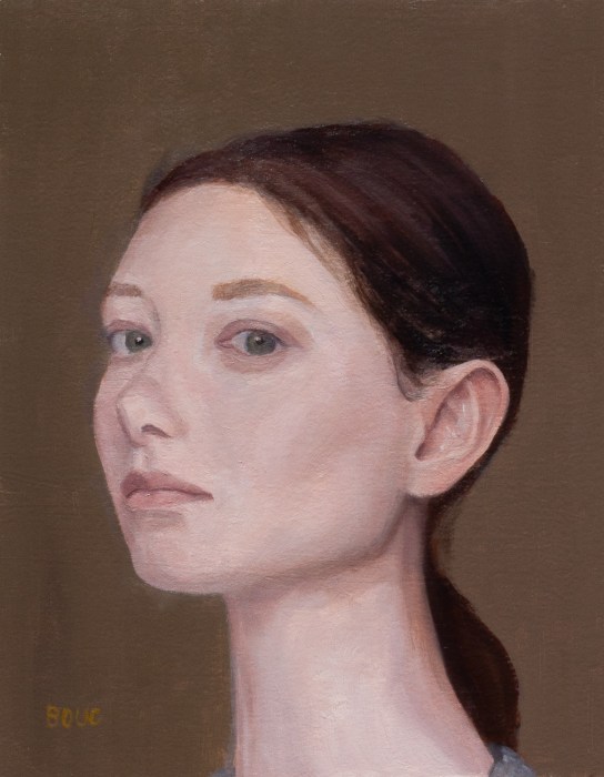
Freckles Minus Freckles, oil on gessoed Arches Oil paper, Zorn palette, 9×7”
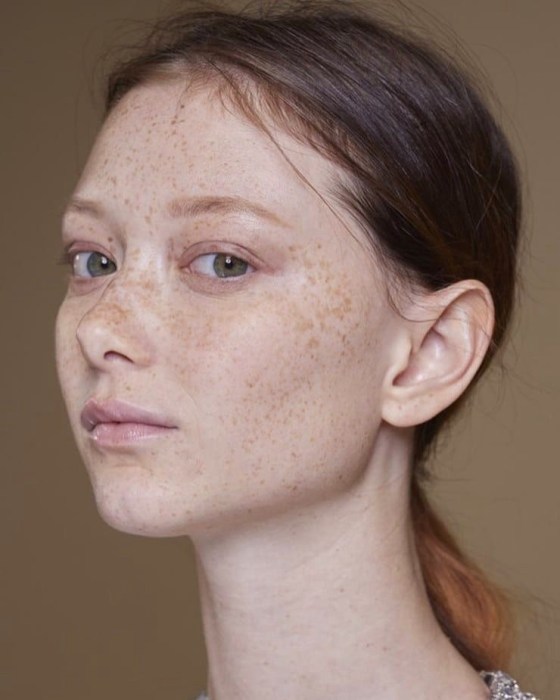
Her nose! That interesting shape is why I wanted to paint her when I saw her photo (see below) on Pinterest. In the photo she is speckled with freckles but I was only interested in getting that nose!
Painting at 2 hours ( + 5 minutes to mess things up).
My intention had been to paint this in one session but I started too late in the day. I could have left it as it was at the the two-hour mark, but instead of walking away and getting dinner, I stupidly decided to just touch up one thing (which was unsuccessful of course because I was exhausted) so I had to basically touch up everything.
Inspiration photo from Pinterest; no photographer credit provided
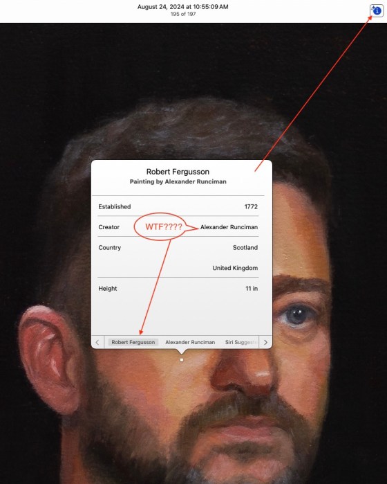
Justin Timberlake After DUI Bust, Zorn palette, oil on paper, 11×7’
There was something so poignant about the news photo of Justin Timberlake after his bust for Driving While Intoxicated and I wanted to capture it in paint. Then something hilarious happened when I was preparing the photo of the painting for posting.
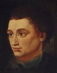
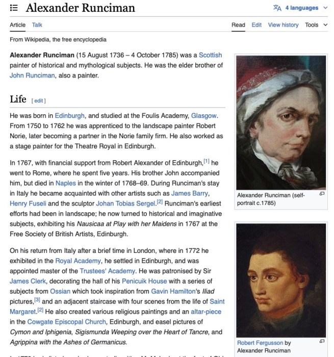
I clicked on the ℹ️ symbol in Apple Photos to make sure the picture I was selecting was the correct version for posting. I noticed a little white dot appeared in the middle of the photo. When I clicked on the dot, Apple AI/Siri told me that this was a painting of Robert Fergusson painted by 1700s Scottish painter, Alexander Runciman. WTF?
Isra Hirsi, daughter of Ilhan Omar, oil on paper, 8×7.5”
I was so struck by the photo (see below) of Isra Hirsi, the daughter of Representative Ilhan Omar, when I saw it in the New York Times. She was being interviewed after she was arrested for participating in a pro-Palestinian protest at her university. The look on her face seemed to say so much.
First sketch, 10×8”
After I sketched her (above) I had a dilemma. I loved the sketch but could see that I had gotten the dimensions very wrong. So do I paint from my sketch or try again to get the correct likeness? I decided to do another sketch, get it right and then do the painting.
As usual I got about halfway through the 12×9” painting, wasn’t happy with it and abandoned it, choosing to start over. I went for a smaller format since I was working from a screenshot of a tiny photo and was relatively happy with the results.
I used the Zorn palette to simplify things, but added a few other colors for her shirt.
Summer Selfie, Oil on Shellacked Arches Oil Paper, 9”x 6.5”
After the wig experiment I got even braver and cut my hair very short for the first time since I was about 12. I was going for something spiky, between Laurie Anderson and a pixie cut but this is what my curly hair wants to do.
I painted the oil sketch above from a photo as a test for using shellac as an archival primer/sealer/ground on paper. I used the Zorn palette (black, white, cadmium red and yellow ochre).
I got bored after painting my head so everything below my chin is pretty rough.
Getting Started with Shellac
Although it comes in a colorless formula, I bought amber shellac so that it could seal the paper and tone it at the same time (and it’s easier to see what you’ve covered). Since it’s transparent you can do a drawing with pencil or charcoal on the paper and then shellac over it and still see your drawing. (See below)
Shellac Over Pencil Sketch on Paper
Fun fact: Shellac is made from a substance secreted by female (she?) Lac beetles to make their tunnel-like tubes on tree branches. It is harvested by scraping it off those trees in India.
Shellac dries super quickly (in under 15 minutes) by evaporating out the denatured alcohol, which is the liquid the shellac is dissolved. It barely smells at all but it’s still good to have ventilation.
It’s best to make it fresh from flakes, but since I can’t buy denatured alcohol in California to dissolve it in, Zinsser canned shellac is my only option. You buy it at the hardware store, not the art store.
Application: It should be stirred first (not shaken). Then you can apply it with a cheap hardware store bristle brush (or a nicer one if you can get denatured alcohol or don’t mind using ammonia to clean it). Supposedly you can also let the brush dry without cleaning it and when you put it back in the can it will soften and be ready to use.
You can also apply it with a rag, a squeegee or anything except a sponge brush according to the hardware store guy. For this first experiment I just spread it with a flat paint stirrer stick and it worked fine and made a nice variegated background.
I really like the interesting painting surface that shellac provides—not too slippery like acrylic sealant but not so dry/absorbent like gesso or Arches Oil Paper without sealant.
A Few Tips and Mistakes to Avoid
For more shellac tips, watch artist Aimee Erickson’s video demo on using shellac to prime pages in a sketchbook for oil painting.
Shellac is thin and as it turns out, quite splashy. After I applied the shellac to my paper, I put the lid on the can, and, as I usually do with my gesso bucket, I tapped the lid with my rubber mallet to seal it. That sent golden shellac from the rim of the can splattering all over my table, the wall, a framed (in glass fortunately) painting on the wall and everything on the table. Now I carefully wipe the rim before tapping it with the mallet.
I did the drawing for this painting directly on the shellacked paper. Even though I had pretty good luck with the drawing, I still needed to do some erasing and redrawing. That roughed up the surface unpleasantly in some spots. Shellacking over a drawing may be a better solution.
I tried shellacking 140 pound cold pressed watercolor paper instead of Arches Oil Paper for another painting. Even though it does seal the paper, I found the painting surface quite unpleasant, and won’t do that again.