Categories
Building Drawing Ink and watercolor wash Landscape Life in general Painting People Photos Places Sketchbook Pages

Workshop, Weddings, Wheels at Legion of Honor, SF

Legion of Honor, SF, Ink & watercolor

My plein air painting group held a workshop today at the beautiful Legion of Honor in San Francisco’s Lincoln Park at which Ed Terpening demonstrated.  After an hour some people set up and started their own painting but I watched the full demo so had only enough time for this quick sketch. At the critique Ed pointed out the problem with the size of the guys in the foreground compared to the cars which made me laugh.

Ed is one of those rare artists who can paint while at the same time explaining the how, and why of what they’re doing. I learned so much! I’ve enjoyed following Ed’s blog, Life Plein Air for years and it was a real pleasure to meet him in person.

Afterwards I tried to walk over to the museum to see the Impressionists in Paris show (wonderful!) but was prevented by this craziness:

There were about a hundred noisy, smoky mopeds, coming up the hill and then circling around and around, more and more of them. Finally they left and I made it across the street and directly to the museum’s café for a much-needed latte. While I sipped I sketched the view out the cafe’s french doors (except they didn’t have Ed’s name above them):

Cafe view under my notes about the workshop in sketchbook
Sketch under my notes about the workshop in journal

I took notes during the demo on a page in my journal that had an unfinished sketch done with green pen which is what that green mark is under Ed’s name.

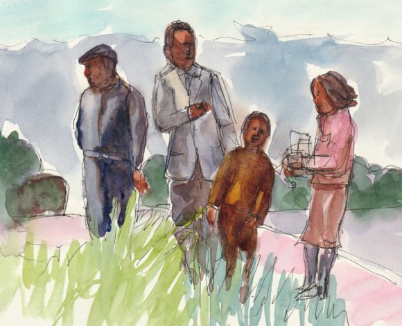
Apparently the Legion of Honor is a place people go to take wedding and Quinciaños photos (even though their ceremonies weren’t actually held there). I noticed five different groups being photographed and took my own photos of a few. Since I used a zoom lens you don’t see the tourists and museum goers that were all around them:

Wedding #1, Very serious and stoic
Wedding group #1, So formal and serious
Getting the flower girls ready
Wedding Group #2: Flower Girls
The Quincianera and her court of honor
Quincianera and her court of honor getting ready for photos

The Quinciañera is a Latin American tradition for celebrating a girl’s 15th birthday. Formerly a religious celebration, it has become an obscenely expensive event that can match weddings in cost and extravagance, including ball gowns, banquets, limos, huge parties, photographers, bands and more. I wish they’d save their money for college.

After their photos they left in a huge stretch limo as long as a bus but made out of a Hummer.

Priceless expression (great hat, too)
What is he thinking?

Nobody looked like they were enjoying themselves much in any of the groups. Except maybe the photographers, but they were getting paid to do their art.

Categories
Animals Art theory Landscape Outdoors/Landscape Painting Photos Places Sketchbook Pages Watercolor

Watercolor Study & Watercolor Class Openings

Study for Kaiser Garden II, watercolor, 6.5" x 4.5"

There are still openings in my watercolor class starting Sunday, June 27; click here for all the information. Ok, business done, now on to the painting above, another study from photos I took at the Kaiser garden.

I learned the hard way to do a study first, after time and again putting hours, days or weeks into a painting that was doomed from the start.

No matter how skillful the painting technique is, if the composition is bad (the viewer’s eye goes to a bright corner and then right off the painting), or you’re trying to work from a photo that doesn’t have enough information, or your colors or values are uninteresting, the painting isn’t likely to succeed. Sketching exactly what you see is great fun, but sometimes nature requires editing to make it a painting.

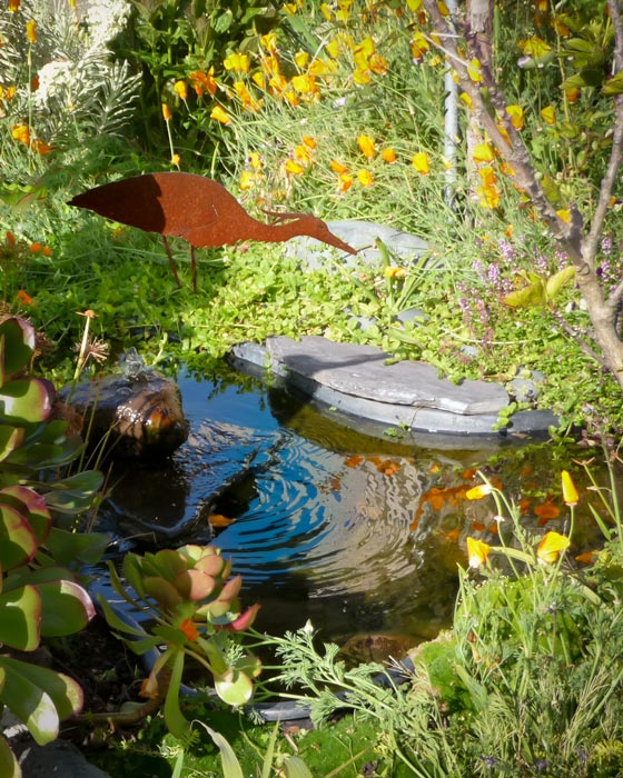
What made me want to paint this scene was the water feature and the bird sculpture but when I looked at my photo I saw big problems with the composition:

Original photo, Kaiser garden

There is way too much going on, the two big succulent plants on the bottom left dominate, a big stem above them leads the eye out of the frame, and the composition seems divided right down the middle, vertically. You barely notice the water.

So I spent some time in Photoshop cropping, rearranging and revising things:

Revised Photo Reference, Kaiser Garden II

Before cropping off the left side, I cut out the bird, moved it to the right, tilted it and gave it legs. Then I darkened the remaining succulents on the left and bottom to use them as a frame for the water feature instead of competing with it. When I started sketching the composition in my journal I decided to get rid of the messy tree branches poking in from the right too.

Although Photoshop is great for preparing a photo reference, so are the scissors, glue, sketches and notes that I used pre-Photoshop. Along with learning Photoshop, I’m also trying to become a better photographer and compose more carefully. I can do that with my digital SLR because it has a viewfinder but my carry-everywhere little Panasonic doesn’t. In the bright sun it was impossible to see anything on the LCD screen, so I guess I’m lucky that I got something I could work from at all.

My notes for the painting are in my journal opposite the study, with reminders about colors and things that worked (or didn’t). I’ve transferred the drawing to the canvas and it’s just waiting for its turn at the easel. I have a feeling it’s really meant to be a watercolor, not an acrylic painting, so may do it both ways.

Categories
Art theory Flower Art Landscape Painting Photos photoshop Places Sketchbook Pages Watercolor

Study for Tulip Painting in Watercolor

Kaiser Hospital Tulip painting study, watercolor, 4.5" x 6.5"

I accidentally arrived an hour early for a doctor’s appointment at one of Kaiser Oakland’s medical offices that has an amazing hidden garden. The building is an architectural treasure, built around a courtyard in 1912 by Julia Morgan as a hospital and home for unwed mothers (or so I’ve been told). Instead of reading old, germy magazines, I spent the hour in the courtyard sketching, wandering and taking photos.

After working out the composition and colors, I’ve got two paintings ready to start: a full-size watercolor sheet of the above image and a slightly smaller canvas of another garden scene.

Before starting a large painting I like to do a study first, getting to know the image more intimately, and experimenting with pigments and techniques so when I start the real painting I have a plan of action or at least a sense of direction.

Tulip study and notes for painting, journal spread

Since I only recently began experimenting with opaque watercolor pigments after years of using only transparents, I made some discoveries with this study and took notes as I worked. Here are a couple that might be of interest:

  • Opaque pigments (Cadmiums, Cerulean, Yellow Ochre) are great when putting down an area of strong color and leaving it (such as when painting in my journal). But they lift too easily when adding layers over them, and become thick and unattractive when trying to mix darks. As I learned in oil painting, darks/shadows are best when thin so they don’t draw attention to themselves with texture.  Seems to be the case in watercolor as well: better to use staining, transparent darks that won’t lift or get thick. For the dark green areas in the painting I’ll use Sap Green with Sepia and vary with a bit of Indigo, Winsor Violet and/or Alizarin.
  • The Legion/Utrecht 100% rag watercolor paper I’m using in my journal lifts incredibly easily. This is great when you actually want to lift paint but not so good when you just want to soften an edge and a bunch of paint lifts off instead!

Here are the original reference photo and the Photoshopped version. As you can see I got rid of some distractions and changed the proportions a bit.

Original reference photo of tulip in garden
Photoshopped tulip reference photo

Photoshop CS5 has some great new composition tools, such as “Content-Aware Fill” which I used to fill in the windows, white at top right corner and a tulip on the right margin. You just select and delete sections you want to replace and PS fills them with information from the surrounding area. I also narrowed the image to fit the proportions of the 22×30 watercolor paper using Content-Aware Scaling which preserves the proportions of the important stuff while squeezing in (or stretching) the other stuff.

Categories
Animals Berkeley Life in general Places

A Walk on the Wacky Wild (life) Side in Berkeley

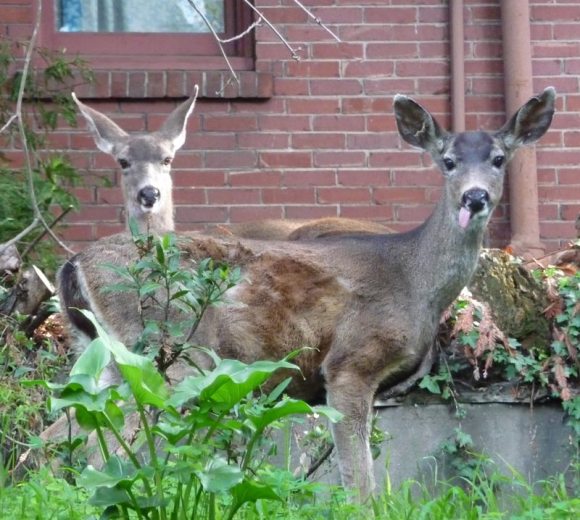
Deer sticking tongue out

Berkeley, California is known as a nutty town, and this morning even the wildlife seemed wacky. I don’t usually post photos, but just couldn’t resist sharing these pictures from this morning’s after-breakfast walk in the hilly  neighborhood above Berkeley’s “Gourmet Ghetto.”  This deer couple above were camped out in a secluded front yard. One had a strange floppy tongue, retracted only when she chewed an itch.

OCD Bird
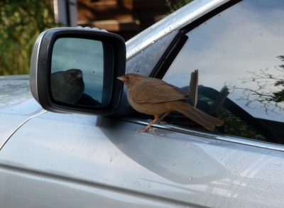
OCD Bird

This bird was stuck in a loop of peering into the mirror of a parked car, attacking his image, jumping atop the mirror, and then coming back to see if the bird was still there, and attacking it again. I tried to shoo him away, but he started the loop again when I walked away. Do birds get OCD?

Chickens on a log
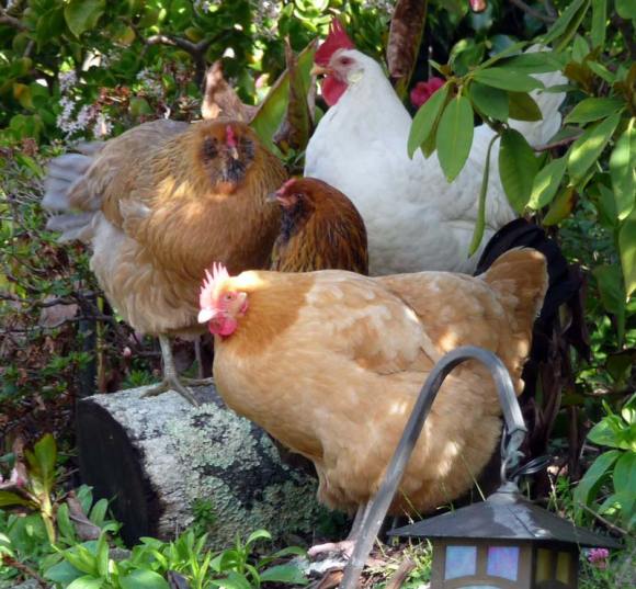
Chickens on a log

These chickens had a huge yard to themselves but gathered together in one tiny corner, all trying to all perch on the same chunk of log. Makes you wonder about how important “free range” really is to chickens.

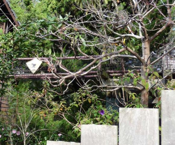
Catwalk 1
Catwalk (see below)

And then there are the people. These neighbors  built a second story bridge between their two houses for their cats. (above and below)

Cat crossing between two houses

And these humble homeowners hung this on their modest bungalow in a neighborhood where even a 3-room shack is worth half a million dollars.

Happy Hovel
Happy Hovel

And then there were the bird lovers…

For Birds
For Birds

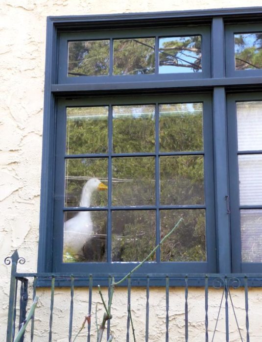
…and goose lovers…

Window Goose
Window Goose (I hope it's plastic!)

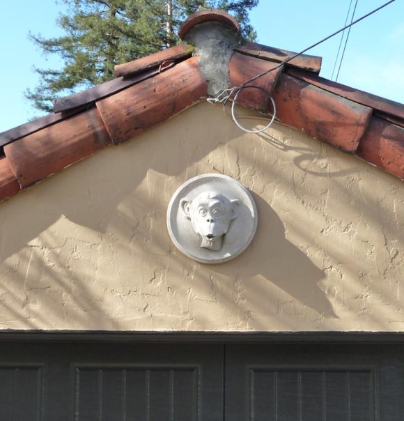
and Monkey madness and…

Monkey ornament
Surprised Monkey garage ornament

and just plain madness…

Australia: One hour tmie limit
Australia: One hour time limit

That’s a dismantled parking meter below the Australia sign.  Their whole front yard was filled with similar flotsam and jetsam.

Welcome to Berkeley
Welcome to Berkeley

Of course I would have preferred to sketch these sights, but I was walking with a non-sketching friend whose patience was already tried by my taking photos, let alone stopping to sketch. And now I’m even further behind posting all the sketches and paintings I’ve been working on.

Categories
Art theory Drawing Flower Art Painting Plants Watercolor

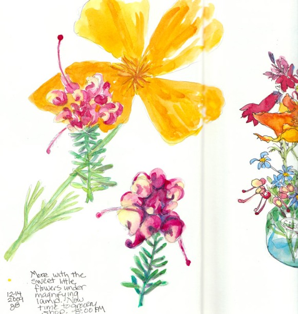
Magnified Teensy Flowers

Magnified teensy flowers
Magnified teensy flowers, ink & watercolor 8x6

The teensy bouquet was still holding up and the complicated shapes in these flowers intrigued me. So I stuck them under my magnifying lamp and drew them again in sketchbook opposite the bouquet side. The California poppy had opened up and wanted to play too so I stuck him in behind the little flowers after I painted them. It’s fun drawing what’s under the magnifying glass and getting to see all the neat details.

Then it was back to work on the third painting I’ve been asked to do for the book, Must Paint Watercolor Flowers. This time it’s a peach colored begonia with really interesting veiny leaves.

Begonia leaf colors
Begonia leaf color tests

My first step was to test colors and try to find the pigments that will mix to the right values, colors and textures. On the tests above I experimented with glazing with different yellows, blues and greens, and tried lifting color for the veins in the leaves to see which worked best for that.

Begonia petal test colors

I found just the right mixture of colors for the petals with a color I’ve rarely ever used because it is more opaque than I usually prefer: Naples Yellow. When mixed with combinations of Cadmium Orange, Permanent rose, and Quinacridone gold, it looks like it will give me perfect petals. But now it’s back to “day job” work for the rest of the week. That will give me time to focus more on how I will approach the painting so once I have brush in hand I’m ready to go.

I don’t always plan things out so carefully, but it can help prevent wasted time and do-overs which becomes more important when I’m also photographing each step and writing about it for the book.

Categories
Life in general Photos

Creepy Bugs and Even Creepier Humans

While I’m busy in the studio with a painting project, here are some photos of creepy critters in my garden and the creepiest of all, on a big SUV.

First I opened my front door to grab the mail and as I reached out, this was guarding my mailbox box. She turned her little ET head towards me in a friendly sort of way.

I reached for my mailbox and...

But I thought Praying Mantises were green? Are they chameleons?

Spooky Shadow!
Spooky Shadow!

Then I was watering the garden and spotted this big guy.

Big Hefty Spider. Should I be scared?

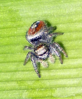
I’m curious whether it’s a kind of spider I should be worried about. She? was huge! If you know, do tell. I touched a silken strand leading to her web and she went running down it, thinking something juicy had landed there.

Here’s what she looks like from on top:

Big one from above
Big one from above

And this pretty little one was hanging out nearby.

Little Pretty Spider

Maybe about to be lunch for the big guy?

And now for the creepiest of all…I saw this giant Yukon SUV in the parking lot at the doctor’s office. Can you imagine being someone who would hang these on their car? They even had a baby seat on the back seat, fully equipped with a TV screen facing it. Scary.

What were they thinking! Yuck!
What are they thinking! Yuck!

I hope I haven’t ruined your day with obscene car accessories and insects! Maybe I should remove this last picture? Or the license plate number? But I guess if they have the balls to hang them off their car in public, they mean to be seen. Or am I joining them in contributing to the downfall of civilization by posting it? And oh yeah, the Yukon gets 12 mpg and costs over $42.000.

More art coming soon.

Categories
Drawing Flower Art Gardening Gouache Outdoors/Landscape Painting Photos Plants Sketchbook Pages

Botanical Sketches: Proteus

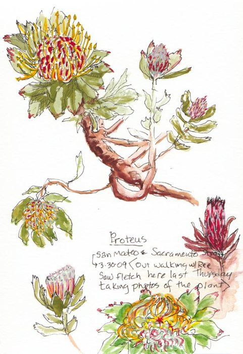
Proteus in Bloom, ink & gouache, Moleskine 5x7 sketchbook

When I was walking to BART last week I ran into Fletch who had just finished shooting photos of an amazing Proteus  a few blocks from my house. I must have walked by this stunning plant a hundred times and never noticed it until he pointed it out to me. I couldn’t stop to sketch that morning but finally got back there this afternoon.

I got as close as I could without trespassing and sketched with my Micron Pigma .01 pen, trying to capture the many different forms the blossoms take along the way to fully blooming. Then I used my mini gouache palette and a tiny brush to paint the details.  Gouache seemed like a perfect medium for doing this kind of detailed botanical sketching.

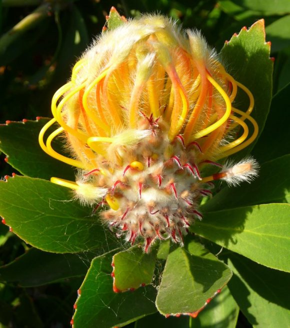
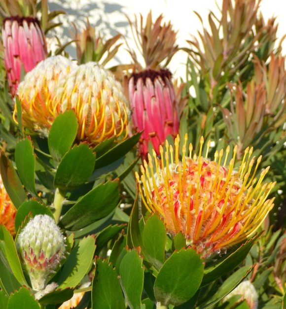
I also took a bunch of photos of these amazing and diverse flowers. Here are a couple of them:

Photo of Proteus blossom
Proteus in bloom, photo

Note to self: Find proteus at a nursery and plant them! But first I want to do some larger botanical illustrations from my photos (or from life if I can convince the woman who owns the plant to allow me to take some cuttings). Fletch told me she reluctantly allowed him to take one.

And here’s a bit of etymological (word origin) trivia about theProteus:

The Proteus got its name because of its amazing diversity of form: It was named after the Greek sea god, Proteus, who was able to change his appearance at will.  From this comes the adjective “protean,” which means “versatile”, “mutable”, “capable of assuming many forms.” “Protean” has positive connotations of flexibility, versatility and adaptability.