I’m back on the blog after an intense week spent alternately deep in the bowels of a massive garage clean up/reorganization, and obsessively fighting the acrylic version of the watercolor sketch above. After finishing the garage on Saturday afternoon it was time to clean up in the house and studio and prep for my Sunday morning watercolor class (which went great with a terrific group of artists who left me feeling inspired).
Virtual Paintout: Hawaii
For the Virtual Paintout we went to Hawaii this month via the very cheap Google Air (just kidding—to participate you use Google Maps’ Street View feature to find your painting spot and all travels are virtual). Here’s the original scene:
Hawaii - near West Maui Forest Reserve
The painting got off to a good start with Golden Open Acrylics. I was trying to work from both my watercolor sketch above in which I’d changed the colors, warming up the scene, and also from the Google photo which just has a blur for the foreground. I first painted the gate purple for fun, but nearing completion realized the gate was too prominent and acting as roadblock into the painting so I repainted it green.
Then I started fighting the foreground. Over and over I painted, repainted, scraped, repainted. Here it is in its current state with the foreground (and some of the fence) scraped off again .
Hawaii with Scraped Off Foreground, Acrylic, 11x14"
Part of the problem may be the Utrecht Masters canvas panel that I was experimenting with. The canvas texture is too coarse and too absorbent so first I painted a layer of regular acrylic to smooth it out and reduce the absorbency (which is OK to do according to Golden). But then I had a paint adhesion problem, easily peeling off several layers where I’d painted thickly or repainted over not quite dry paint.
Since I wasted so much time messing with this painting and because I really love the top half of it I just didn’t want to give up. But to enjoy the second half of my vacation I’ve banished it to the closet and have gone back to working on a big watercolor of a tulip that is going great and makes me happy when I paint, not frustrated. I’m becoming convinced that I’m meant to be a watercolor painter and should forget about oils and acrylics.
The Garage
Cody unloading and saying "Bye" to his junk at the dump
When I bought my house 10 years ago it had been a rental for many years before that and the standalone garage probably hadn’t been cleaned forever. Then for 9 years my son used it to dismantle and rebuild his 71 Firebird, leaving grease, car parts, tires, miscellaneous junk, and bondo dust on top of years of grime, cobwebs, and worse (we found a literal rats’ nest made of fluffy chewed up shop towels in one corner behind a piece of plywood but no sign of recent rodents).
After moving most of his stuff out and the initial trip to the dump above, the real clean up began. I hired the smart, hardworking 15-year old boy next door to help me clean and we worked together most of Friday and Saturday. He vacuumed the wood walls and concrete floors after cleaning out the Bondo-filled ShopVac, removed and cleaned all my storage bins from the shelving units and then cleaned the shelving too. Meanwhile I sorted my junk and took a carload to the recycling/donation center and made another pile for the dump.
Finally the garage is ready for its new life as studio annex and multipurpose room. And I’m ready for my last week of vacation which I will fill with art fun, rest and recreation!
On Solano Avenue in Albany to do an errand I looked up and saw the bell tower of this church against the very blue sky and was sorry I’d accidentally left my sketchbook and paints at home. Fortunately I did have my little camera and took a few photos I could paint from.
The title of the painting is actually the name of the church. According to their website this 100-year old church community changed their name from “First Baptist Church of Albany” to “Church on the Corner” in 2005 because “many people in the community refer to it that way.”
I can’t stop pondering the implications of this: like what if other businesses started dropping their identities and brand names and Apple Computer became “Big Corporation in Cupertino” or Starbucks became “That Coffee Place on Every Corner.”
Golden Open Acrylics and Utrecht Masters Panels
This painting had been nearly finished when I tried glazing over the sky and it failed miserably, lifting off some of the previous layer. So I painted the sky again. Not sure if it was something I did wrong or that the Open Acrylic Gloss Medium doesn’t work well for glazing over layers.
For this painting I used an archival-quality Utrecht Masters panel which is medium-textured canvas on MDF (medium density fiberboard). The surface seemed too absorbent and coarse for the soft Golden Open Acrylics so I applied a first layer of regular acrylic.
That solved the absorbency problem but the texture is still a little too rough for the way I like to paint in thin layers. I have several more of these panels so will continue to experiment with them, using paint more abundantly so the texture isn’t as problematic.
The day I painted in this meadow was gorgeous: warm and sunny with the air full of the scents of spring and the sounds of birds, bees and frogs. The plein air painting I did wasn’t worth posting but served as a memory guide, along with my photos for this painting. It is painted with Golden Open Acrylics on a RayMarArt canvas/hardboard panel.
I know I’ve been a bit quiet here lately—just a bit of spring fever and choosing to be outdoors and/or painting, not at the computer. (:
Borges Ranch View, Open Acrylics on canvas panel, 10x12" (studio painting)
It’s springtime in California and those famous “golden rolling hills” are actually a million shades of green right now, thanks to all the rain (which we probably won’t see again until next winter). When my plein air group went to Borges Ranch in Walnut Creek last month for our paint out, I used the time to hike, sketch and take photos. Then I made the painting above in the studio from my photos memories of the day.
You can see my recent sketches of Borges here. The two Borges paintings below from 2009 and 2008 help me see that I am making progress.
I really like going out sketching with the group and experiencing everything about the day without the frustration of trying to make a 2-hour painting as the light and scene changes completely. I’m better suited to doing sketches in the field and paintings in the studio.
Last Sunday I tried again to paint on site. I thoroughly enjoyed the sounds of birds, crickets and frogs in the meadow where I painted in the sun along the bay in Benicia. The painting was a 50-50 flop that might be salvageable but I took some photos which I altered in Photoshop to match my memories, from which I will make a painting
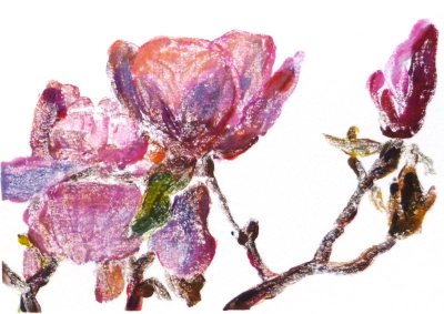
The tulip trees (Saucer Magnolias) and tulips were blooming when we painted at Blake Gardens on a sunny Friday a week ago. Of the multiple sketches and paintings I did of the scene, I think I’m happiest with the one above, done in my journal when I got home, from a combination of memory and photo. I clipped the text from their brochure and pasted it on the journal page.
Here is the final painting and below that are the steps in between:
Blake Tulips & Tulip Tree, Acrylic, 10x8" on Gessobord
After I picked my spot to paint and set up my easel, I did several thumbnail sketches (left below) to plan my composition. While each thumbnail improved on the one before it, none were great compositions and as a result neither was the plein air painting I did on site.
Journal Spread with thumbnails
I was working with Golden Open Acrylics, my first time trying them outdoors. A Golden expert suggested I put a drop of Golden Open Acrylic Thinner atop each blob of paint to keep them moist when painting outdoors. Instead, thinking I was so clever, I mixed about 25% thinner with 75% water in a spray bottle and misted the paints occasionally.
But I should have taken her advice as my method didn’t work. She’d warned me that adding water to the Open paints will make them dry faster, which it did, and they started getting icky-sticky about the time I needed to quit and head for the critique anyway. Indoors they stay wet all day and in a closed palette, for a week or two.
The plein air painting was so UGLY that I’m glad I only expect my plein air paintings to be learning studies. My plein air painting goal is to fully experience and participate in a scene and embed my memories of color, light, texture, sounds and scents.
Plein air study
And there were sounds and scents: not only were the many magnolias overly fragrant, but shortly after I set up, two gardeners fired up a gas-powered industrial-strength chain saw, cut down a huge tree and sawed it to pieces about 20 feet away from me. The sound was horrible and the smell was worse.
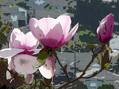
Below is a photo taken when I first arrived, cropped into a more pleasing composition. I like the diagonals and the way shapes of shadows and colors lead the eye into and around the painting.
Photo at Blake Gardens
From my watercolor sketch and the photo above, I started working on a studio version of the painting. Below is the underpainting with the main shapes and colors blocked in.
Acrylic under painting
I liked just as it was and was hesitant to paint over it so I left it for a few days before working on it again until it decided it was finished.
This month’s Virtual Paint-out is taking place in Norway. When I picture Norway it’s always snowing—silly me. I was amazed to wander the roads and see the beautiful summer light and perfectly maintained buildings and fields. There was so much gorgeous scenery it was hard to pick, but I couldn’t resist all the different greens in this scene.
Here is the original scene from Google Earth. I used Windows 7 cool “Snipping Tool” that lets you select an area of the screen to copy and save:
Original Google photo
If you click to enlarge the image you will see the address of this farm in the top left. I played around in Photoshop to compose and crop the scene. Then I used the “Content Aware Scaling” feature in CS4 that allows you to compress a scene without distorting elements such as buildings or people. I wanted to fit the image on a 9×12″ canvas:
Cropped/Scaled in Photoshop
What’s really exciting to me about this painting is that I used Golden Open Acrylics to paint it. I am in love with these paints! [SEE less enthusiastic UPDATE AT BOTTOM]. They have all features that I love about oils and acrylics with none of the features I don’t like. I’ve been struggling with both those mediums for months and was going through an artistic crisis, considering giving them both up.
The problem with acrylics
I couldn’t stand working with regular acrylics because I like to layout a palette of paint and work intuitively, mixing as I go. Acrylics dry too fast to do this. (Yes I know you can mist the paint regularly and that there are special stay-wet palettes but I found they turn the paint to soup and smell bad after a couple of days). I also like to blend colors on the canvas and to be able to wipe off a passage if it’s not quite right. None of this is easy to do with regular acrylics.
The problem with oils
Because I try to use solvents as little as possible with oils due to their toxicity and smell, I can’t start with juicy washes for the first layer as I like to do when sketching out the composition with oils. And even with the minimal use of the least toxic odorless solvent (Gamsol mineral spirits) I found there was an odor (probably from linseed oil going rancid that was left in the solvent) that bothered me anyway. And then there’s the cleanup up dozens of brushes after a painting session.
Why I love[d] Golden Open Acrylics
Golden Open Acrylics do not smell, stay workable about as long as oil paints [update: they don’t really], can be diluted with medium and/or water, clean up with water, do not dry on brushes (for 24 hours at least), blend nicely and are just a dream to work with. When I quit painting last weekend I stuck a small, damp sponge on the palette, and closed my Masterson “Palette Seal” box. I opened it today, a week later, and the paint was still in perfect working condition, better than oil paint would have been.
While I admire thick, expressive, brush strokes in paintings, it’s not really my thing. I prefer working more thinly and that’s just the way Golden Open Acrylics are meant to be used: in layers less than the thickness of a penny. They can also be mixed with regular acrylics to modify the texture or the drying time. Or they can be combined in different layers, although it’s suggested to use regular acrylics as the first layer(s) before adding the Opens or waiting for the layers of Open Acrylics to thoroughly dry (2 weeks) before applying a layer of regular acrylics.
I think these paints are also going to transform my plein air painting. [update: they didn’t work for plein air; got tacky too quickly] I won’t need to bring solvent or a slew of brushes. I haven’t figured out what to carry for a water container or how much water I will need to carry for brush washing between colors.
Our first plein-air session of the new season is next Friday and I’m looking forward to playing with my new medium in a Non-Virtual paint-out too.
UPDATE June 30, 2010
After working the Golden Open Acrylics for three months I’m considerably less enthusiastic about them. The deal breaker is that the paint dries darker (about 10%, varies between colors) which requires guessing when mixing paint how much lighter to make it and makes it impossible for me to try to match colors I’m seeing . Other problems are the drying time which depends on the humidity and wind which makes painting outdoors with them next to impossible in my area. Unless there is no breeze and high humidity, even indoors, you have to work quickly before the painting starts getting tacky within an hour or so. But then it can take a really long time for the paint to dry completely. When trying to glaze on top of a seemingly dry layer, I’ve ended up lifting the previous layer instead and had to give up glazing.
I’ve now switched to Holbein Duo Aqua water soluble oils and so far and am finding them the best of all worlds. No color shift, artist quality pigments and pigment load, no toxics, no smells, easy clean up. I write about them here.
After I started working on a series of paintings in acrylic I realized I needed to learn more about acrylic technique and materials if I wanted to make better progress. Although I’d read several good books and seen a couple of brief demonstrations I needed more.
Although there are hundreds of oil painting and watercolor videos, I could find only a few for acrylics. I rented a couple of awful ones from Netflix and viewed an online video from Artistsnetwork.tv that I found useless. Then I found the video that provided the lessons from which I did the exercises above. The video is “16 Acrylic Painting Techniques: A Studio Workshop with Jackie Miller.” Miller demonstrates and carefully explains how to prepare the support and create each of the 4.5″ square paintings.
I played the DVD on my computer in my studio, and worked along with it, pausing and rewinding as needed. Below are close-ups of the 4.5″ technique squares with a little information about each.
#1: Discrete Brush Strokes
1. Discrete Brush Strokes. Apply a flat, gradated blue background and many layers of individual brush strokes to create optical color mixing (and theoretically the illusion of water and sun reflections).
#2: Stencil and Stamp Painting
2. Stencil and Stamp Painting. Used a variety of materials as stencils, such as plastic embroidery mesh, hardware cloth, plastic decorative stencils. Multiple layers of paint were applied with a stencil brush and with q-tips and a rubber stamp. Fun!
#3: Energized Brush Strokes Alla Prima
3.Energized Brush Strokes Alla Prima. Using glazing liquid to keep paint workable a bit longer, applied layers of brush strokes freely, letting colors blend into each other.
#4: Impasto with Sgraffito
4. Impasto with Sgraffito (scraping). On top of flat underpainting, applied paint mixed with gel medium and before it dried, scraped through it with a variety of implements including popsicle stick, rubber combs, and paint shapers.
#5: Glazing and Scumbling
5. Glazing and Scumbling. Applied underpainting of blue, leaving white hole in the center. Then half the blue was glazed with a very thin layer of the same blue mixed with glazing medium (to see how it enriches the color and removes chalkiness). The center hole was painted red. Then turquoise paint was scumbled (scrubbed with a dry brush) on top of the blue and softly over the edge of the red.
#6: Cross-hatch Brush Stroke
6. Cross-hatch Brush Stroke. I need more practice with this one. A flat, dark underpainting was done first and then the idea was to make brush strokes that cross each other in hundreds of little X’s with a fairly dry brush to create soft gradations with many layers. The original actually looks better than this photo shows because of glare, but I still found it difficult to make those X’s.
#7: Soft-edge & Hard-edge
7. Creating soft- and hard-edged transitions. A dark, flat background was painted first and then the edge of the section at the top left was masked with masking tape and lighter red painted in that area. The transition at the bottom was created with layers and layers of softly scumbled paint lightly scrubbed on with a nearly dry brush, always starting at the corner and moving towards the center so there was less paint on the brush as it approached the transition area.
#8: Glazes, Wipe Removal & Combing
8. Glazes, Wipe Removal & Combing. On top of a flat, mauve background, layers of paint mixed with glazing medium were applied and then wiped back with a damp cloth and combed through using a rubber, multi-sided comb.
#9: Finger Painting & Mixed Media
9. Finger Painting & Mixed Media. Started by finger painting with grey paint (she used Graphite Gray meant to look like graphite) and then added water soluable crayons, Sharpie marker, pencil, layer of acrylic medium, and more crayons and pens, finishing with medium to seal the crayon layer.
#10: Staining
10. Staining. On the video she left this square of the canvas raw, but since I was using watercolor paper, I gessoed the whole sheet and then covered this square with Absorbent Ground Medium which creates an absorbent surface, similar to ungessoed paper. The paint was mixed with a high proportion of water and allowed to move and blend wet into wet. It didn’t work as nicely as watercolor does wet into wet. Mixing more than 25% water with acrylics can cause them to fail to bond with other acrylic layers, but that’s not important when working with an absorbent ground since it will sink ito the fibers.
#11. Alla Prima as Underpainting
11. Alla Prima as Underpainting. The underpainting was created like #3 using bold strokes of paint, wet into wet. When dry it was painted over with various techniques including combing and glazing. On the video she did the over-painting with oil paint. I used acrylic.
#12: Painted Gel Relief
12. Painted Gel Relief. First a a pile of heavy clear gel was applied to the surface and then pushed around and smoothed and shaped with various implements. When it was dry to the touch after 24 hours I painted it with Micaceous Iron Oxide, Copper and Bronze acrylic paint.
#13: Found-Object Collage
13. Found-Object Collage. A flat layer of heavy gel was applied and then random stuff stuck into it (twine, match stick, pennies, plastic stretcher bar “key”, electrical wire thingees, some glitter for texture). When dry it was painted.
#14: Rubber Cement & Tape Masking
14. Rubber Cement & Tape Masking. Rubber cement was applied and when dry, the square was painted. Then rubber cement was removed, another layer of rubber cement painted over a different area, another layer of paint, cement removed. Masking tape applied and then painted over, etc.
#15: Paper and Fabric Collage
15. Paper and Fabric Collage. Acrylic medium was used as an adhesive to attach scraps of fabric, string, lace and paper. When dry the surface was painted using various colors and Iridescent Gold paint.
#16: Water Soluble Crayon
16. Water Soluble Crayon. This was supposed to also include bits of dried acrylic paint film but I didn’t quite see the point of using scraps of dried up paint. I’m not sure I really got the point of drawing with the water soluble crayons and then coating them with acrylic medium (they smear) either, but I gave it a try.
IMPRESSIONS:
I was suprised how much I enjoyed the more abstract, random, textural pieces; a nice respite from my usual striving to capture what I see in a somewhat realistic fashion. I can see many possibilities for exploration with acrylics, but I’m still not convinced of their suitability for my work right now, although I haven’t given up yet. I’ve gone back to working on the paintings in progress with more understanding and skill but still feel like I’m fighting the medium. More about that later.
"Lovers Mongrels Curs #1 M.H.", Acrylic on canvas, 28x22"
It’s not what you might think, based on the above work in progress. It’s that I finally started the series of paintings that I’d been waiting on for over a year. I hadn’t realized it, but I was waiting for the painting to tell me how to paint it (see below about intuition and broccoli).
I’m just having so much fun with the series and haven’t wanted to use time I have for painting being on the computer. Also I wasn’t sure if I was ready to post what I’m working on yet. I’m also not sure how much I want to share about each painting and the series as a whole, except to say that it’s sort of auto- and bio- graphical, about the men who’ve played a role in my life, hence the title of the series: “Lovers, Mongrels and Curs.”
This painting is the first in the series and it is still a work in progress; a little sketchy but I like it that way and may just leave it…or not.
I followed the saying, “If you don’t know what to do, just wait until you do,” instead of forcing the start of the series. It just took some down time to conceptualize how the series needed to be painted and for the ideas to bubble up (literally: I was on vacation, lying on my back on the deck of my little, private, open-roofed, hot-tub room at Albany Sauna, watching the clouds float by overhead while the hot tub bubbled beside me when it came to me that the series needed to be painted large, in acrylic.)
I wanted to work on two paintings simultaneously, side by side on the wall so first thought of using gessoed paper or unstretched canvas, finally settling on stretched canvases. But how to hang them?
Using Velcro to Hang Canvases on the Wall for Painting
After some brainstorming I found an easy way to mount two canvases side by side on the wall without harming the wall or making holes with nails.
2 canvases mounted on bulletin board with Velcro
I applied a few strips of Velcro along the top rail of my 36×48″ metal framed bulletin board already hanging on that wall (the cork is covered by a sheet of paper pinned to it). Then I measured and matched the other half of the Velcro strips to the backs of the canvases and stuck them together. To stabilize the canvases a bit I put a few large push pins along the bottom and sides. It’s working great!
Listen to Your Broccoli poster, colored pencil, 16x14", created after reading Bird by Bird in 1994
“There’s an old Mel Brooks routine, on the flip side of the ‘2,000-Year-Old-Man,’ where the psychiatrist tells his patient, ‘Listen to your broccoli, and your broccoli will tell you how to eat it.’ And when I first tell my students this, they look at me as if things have clearly begun to deteriorate. But it as important a concept in writing as it is in real life.
It means, of course, that when you don’t know what to do…you get quiet and try to hear that still small voice inside. It will tell you what to do. The problem is that so many of us lost access to our broccoli when we were children. When we listened to our intuition when we were small and then told the grown-ups what we believed to be true, we were often either corrected, ridiculed, or punished. God forbid that you should have your own opinions or perceptions–better to have head lice.
. . . So you may have gotten in the habit of doubting the voice that was telling you quite clearly what was really going on. It is essential that you get it back.
. . . Get your confidence and intuition back by trusting yourself, by being militantly on your own side.
. . . Get your intuition back and make space for it, when you stop the chattering of the rational mind. The rational mind doesn’t nourish you. . . Rationality squeezes out much that is rich and juicy and fascinating.
. . . If you don’t know which way to go, keep it simple. Listen to your broccoli. Maybe it will know what to do. Then, if you’ve worked in good faith for a couple of hours but cannot hear it today, have some lunch.”
Last night my step-granddaughter Mariah, a brilliant, almost 10 year-old artist with an enviable sense of design and assurance and confidence in her work came over for a visit while her parents went out to dinner. Even though she she was sick, she was still up for doing some drawing and painting.
We picked a few camellias from my tree and got to work (or was it play?) drawing. She wanted to use acrylics; I fooled around with gouache and watercolor. Here’s her painting:
Mariah's Camellias, Acrylic & graphite on paper, 8x8"
And here are the two I did last night. (The one at the top top of this post I did this morning, with the flowers beside the window. I wasn’t ready to stop painting these pretty flowers, the first of the flowers to bloom in my garden.)
Camellia #2, Watercolor & ink on paper, 6x4"Camellia #1, Gouache and graphite on paper, 4x6"
I really don’t like the way using white with gouache looks so chaulky. I much prefer the clear lights in watercolor that you get by leaving areas white or only lightly glazed with color.
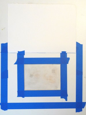
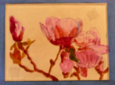
After watching a demo of how Golden’s new Open Acrylics can be used for monoprinting (since they stay wet 10 times longer than regular acrylic paint) I was excited to give it a try. I love monoprinting but working with oil-based inks can be messy and the cleanup isn’t fun so using acrylics seemed like a great option.
I think Golden’s Open Acrylics have a lot of promise as a painting medium, and seem to combine good features of oil and acrylic, but I wasn’t at all happy with the way they worked with monoprinting. As a matter of fact, these two preliminary painting layers (above and below) on the plexiglass plate, pleased me much more than the prints I pulled from them. I had much better luck previously when I used printing inks (see previous posts Persimmon Monoprint, Magnolia Monoprint andTurtle to Swan monoprints).
Paint on plexi plate 2
Below are steps along the way:
1. Tools and palette
2. Setting up the registration
3. First layer print
4. “Cartoon” on back of plexiglass
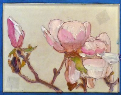
5. Paint on plexi
6. Plexi and print
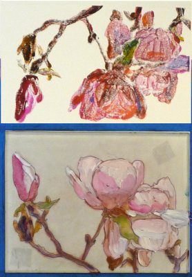
7. Paint on plexi plate 2
8. Print above, plexi below
9. Paint on plexi plate 3
10. 1st print final
11. 2nd print final
12. 3rd print final
13. 4th print, final
14. Original photo
15. Photo reversed and posterized in Photoshop
To read the details about the photos above, or find out how you can watch the video demo that inspired me to try this by artist Tesia Blackburn, please click Continue: