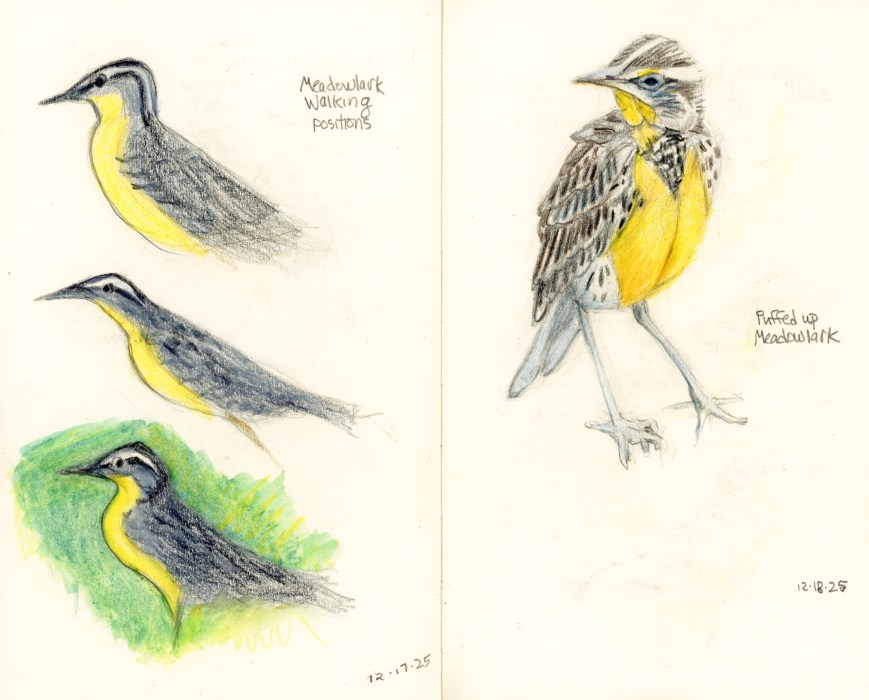
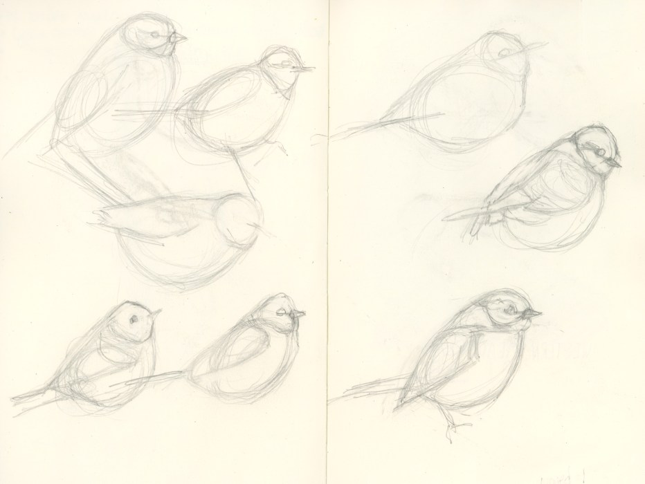
Have you ever noticed the weird way birds walk, bobbing their heads back and forth? Watching the birds in the video below about the return of meadowlarks to my beloved park, Point Isabel, I once again wondered why birds do that.
Instead of letting the thought go as usual, I decided to follow my curiosity. And that lead me down unexpected rabbit holes, to some fun drawing, joy and surprises. (Yes, I’m easily amused.)
First, I learned that the head bobbing is called “translation” (huh?). Yep, same word, (almost) completely different meaning. “Translation” as used in biomechanics means “moving an object linearly from point A to point B, no turning.”
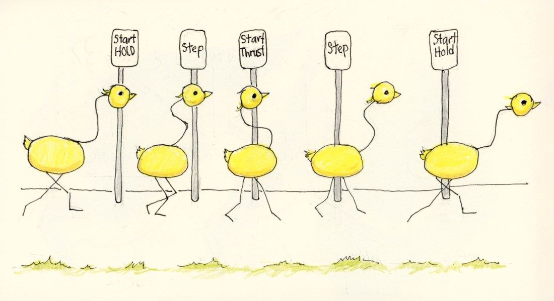
I wondered if birds were doing something similar to spotting—what dancers and ice skaters do to avoid dizziness when spinning. Dancers focus their eyes on one spot as their body turns, then quickly snap their head to focus on that spot again.
But nope. As you can see in my diagram above, the bird’s head stays still in one place as its body and feet move forward. Then the head snaps forward to catch up. They do this for image stabilization, not to prevent dizziness.
When humans move forward and the scenery changes (or when seeing something move towards us), our eyes constantly make micro-moves to focus. (See this YouTube video for more about human vs bird vision when walking and flying.)
But birds’ eyes, on the sides of their heads, can’t move like that. They have to move their heads instead. Without “translation” their vision would be super blurry, and they wouldn’t be able to spot food or predators.
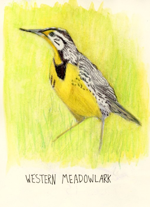
Nerding out (birding out?) even more: Birds have from 13-25 neck vertebrae. Meadowlarks have 14, twice as many as humans and giraffes who only have 7! Birds’ necks are so flexible they can look behind themselves without moving their bodies (think owls)!
Nature and evolution are so amazing.
PSA: We humans also do a forward head bob when we stare at screens, sometimes spending all day in that position. For every 1 inch our head is forward of our shoulders, the load on the neck increases by ~10 pounds. That puts 30-50 pounds (when head is 2-4″ in front of shoulders), leading to headaches, neck pain, muscle imbalances, etc. Bob it back!
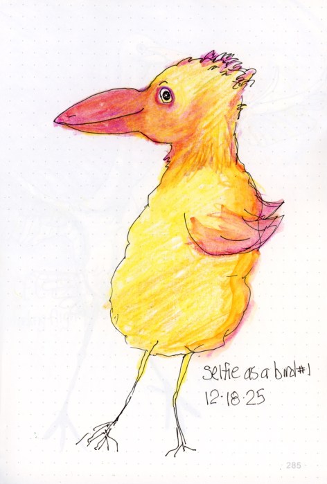
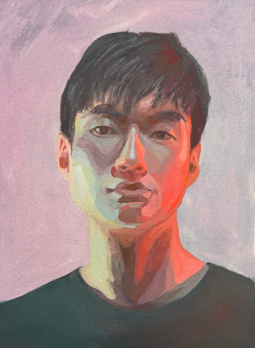
Bonus (?) for making it to the end: For the past year I’ve sketched a quickie self portrait every night, right before bed. This is what happened after the day I’d spent immersed in bird things. Totally silly and improbable anatomy!