Categories
Oil Painting Painting Still Life

Trying and Failing to Do 1-Hour Studies

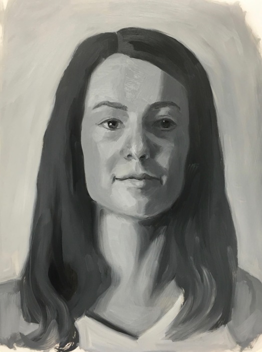
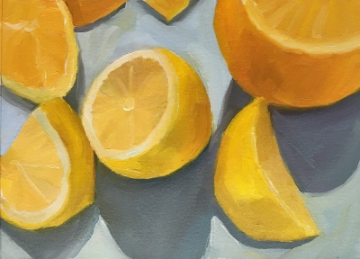
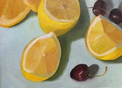
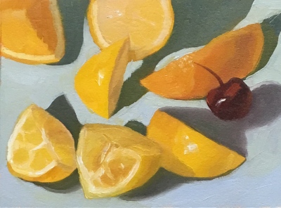
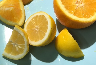
I’ve given myself the gift of working with artist and painting mentor Sarah Sedwick to spur my growth as an artist, learn new techniques, improve skills and get help from an expert who can spot problems that may be hindering me and that I can’t see myself. We’ve been working on value and color mixing with limited palettes, and after an awful bout of reworking a painting to death she challenged me to do three one-hour paintings. Unfortunately I seem to be constitutionally incapable of doing 1-hour studies, although I haven’t given up trying. My 4 studies above are all 7×5 inches on Arches Oil Paper. Below are the work in progress photos including a photo of the still-life set-ups (though these were all done from life) and in some cases, the color palettes used. You can click on any image to see the set enlarged.

Despite my intention each time to do a one-hour study, I painted three-hour (or more) studies. I worked quickly enough to leave them looking unfinished to me, but slowly enough to lose the freshness and conviction of the original brushstrokes. As Sarah explained, the goal wasn’t to learn to paint fast but rather to loosen up and get out of the rut of perfectionism, to get bold and concise with brushstrokes. She said, “The point of timed paintings is to set a constraint so we can be more free in other ways, not create more struggle. We aren’t attempting to create finished masterpieces in one hour, here – it’s a challenge to yourself to see how much you can do, how freely, how efficiently. Setting a time limit frees you to experiment – to slap on some thick paint in an area and go with it – to not stress as much about the drawing and composition – you can fix any issues in the NEXT painting.”

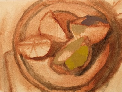
Part of my problem with these attempts I think, was setting up too complicated of a subject. When I get back to the studio today I’m going to use a simpler subject. And will force myself to stop at one hour no matter what. If I sketch in the composition too quickly it’s inaccurate and I spend my painting time correcting my drawing mistakes. By the time I’ve done a preliminary sketch and/or a careful sketch on the canvas, blocked in the shapes and values with a quick burnt sienna wash/underpainting, the hour is up. I can easily spend another half hour pre-mixing my paint.

Then when I start painting I get interested in all the cool light effects and details I see and want to capture. I forget my plan to go with 3 values per subject, simple planes and shapes, big brushstrokes and instead soar off into the groove of seeing and painting, seeing and painting until I look at the clock and suddenly it’s 8:00 pm and I haven’t had dinner or midnight…and I long ago turned off the timer and have lost it again!

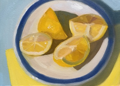
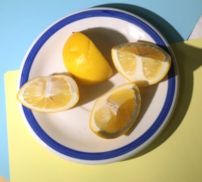
I painted the 4th still life below with a limited 4-color palette (White plus Cad yellow pale, Cadmium Red Medium, Ultramarine blue) but in the end I added in a bit of Cad yellow medium and Phthalo blue) because I just couldn’t get the colors I wanted for the lemons and blue background.

But I am determined, and today I will succeed! I am an optimist, for sure, since that’s what I always say when I go to the studio, but I will obey my timer and see what I can accomplish in one-hour one more time.

Categories
Art theory Faces Oil Painting Painting People Portrait

Revised Post: Color Boot Camp Monochrome Studies

Color Boot Camp Part I Monochrome. Left to right: Color reference photos, B&W converted ref photo, my two studies

When my art friend Chris Beaven commented on the previous version of this post that it would be interesting to see my studies compared to the black and white versions of the photo references, I did a virtual dope slap (Of course! What a perfect way to see if I got the values right!) and then decided to redo this blog post to show that comparison (above).

While I often convert color photos to black and white to see the values, when I did these studies from Bill Perkins’ Color Boot Camp on New Masters Academy I wanted to try to do the conversion in my artist brain instead of using technology. But putting my studies next to the converted photos gives me just the reality check I needed. I can see that I did pretty well in painting the values from the color photos.

In the lesson he set up one model in four different lighting situations and then demonstrated doing a 30-minute painting of each in black and white. He recommends doing the studies in no more than 30 minutes, emphasizing that it’s more important to do many starts, without worrying about getting a likeness or making finished paintings. I have to admit spending longer than 30 minutes, probably up to 3 hours on some, and in retrospect, the longer I worked the less effective the study was.

If you want to see Bill Perkin’s studies and mine in greater detail, click the “read more” link below.

Categories
Art theory Faces Oil Painting Painting People Portrait

Color Boot Camp, Part I: Monochrome Portrait Value Studies

CBC Part 1-3, Janas #1 High Key, High Contrast Painting
CBC Part 1-3, Janas #1 High Key, High Contrast Study (My favorite of 8 below)

Being a member of the New Masters Academy is like having a treasure chest of jewels to explore, with new art classes added all the time. The only downside is that I have to assess my own work and be my own teacher since NMA doesn’t offer feedback to the video lessons’ assignments.

I revised this post by publishing a new version of it so I’ve deleted the content here. Please see the next post for the rest of the content from this post.

Categories
Figure Drawing

Sketching a Posing Pirate: Figure Drawing Tips

Pirate, Cutlass and Whiskey, Conte pencil on black paper
Pirate, Cutlass and Whiskey, Conte pencil on black paper, approx. 20×18 inches

After posing nude for a couple of hours, our wonderful male model dressed in a pirate costume, complete with plastic sword,  with sea shanty and pirate songs playing on the stereo. He was such a delight, with a warm smile and a white beard ending in a long, skinny braid. I used four Conté Pencils in white, black, sepia and sanguine on black pastel paper for this long pose (90 minutes).

I’m finding more ease with life drawing lately as I apply the techniques I’ve been taught over the years but that hadn’t “clicked” until now. Finally I’m willing to do a little measuring of lines, shapes and angles instead of “just going for it,” which is fun, but always wonky (not that my drawing isn’t still wonky, even when I do my best to measure—but I’ve also learned that “wonky” is what gives work our own style and I like my wonky.)

Three resources that have helped me learn to draw better:

  1. The book Sketching – from Square One … to Trafalgar Square that explains better than I can, techniques to improve your drawing.
  2. Sadie Valeri’s excellent student handout that I got when I took a workshop at her studio, which she has generously given me permission to share with you: sadie-valeri_draw_block-in_08-2013-2 (PDF Download).
  3. Sadie Valeri’s free video demonstration of how to do a “Straight Line Block In.” All of her videos are excellent, free or paid. She is one of the most generous and clear teachers that I’ve studied with. She is brilliant at lifting the veil between the subject, your eyes and your brain so that you can see what’s really there and draw it.

Here are the ways I practiced some of these techniques in this drawing:

  • first determined whether the subject is wider or narrower using a skinny stick (e.g. a bamboo skewer or knitting needle) held at arm’s length to compare both directions so I know whether to place the drawing and the paper in portrait (tall) or landscape (wide) orientation.
  • marked where I want the top and bottom of the drawing on the paper (to avoid decapitation or leg/foot amputations).
  • measured the size of the model’s head with the skewer, marking the size on the stick with my thumb and then moving down his body, measuring how many heads fit from his chin to the lowest part of his body (e.g bottom of foot). In this case there were 5 heads.
  • divided the space between the top and bottom marks on the paper into 5 equal sections, using the sepia pencil so it wouldn’t show much.
  • noted where on the models body each of those “head” divisions were (e.g. chin bottom, right knee top, left knee top, right foot bottom, left foot) and indicated that on the paper. I also noted how many “heads” wide the subject was at the widest part and marked that.
  • sketched the head in its section.
  • held up the skewer along the angles from the top of the head out to the sides to find the shape of the imaginary “envelope” that the pirate’s body would fit into and drew those lines lightly on the paper (see Sadie’s handout).
  • broke that envelope down into smaller and more exact shapes, looking for negative space shapes and angles to help find the shapes that made up his body parts.
  • continued doing the same, ending with the feet, which I didn’t quite finish as time ran out.
  • drew the whiskey bottle (which was actually empty) during model breaks.

The model asked to take a photo of my drawing at the end of class. That was a first…and a great payoff to practicing the tools!

Categories
Art supplies Art theory Drawing Faces Gouache People Product Review Sketchbook Pages

Painting with Gouache: Color Charts, Zorn Palette, Brush Tests

Zorn Palette color chart in gouache, 10x8 inches in A4 Moleskine
Zorn Palette color chart in gouache, 10×8 inches in A4 Moleskine

In trying to learn more about gouache I made a few color charts. I’m using mostly M. Graham gouache which I like much better than the Winsor & Newton and Schmincke I used before. The Graham gouache is creamy and brilliant, rewets well and doesn’t smell (like the W&N). I found that using fresh-squeezed gouache is more fun to work with than rewetting dried paint, but frugality keeps me trying to reuse dried. The best solution is to set up a palette for each session, squeezing out tiny blobs, adding more as needed.

Above is an exploration of the Zorn palette in gouache, a limited palette using only Yellow Ochre, Cadmium Red, White, and Black. The black paint, when mixed with white, is meant to serve as blue since it is a cool color that can look blue next to warm colors. Next I want to try using it in an actual painting.

M. Graham Gouache paint chart, gouache in A4 Moleskine, 10x4 inches
M. Graham Gouache paint chart, gouache in A4 Moleskine, 10×4 inches

Above is a chart of my gouache colors straight from the tube and mixed with white and each other. Sadly when I removed the masking tape it pulled off some of the paper from the extra large Moleskine watercolor notebook that is my current journal. I don’t recall previous Moleskine WC notebooks having that problem but I’ve switched to low-tack tape now.

Before ordering any new brushes specifically for gouache I wanted to see how the brushes I already had might work so did the test below. I found a few that I liked and ordered a couple of others. I’ll do another post about my gouache palette and brushes I’ve settled on soon.

Old brushes-testing for gouache
Categories
Art theory Flower Art Oil Painting Painting Still Life

Two Sunflower Survivors with Process Chart

Two Survivors, oil painting of sunflowers and white vase on linen panel, 7x5 in
Two Survivors, oil painting on linen panel, 7×5 in

Persistence, patience, perseverance, determination, curiosity, courage, confidence, wonder…these are all qualities needed to become a better painter. Another essential is learning to really see and understand the subject. I titled this painting (available hereTwo Survivors because only these two survived from the big bouquet during the week I struggled with two previous sunflower “studies” (aka failed paintings). Sometimes it takes a while before the “blinders” fall away so that I can see the shapes, colors, and values instead of the named bits (e.g. petal, leaf, or nose) that interfere with seeing as a painter.

I was inspired by artist Chris Beaven (whose sunflower painting I purchased and love) by his Session Detail charts that he embeds at the end of each post (sample). I modified his chart to create one for myself to focus my goals and intentions for each session and the painting as a whole. Completing  the chart at the end of each painting session with image, results and plans/goals for the next session is making a big difference in my process and helps me avoid random, unfocused messing about with paint.

Below is the chart I used for this painting. If you’d like to see all three session charts for this painting with my notes about goals, composition mistakes and corrections, and corresponding images, click here to open 3-page PDF file.

Session 1 Detail Chart (Click image to enlarge or click PDF link above to see all 3 sessions)

I loved the original painting of the vase in Session 1 above, with wonderful warm highlights and cool shadows created by the new LED lightbulb I’m experimenting with. My intuition told me to leave the vase alone but instead I started adding the pattern from the actual vase. After a few strokes I realized I didn’t like it and tried to wipe the pattern off the still wet paint. Then I tried to return to the original shapes of color, temperature and value.

I revised the chart layout after this painting. In my next post (another sunflower still life) I’ll include the completed chart for that painting’s 6 sessions and a blank template for anyone who wants to experiment using or modifying it for their own artwork sessions.

Categories
Art theory Oil Painting Painting Portrait

Frankie Flathead Finally Painted (Planes of the Head Grisaille Study)

Frankie Flathead Planes of the Head Study, oil on canvas panel, 11x14"
Planes of the Head, Grisaille study, oil on canvas panel, 11×14″

When I bought a “Planes of the Head” life-sized plaster cast two years ago I wanted to learn more about portrait painting. I put it on display in the studio and studied it. I knew I should be drawing and painting from the cast, but hoped learning would happen by osmosis since it didn’t really inspire me as a painting subject.

Planes of the Head Plaster Cast

Then I got curious about grisaille techniques after seeing beautiful paintings that began with that approach. I watched the excellent video “How to Paint: The Grisaille Method” by Jon deMartin (in which he paints from a cast of Julius Caeser) and decided to try grisaille using homely Frankie Flathead, my Planes of the Head cast, as my model. See bottom of post for a clip of the deMartin video.

Planes of the Head Open Grisaille
Open Grisaille in which Frankie resembles a demented old perv

I was going to display all my steps along the way, but my photos weren’t good enough. Above is the first stage, the “open” grisaille, which means it’s painted thinly, using only transparent washes of grey (or in this case, burnt umber) and wiping paint off to achieve the lighter values. At the top of the post is the “closed” grisaille, made by mixing and applying a range of values opaquely, using white and the same burnt umber on top of the original “open” grisaille.

One of the most powerful things I discovered in the video is the way light changes across planes.

Gray scale and strip painted 50% gray
9-step Value Scale (white to black) on left and strip painted Value 4 Gray on right (screenshot from video)
Same Value 5 gray strip curved to show the range of values as it turns from light
Same Value as image to the left but the Value 4 Gray strip is curved to show the range of values as it turns away from light (screenshot from video)

When bent so planes are at different angles to the light, the gray strip on the right seems to have all the values in the 9-step value strip on the left. Isn’t this a powerful demonstration of the effects of light and shadow?

My first attempt at grisaille was  interesting. I made many mistakes and got lots of good practice.

My finished painting isn’t great, but doing the study helped prepare me for the next lesson I gave myself (and that I enjoyed more and will post soon): starting with a grisaille to set the value structure in a still life and then adding the color in the same values.

Below is a clip from the video. I was very curious about how grisaille works so it was worth the $35 to download the three-hour program, also available here to watch online and DVD.

(Disclaimer: I have no connection to or receive no benefit from writing about these products)