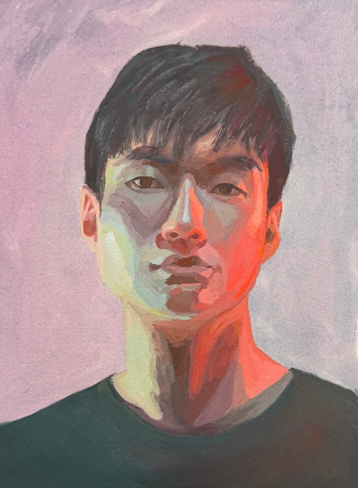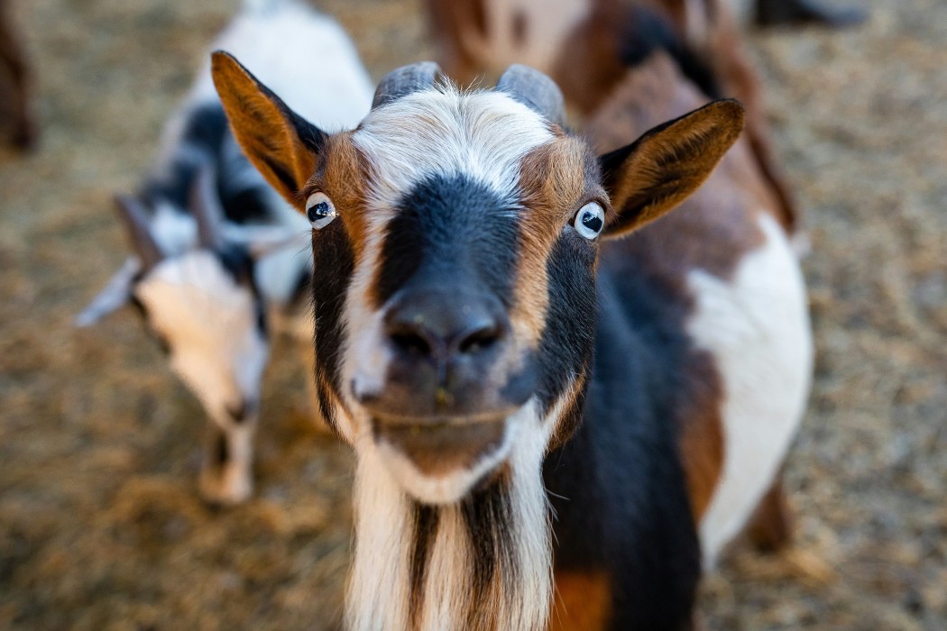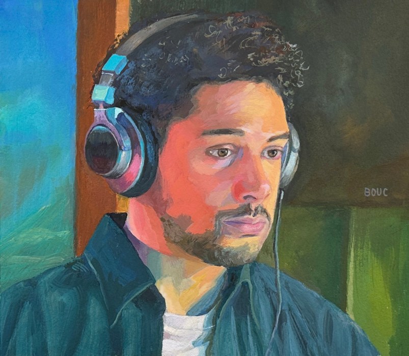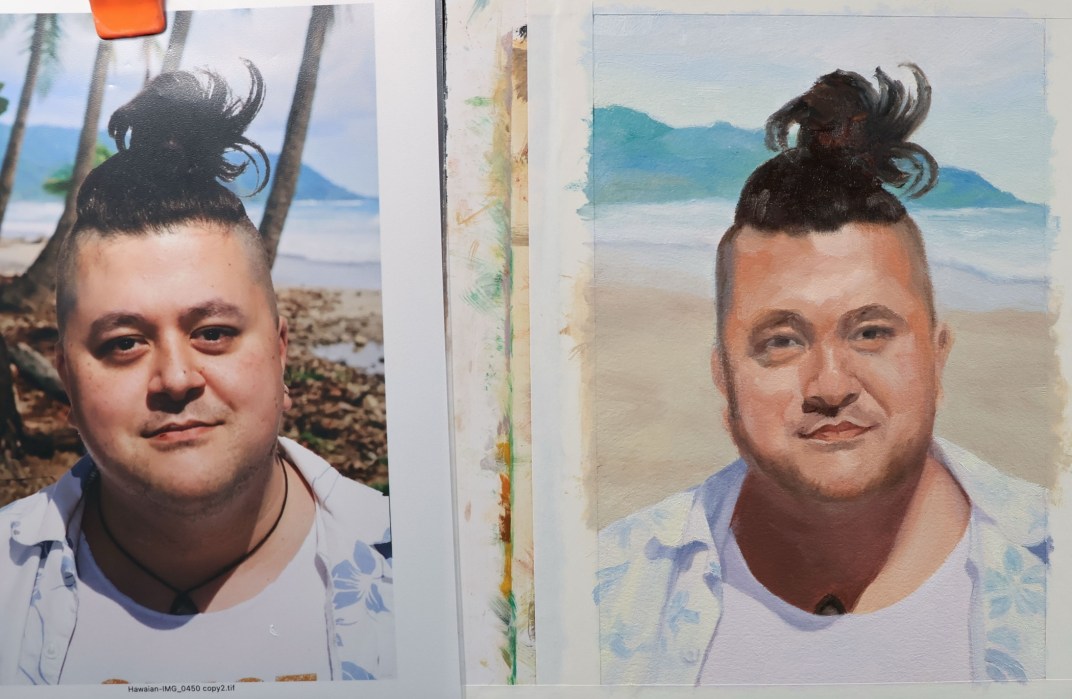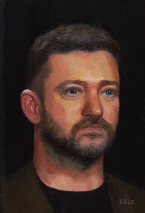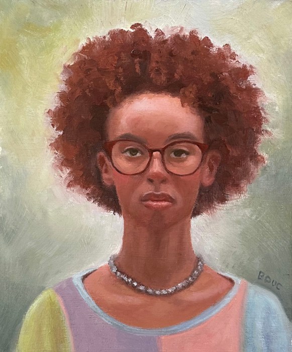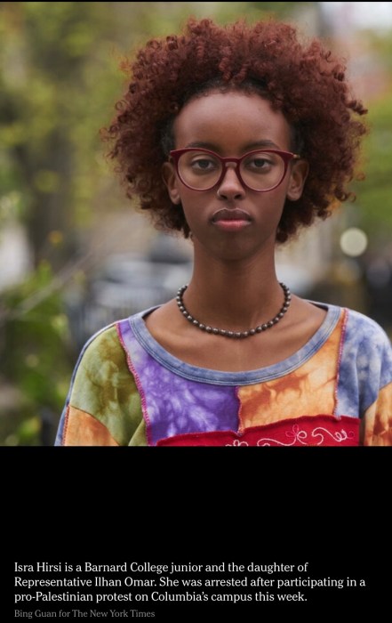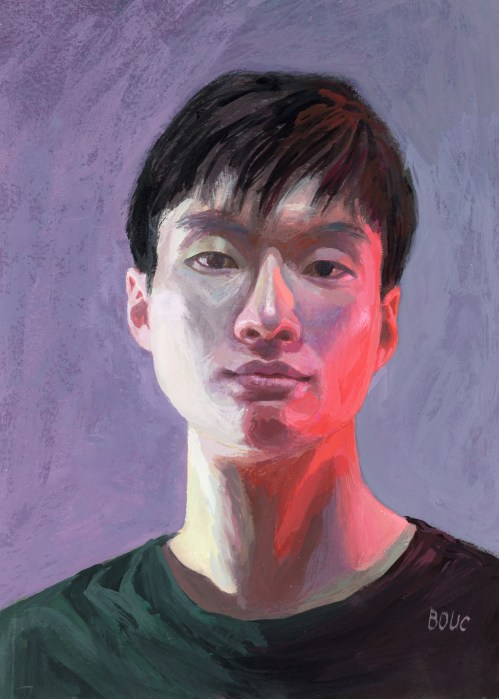
What was I thinking? The reference photo1 had strange lighting. From the left was a cold, greenish light, and from the right a very red light. To make the painting even more “fun,” I chose a weird limited palette2.
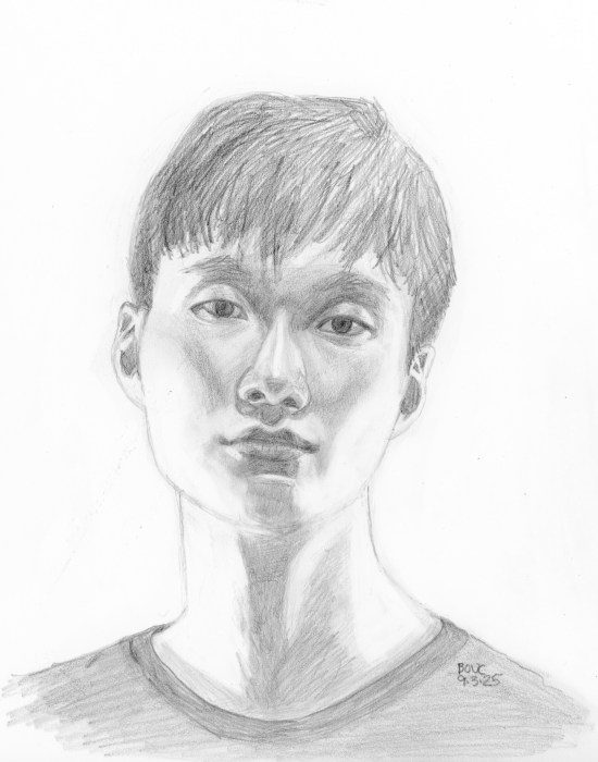
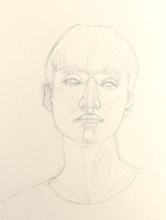
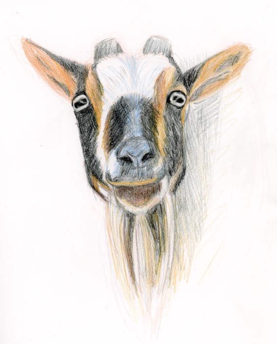
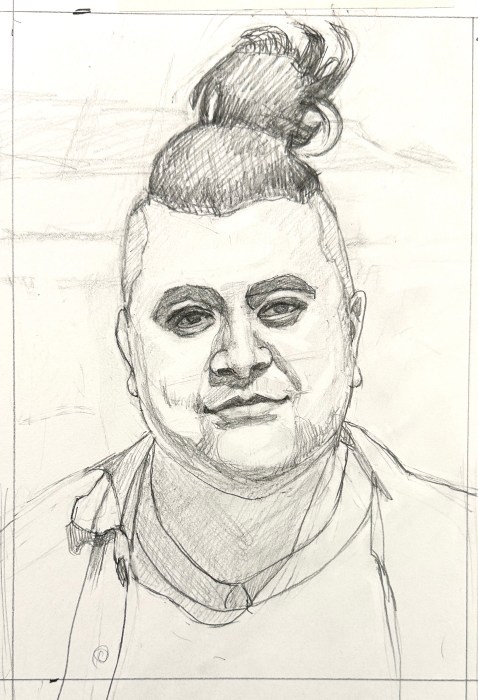
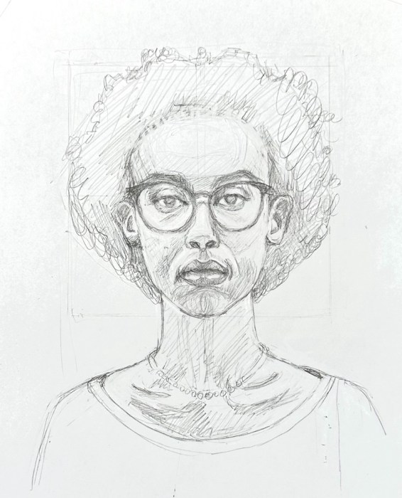
Below are my two preliminary pencil drawings and the painting, second layer done. I should have left it as it was—blocky, but fresh. Instead I labored over it, trying to match values and colors to the original despite the crazy palette.
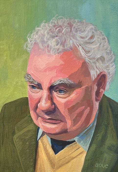
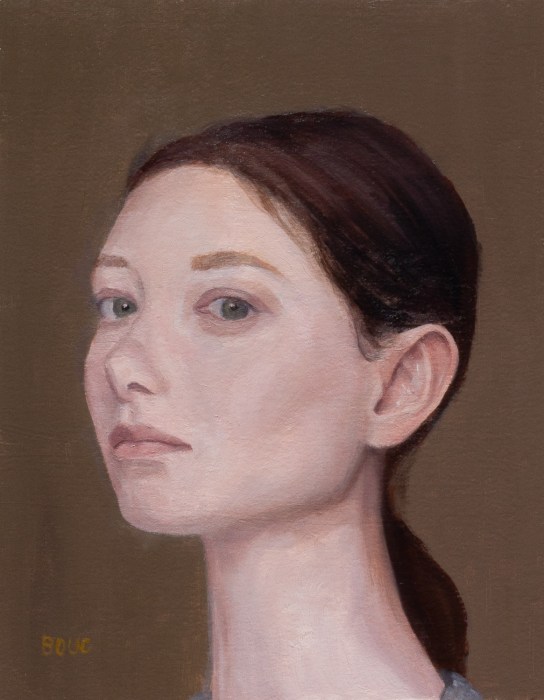
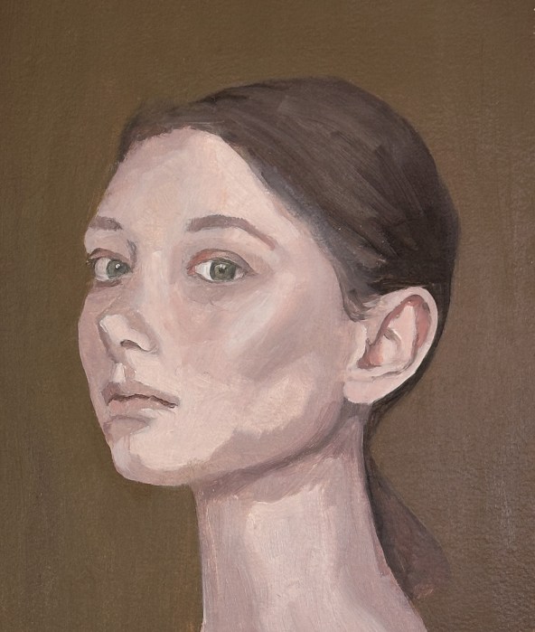
I forgot how much I love gouache’s immediacy vs. forever fussing and overworking. By the time I decided to stop it was way overcooked and I wanted to start over to get it “right.” I refrained and moved on to the next painting with happier results.