I watched the interesting class taught by Kirsten Britt on Sktchy and then, as usual, I painted the subject completely differently than was instructed. Kirsten’s work is beautiful but is all about splotches (here’s her version on IG).
3-Pigment Triad, Limited Palette
I used an odd limited palette for this one which made it a little challenging. The pigments are DS Perylene Scarlet, DS Cobalt Teal and WN Raw Sienna. It wasn’t possible to get any real darks so I stuck with a high key painting.
Original sketch, graphite on paper, 10×6”
My check of the sketch in Procreate
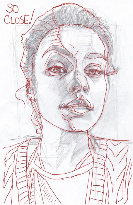
I got very close with my sketch, even with the camera distortion; I only needed a few small adjustments.
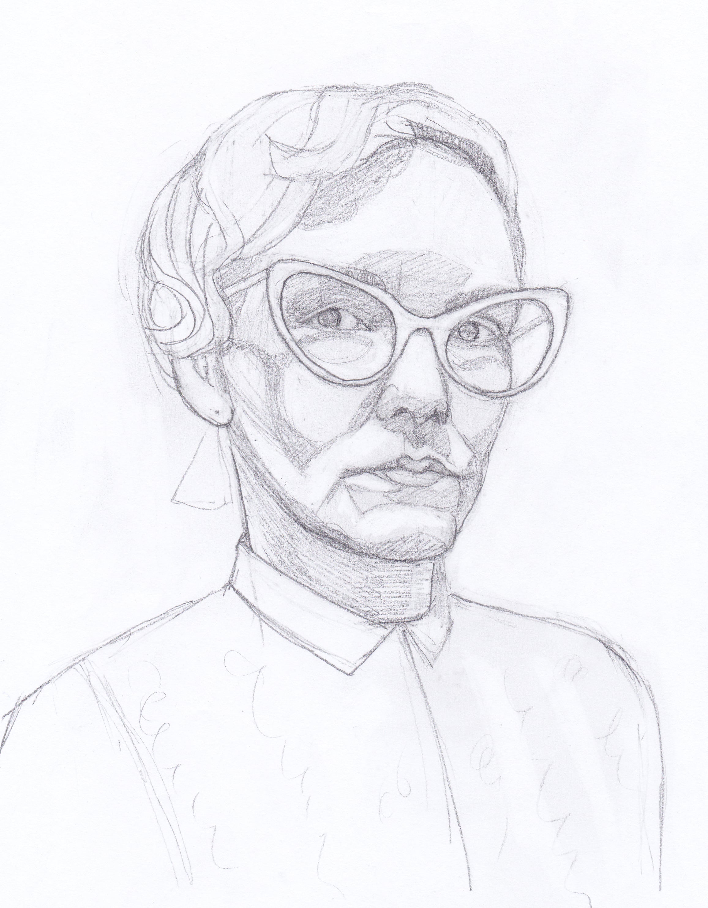
I recently spent a couple weeks working through a Proportions and Rhythms of the Head portrait drawing class created by Bradwynn Jones. I watched him do the demo drawings (mostly while working out on my rower) and then sketched them myself. When I finished all the drawings I transferred them to watercolor paper and started painting them. This is the first one I painted.
Reference Photo of Mean Model
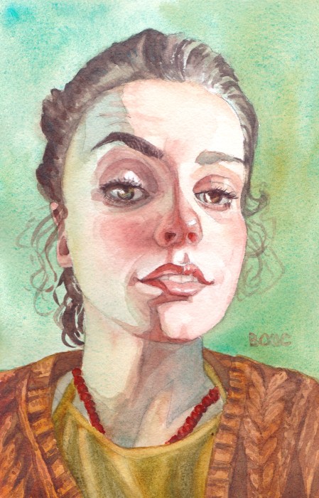
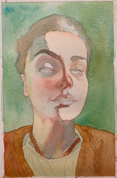
I took an immediate dislike to this model. She was pretty but mean-girl looking to me. I decided to experiment with a triad of colors on her that turned out to be equally unpleasant.
Final Sketch for the painting
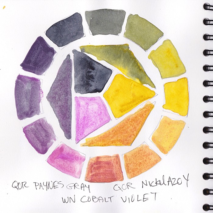
Cobalt Violet has very low tinting strength and just sits on top of the paper, so it came right off if I tried to glaze over it. It is both opaque and granulating, causing an unpleasant texture for skin.
Color wheel test of triad limited palette
The QOR Nickle Azo Yellow also had low tinting strength and when mixed with the violet made a yucky brownish color for shadows. The QOR Paynes Grey combined with the yellow made a gross greenish-gold of her hair.
I didn’t really care because, like I said, take that, mean girl!
Also, Payne’s Grey; I’ve never understood why people use it. Most brands make it from black and ultramarine blue and sometimes a bit of violet. I guess it’s a convenience color, but one that would be so easy to make, though I prefer not to use black paint in watercolor.
Do you use Payne’s Grey? If you do please tell me why and which brand you like.
Initial sketch with needed corrections superimposed in Procreate
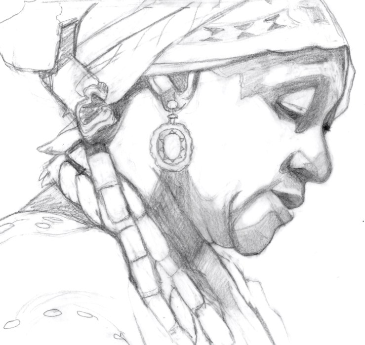
While I drew and painted her I thought of her as one of the Quilters of Gee’s Bend, Alabama, women who were direct descendants of the enslaved people who worked the cotton plantation there. I saw a traveling show of their quilts at a local museum years ago.
I painted this after watching a video of master Korean watercolor artist J Hunsung paint her. He didn’t credit* the photographer or model for this reference photo.
*The source photo was taken by photographer Jan Sochor.
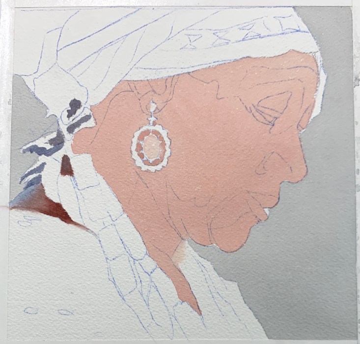
Quilt Lady sketch 7×7”
It took three attempts to get the sketch right. I’m learning to take my time and get everything sketched in. And if things don’t quite fit together, fix it, don’t pretend it will be ok as is. Looking at my sketch compared to the reference photo below, I can see I still didn’t get it perfectly, but it felt close enough to go for it.
Initial block in
I was so pleased with these perfect flat washes in my initial block in that I had to share them. In watercolor, getting a flawless flat wash is not easy.
Uncropped painting with limited palette colors in the margin
With each watercolor painting, I’m experimenting with a different limited palette and then adding strokes of the colors used at the bottom of the painting. For this one I used Daniel Smith Quinacridone Gold, Winsor Newton Perylene Magenta, Daniel Smith Indanthrone Blue and a guest appearance in the jewelry only of Daniel Smith Perylene Scarlet. (I know it says DS Perylene on the painting but that’s a mistake.)
Watercolor set up with limited palette
I’m enjoying using fresh from the tube paint in a little porcelain palette instead of the ancient dried up old palette I had been using.
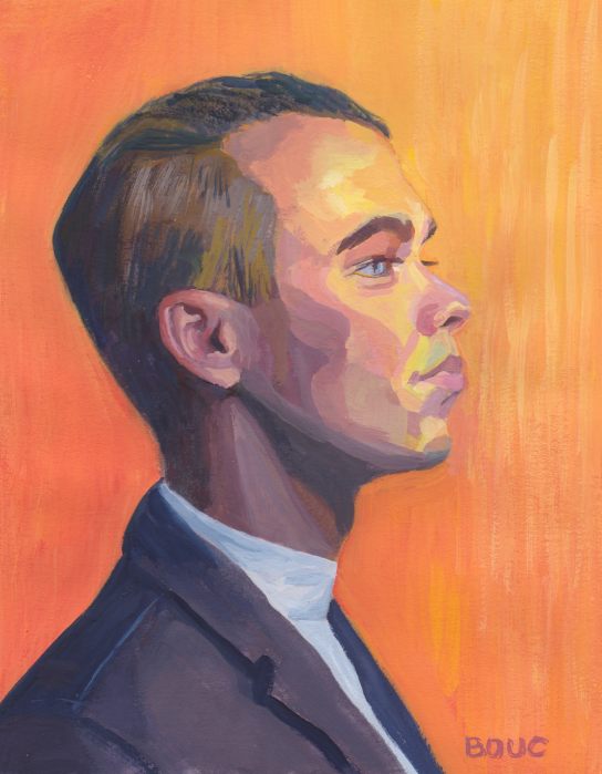
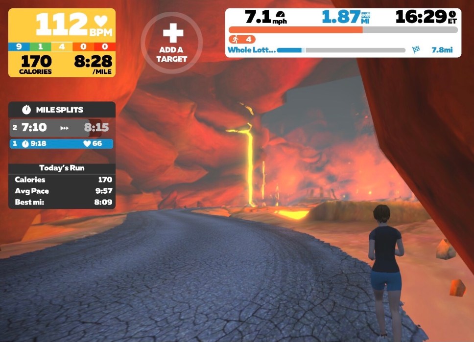
I used a limited palette to paint this guy twice. I based the one above on the colors I’d seen in a run around erupting volcanoes on Zwift. I also painted him using the original blue colors of the reference photo below.
Zwift is a virtual world/video game that you move through based on your speed and effort on a spinning bike or treadmill (see screenshot below). My limited palette was Indigo, Napthol Red and Cadmium Yellow Pale.
A scene from my run in Zwift’s Whole Lotta Lava route
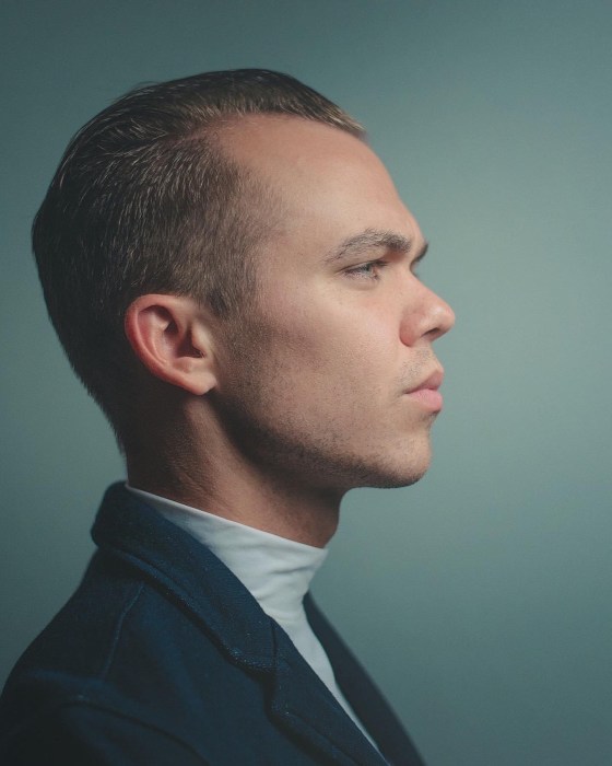
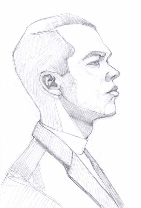
I thought he’d be fun to draw, with that prominent forehead and strong jawline and he was. I also painted him using a limited primary palette of yellow, red and blue, trying to get colors close to the reference photo (below).
Big Forehead Guy, #1, Gouache, 10×7.5”
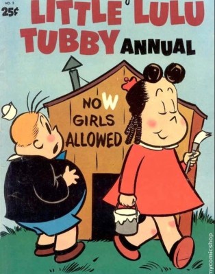
About volcanoes…when I was a kid I had a reoccurring nightmare about being on an erupting volcano with Little Lulu and Tubby, characters from my favorite childhood comic books.
Below is the photo reference, my sketches, correction checks (photo tracing over sketch in Procreate) and the painting starts.
Photo referenceFirst SketchComparing 1st sketch to photo Second SketchBlue painting startRed painting WIP
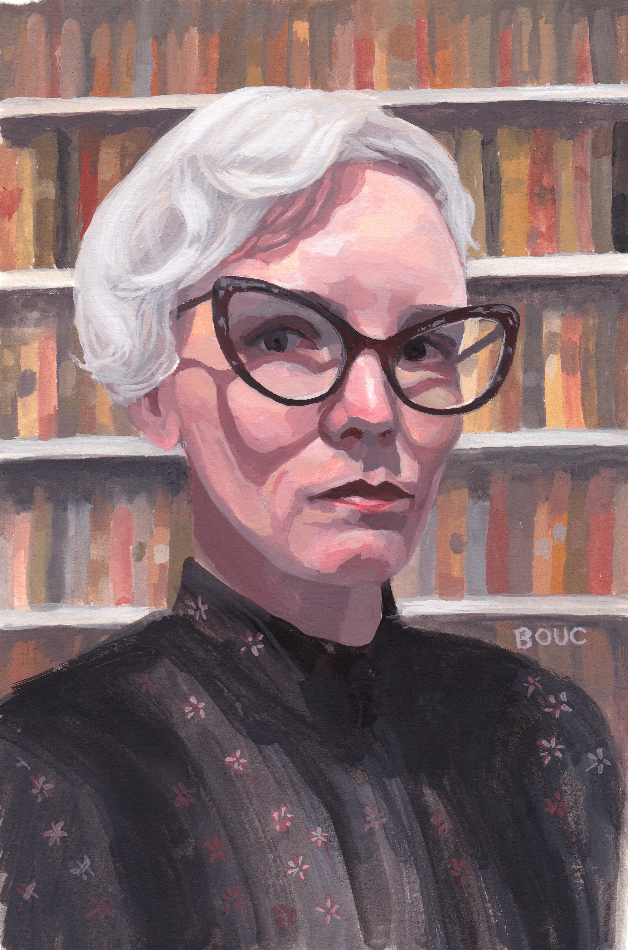
Stacy D from Sktchy in Gouache using Zorn Palette, 10×7 inches
I dramatically changed the setting of this portrait from a graffiti-covered wall (photo at bottom) to a library. There was something about her expression and clothing that made me think judgmental librarian, not the hip artist she appears to be in her photo feed on Sktchy. (Not that librarians can’t be hip artists! I was thinking of the mean school librarian who was always shushing us and glaring if we giggled.)
This was the last lesson in Mike Creighton’s Sktchy class on gouache portrait painting and color mixing. This lesson was about the Zorn palette: white, yellow ochre, cadmium red light and black. I’m really enjoying playing with limited palettes and discovering all the varieties of color possible with them.
In my initial sketch below, I hadn’t decided on the background yet.
Stacy D. from Sktchy, initial sketch on Xerox paper
When I decided to change the background from the wall in the reference photo below, to a library I did a quick internet search and found the photo below, right, which I used as inspiration.