Categories
Art Art supplies

Arches Watercolor Paper and Blocks ARE Different!

Arches watercolor sheets and blocks in my flat file drawer

Every time I’ve tried to paint a portrait on a block I’ve failed. I became convinced it’s because the cold press blocks are rougher than the sheets, too rough for me. But Arches’ website and Google say no, “they are exactly the same.”

Today I figured it out–I’m right–and I’m mad! And that’s why I’m posting this little PSA post. I hope others will find this when they’re questioning their sanity after being told they’re the same.

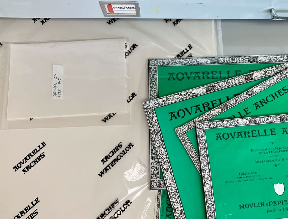
The two sides of Arches 140 pound cold press paper are different. When they are pressed in the mold, one side is pressed against a wire screen and the other side is pressed against a felt mat. The latter produces a smoother surface for painting.

Theoretically, Arches watermark/logo is on the side that is meant to be painted on, since if it shows in a painting, it should be readable, right? That side is the smoother side and it’s the side on which I’ve always painted.

But blocks, which are glued on all four sides and to a hard cardboard support on the bottom to prevent buckling, can only be painted on the top exposed surface. And they are bound with the ROUGH side up! Also they have no watermark.

Therefore, they ARE DIFFERENT! It’s not me, it’s the paper!

I guess I will save the blocks for landscape paintings, or peel a sheet off and use the back when I have used up all my sheets.

Categories
Art Art supplies Flower Art Oil Painting Painting

Allergic to Peonies

“Allergic to Peonies”, oil on Gessobord panel, 12x9 inches
“Allergic to Peonies”, oil on Gessobord panel, 12×9 inches

I was excited when I found these peonies at Trader Joe’s and wanted to try to paint them. Maybe they’re not native to the Bay Area since I’d never seen them in person before, only in other artists’ paintings.

Preliminary sketches, block in of flowers then background, then vase

I got started and all was well at first while they were newly opened. I got them sketched out and blocked in the first afternoon of painting. By the end of the second afternoon when they were fully opened, their scent was killing me, making my throat and eyes itch and I started sneezing and coughing. I gave the bouquet to my neighbor.

Working on the flowers then the background and the vase to strengthen shapes and values

The next day I finished the painting from a photo which isn’t nearly as much fun as painting from life. I also didn’t particularly enjoy working on Gessobord which is kind of dry and absorbent compared to the wonderful Yupo I’d been working on lately but I stopped using it because of some possible issues with mounting or framing Yupo.

Photo reference
Categories
Art supplies Drawing Faces Oil Painting Painting People Portrait Portrait Party

Portrait Process: Start to Fail and Start Again

Forest Girl #2-C, Oil Painting on Mylar, 12x8"
Forest Girl #2-C, Oil Painting on Mylar, 12×8″

My first attempt at painting Sylvia, a lovely young Bulgarian architecture student, ended in an abandoned failure, displayed at the bottom of this post in 6 steps. I altered my course for the second attempt (above), starting with a better drawing, and was able to complete the study more successfully. I tried to practice for alla prima painting, not going for a “finished” portrait, even though I painted from her reference photo on Julia Kay’s Portrait Party, instead of from life.

What made the difference between failure and success was that I took the time to make a more accurate drawing first (above). I drew on one side of a sheet of Dura-Lar Matte Film (after first reversing the reference photo in Photoshop) and painted on the other side. Then I turned the sheet over, toned it with a transparent umber stain, and reversed the photo back to normal. That way I had the lines of the drawing to refer to, along with the photo without obliterating the drawing. It’s still visible on the back of the painting and could be traced over onto another sheet of Dura-Lar if I wanted to paint her again from the same drawing.

Below is the failed first attempt, where impatience and hubris led to a quick, sloppy drawing (with the evil thought, “I can always correct the drawing when I paint,” which I need to ignore in the future!). The captions describe what went wrong at each step:

Categories
Art supplies

The Power of Pointy Pencils: Friendly Pencil Sharpener Review

Regular-size pencil sharpener, long points possible
Regular-size sharpener, long points possible (charcoal and one drafting pencil, foreground)

An artist at a portrait workshop I attended was using one of these cute retro-looking red metal pencil sharpeners. I knew she was a student at Sadie Valeri’s Atelier and was surprised that she wasn’t using the traditional sharpening technique that Sadie demonstrates on this video. I told her I failed miserably when I tried that approach and was grateful for her recommendation to order one from the manufacturer, Classroom Friendly Supplies.

I received it quickly, watched their how-to videos and started sharpening my charcoal and graphite pencils. I got some nice, long points (see above photo) but also went too far several times, breaking the lead and having to repeatedly take the device apart to get the little chunk out (they have a video showing how to do that too). Once I figured out that 5 was the maximum number of handle rotations needed to get just the right point (fewer if it wasn’t too dull) I stopped breaking/wasting the lead. Some of the breakage might also have been from the lead being broken inside the wood casing from having dropped the pencils before.

Large diameter pencil sharpener (sharpens large and normal diameter pencils)

When I discovered the opening on the sharpener was too small for my Conté pencils I inquired about Classroom Friendly’s large-hole sharpener and they offered me a complementary one in exchange for posting an honest review on my blog. I accepted and received the black and white model above. This large-hole version can sharpen both large and regular diameter pencils so is really all I would have needed. One difference between the two models is that this one has a stop that prevents extra long leads and associated waste from not stopping soon enough. In the photo above you can see the nicely sharpened Conté pencils.

Sharpeners, front view

20151016_Pencil_Sharpener_002
Sharpeners, side view, with the pencil-holders pulled out to prepare for inserting pencil

One day I will learn to sharpen pencils properly by hand, but until then, these Classroom Friendly Sharpeners are my new good friends,  making quick work of sharpening a dozen pencils before going to figure drawing and easily portable to bring to class.

Categories
Art supplies Faces Oil Painting Painting People Portrait

Portrait of Pigeon Plumtree III

Portrait of Pigeon, oil on Duralar Matte, 12x9"
Portrait of Pigeon, oil on Mylar Duralar Matte, 12×9″

I took a fantastic 1-day Alla Prima Portrait Workshop with the amazing Elizabeth Zanzinger at her studio in Oakland. I spent most of the day watching and listening to her, which was my goal; to observe and learn from her. It was a revelation to see her approach to alla prima painting, which begins with dots to mark the edges of shapes and features and then proceeds with small tiles of color and value painted along the planes of the form. You can see her completed demo painting on her Instagram.

In the late afternoon I started my own painting but ran out of time. Fortunately, our model, the exquisite Pigeon Plumtree III, generously allowed us to take photos of her for a small fee. Although my iPhone wasn’t quite up to the task because of the lighting, it gave me enough information to make another attempt at painting her.

We painted our portrait studies on Mylar Dura-Lar Matte Film, similar to the Canson Vidalon Vellum that Sadie Valeri uses, but twice as heavy. Elizabeth tones the Duralar first with a thin film of raw umber which she allows to dry before starting to paint. I absolutely love painting on this surface; it is so smooth but not too slippery and very forgiving. It’s archival and can be mounted to a panel later to be framed.

Below are a few steps in the work in progress. Click any image to enlarge or view as slide show (and then click the x in the top left corner to return to this page).

Categories
Art supplies Oil Painting Still Life

Studies from Sadie Valeri’s Alla Prima Still Life Workshop

Avocado and Pear, oil on panel, 10x8"
Avocado and Pear, oil on panel, 10×8″  Available. Click image for purchase information.

I took a wonderful Alla Prima Still Life workshop from Sadie Valeri recently and really enjoyed the class. She is such a generous and knowledgeable teacher. I really appreciate the way she is able to verbalize what she’s thinking as she demonstrates and how organized and thorough her teaching style is. I got this one nearly done before the end of the day and finished it up at home from memory.

Oil on Canson Vidalon Vellum, 8x8"
Lemon Studey, Oil on Canson Vidalon Vellum, 8×8″

We started the day by doing a lemon study on Canson Vidalon Vellum. What a great idea for a painting surface for studies–so much cheaper than using panels or canvases. Taping it to a board with a piece of white or grey paper underneath works great. This was a limited stroke painting, done quickly as a warm up to practice laying in colors in little color chips, side by side.

Categories
Art supplies Art theory Drawing Faces Gouache People Product Review Sketchbook Pages

Painting with Gouache: Color Charts, Zorn Palette, Brush Tests

Zorn Palette color chart in gouache, 10x8 inches in A4 Moleskine
Zorn Palette color chart in gouache, 10×8 inches in A4 Moleskine

In trying to learn more about gouache I made a few color charts. I’m using mostly M. Graham gouache which I like much better than the Winsor & Newton and Schmincke I used before. The Graham gouache is creamy and brilliant, rewets well and doesn’t smell (like the W&N). I found that using fresh-squeezed gouache is more fun to work with than rewetting dried paint, but frugality keeps me trying to reuse dried. The best solution is to set up a palette for each session, squeezing out tiny blobs, adding more as needed.

Above is an exploration of the Zorn palette in gouache, a limited palette using only Yellow Ochre, Cadmium Red, White, and Black. The black paint, when mixed with white, is meant to serve as blue since it is a cool color that can look blue next to warm colors. Next I want to try using it in an actual painting.

M. Graham Gouache paint chart, gouache in A4 Moleskine, 10x4 inches
M. Graham Gouache paint chart, gouache in A4 Moleskine, 10×4 inches

Above is a chart of my gouache colors straight from the tube and mixed with white and each other. Sadly when I removed the masking tape it pulled off some of the paper from the extra large Moleskine watercolor notebook that is my current journal. I don’t recall previous Moleskine WC notebooks having that problem but I’ve switched to low-tack tape now.

Before ordering any new brushes specifically for gouache I wanted to see how the brushes I already had might work so did the test below. I found a few that I liked and ordered a couple of others. I’ll do another post about my gouache palette and brushes I’ve settled on soon.

Old brushes-testing for gouache