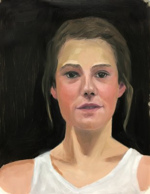
Color Boot Camp: Saturation. Overall LOW Saturation, Study 1 v.2, 11×14″ oil on Dura-Lar
In each of Bill Perkins’ New Masters Academy Color Boot Camp courses, he introduces one aspect of color (e.g. Value, Saturation, Complements, Temperature), demonstrates and explains further with a quick oil study of the same model in different color/lighting situations. I tried this one twice (second version above, first below) because even though he emphasizes these assignments are NOT meant to be portraits, I’m as interested in learning to capture a likeness as I am color. I did a better job on the positioning of her head and getting a likeness in the second one, above. (See bottom of post for reference photo and teacher’s rendition.)
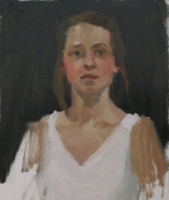
Color Boot Camp: SATURATION. Overall Low Saturation, Study 1 v1
Mr. Perkins uses the concepts of Major Key and Minor Key for each color topic. In Saturation, the Major Key describes the Level of saturation—how intensely saturated the colors are in the greater proportion of the image. The Minor Key represents the Range of contrast between neutral gray and the most saturated color in the image. This first study in saturation is supposed to represent a Low Major and Minor Key.
I was confused at first by how highly saturated the model’s face seemed to be with her very rosy cheeks and golden skin. But after getting some valuable feedback from the teacher, I now understand that the Major Key is Low because the proportion of saturated color (her cheeks) to neutral areas (the rest of the painting) is small; and the Minor Key is Low because the range of saturation from neutral to the moderately-saturated pink in her cheeks is also fairly low.
Below are the photo reference, my paintings, and the teacher’s study. He painted her skin tones much darker than I did. Maybe I need more study with value? I can see how I could have gone a little darker but not as dark as he did. Coming up next, Study 2 with very saturated High Major and Minor Keys; just the opposite of this one.
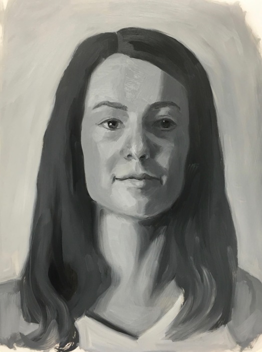
Color Boot Camp Part I Monochrome. Left to right: Color reference photos, B&W converted ref photo, my two studies
When my art friend Chris Beaven commented on the previous version of this post that it would be interesting to see my studies compared to the black and white versions of the photo references, I did a virtual dope slap (Of course! What a perfect way to see if I got the values right!) and then decided to redo this blog post to show that comparison (above).
While I often convert color photos to black and white to see the values, when I did these studies from Bill Perkins’ Color Boot Camp on New Masters Academy I wanted to try to do the conversion in my artist brain instead of using technology. But putting my studies next to the converted photos gives me just the reality check I needed. I can see that I did pretty well in painting the values from the color photos.
In the lesson he set up one model in four different lighting situations and then demonstrated doing a 30-minute painting of each in black and white. He recommends doing the studies in no more than 30 minutes, emphasizing that it’s more important to do many starts, without worrying about getting a likeness or making finished paintings. I have to admit spending longer than 30 minutes, probably up to 3 hours on some, and in retrospect, the longer I worked the less effective the study was.
If you want to see Bill Perkin’s studies and mine in greater detail, click the “read more” link below.
CBC Part 1-3, Janas #1 High Key, High Contrast Study (My favorite of 8 below)
Being a member of the New Masters Academy is like having a treasure chest of jewels to explore, with new art classes added all the time. The only downside is that I have to assess my own work and be my own teacher since NMA doesn’t offer feedback to the video lessons’ assignments.
I revised this post by publishing a new version of it so I’ve deleted the content here. Please see the next post for the rest of the content from this post.
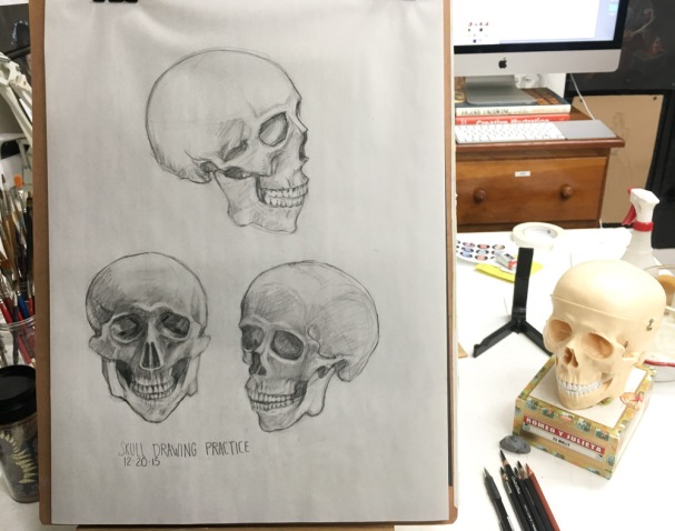
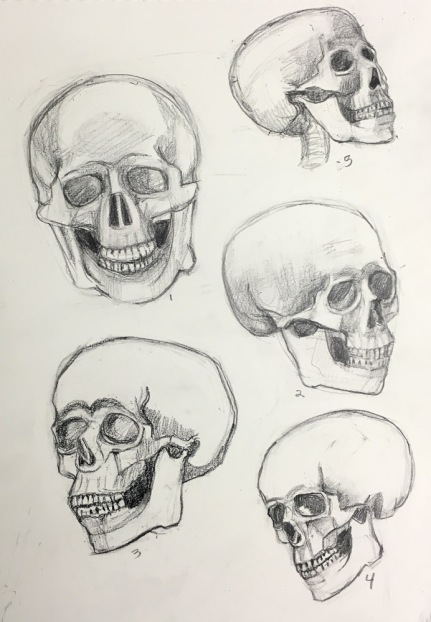
Skull drawing practice #1, Conte pencil on paper, 24×18 inches
I wanted to improve my people-drawing skills, learn about anatomy and be able to quickly sketch a head with some degree of accuracy and fluency. I was looking for information, instruction, and explanation of how the skull, features, and muscles all work together to make each of us look like individuals.
I began exploring resources for learning online and I found one that met all of my requirements: New Masters Academy. It is affordable ($19 to $29/month), has excellent teachers, an abundance of classes in portrait and figure drawing and painting and more, plus great resources for artists including thousands of high-resolution artist model reference photos and timed portrait and figure drawing sessions.
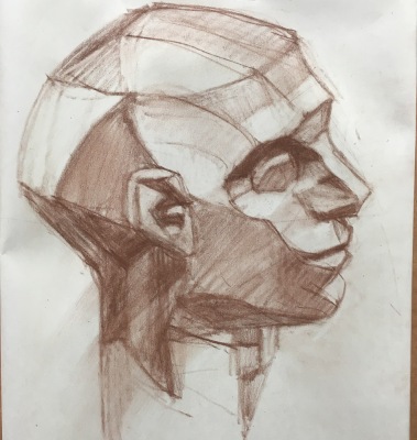
Drawing Practice, First Assignments from New Masters Academy course
What initially convinced me to become a member on New Masters was the free, 3-hour YouTube video below by one of their many excellent teachers, Steve Huston. This is just a small part of his Structure of the Head course in which he explains in great detail about the planes of the face, the shapes and functions of the muscles, and each of the features (eyes, nose, etc.) in a very user-friendly way.
The YouTube video by Brandwynn Jones (below) introduced me to the Reilly Method Abstraction, an interesting way of conceptualizing and constructing the head. Mr. Jones is a student at the Watts Atelier, another online artist training program.
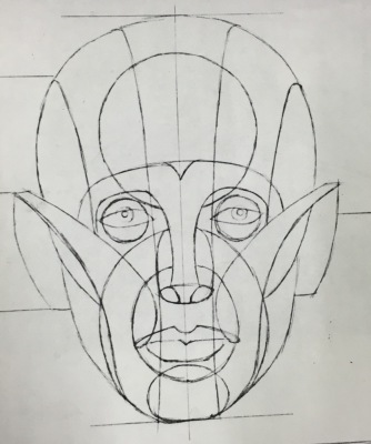
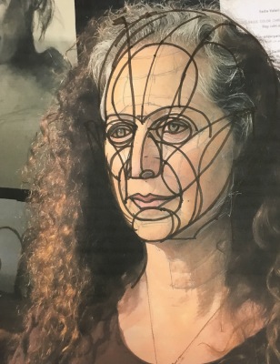
Reilly Abstraction template
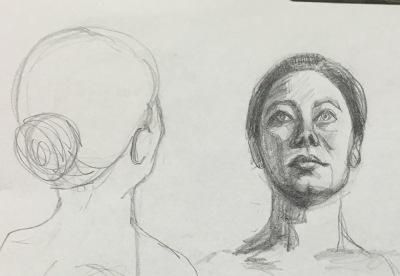
Reilly Abstraction drawn on photo of Marcy
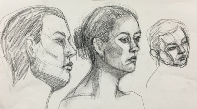
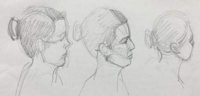
Planes of the head drawing practice
Before I found New Masters, I regrettably signed up for an expensive month ($99/month) at Watts Atelier Online, based on what I saw and heard in Mr. Jones’ videos and on fellow artist Chris Beaven’s blog, who was trying out the Watts program too. But after watching the head drawing course “taught” by Mr. Watts, I requested and received a refund for the remaining half month. The course consists of videos of him drawing, while he talks on and on–what he calls “bantering”–with very little actual instruction or explanation and it just didn’t meet my needs. Chris later wrote this review of Watts Atelier Online.
Skull drawing practice #2, Conte pencil on paper, 18×24″
Another great source of figure drawing instruction videos (for free) can be found at Stan Prokopenko’s website, Proko.com and on his on YouTube channel. His sense of humor and high production values makes them fun to watch but I find they fly by too quickly for me to retain the information. He offers expanded versions at reasonable cost. In the video below he clarifies and summarizes the Andrew Loomis approach to drawing the head.
Over the past year I’ve watched several good instructional videos on Craftsy.com but I prefer the comprehensive courses on New Masters. One plus for Craftsy is that the videos you “buy” are always yours to stream on demand; on New Masters they’re available to stream as long as you’re a paying member.
Sadie Valerie offers both in person classes, video and online classes at Sadie Valerie Atelier in San Francisco. Sadie is an amazing teacher, very kind, positive, generous and detailed in her approach. I’ve studied with her and her associate Elizabeth Zanzinger in person and via Sadie’s videos and highly recommend them as teachers.
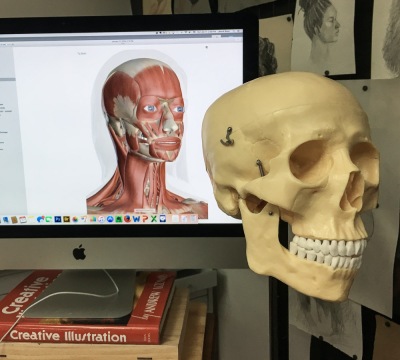
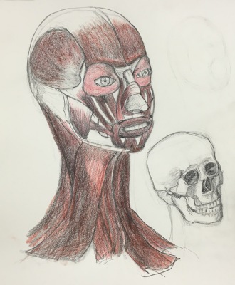
For quick and detailed anatomical information where you can switch from skin, muscles, skeletal or even organ views, I go to Innerbody.com, where I found the resource for the drawing below. I wanted to know more about the muscles that we see through the skin.
Innerbody.com on the screen, and my skull Mortie Skullman
My drawing of the muscles of the head
A free 2.5 hour figure drawing course based on the Reilly Method is available from Udemy.com.
Croquis Cafe on YouTube offers free figure drawing sessions with artist models (mostly nude) posing in real time, just like you are in a figure drawing session with timed poses and music. They also have reference photos to work from and some paid classes, which I haven’t explored.
Pixelovely.com is another source for figure drawing practice that provides timed photo references of nude and costumed models in interesting and unusual poses as well as instruction and tips on figure drawing.
PoseManiacs.com also offers thousands of digital images of figures in motion or still, without skin so all the muscles are visible.
Reilly Method class notes by one of his students are lovingly offered on The Reilly Papers blog.
Glen Orbik was another master figure and portrait drawing teacher. Free clips from videos of his lectures are available on YouTube here. The full course is available at Zarolla Academy but is expensive.
Fred Fixler was another of the great drawing and painting teachers who has passed on but on this site you can download his Reilly method handouts and some great drawing and gouache painting tips.
To find figure drawing classes, workshops and open studios in your area, visit ArtModelBook.com.
Zorn Palette color chart in gouache, 10×8 inches in A4 Moleskine
In trying to learn more about gouache I made a few color charts. I’m using mostly M. Graham gouache which I like much better than the Winsor & Newton and Schmincke I used before. The Graham gouache is creamy and brilliant, rewets well and doesn’t smell (like the W&N). I found that using fresh-squeezed gouache is more fun to work with than rewetting dried paint, but frugality keeps me trying to reuse dried. The best solution is to set up a palette for each session, squeezing out tiny blobs, adding more as needed.
Above is an exploration of the Zorn palette in gouache, a limited palette using only Yellow Ochre, Cadmium Red, White, and Black. The black paint, when mixed with white, is meant to serve as blue since it is a cool color that can look blue next to warm colors. Next I want to try using it in an actual painting.
M. Graham Gouache paint chart, gouache in A4 Moleskine, 10×4 inches
Above is a chart of my gouache colors straight from the tube and mixed with white and each other. Sadly when I removed the masking tape it pulled off some of the paper from the extra large Moleskine watercolor notebook that is my current journal. I don’t recall previous Moleskine WC notebooks having that problem but I’ve switched to low-tack tape now.
Before ordering any new brushes specifically for gouache I wanted to see how the brushes I already had might work so did the test below. I found a few that I liked and ordered a couple of others. I’ll do another post about my gouache palette and brushes I’ve settled on soon.
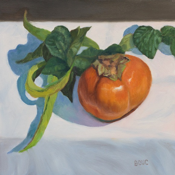
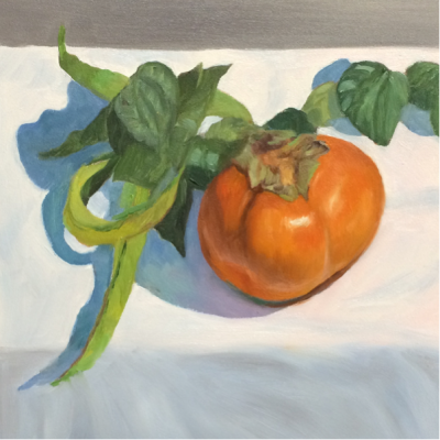
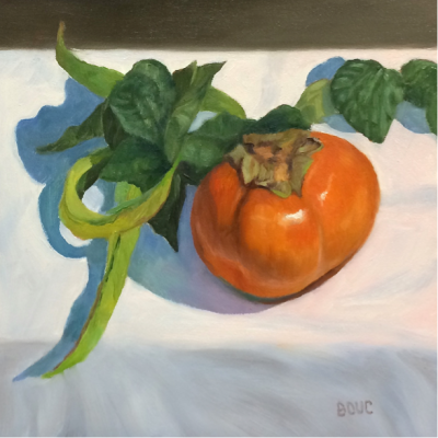
Persimmon and String Beans, oil on panel, 6×6 inches
This was one of the those magical paintings that just worked from beginning to end. Maybe it was painting on Gessobord, which I love, or maybe it was because I tried to stay really focused. It’s available here on Daily Paintworks.
I was careful to paint the string beans from the garden and their leaves first since I knew they would change quickly. I stopped when I found myself getting tired or losing focus and took a break. And I closely followed my pre-planned goals for each session.
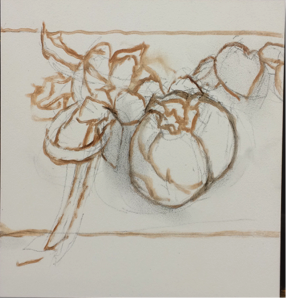
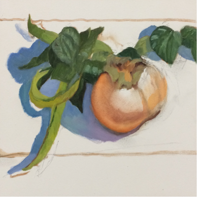
See my session chart for Persimmon and String Beans (pdf) with all the steps, plans and session images or see the images of the steps below without details. One new step I added this time was studying the nearly finished painting in Photoshop on a large screen before declaring it finished and then finding and noting areas that needed adjustments, including completely changing the background value at top.
Let me know if you’re finding these charts or step by steps interesting. I do them for myself but if others find it interesting it’s worth posting them.
Photo of set up (but painted from life)
Session 1A: the drawing on panel in charcoal then restated with thinned paint
Session 1B, painting the green beans since the leaves would change quickly. I started to paint the persimmon but wiped it off when I realized I’d lost focus and needed a break before returning and painting with focus
Session 2, painting everything except green beans
Adjustments/corrections made in Photoshop including darkening the top background
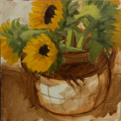
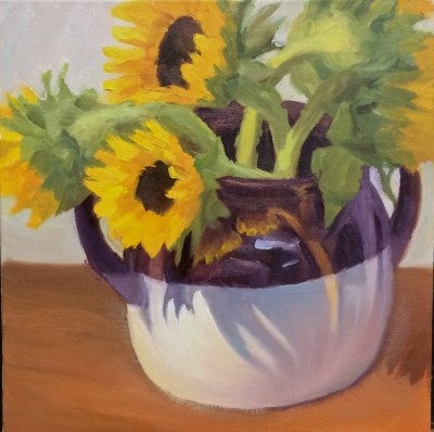
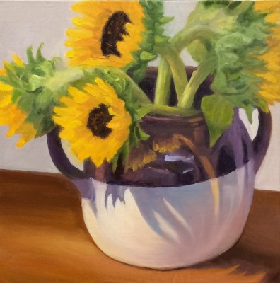
Sunflowers in Found Crock, oil on linen panel, 8×8 in. Click image to enlarge.
I found this wonderful old crock set out on the curb, adorned with a “Free” sign so I carried it home for my “Found Stuff” painting series. One handle had broken off but the owner had thoughtfully placed the pieces inside and I glued it back together. I love the way the flowers are reflected and shadowed on the crock. The painting is available here. Below are photos of the work in progress.
It takes two to paint. One to paint, the other to stand by with an axe to kill him before he spoils it. William Merrit Chase
My biggest painting goal is to stop what I call “unauthorized painting” — I finish part of a painting, like it and write my plan for that area: “Don’t touch it!” Later I decide to just do a little “touching up” and the next thing I know I am wishing for a “REWIND” button as I try to wipe off the “unauthorized” paint. Where’s the guy with the axe when I need him? I need to draw him, axe and all, and stick it on my easel!
Two Survivors, oil painting on linen panel, 7×5 in
Persistence, patience, perseverance, determination, curiosity, courage, confidence, wonder…these are all qualities needed to become a better painter. Another essential is learning to really see and understand the subject. I titled this painting (available here) Two Survivors because only these two survived from the big bouquet during the week I struggled with two previous sunflower “studies” (aka failed paintings). Sometimes it takes a while before the “blinders” fall away so that I can see the shapes, colors, and values instead of the named bits (e.g. petal, leaf, or nose) that interfere with seeing as a painter.
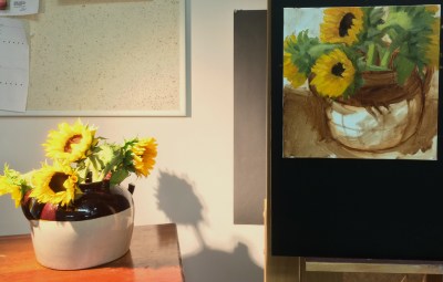
I was inspired by artist Chris Beaven (whose sunflower painting I purchased and love) by his Session Detail charts that he embeds at the end of each post (sample). I modified his chart to create one for myself to focus my goals and intentions for each session and the painting as a whole. Completing the chart at the end of each painting session with image, results and plans/goals for the next session is making a big difference in my process and helps me avoid random, unfocused messing about with paint.
Below is the chart I used for this painting. If you’d like to see all three session charts for this painting with my notes about goals, composition mistakes and corrections, and corresponding images, click here to open 3-page PDF file.
Session 1 Detail Chart (Click image to enlarge or click PDF link above to see all 3 sessions)
I loved the original painting of the vase in Session 1 above, with wonderful warm highlights and cool shadows created by the new LED lightbulb I’m experimenting with. My intuition told me to leave the vase alone but instead I started adding the pattern from the actual vase. After a few strokes I realized I didn’t like it and tried to wipe the pattern off the still wet paint. Then I tried to return to the original shapes of color, temperature and value.
I revised the chart layout after this painting. In my next post (another sunflower still life) I’ll include the completed chart for that painting’s 6 sessions and a blank template for anyone who wants to experiment using or modifying it for their own artwork sessions.
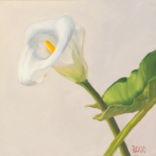
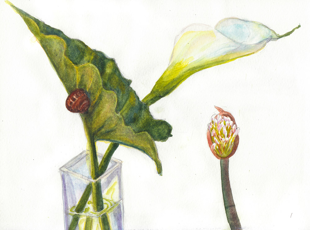
“Lily White on White,” oil on Gessobord panel, 8×8″ (AVAILABLE on DailyPaintworks Auction: CLICK IMAGE to visit auction)
I spent some time sketching and painting a calla lily that sprouted in my garden and while I was at it, tested a palette of Winsor Newton Cotman paints. Several of my friends have this clever, inexpensive Winsor & Newton Cotman Sketchers Palette and I thought it was worth a try so I ordered one.
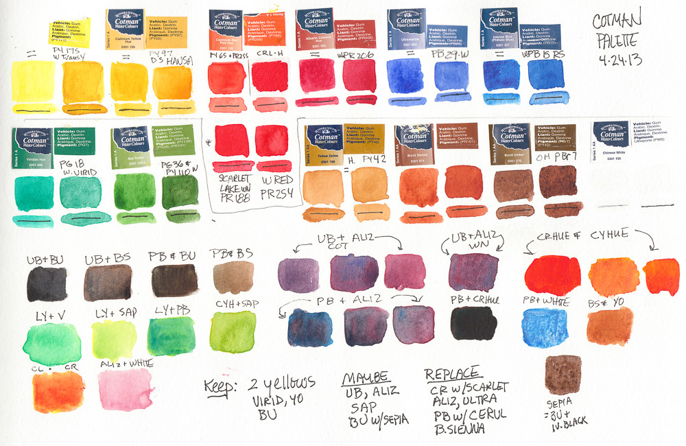
I started by testing the colors, listing the pigments to match them to artists’ quality pigments I normally use (click to see larger with pigment numbers) and making notes about which ones to swap out (at that point assuming I’d continue using the others).
Test of WInsor Newton Cotman pan paints (FAIL)
I was very frustrated with the results I was getting when painting and in the end, took ALL the Cotman pans out of the palette and replaced them with pans filled with artist quality paints from tubes. I put the Cotman pans in a large jar of water to soak so that I could empty and reuse the empty pans. After dumping and refilling the jar many times I ended up with a jar of tinted water with a lot of white sandy junk at the bottom: the nasty fillers and binders added to the pigments to make it cheap.
I know that for the same $17 that this palette AND crappy paint costs, you can only buy one or two tubes of full strength, high quality paint. But I’d rather have only a few colors than use junk. Most of the following sketches lack vibrancy, richness in color, and paint application was difficult and unattractive. Here they are in reverse order of completion:
Lily sketch #6, watercolor, 8×10″
I liked the drawing above, but not the grayed colors.
Lily sketch #5, ink & watercolor, 8×10″
I liked the shape of the leaf above.
Lily sketch #4?, gouache, 8×10″
I painted over an awful sketch with gouache (above), just loosely trying to get the shape of the flower.
Lily sketch #3-4, watercolor, 8×10″
Two previous attempts at the leaf, on 2 other kinds of paper I taped into the 8×10″ Moleskine.
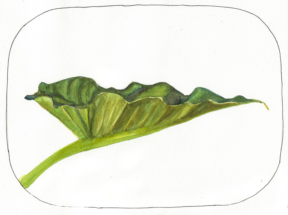
Lily sketch #1 with Snail, watercolor, 8×10″
The first sketch. I like the composition but the colors and application were yuck.
I’m still using the Cotman Palette. I think it’s a great for sketching because it’s light, compact and holds enough colors (12). And at $17 I don’t mind the price, even after throwing away the colors it cane with. It’s handy to have the now-empty, extra half-pans which usually cost about 50 cents each. So really, I got the palette for $11, and 12 empty pans for $6. Not too bad.
Draw a Pine Tree and a Scented Product (perfume and cat litter), ink & watercolor 8×11″
I had fun with May 6: “Draw a Scented Product.” I sketched two scented “products” — one man-made and one cat-made. The man-made is a lovely (and expensive) room perfume (Vanilla, Bourbon and Mandarin) that I fell in love with at my dentist’s office and unlike most scented products doesn’t give me a headache. It nicely counteracts the scented product my cats produce on a regular basis.
“Draw a pine tree” was the cue for May 5. Easy…found one in my neighborhood bigger than a house and sketched it and painted it sitting in my car on a cold, foggy, windy day.
I’m experimenting with an inexpensive ($13.00) Winsor Newton Cotman watercolor palette. I like the format, size and light weight very much and the way the paint easily re-wets. Although the colors aren’t as intense as their artist’s grade paints they’re all permanent/lightfast. But that might be fine for sketching since it might help me keep the sketches simpler and save fancy washes for real watercolor paper.