Categories
Faces Figure Drawing Portrait Product Review

Portrait and Figure Drawing: Online Classes and Resources Reviewed

Skull drawing practice #1, Conte pencil on paper, 24x18 inches
Skull drawing practice #1, Conte pencil on paper, 24×18 inches

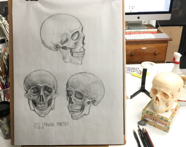
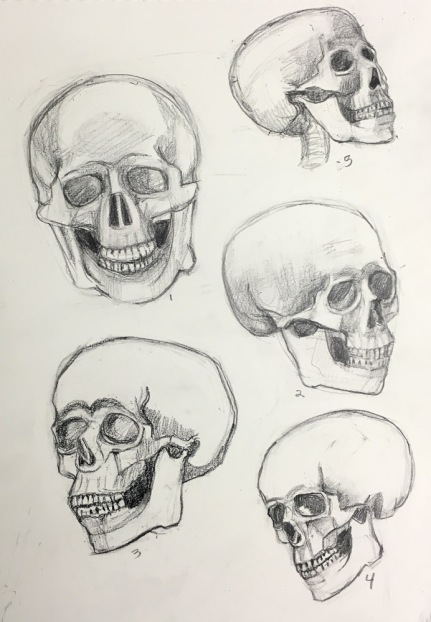
I wanted to improve my people-drawing skills, learn about anatomy and be able to quickly sketch a head with some degree of accuracy and fluency. I was looking for information, instruction, and explanation of how the skull, features, and muscles all work together to make each of us look like individuals.

I began exploring resources for learning online and I found one that met all of my requirements: New Masters Academy. It is affordable ($19 to $29/month), has excellent teachers, an abundance of classes in portrait and figure drawing and painting and more, plus great resources for artists including thousands of high-resolution artist model reference photos and timed portrait and figure drawing sessions.

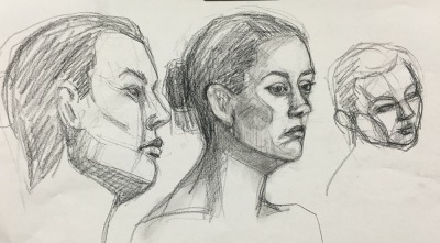
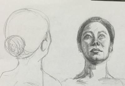
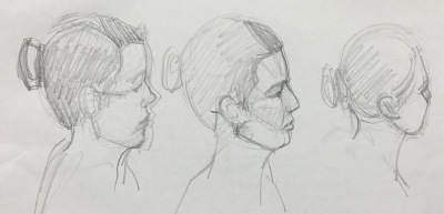
What initially convinced me to become a member on New Masters was the free, 3-hour YouTube video below by one of their many excellent teachers, Steve Huston. This is just a small part of his Structure of the Head course in which he explains in great detail about the planes of the face, the shapes and functions of the muscles, and each of the features (eyes, nose, etc.) in a very user-friendly way.

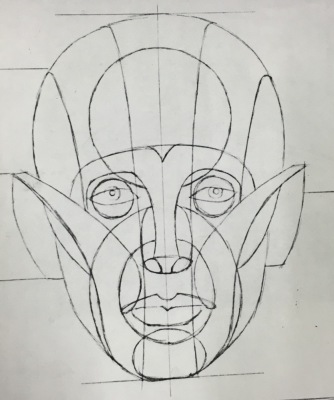
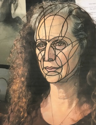
The YouTube video by Brandwynn Jones (below) introduced me to the Reilly Method Abstraction, an interesting way of conceptualizing and constructing the head. Mr. Jones is a student at the Watts Atelier, another online artist training program.

Before I found New Masters, I regrettably signed up for an expensive month ($99/month) at Watts Atelier Online, based on what I saw and heard in Mr. Jones’ videos and on fellow artist Chris Beaven’s blog, who was trying out the Watts program too. But after watching the head drawing course “taught” by Mr. Watts, I requested and received a refund for the remaining half month. The course consists of videos of him drawing, while he talks on and on–what he calls “bantering”–with very little actual instruction or explanation and it just didn’t meet my needs. Chris later wrote this review of Watts Atelier Online.

Skull drawing practice
Skull drawing practice #2, Conte pencil on paper, 18×24″

Another great source of figure drawing instruction videos (for free) can be found at Stan Prokopenko’s website, Proko.com and on his on YouTube channel. His sense of humor and high production values makes them fun to watch but I find they fly by too quickly for me to retain the information. He offers expanded versions at reasonable cost. In the video below he clarifies and summarizes the Andrew Loomis approach to drawing the head.

Over the past year I’ve watched several good instructional videos on Craftsy.com but I prefer the comprehensive courses on New Masters. One plus for Craftsy is that the videos you “buy” are always yours to stream on demand; on New Masters they’re available to stream as long as you’re a paying member.

Sadie Valerie offers both in person classes, video and online classes at Sadie Valerie Atelier in San Francisco. Sadie is an amazing teacher, very kind, positive, generous and detailed in her approach. I’ve studied with her and her associate Elizabeth Zanzinger in person and via Sadie’s videos and highly recommend them as teachers.

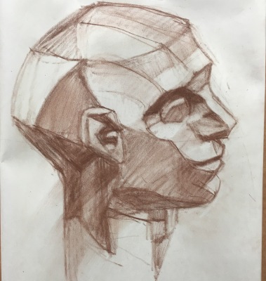
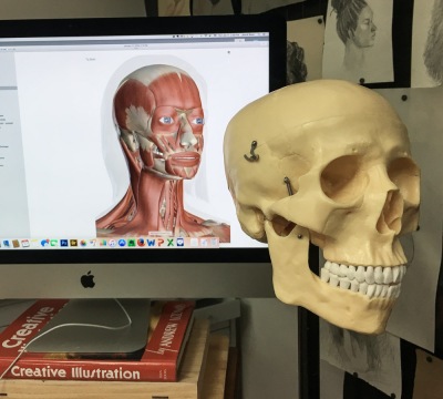
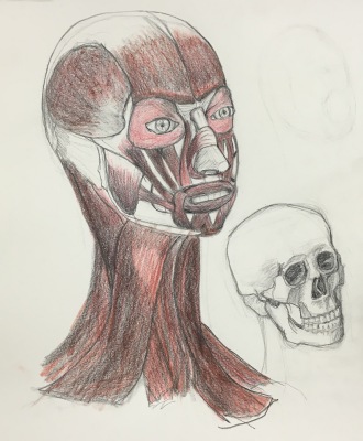
For quick and detailed anatomical information where you can switch from skin, muscles, skeletal or even organ views, I go to Innerbody.com, where I found the resource for the drawing below. I wanted to know more about the muscles that we see through the skin.

A free 2.5 hour figure drawing course based on the Reilly Method is available from Udemy.com.

Croquis Cafe on YouTube offers free figure drawing sessions with artist models (mostly nude) posing in real time, just like you are in a figure drawing session with timed poses and music. They also have reference photos to work from and some paid classes, which I haven’t explored.

Pixelovely.com is another source for figure drawing practice that provides timed photo references of nude and costumed models in interesting and unusual poses as well as instruction and tips on figure drawing.

PoseManiacs.com also offers thousands of digital images of figures in motion or still, without skin so all the  muscles are visible.

High resolution photos of the Asaro Planes of the Head model in 22 different positions are available to download here.

Reilly Method class notes by one of his students are lovingly offered on The Reilly Papers blog.

Glen Orbik was another master figure and portrait drawing teacher. Free clips from videos of his lectures are available on YouTube here. The full course is available at Zarolla Academy but is expensive.

Fred Fixler was another of the great drawing and painting teachers who has passed on but on this site you can download his Reilly method handouts and some great drawing and gouache painting tips.

To find figure drawing classes, workshops and open studios in your area, visit ArtModelBook.com.


Categories
Art supplies Art theory Drawing Faces Gouache People Product Review Sketchbook Pages

Painting with Gouache: Color Charts, Zorn Palette, Brush Tests

Zorn Palette color chart in gouache, 10x8 inches in A4 Moleskine
Zorn Palette color chart in gouache, 10×8 inches in A4 Moleskine

In trying to learn more about gouache I made a few color charts. I’m using mostly M. Graham gouache which I like much better than the Winsor & Newton and Schmincke I used before. The Graham gouache is creamy and brilliant, rewets well and doesn’t smell (like the W&N). I found that using fresh-squeezed gouache is more fun to work with than rewetting dried paint, but frugality keeps me trying to reuse dried. The best solution is to set up a palette for each session, squeezing out tiny blobs, adding more as needed.

Above is an exploration of the Zorn palette in gouache, a limited palette using only Yellow Ochre, Cadmium Red, White, and Black. The black paint, when mixed with white, is meant to serve as blue since it is a cool color that can look blue next to warm colors. Next I want to try using it in an actual painting.

M. Graham Gouache paint chart, gouache in A4 Moleskine, 10x4 inches
M. Graham Gouache paint chart, gouache in A4 Moleskine, 10×4 inches

Above is a chart of my gouache colors straight from the tube and mixed with white and each other. Sadly when I removed the masking tape it pulled off some of the paper from the extra large Moleskine watercolor notebook that is my current journal. I don’t recall previous Moleskine WC notebooks having that problem but I’ve switched to low-tack tape now.

Before ordering any new brushes specifically for gouache I wanted to see how the brushes I already had might work so did the test below. I found a few that I liked and ordered a couple of others. I’ll do another post about my gouache palette and brushes I’ve settled on soon.

Old brushes-testing for gouache
Categories
Art supplies Drawing Flower Art Gouache Oil Painting Plants Product Review Sketchbook Pages Watercolor

Loads ‘o Lillies and Winsor Newton Cotman watercolor review

"Lily White on White," oil on Gessobord panel, 8x8"
“Lily White on White,” oil on Gessobord panel, 8×8″
(AVAILABLE on DailyPaintworks Auction: CLICK IMAGE to visit auction)

I spent some time sketching and painting a calla lily that sprouted in my garden and while I was at it, tested a palette of Winsor Newton Cotman paints. Several of my friends have this clever, inexpensive Winsor & Newton Cotman Sketchers Palette and I thought it was worth a try so I ordered one.

I started by testing the colors, listing the pigments to match them to artists’ quality pigments I normally use (click to see larger with pigment numbers) and making notes about which ones to swap out (at that point assuming I’d continue using the others).

Test of WInsor Newton Cotman pan paints (FAIL)

I was very frustrated with the results I was getting when painting and in the end, took ALL the Cotman pans out of the palette and replaced them with pans filled with artist quality paints from tubes. I put the Cotman pans in a large jar of water to soak so that I could empty and reuse the empty pans. After dumping and refilling the jar many times I ended up with a jar of tinted water with a lot of white sandy junk at the bottom: the nasty fillers and binders added to the pigments to make it cheap.

I know that for the same $17 that this palette AND crappy paint costs, you can only buy one or two tubes of full strength, high quality paint. But I’d rather have only a few colors than use junk. Most of the following sketches lack vibrancy, richness in color, and paint application was difficult and unattractive. Here they are in reverse order of completion:

Lily sketch #6, watercolor, 8x10"
Lily sketch #6, watercolor, 8×10″

I liked the drawing above, but not the grayed colors.

Lily sketch #5, ink & watercolor, 8x10"
Lily sketch #5, ink & watercolor, 8×10″

I liked the shape of the leaf above.

Lily sketch #4?, gouache, 8x10"
Lily sketch #4?, gouache, 8×10″

I painted over an awful sketch with gouache (above), just loosely trying to get the shape of the flower.

Lily sketch #3-4, watercolor, 8x10"
Lily sketch #3-4, watercolor, 8×10″

Two previous attempts at the leaf, on 2 other kinds of paper I taped into the 8×10″ Moleskine.

Lily sketch #1 with Snail, watercolor, 8x10"
Lily sketch #1 with Snail, watercolor, 8×10″

The first sketch. I like the composition but the colors and application were yuck.

I’m still using the Cotman Palette. I think it’s a great for sketching because it’s light,  compact and holds enough colors (12). And at $17 I don’t mind the price, even after throwing away the colors it cane with. It’s handy to have the now-empty, extra half-pans which usually cost about 50 cents each. So really, I got the palette for $11, and 12 empty pans for $6. Not too bad.

Categories
Art supplies Ink and watercolor wash Landscape Product Review Sketchbook Pages

EDiM 5-6: Draw A Scented Product (one to counteract another) and a Pine Tree

Draw a Pine Tree  and a Scented Product (perfume and cat litter)
Draw a Pine Tree and a Scented Product (perfume and cat litter), ink & watercolor 8×11″

I had fun with May 6: “Draw a Scented Product.” I sketched two scented “products” — one man-made and one cat-made. The man-made is a lovely (and expensive) room perfume (Vanilla, Bourbon and Mandarin) that I fell in love with at my dentist’s office and unlike most scented products doesn’t give me a headache. It nicely counteracts the scented product my cats produce on a  regular basis.

“Draw a pine tree” was the cue for May 5. Easy…found one in my neighborhood bigger than a house and sketched it and painted it sitting in my car on a cold, foggy, windy day.

I’m experimenting with an inexpensive ($13.00) Winsor Newton Cotman watercolor palette. I like the format, size and light weight very much and the way the paint easily re-wets. Although the colors aren’t as intense as their artist’s grade paints they’re all permanent/lightfast. But that might be fine for sketching since it might help me keep the sketches simpler and save fancy washes for real watercolor paper.

Categories
Art supplies Drawing Ink and watercolor wash Painting Product Review Sketchbook Pages

Testing Stillman & Birn Sketchbook Paper with Strawberries: A Review

Stillman & Birn Delta 180 lb Ivory paper, ink & watercolor, 6x4"
Stillman & Birn Delta 180 lb Ivory Multi-Media, ink & watercolor, 6×4″

Stillman & Birn sketchbooks are highly rated by other sketchers so I wanted to try one but couldn’t figure out which paper to choose. I emailed the company and they sent me a packet of paper samples. On a sunny afternoon I tested them using potted strawberries and flowers on the deck for my subjects. (Then I ate the strawberry. Yum!)

Stillman & Birn Beta 180 lb white multimedia paper, ink & watercolor, 4x6"
Stillman & Birn Beta 180 lb white Multi-Media Surface, ink & watercolor, 4×6″

The two most likely options were the Multi-Media Surface papers: either the Delta 180 pound ivory (at top) or the Beta 180 pound white paper (above). I liked the way the ink went on smoothly. The watercolor worked well if applied directly in one layer without much water. Otherwise it backwashed like crazy (see splotches above).

Stillman & Birn Epsilon 100 lb white Plate Surface, ink & watercolor, 4x6"
Stillman & Birn Epsilon 100 lb white Plate Surface, ink & wc, 6×4″

I liked the Epsilon paper (above) but worried that the 100 pound weight wasn’t going to be thick enough. The very smooth finish was nice for both ink and watercolor, similar to hot-pressed watercolor paper.

Stillman & Birn Gamma 100 lb white Vellum Surface, ink & watercolor, 4x6"
Stillman & Birn Gamma 100 lb ivory Vellum Surface, ink & watercolor, 4×6″

The 100 pound Gamma (above) and Alpha (below) vellum surface paper was probably my least favorite, although I ended up judging my impressions by how well I liked the way the sketch turned out instead of technical reasons since they all took ink and watercolor somewhat similarly.

Stillman & Birn Alpha 100 pound white Vellum Surface, ink & watercolor, 4x6"
Stillman & Birn Alpha 100 pound white Vellum Surface, ink & watercolor, 4×6″

I chose the ivory Delta paper (at top of the post) in an 8×6″ wire-bound journal  because I liked that paper the best, even though it only comes wirebound. I’ve used that journal for the past month. It works well if I draw in ink and then apply a stroke of paint and leave it alone. I’ve been less successful if I add another layer of paint or try to get a smooth wash over a larger area. The paper pills, previous layers of paint lift off, or it backwashes.

I also keep getting nasty, dirty, thumbprints on the previously painted page when painting on the next page (which has ruined a couple nice sketches). But maybe that’s just me being clumsy. Or maybe I should only paint on one side of the paper even though it’s thick enough to paint on both.

I’m halfway through the journal and have found workarounds to my problems. It’s been good practice for me to be more direct and get it right on the first stroke or else. But I’d still like the option to add more washes when I need to. It’s a beautifully made journal but I don’t think I’ll buy another. I’m going back to binding my own with the watercolor paper I prefer.

If you’ve used a Stillman & Birn journal, which version did you use and why do you love it (or not)?

Categories
Art supplies Mexico Oil Painting Painting Product Review Studio

Painting Sold and Varnished: A Review and How-To with New Pre-Mixed Gamvar Varnish (for oils, acrylics, alkyds)

San Miguel de Allende, Mexico, 9"x12, oil on panel
San Miguel de Allende, Mexico, 9″x12, oil on panel

I just sold the painting above and wanted to varnish it with a protective layer before shipping. I’ve been afraid to try traditional damar-based varnish which is prone to drips, bubbles and yellowing. I knew that somehow at least one cat hair would embed itself. So in the past I used a spray-on varnish (which has its own disadvantagse) or just shipped sold paintings without varnishing.

The ORIGINAL 2-part Gamvar Picture Varnish
The ORIGINAL 2-part Gamvar

I’d read that Gamblin’s Gamvar synthetic varnish was easier to use and very archival, developed based on research at the National Gallery of Art. But it came as a two-part kit that you have to gently mix, every hour over eight hours. For me, that is a recipe for failure. I knew I’d get distracted and miss an hour just like when I make a cup of tea, forget about it, and hours later have to throw it out and start over.

New Gamvar Pre-Mixed Picture Varnish

Now it comes Pre-Mixed! Gamblin just released a pre-mixed version of Gamvar in a 2 oz. bottle containing enough varnish to cover 40 square feet. I called Gamblin with some questions that I didn’t see answered on their website. Their technical support people were on other calls so the operator connected me to their president who cheerfully answered my questions. You can’t beat that for customer service!

My questions and his answers were: