Strauss Family Creamery is a Marin County dairy that produces organic dairy products served in old-fashioned glass bottles from happy cows that graze on sweet grass in the hills by the sea. I enjoy their bottles as much as their cream in my coffee.
I started this painting with a goal to complete it from life in one 3-hour session, as so many plein air artists and daily painters do. I had somehow come to believe that I “should” be painting that way too. But while I met my time goal, I didn’t like the results (see original version below). And that’s when I finally accepted that it’s better to take as much time as a painting needs, and relax and enjoy the process rather than try to rush to keep up with someone else’s “rules.”
If you’re interested in seeing how I got here from there, click “keep reading” and stick around.
These lemons came from my little Meyer Lemon tree which produces the sweetest, plumpest lemons. I planted the tree from a small pot about 5 years ago and now it’s as tall as me. I really like the Centurion Oil Primed Linen Panel I painted this on, except that it takes much longer for the paint to dry than when painting on Gessobord because it doesn’t sink in to the oil priming.
A= Still life table beside easel
I set up the bowl of lemons on my new rolling, adjustable (from 28″ to 45″ high) still life stand, also known as an Over the Bed Table on Amazon where I got it with free shipping (good thing because it’s not light). Since I was taking a picture of it I thought I’d also describe the other items in the photo since I’m so happy with my painting set up.
B = Karen Jurick’s “Alter Easel” which I love for holding thin panels instead of trying to balance them between the narrow supports on my easel. Works great!
C = Daylight Studio Lamp for lighting the still life (not visible is the Daylight Artists Easel Lamp that is attached to the top of my easel to light the painting (that I was given for free by the company and liked so much I bought the standing light).
D = A silly maul stick (just the top shows) that doesn’t work very well. I’ve seen people using canes instead, hooked over the top of the painting to provide support for your hand when painting details.
E = Masterson Artist Palette Seal with a lid that seals like Tupperware and with a pad of palette paper inside (the palette paper is a recent discovery that I LOVE because it saves so much time from having to clean the palette.) I keep the palette in my freezer when I have paint left over. Once thawed (in a few minutes) it’s in perfect condition for the next painting session. The palette is on top of an upside down plastic drawer from a defunct rolling cart to raise it up high enough for me to use without bending over (I’m 5’10”).
Not lettered but in the picture is the beautiful silk sari fabric my friend Barbara gave me for my birthday for just this purpose and the ancient microwave cart that holds my palette and supplies. Not shown is the rolling plastic taboret I’ve had for 20 years that holds my brushes and other stuff.
OK, I know I’m a gadget girl and many of these things are not necessary. But I feel like painting (and life) are hard enough, why not have great tools to make it easier? There are lots more pictures of my studio under the category “Studio.”
One way to the stack the odds in your favor with most endeavors is to rehearse. So before I attempted the oil painting above, I did a little thumbnail sketch, a full-sized value sketch, and a watercolor sketch (below). I also took photos just in case the paperclips and scotch tape holding it all together failed (but they didn’t–the stack is still standing!)
Stacked, ink & watercolor, 7x5"
I did the watercolor sketch first with the fruit sitting on my drawing table and the grey studio wall as the background. I love ink & watercolor. So immediate and so fun!
Stacked, value study with Prismacolor cool grey markers, 10x8"
Then I set up the fruit stack by my easel and did this value and compositional sketch. I wanted the sketch to be the same size as the painting so I used the Gessobord as a template, tracing around it on the sketching paper. Once I had the drawing the way I wanted it, I used Prismacolor cool grey markers (30%, 50% 80%) to shade the values. It was easy to transfer the full-sized sketch to the Gessobord with a sheet of blue Saral Transfer Paper between the sketch and the board, then drawing over the sketch with a stylus.
I revised the background by hanging a dark gold/green cloth hung behind the still life hiding the gray wall. Now I’m wondering whether to repaint the leaves. What do you think? Is it better to leave them kind of soft and blurry so they don’t attract too much attention. Did you notice them before I asked the question?
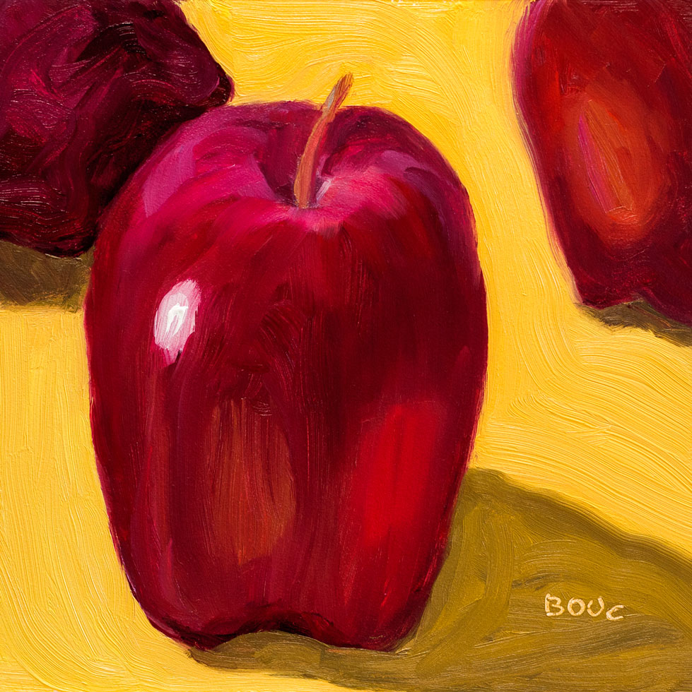
"Learning Leaning Apples", oil painting on linen panel, 8x8"
I’m happier with this painting of apples on a linen tablecloth embroidered by my grandmother. After the mighty fail of my cringe-worthy zombie apple painting, I got really curious. What was I missing? Clearly my drawing hadn’t been careful enough, per my friend Michael’s appraisal of the painting: “Uh, what is it?” And I know it was way overworked.
So before trying to paint these apples again I sat down with my sketchbook, an apple and my Lamy Safari pen. (The note below about Cathy’s special pen was just me grabbing any old page in the sketchbook to try out her strange new pen when she handed it to me.)
Study for "Leaning Learning Apples," ink & watercolor
I sketched one very dark purple delicious apple over and over in ink, trying to understand what I was seeing, where the planes changed, where the darks and lights were, trying not to get tricked by the reflections. That gave me a little more courage to try to paint the apples again in oil.
The painting at the top of the post was the result. This was a new painting surface for me: oil-primed linen on panel, surprisingly inexpensive (for linen), on sale at Jerrys Artarama. It was quite lovely to paint on. It was slippier than I was used to; the Ampersand Gessobord panels I usually use kind of “bite” the paint right off the brush and the oil primed linen allows it glide.
It’s funny how a small apple on a small panel can look so big! In the lunch room at the office where I work, people bring in boxed lunches from a nearby cafe. The boxes always include a petite Delicious apple but nobody eats them, preferring the sandwich on homemade bread, chips, and giant cookie.
So the apples are abandoned on the lunchroom table and I take them home to use as still-life objects. I have about a dozen of them now (they seem to last forever) and like setting them up to interact with each other like actors on a stage.
Peet’s Coffee is selling coffee scoops in three sizes that measure exactly the right amount of coffee for their French press coffee makers. Although I was happy with my French press pot and coffee scoop, I couldn’t resist the promise of the perfect cup of coffee.
Haha. It holds exactly the same amount that I already use. And it’s too wide to dump the coffee into my little French press pot without some of it landing on the counter and the handle is too short to comfortably scoop out of the bag or canister. So, while useless in the kitchen it is earning its keep as a model in the studio.
Value study/under-painting for Scoop and Cork, oil, 5x7"
This week’s Daily Paintworks challenge is to do a value study using only burnt umber, and to vary the amount of dark, medium and light so that there is a majority of one, some of the other, and a smidgen of the other. This is done by applying a thin layer of burnt umber, wiping it down for mid value, painting in the darks using only burnt umber, and wiping with paper towel or q-tips dipped in mineral spirits for the highlights.
I was going for a majority of dark, some middle, and smidgen of light. Not sure if I accomplished that. It seems like there’s almost as much middle as there is dark. I’ve done plenty of value studies and monochrome paintings, but I’d never done it this way before and enjoyed it. I like the way the finished study kind of glows but used it as a the under-painting for the painting at the top of this post.
Six inches is just too small! I chose a 6×6″ panel for this project because I thought I’d just do something quick for Virtual Paintout and then get on with my “real” painting projects. But I end up putting just as much work into this small painting as I would a big one.
When it was “finished” I kept seeing one more little thing to adjust until suddenly it was 7:00 p.m. and it was too late to go to my REAL paintout/sketch group. And I had paint all over my hands because I’d taken off my gloves when I thought I was done an hour before.
What’s important is that I had fun and as with every painting, learned something. And I got to spend some time “on” the Cote d’Azur. Wow is that place spectacularly beautiful and loaded with wealth, from what I could see wandering around on Google Streetview. Here is the original scene on Streetview.
When my tabby cat Busby Berkeley decided to sit in my still life light box and pose, I decided to paint him. After all, what’s more of a still life than a cat (except when they’re running through the house and pouncing on wrinkles in the covers when you’re trying to sleep)?
I painted from the photo below, displayed on my monitor near my easel.
Busby still life
Busby spends most of the day sleeping in the closet, my bureau, or a kitchen cabinet so painting him from life wasn’t an option. Even drawing him from life is tough. In the same way cats chose to sit on the one person who doesn’t like cats, they also get up and leave if they notice you watching them.
This was the first time I’d painted a cat in oils and it was fun and challenging. I’m about to try another from a different Busby photo to see if what I learned the first time will make it easer the second time. This painting is available here on my Daily Paintworks page where I am in the process of placing selected paintings from the past along with current work as I paint it, when/if I’m ready to let it go.
Every time I paint I learn something. This time I learned some new tricks with different brushes and mediums and also about how much easier it is to paint in a good mood than a bad one. I painted the radishes for last week’s Daily Paintworks challenge, “Paint your vegetables.” It is available there on my new Daily Paintworks page.
I painted the radishes over Sunday’s painting of cucumbers that didn’t work because of my bad composition (or my bad mood when I was painting it) not sure which. I liked the lemon slice in the painting so I took a photo before I scraped off the panel for reuse. Here is the happy little corner of the painting with the lemon slice (and without the two big ugly cukes at the top):
Cucumbers and Lemon, corner of painting
And here is the promised Still Life With Cat, shot when I put the radishes back in the fridge and silly Busby decided my still life light box would make a nice kitty sauna.
Still Life with Cat
I’d probably look grouchy too if someone tried to take a picture of me in the sauna!
When one of my sketch group members sent me this photo of her little girl, I had to paint it, despite having never painted my own kids (except as they appeared in a dream once, as a bear and a tiger).
The original photo was taken on an iPhone with a busy background of kid’s toys and furniture. I experimented in Photoshop with different backgrounds and color schemes. I tried some in paint. But in the end I chose this simple grayish-warmish-whitish background.
I thought about putting some of her toys from the photo in the painting but decided I like the way she’s alone in an empty space. It reminds me of my own childhood photos where I usually looked kind of alone and perplexed about the big world around me. I guess that’s an example of how whatever the artist paints, she’s painting herself too.