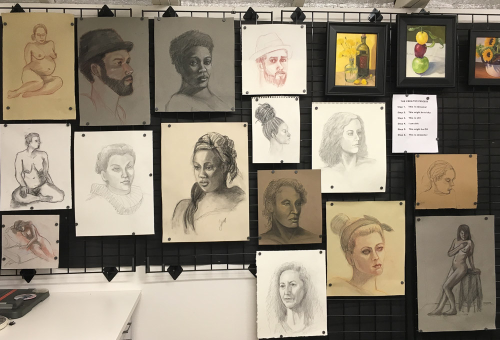
I just made a big leap in my understanding of figure and portrait drawing so wanted to share previous sketches and paintings before the new work. Above is a photo of the “figure drawing wall” in my studio. I’d covered this wall with black non-fade bulletin board paper to avoid reflected light when I’m at my easel (that stands just to the right of this photo). Then I hung black metal grid panels that I got super cheap on Craigslist and use little magnets to stick the drawings to the grid wall. Now it’s easy to add, move or replace drawings with better ones as my skill improves and I can hang framed paintings from it with grid wall picture hooks.
Below are assorted figure and portrait drawings from past Friday Figure Drawing sessions. Click on any image to go to slide-viewing mode and click through them using the arrows on each side.
Charcoal on paper
Pregnant Mama, conte on paper
Woman with headdress, charcoal on paper
Charcoal on paper
Fallon in Elizabethan Collar, Pencil drawing
Top Knott, charcoal on paper
10 Minutes, charcoal on paper
Hat Guy, Conte on Paper
Conte drawing from first 20 minute session for underpainting
Brian in conte, 1 hour, trying to see the planes of his face
These lemons came from my little Meyer Lemon tree which produces the sweetest, plumpest lemons. I planted the tree from a small pot about 5 years ago and now it’s as tall as me. I really like the Centurion Oil Primed Linen Panel I painted this on, except that it takes much longer for the paint to dry than when painting on Gessobord because it doesn’t sink in to the oil priming.
A= Still life table beside easel
I set up the bowl of lemons on my new rolling, adjustable (from 28″ to 45″ high) still life stand, also known as an Over the Bed Table on Amazon where I got it with free shipping (good thing because it’s not light). Since I was taking a picture of it I thought I’d also describe the other items in the photo since I’m so happy with my painting set up.
B = Karen Jurick’s “Alter Easel” which I love for holding thin panels instead of trying to balance them between the narrow supports on my easel. Works great!
C = Daylight Studio Lamp for lighting the still life (not visible is the Daylight Artists Easel Lamp that is attached to the top of my easel to light the painting (that I was given for free by the company and liked so much I bought the standing light).
D = A silly maul stick (just the top shows) that doesn’t work very well. I’ve seen people using canes instead, hooked over the top of the painting to provide support for your hand when painting details.
E = Masterson Artist Palette Seal with a lid that seals like Tupperware and with a pad of palette paper inside (the palette paper is a recent discovery that I LOVE because it saves so much time from having to clean the palette.) I keep the palette in my freezer when I have paint left over. Once thawed (in a few minutes) it’s in perfect condition for the next painting session. The palette is on top of an upside down plastic drawer from a defunct rolling cart to raise it up high enough for me to use without bending over (I’m 5’10”).
Not lettered but in the picture is the beautiful silk sari fabric my friend Barbara gave me for my birthday for just this purpose and the ancient microwave cart that holds my palette and supplies. Not shown is the rolling plastic taboret I’ve had for 20 years that holds my brushes and other stuff.
OK, I know I’m a gadget girl and many of these things are not necessary. But I feel like painting (and life) are hard enough, why not have great tools to make it easier? There are lots more pictures of my studio under the category “Studio.”
Painting blocks to use in light and color-study still-life as explained in this previous post. (Newly gessoed panels drying in little rack behind the blocks).
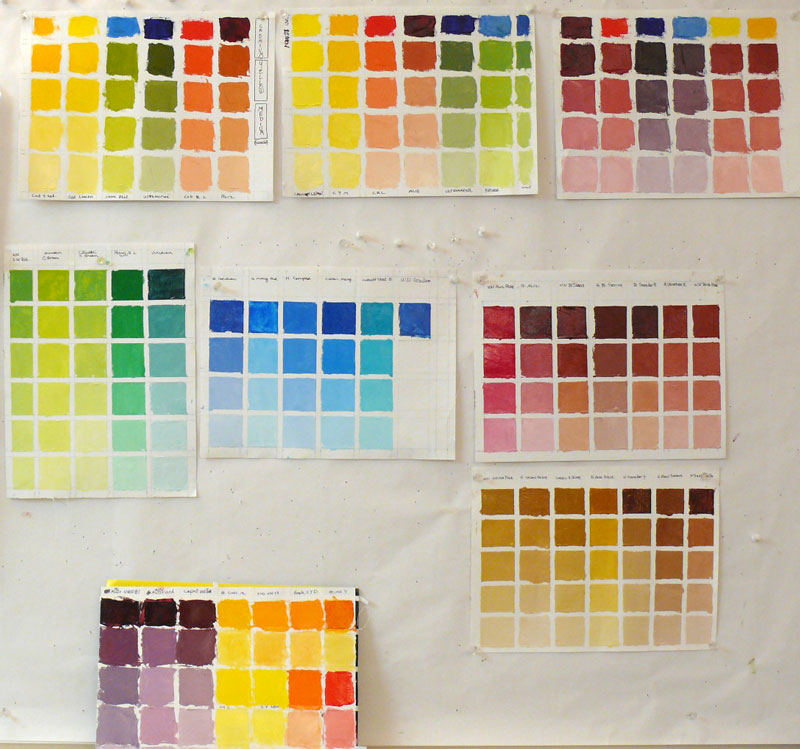
After jumping head first (or was it feet first?) into oil painting, and then flailing about, trying to find my way, I realized it was time to go back to basics. Just as with writing or speaking, a basic vocabulary is essential to expressing oneself.
But I was trying speak “oils” using the vocabulary of color I’d learned with watercolor, assuming that Red is Red, whether it’s watercolor or oils. Unfortunately, I’m finding that’s like assuming if you can speak English you can speak French since they use the same alphabet.
Oil painting tests of different brands of color to choose my basic palette
(Click Images To Enlarge)
When I first started painting with watercolor, I made dozens of color charts, testing the various pigments to learn about their natures, alone and mixed with other colors. In watercolor this is really essential since there are so many characteristics that affect the flow of the paint: whether it charges into neighboring paint or resists it; whether it’s opaque or transparent; sedimentary (leaving little spots of sediment), staining or lifts easily, how it mixes with other colors and more.
I hadn’t done this with oil painting. But watching Camille Przedowek demonstrate a couple of weeks ago, I was struck by her huge “vocabulary” of color. She was quickly mixing up and painting with colors I couldn’t even name! I realized my oil painting color vocabulary is about that of a 4-year old from a foreign country.
(CLICK “Continue Reading” to read and see the rest…)


, conte on paper")