Categories
Art Drawing Faces Painting People Watercolor

Dorothy of Oz: All Grown Up?

Watercolor painting of Dorothy from the Wizard Oz, as an adult, from a photo of a woman at a county fair
Dorothy of Oz, Watercolor on paper, 9”x6.5”

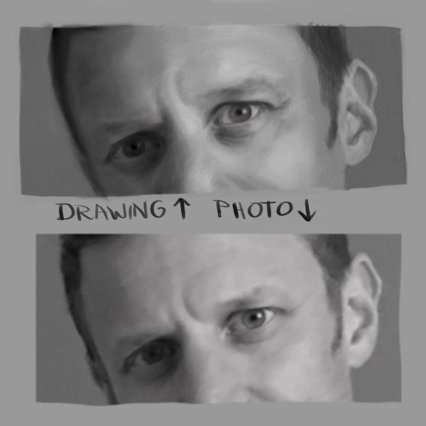
My first thought was, “Dorothy from the Wizard of Oz, all grown up,” and, as the saying goes, “rode hard and put away wet” when I saw the photo (below) on photographer Earthsworld’s Instagram.

Photo reference by Earthsworld, posted with permission

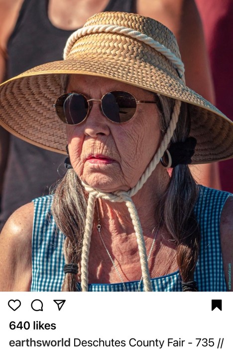
My second thought was “I must paint her!” I contacted Earth (his real name) and he gave me permission to paint from and share his photo. Then, while the painting was in progress I came across the cartoon below on Instagram by artist WadeHate.

Cartoon of Dorothy from the Wizard of Oz as a grown up, smoking a cigarette
Cartoon by WadeHate, posted with permission

It was too perfect, another image of Dorothy all grown up. He was kind enough to give me permission to share this artwork.

Experiments with background color in Procreate.
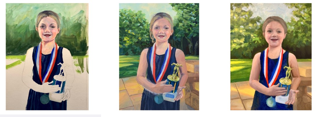
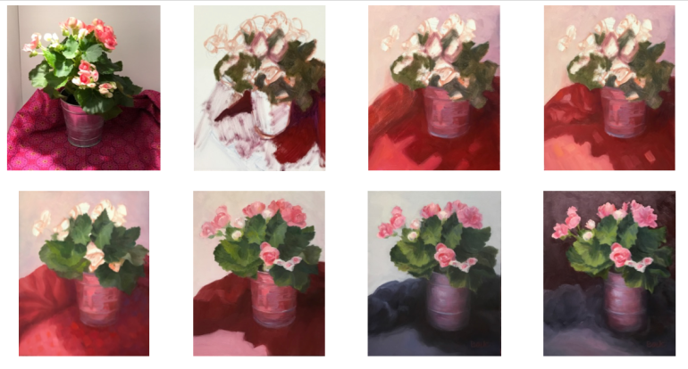
Bottom left was original before painting background.

The original photograph had a background I didn’t want so I experimented in Procreate with different backgrounds. I probably should have just left the background white (below).

Finished painting except for background.
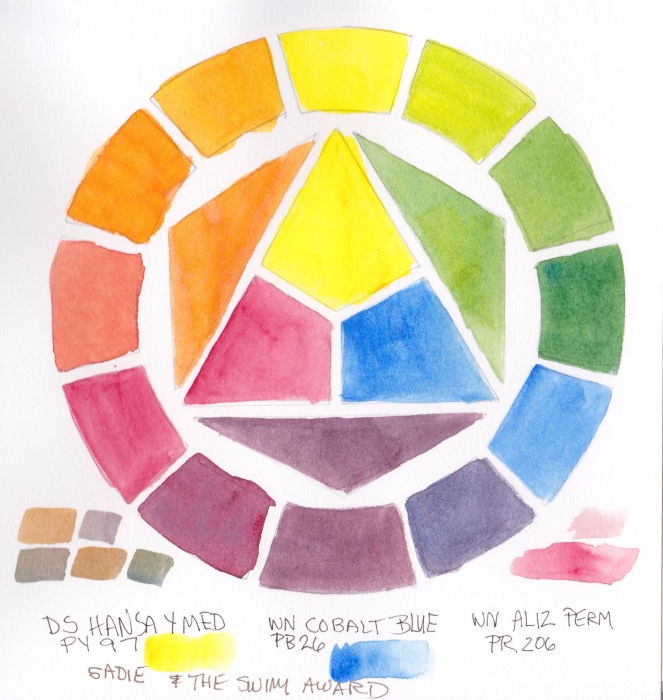
Also, the limited palette of W&N watercolors notated:
Raw Sienna, Permanent Alizarin, Winsor Blue Green Shade

The deep orange I chose didn’t please me so I tried washing it off. That left an “interesting” peachy color and a paper surface that was not going to respond well to more paint layers. So, peachy pink is how it shall remain.

Painting in Progress, Final Sketch, Sketch check for accuracy in Procreate

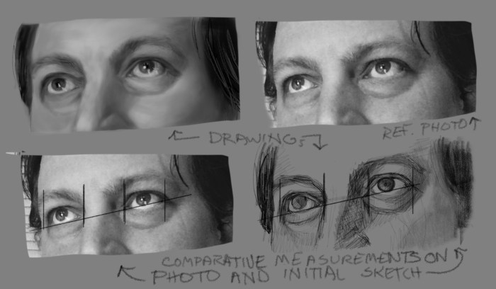
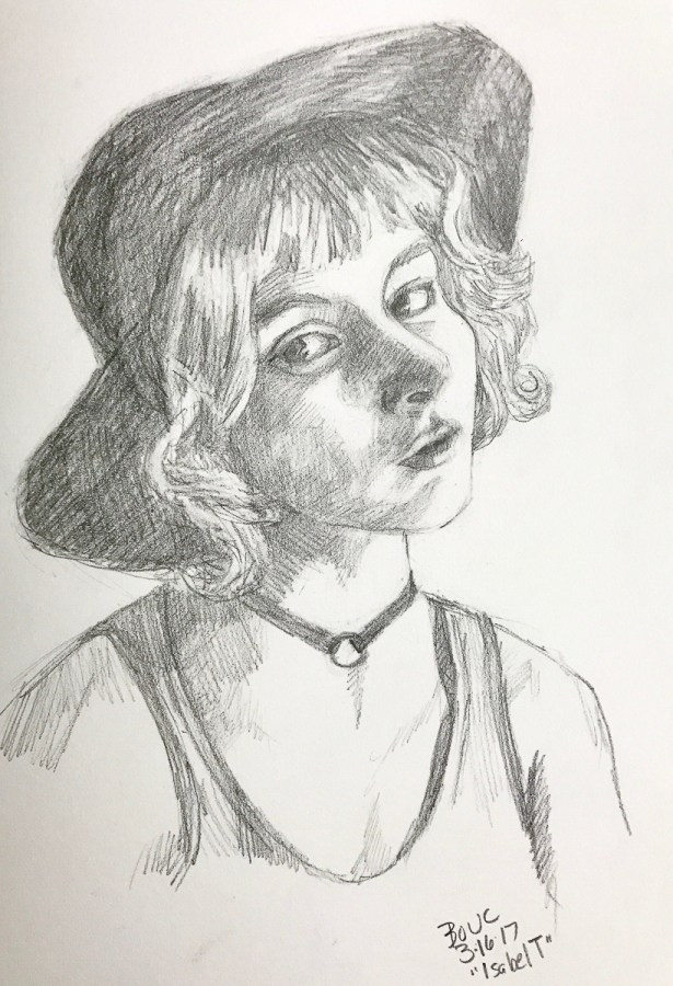
When I checked my initial sketch I was delighted to see how close I got on my first try, and how few corrections were needed (above). It’s so nice to see progress, whether it’s in drawing or painting or both. This painting also went really well (except the background).

Categories
Art Oil Painting Painting People Portrait Watercolor

Sadie and the Swim Trophy

Sadie and the swim trophy, watercolor
Sadie and the 2021 Swim Trophy, watercolor, 10”x7.5”

My granddaughter Sadie loves to swim (and play soccer, basketball and read books, too). At the end of the season, after winning many races and awards, to fundraise for her team she swims lap after lap and people pledge $ per lap.

Reference photo

Trying to paint Sadie from this photo led to me giving up on oils and going back to watercolor. As was my way with oils, I tried repeatedly, persistently (obsessively?) but couldn’t make it work. This watercolor isn’t perfect, but it captures the joy of the moment and that makes me happy.

Failed oil paintings
Abandoned Oil Paintings, 9×12”
L-R: Start of painting #2; unfinished painting #2; unfinished painting #1

With watercolor I’m able to paint to a certain point and then happily call it done. Watercolor doesn’t allow you to keep fiddling forever like oil does.

Final drawing for the portrait painting
Final drawing for the painting (after many corrections)

I again used a limited palette because it’s fun to see what I can do with only 3 colors. This time it was DS Hansa Yellow Medium, WN Permanent Alizarin and WN Cobalt Blue.

Limited palette color wheel of primary triad
Test of Limited Palette Primary Triad using DS Hansa Yellow Medium, WN Cobalt Blue and Alizarin Permanent

I used to think it was really weird that artists limited their palettes. I thought one needed every possible color in order to capture color exactly. But now I prefer the harmony a limited palette provides and don’t really care about capturing exactly the colors in real life. I’m not trying to be a photocopier.

Categories
Art Drawing Faces Painting People Portrait Watercolor

Terrible Watercolor Triad, Mean Model

Mean Model, Watercolor portrait of woman, 8.5”x7”
Mean Model, Watercolor, 8.5”x7”

I recently spent a couple weeks working through a Proportions and Rhythms of the Head portrait drawing class created by Bradwynn Jones. I watched him do the demo drawings (mostly while working out on my rower) and then sketched them myself. When I finished all the drawings I transferred them to watercolor paper and started painting them. This is the first one I painted.

Reference Photo of Mean Model

I took an immediate dislike to this model. She was pretty but mean-girl looking to me. I decided to experiment with a triad of colors on her that turned out to be equally unpleasant.

Final Sketch for the painting

Cobalt Violet has very low tinting strength and just sits on top of the paper, so it came right off if I tried to glaze over it. It is both opaque and granulating, causing an unpleasant texture for skin.

Color wheel test of triad limited palette

The QOR Nickle Azo Yellow also had low tinting strength and when mixed with the violet made a yucky brownish color for shadows. The QOR Paynes Grey combined with the yellow made a gross greenish-gold of her hair.

I didn’t really care because, like I said, take that, mean girl!

Also, Payne’s Grey; I’ve never understood why people use it. Most brands make it from black and ultramarine blue and sometimes a bit of violet. I guess it’s a convenience color, but one that would be so easy to make, though I prefer not to use black paint in watercolor.

Do you use Payne’s Grey? If you do please tell me why and which brand you like.

Initial sketch with needed corrections superimposed in Procreate
Categories
Art

Sktchy Gals

Sktchy app is such a great resource for finding people to draw. Here are a couple of gals drawn/painted in Procreate on the iPad.

Categories
Sketchbook Pages

Sktchy Guys

More sketches inspired by the interesting characters who post their photos for artists to draw on the Sktchy app. Many of them are artists too. All done on Procreate on the iPad.

Categories
Faces Portrait

Eye Eye Eyes!

I took a class on Schoolism.com with Jason Seiler about drawing realistic portraits that was very helpful. This was part of the homework for the class, drawing lots of eyes. Above is one from Sktchy app and below are from photos from that class, the web and people I know. The next one below is my son Robin. All are done on the iPad in Procreate.

Robin's eyes and an ear, Procreate on the iPad.
Robin’s eyes and an ear, Procreate on the iPad.

Eye, sketched in Procreate on the iPad

Eye, sketched in Procreate on the iPad

More Eyes, sketched in Procreate on the iPad

Working out comparative measurement

Categories
Digital art Faces People Sketchbook Pages Sktchy

Sketching People on the iPad Pro

Lady in Red (from Sktchy)

While my backyard and the entrance to my studio were inaccessible due to construction I did more drawing and painting on my iPad than on canvas. The 12.9″ iPad is just the right size for me and the Apple Pencil makes it just like drawing with a great pencil or pen except so much easier to erase or start over without fear of “wasting” paper. Here are a few of those sketches from TV and photos.


Categories
Faces People Portrait

Portrait Sketch on Map of Pooh Corner

Thanks to Kaelin on Sktchy app for the twinkle in her eyes that inspired me to sketch her on my ancient Winnie the Pooh book’s last page map of Pooh Corners. Digital ink in Procreate.

Kaelin, digital ink in Procreate on iPad.

Here is the photo reference from Sktchy.

Categories
Drawing Faces Oil Painting Painting People Portrait Sketchbook Pages

Oil Portrait of Baby Toa; Painting with Joy and Freedom

Portrait of Baby Toa, oil on linen panel, 10x8 inches
Portrait of Baby Toa, oil on linen panel, 10×8 inches

I really enjoyed making this painting of my friend’s grandson Toa. The biggest challenge was working from a cellphone photo taken in a carseat in the dark where his skin looked dark and bright orange. Fortunately I was able to see some other snapshots with better skin color.

I’ve been taking a new approach to painting; focusing on the joy of creating and letting go of the internal “committee” that demands perfection. I have accepted that my work will never be perfect and that perfect art bores me anyway. A bit of wonkiness, even in a portrait, is ok with me, if I feel I have captured the spark of the subject. I’m painting for myself; if it pleases someone else too that’s a bonus, but not at all a requirement. Giving myself this freedom has completely changed my life.

Below are my initial sketches, a picture of the setup with the photo, and an early stage in the painting.

Categories
Drawing Oil Painting Painting People Portrait Sketchbook Pages Sktchy Still Life

From Veggie Porn to Bad Begonias

Veggie Porn, oil on Gessobord panel, 8x8"
Veggie Porn, oil on Gessobord panel, 8×8″

I’ve developed the goofy habit of storing my leftover cucumber in the bell pepper half when I prepare a salad. It always makes me laugh so I decided to paint it. My sister called it veggie porn. I hope it makes you chuckle too.

I’m trying out a new format for my blog posts, a simple list with images of what I’ve been working on, successes, challenges and what else is going on in the studio and my life. Theoretically it will mean less writing and more frequent posting. So here goes…let me know what you think.

CHALLENGES: I’ve been struggling with composition, discovering half way through a painting that the composition sucks and the painting will never be an enjoyable thing to look at.

SUCCESSES: I finally got the willingness to begin all paintings with some thumbnail sketches. I realized that COMPOSITION is simply the structure that directs the eye around the painting, creates a feeling of action or stillness and (if done well) delights the eye. Two of my favorite painters, Susan Jane Walp and Giorgio Morandi use composition in unexpected ways, and both delight the eye (or at least my eyes) whether they are following or breaking the “rules” of composition or making their own.

LETTING GO OF A BAD PAINTING: This one started off really happily but ended up in the trash, after scraping and redoing it over and over until I killed it so dead it couldn’t be revived. I just felt there was too much red, that it was too “hot” somehow. A friend suggested adding black. That was the final nail in the coffin. I’m not sure why I’m even sharing it at all.

FAIL: Bad Begonias, oil on panel, 10x8"
FAIL: Bad Begonias, oil on panel, 10×8″

SKETCHES: I try to do a sketch from the SKTCHY App at least weekly. Here is a recent one.

Isabel T, from Sktchy photo reference, graphite, 12x9"
Ms. I. T, from Sktchy photo reference, graphite, 12×9″

WHAT I’M READING: “Irresistible: The Rise of Addictive Technology and the Business of Keeping Us Hooked.” Great book about how our devices and apps are designed to keep us using them. I waste way too much time web-surfing on my phone. This book gave me some tools for changing my habits along with a good talking to! I think it’s a must-read for parents especially.

WHAT I’M LISTENING TO: Ed Sheeran and Alicia Keys on Amazon music, which I like much better than Apple music. (If you’re interested, here’s a link to  Amazon Music Unlimited 30-Day Free Trial)