I recently spent a couple weeks working through a Proportions and Rhythms of the Head portrait drawing class created by Bradwynn Jones. I watched him do the demo drawings (mostly while working out on my rower) and then sketched them myself. When I finished all the drawings I transferred them to watercolor paper and started painting them. This is the first one I painted.

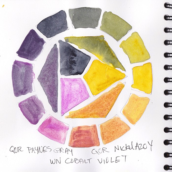
I took an immediate dislike to this model. She was pretty but mean-girl looking to me. I decided to experiment with a triad of colors on her that turned out to be equally unpleasant.
Cobalt Violet has very low tinting strength and just sits on top of the paper, so it came right off if I tried to glaze over it. It is both opaque and granulating, causing an unpleasant texture for skin.

The QOR Nickle Azo Yellow also had low tinting strength and when mixed with the violet made a yucky brownish color for shadows. The QOR Paynes Grey combined with the yellow made a gross greenish-gold of her hair.
I didn’t really care because, like I said, take that, mean girl!
Also, Payne’s Grey; I’ve never understood why people use it. Most brands make it from black and ultramarine blue and sometimes a bit of violet. I guess it’s a convenience color, but one that would be so easy to make, though I prefer not to use black paint in watercolor.
Do you use Payne’s Grey? If you do please tell me why and which brand you like.


6 replies on “Terrible Watercolor Triad, Mean Model”
Very beautiful
LikeLiked by 1 person
Thank you. I thought it was kinda ugly but I appreciate your kind words.
LikeLiked by 2 people
What? It’s not ugly. It’s completely opposite of that. It’s great
LikeLike
That’s so kind of you—you helped me see it with different eyes.
LikeLiked by 2 people
Because it is beautiful
LikeLike
[…] – Jana Bouc was also experimenting with watercolor triads recently. She stuck it out with a difficult combo for […]
LikeLike