Figs on a Grey Plate, oil on Arches Oil Paper, 9×11″
My fig tree is supplying me with figs that are delicious to look at and to eat. I’m working on simplifying my paintings, aiming from strong values and composition, and trying to stop at “good enough for jazz.” This is so much more fun than trying for perfection and ending up with overworked instead. This painting is available on DailyPaintworks here.
Below are the steps in the progress of this painting and below that some bonus fig
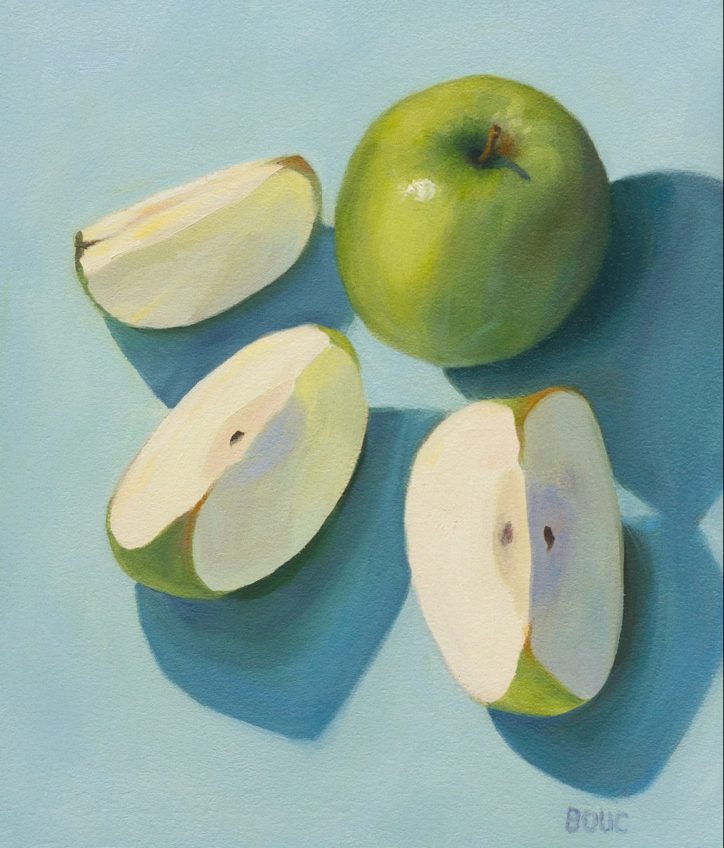
Granny Smith Sliced, oil on Arches Oil Paper, 11×9 inches
I was struck by the beautiful cream color of the apple when I cut it open and then all the subtle pastel colors I could see in the flesh because of the light shining through and reflecting off of the apple skin and the turquoise plate. Below are photos in the process of painting the apples from life, with a snapshot of the set up. This painting isavailable here: (Click here for purchase info)
Kissing Cantaloupe, still life oil painting on Arches Oil Paper, 10.5 x 9 inches
I’ve been thinking about still life painting and what, for me, makes it fun to paint and enjoyable to look at. Number one is color that pleases me and a feeling of light and space and a close second is strong value contrast (between dark and light). Traditional or classic still life paintings often have dark backgrounds and somber colors and I’ve realized that’s just not me. That style seems very masculine to me; perhaps because the old masters were mostly men and even back then men liked their “man caves.”
I want to find a way to paint in oils that incorporates what I like so much about my watercolor paintings, which have mostly been light with bright colors painted on a background of white unpainted paper. Another difference is that in oils I’ve tended to work small, painting objects smaller than actual size, and in watercolor I’ve typically painted much larger than life size. I’m going to be exploring working larger and lighter and in colors that make me feel joyful.
Another quick post of a recent sketch done from an inspiration photo on Sktchy. I love the app and I love drawing people more than just about anything. Pears and bowls and pretty landscapes are great, but nothing can match the joy of drawing people for me. Below is the reference photo. I’d intended to add color but liked the black and white version too much.
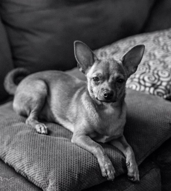
When the Sktchy (see previous post) Weekend Art Extravaganza inspiration was to make a color sketch from a black and white photo I found the photo below and couldn’t resist putting a little color in this little guy’s life. I used to make fun of Chihuahuas, comparing them to rats (which can also actually make good pets if you don’t mind the smell). But after a couple of friends adopted chihuahua mixes, I have come to really appreciate their funny and quirky personalities.
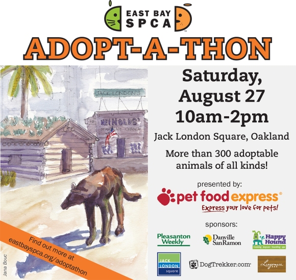
I was honored when the East Bay SPCA asked to license my sketch of Jack London Square (in the poster below) for their annual Adopt-A-Thon fund-raiser publicity materials. They kindly offered to pay for the use of the image but I was very happy to donate it for their use. As an animal lover I am grateful for the wonderful work the SPCA does to care for and find homes for animals.
You can click the image to get more information about the event. It will be a lot of fun and if you’re looking for a new family member of the furry variety, be sure to visit the Adopt-A-Thon! My original sketch is and info about it is at the bottom of this post.
.
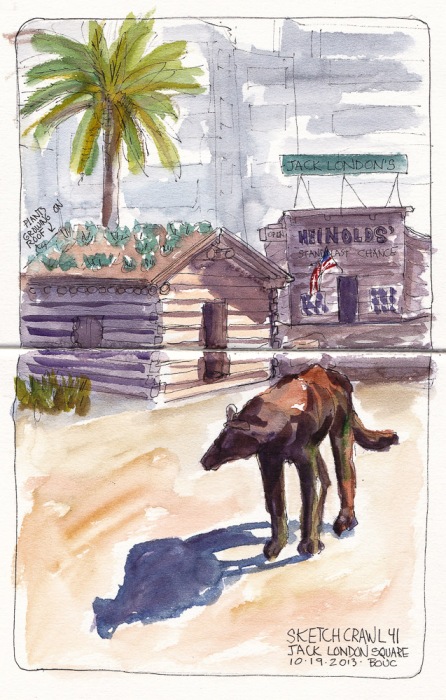
I sketched the scene below at Jack London Square of London’s old cabin and the wolf statue out front on a gorgeous sunny day and the shadows were in just the right place. It was one of those sketches where everything just worked. In the background are the high-rise office buildings of Downtown Oakland.
Jack London Cabin and Wolf Statue, ink and watercolor, 10×7 in
One Hour Pear, oil on Arches Oil Paper, 5×7 inches
After struggling for a few days trying and failing to do a one-hour painting exercise as I posted yesterday, I returned to the studio determined to tackle the challenge again and this time, obey the timer. I “cheated” just a little, redefining the project to better suit my current abilities by doing a quick outline and monochrome block-in with diluted burnt sienna and pre-mixing my paint (below) before starting the timer. At exactly one hour I stopped and then gave myself 5 more minutes to soften the edges on the shadow and back of pear and to add a highlight. It’s not a masterpiece but I met the challenge and, most importantly, enjoyed it!
Pre-mixed Paint
Initial block-in
Photo of set-up
One done, two more to go before moving on and returning to some skull drawing and painting practice to enhance my ongoing portrait drawing and painting study.
Color Boot Camp Part I Monochrome. Left to right: Color reference photos, B&W converted ref photo, my two studies
When my art friend Chris Beaven commented on the previous version of this post that it would be interesting to see my studies compared to the black and white versions of the photo references, I did a virtual dope slap (Of course! What a perfect way to see if I got the values right!) and then decided to redo this blog post to show that comparison (above).
While I often convert color photos to black and white to see the values, when I did these studies from Bill Perkins’ Color Boot Camp on New Masters Academy I wanted to try to do the conversion in my artist brain instead of using technology. But putting my studies next to the converted photos gives me just the reality check I needed. I can see that I did pretty well in painting the values from the color photos.
In the lesson he set up one model in four different lighting situations and then demonstrated doing a 30-minute painting of each in black and white. He recommends doing the studies in no more than 30 minutes, emphasizing that it’s more important to do many starts, without worrying about getting a likeness or making finished paintings. I have to admit spending longer than 30 minutes, probably up to 3 hours on some, and in retrospect, the longer I worked the less effective the study was.
If you want to see Bill Perkin’s studies and mine in greater detail, click the “read more” link below.
CBC Part 1-3, Janas #1 High Key, High Contrast Study (My favorite of 8 below)
Being a member of the New Masters Academy is like having a treasure chest of jewels to explore, with new art classes added all the time. The only downside is that I have to assess my own work and be my own teacher since NMA doesn’t offer feedback to the video lessons’ assignments.
I revised this post by publishing a new version of it so I’ve deleted the content here. Please see the next post for the rest of the content from this post.
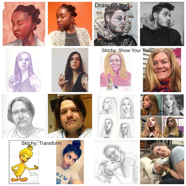
Sketching from Sktchy App photos (I explained it here) is a great warmup exercise and opportunity to practice drawing a wide variety of faces and expressions. Each week they offer a Weekend Art Exploration (#WAX) challenge and 3 of the drawings marked in the collage below were for WAX. All are in a 12×9″ sketchbook.
Collage of sketches and inspiration photos from Sktchy. (Click on image two times to enlarge.)
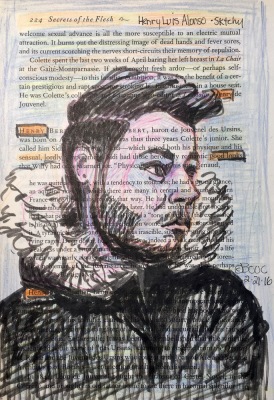
The challenge marked in the top row was to draw on text; mine is on a page of “Secrets of the Flesh: The Life of Collette.” The challenge in row two was to show your tools used to create the art so I put my colored pencils in front of “Crazy Eyes,” as she titled her photo. The bottom row challenge was to use the magic of art to transform a photo into something else (I combined Tweety Bird with the girl making a bird face). The last sketch above is from a photo I uploaded for others to draw. I did a better job on Millie than me.
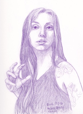
Below are larger versions of a few from this batch (click to see larger):
Audrey Henry, Colored Pencil
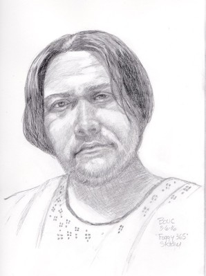
Artist known as “Foggy 365” in the hospital, graphite and conte pencil
Henry Luis Alonso on Secrets of the Flesh
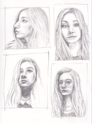
4 views of “Moon Child Luna 2” in graphite
This weekend the challenge is to draw from the same photo twice, once with each hand. Wish me luck! I don’t think my left hand knows how to do anything except type.