Categories
Animals Daily Paintworks Challenge Food sketch Oil Painting Painting Still Life

Happy Boy Radishes in Oil (Paint) and Still Life with Cat

Happy Boy Farms Radishes, oil on panel, 8x8"

Every time I paint I learn something. This time I learned some new tricks with different brushes and mediums and also about how much easier it is to paint in a good mood than a bad one. I painted the radishes for last week’s Daily Paintworks challenge, “Paint your vegetables.” It is available there on my new Daily Paintworks page.

I painted the radishes over Sunday’s painting of cucumbers that didn’t work because of my bad composition (or my bad mood when I was painting it) not sure which. I liked the lemon slice in the painting so I took a photo before I scraped off the panel for reuse.  Here is the happy little corner of the painting with the lemon slice (and without the two big ugly cukes at the top):

Cucumbers and Lemon, section of trashed painting
Cucumbers and Lemon, corner of painting

And here is the promised Still Life With Cat, shot when I put the radishes back in the fridge and silly Busby decided my still life light box would make a nice kitty sauna.
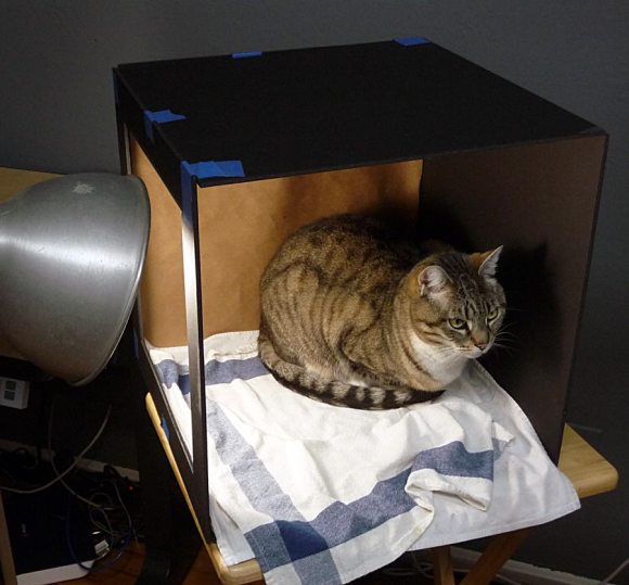
Busby still life
Still Life with Cat

I’d probably look grouchy too if someone tried to take a picture of me in the sauna!

Categories
Drawing Flower Art Painting Sketchbook Pages Watercolor

Relaxing With Calla Lillies

Calla Lilly 1, Ink and watercolor

After a weekend of making paintings, scraping the canvas and starting over (with nothing to show for it but some learning) I accidentally knocked a 12 oz latte off the table, splattering the studio with milky coffee, requiring a major cleanup job. So tonight I thought it might be nice to stare at a pretty calla lilly that popped up in the garden, sketch it a couple of times and just calm down.

I drew the one above first, starting with a little pencil to get the shape right and then drawing with a Micron .03. When I finished I wished I’d skipped the ink.

Calla Lilly 2, ink & watercolor

With this second one I drew directly with the pen, but I liked the scratchy line even less (I think the pen is running low on ink or doesn’t like the paper) so went over it with a Pentel Brush Pen afterwards.

Categories
Art theory Drawing Every Day Matters Ink and watercolor wash Painting Sketchbook Pages

Sweat, Salt and Scissors

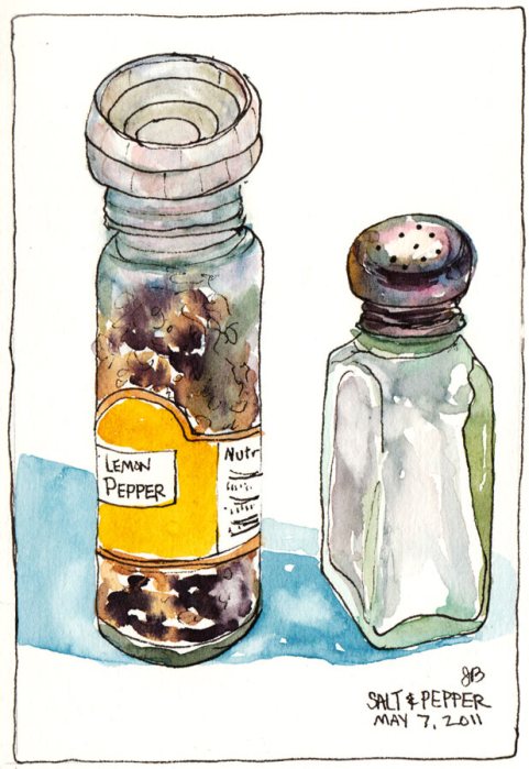
My Lemon Pepper and Salt Shaker, ink & watercolor, 5.5"x7.5
My Lemon Pepper and Salt Shaker, EDM #104, ink & watercolor

Drawing is the foundation of most picture making and it’s a skill that requires regular practice and study. I’m determined to improve my drawing skills and the Every Day in May drawing challenge came at just the right time to inspire this daily practice.

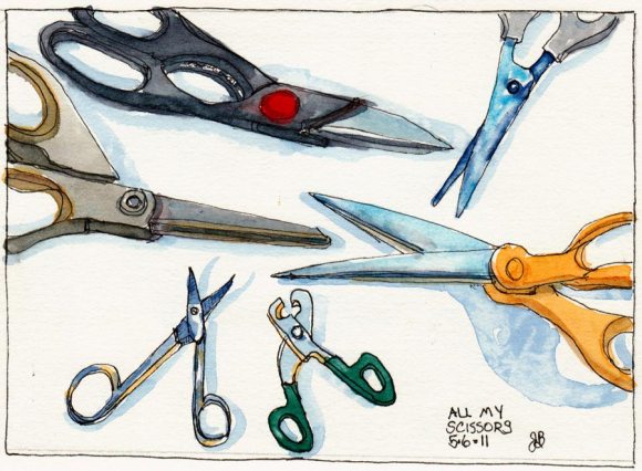
All The Scissors I Own, ink & watercolor, 5.5x7.5"
All The Scissors I Own, EDM#105, ink & watercolor, 5.5x7.5"

I’ve long enjoyed just starting somewhere on the page and letting the details and story expose themselves in my sketch as my eyes explore the subject. I like the “just see what happens” approach. That is a lot of fun. But it doesn’t work well when I’m trying to fit a scene onto a page, or realistically capture a place or people or both.

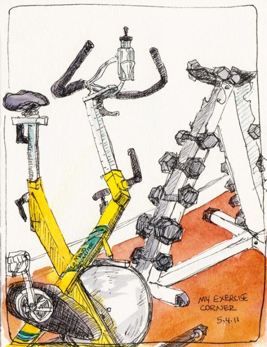
My Exercise Corner, ink & watercolor
My Exercise Corner (drawn sleepy and without using the strategies described below so it's wonky and didn't fit on the page). EDM# 103

That requires some comparing, measuring, careful checking of angles, drawing imaginary (or penciled) “plumb lines” to see what lines up with what, noting where the top, bottom, sides and midlines are in the subject vertically and horizontally, and marking those same spots on the page so that it all fits. And of course there are lots more…perspective, line quality, etc.

I just wasn’t willing to do most of that before, but now I am. Even more surprising than my willingness is how enjoyable it is and how it’s starting to become second nature.

I don’t want my drawing to be pefect—I love imperfect wonky drawings—they’re so much more interesting and lively than perfectly realistic ones.  I just want the darn picture to fit on the page and the proportions to be at least almost right, and to be able to draw more quickly and accurately when I need to.

Categories
Oil Painting Painting People Portrait

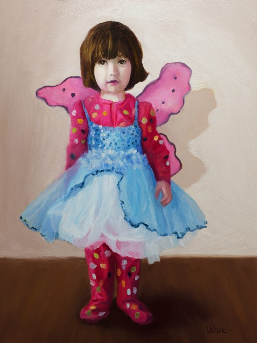
Portrait of Violet: An Angel in Jammies and Tutu

Portrait of Violet: An Angel in Jammies and Tutu; a little girl playing dress-up.

When one of my sketch group members sent me this photo of her little girl, I had to paint it, despite having never painted my own kids (except as they appeared in a dream once, as a bear and a tiger).

The original photo was taken on an iPhone with a busy background of kid’s toys and furniture. I experimented in Photoshop with different backgrounds and color schemes. I tried some in paint. But in the end I chose this simple grayish-warmish-whitish background.

I thought about putting some of her toys from the photo in the painting but decided I like the way she’s alone in an empty space. It reminds me of my own childhood photos where I usually looked kind of alone and perplexed about the big world around me. I guess that’s an example of how whatever the artist paints, she’s painting herself too.

Categories
Drawing Every Day Matters Ink and watercolor wash Painting

Soap: Every Day in May

My Favorite Soap from Trader Joes, Pentel Brush Pen & watercolor
Trader Joe's Lemongrass Soap, Pentel Brush Pen & watercolor, 5.5 x 7.5"

Well, yes, of course I’ll use soap every day in May…but that’s not what this post is about. I read that the Every Day in May group was doing a daily sketch from the Everyday Matters (EDM) list. I had so much fun with EDM in 2006 when I first started art-blogging so despite being in the middle of a dozen different things I decided to join in.

They started with #101 – Draw a bar of soap. I searched the house and had no bars of soap so I drew my favorite liquid hand soap from Trader Joes. It’s Lemongrass-Sage and it smells wonderful!

I hadn’t used my Pentel Brush Pen in a long time and I thought I remembered that it doesn’t bleed when you add watercolor. No such luck. Or maybe I didn’t wait long enough for it to dry?  Just for fun, here’s my original EDM #101 bar of soap, just for fun.

Categories
Albany Drawing Ink and watercolor wash Interiors Painting Places Sketchbook Pages

The Pub/Sketchcrawl Continues: The Pub, Albany

On Pub Time, ink & watercolor

The Pub in Albany was originally an old house and though long ago it was (minimally) converted to a pub, it is as comfy as hanging out in my living room (except a lot more interesting). People come to drink beer or espresso, play card or board games and sit around in big overstuffed chairs to chat. There are interesting collections of objects in every room.

The Pub: Like a Living Room, ink & watercolor

Until we started sketching in pubs I had no idea that there was so much game playing going on. Beer drinking aside, it just seems so wholesome the way groups of friends meet in person to play games instead of playing digital games alone or with virtual friends online.

A note about the picture above–the white shape above the bottom right chair is the head of the bald guy who was sitting there. I liked how it looked even though you can’t tell what it is.

Categories
Drawing Flower Art Ink and watercolor wash Painting Rose Sketchbook Pages Still Life

The First Cut is the Deepest (Or Is It The Sweetest?)

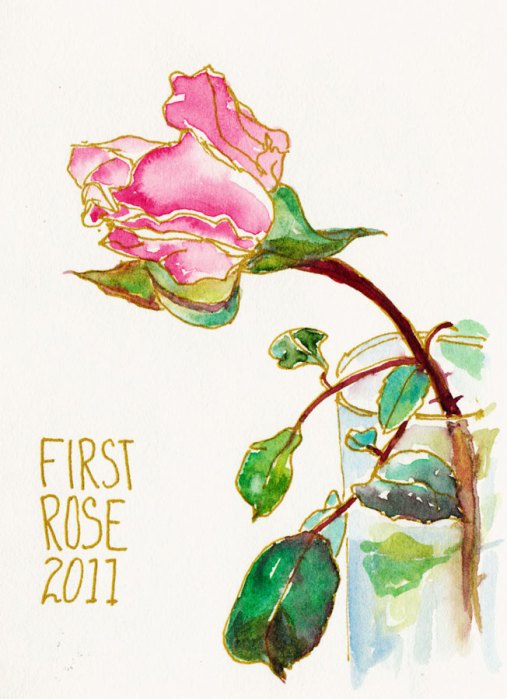
First Cut Rose, gold gel pen and watercolor

This was the first rose I cut from my rose bushes this year which led to the first cut on my hands from the rose thorns (likely not the last). And it was the first sketch I did of the first rose.  My intention was get the essence of the delicate rose with as few lines and as few washes as possible. I drew it with a gold gel pen, painted directly in one layer and stopped.

Happy!

Categories
Animals Bay Area Parks Landscape Oil Painting Outdoors/Landscape Painting Places Plein Air Walnut Creek

Landscape Painting with Coyote Soundtrack

Borges Ranch View, oil on Raymar panel, 6x8"

Last Saturday my plein air group met at Borges Ranch in Walnut Creek’s Shell Ridge Open Space. It’s a beautiful place that feels far away out in the country, and is surrounded by strange, tall hills covered in a hundred shades of green.

While I was painting I kept hearing the strangest sounds: yips, yelps, squeals and howls. I ruled out the sheep, goats, pigs and roosters and decided it was either the world’s most annoying beagle or a coyote. Later I asked the ranger who confirmed that there were three coyote families in the three nearby hills. He said they all have pups in their dens and are very talkative now. Want to hear a coyote? Click here to go to a site with a coyote sound clip.

To see wonderful photos and stories about life with an adopted coyote who was orphaned at 10 days old when his parents were shot for killing sheep, please visit The Daily Coyote blog, “a story of love, survival and trust.”

Now back to the painting–I tried to simplify, avoid details and focus on color, light and big shapes. The sky was completely covered in a thick layer of clouds and I noticed a painting “rule” in action: cool light creates warm shadows (and vice versa). Although the heavy cloud cover meant there weren’t obvious shadows, I could see how darker areas leaned toward red while areas in light were cooler (e.g. lemon yellow, not an orange-yellow).

When I got home I broke my rule of not touching up plein air studies and fussed with it, eventually ruining it and throwing it in the trash. I’m glad I took a photo first…and that I had the joy of painting to a coyote soundtrack!

Categories
Art supplies Bookbinding Drawing Ink and watercolor wash People Self Portrait Sketchbook Pages

The End of Harlequin

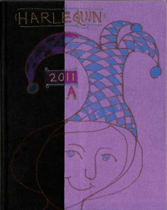
Harlequin cover, Sketchbook 2011 A

When I finished the journal above I decorated the cover and sketched a self-portrait as I do for the last page of each sketchbook. This journal is called Harlequin (theoretically because of the multi-colored cover–the back is turquoise, the front is lavender with black spine covering). I know the word “harlequin” has nothing to do with patching together leftover bits of bookcloth to make a cover, but I let my sketchbooks name themselves and this one wanted to be called Harlequin.

I used (expensive, oil-based) Sharpie Paint markers for the color on the cover but they didn’t show up at all on the black and required several layers on the lavender. Despite the art store clerk’s recommendation, Sharpie Paint markers are not meant to be used on fabric. Annoyed with the markers, I switched to a gold gel pen for the words and lines.

End of sketchbook self portraits, ink & watercolor

These are the two journal-ending self-portraits sketched on the last spread of the book above. I don’t know why I refuse to try for accuracy when I sketch self-portraits. I just draw and see what happens instead. The first one (on the left) feels like me, even though the proportions are wrong. The one on the right is wrong in so many ways I might as well have been drawing a completely different person.

Newly bound journal
Newly bound journal

I’d planned to experiment with dying my own bookcloth for the new journal like Shirley does, but when I went to the store to get the Wonder-Under (iron-on stuff to fuse fabric to paper backing) I fell for this linen fabric and used it instead. My adventure on the previous journal was figuring out how to patch the bookcloth together. This one was figuring out how to fuse the fabric to the Thai Mulberry paper per Shirley’s instructions (the hardest part was figuring out how to peel the almost invisible paper backing off the Wonder-Under). Maybe next time I’ll dye fabric.

I’ve also updated my file How to Bind a Watercolor Journal (as I do each time I bind a journal and learn more) and it’s available to download on the Comments & Resources page of my website, JanaBouc.com.

Categories
Berkeley Drawing Flower Art Ink and watercolor wash Painting Places

Wisteria Hysteria in Berkeley

Cathy's Wisteria, ink & watercolor

It’s become an annual tradition for our sketch group that when Cathy’s wisteria explodes into bloom she invites us to spend the evening in her serene Berkeley backyard garden sketching and painting. This year it was a cool, foggy evening so we bundled up and drew until our fingers were too cold and the light was gone.

Wisteria close up, ink & watercolor

Then we went indoors and shared our work while snacking on ginger cookies and pistachios.

Our excellent online Berkeley newspaper, Berkeleyside, published this wonderful photo essay “The Hanging Gardens of Berkeley” with pictures of wisteria in brilliant bloom all over Berkeley, in some cases completely hiding the buildings.

Sharing art with other sites is fun (and as it turns out profitable). Berkeleyside features my sketches of Berkeley from time to time (linked here) and I’m always honored when they do. Then a few months ago a natural foods specialist asked if she could use some of my paintings on her website. I’m glad I said yes. One of her readers just bought three of those paintings. It’s good to share!