Plink Cereal Dream, ink & gouache, in Moleskine 5x7"
I had a dream last night about a new cereal called “PLINK” that was designed to be eaten at your desk. I think the name of the cereal comes from the sound the computer makes when a new email message arrives.
This morning when I prepared to do the dishes waiting for me in the sink (OK, not just my breakfast dishes but about three days worth) I discovered it was completely clogged and wouldn’t drain. I poured a teakettle full of boiling water down the drain, thinking that might help, but all it did was fill the sink even more. I left the dishes piled in the mucky water and went to work.
Clogged Drain Nightmare, ink & gouache in Moleskine, 5x7"
When I came home I asked my neighbor who knows everything about working on houses, what I should do. He came over with a plunger and spent 15 minutes trying that approach. But instead of emptying the sink, the plunger added what looked and smelled like rusty mud to the water. In a way it was an improvement over the left-over cauliflower scent from last night’s dinner.
After spattering muddy water everywhere he gave up and promised to bring over a drain snake tomorrow night. I tried to look on the bright side: since I couldn’t wash dishes or vegetables, I had a perfect excuse to neither cook nor do dishes.
I had a bowl of cereal for dinner. Not PLINK though, just Cheerios.
Dancing Nude at the Office Party, Ink & watercolor, Moleskine sketchbook, 5x7"
I dreamed that I was at an office party where dancing was to be done nude. I was having fun, and surprised that I wasn\’t the most embarassed person there. There was a woman who was so self conscious she\’d wrapped herself in a gauzy fabric trying to (unsuccessfully) hide beneath it. The dream was fun but it was even more fun to draw it and just see who appeared beneath my pencil.
I usually like to draw directly in ink but I wasn\’t sure where I was going with this one so started with pencil and then inked over it.
Oh…I guess I should also mention that while my office does have nice parties, dancing nude has never been an option at any of them and, I\’m quite certain, never will be.
So I’m still at it with these camellias, this time in oil. I have a plan for Camellias #4 as I still haven’t quite got what I’m after. I want to see if I can get bright light colors in oils without the chalkiness of white paint. I think that will mean using thin transparent washes instead of thick paint, even though the usual method in oil is to make lights thick and darks thin.
I couldn’t resist drawing this one cutting from my camellia bush instead of going straight to the oil painting I was planning to do of the little bouquet of camellias I was assembling. I wanted to enjoy deeply seeing all the shapes and connections and patterns and reflections and colors in the leaves, buds, and flower.
I realize now that I should have gone a little more slowly when I was drawing the flower petals so that I could really capture the personality of this particular flower, the way I did with the leaves and bud. But I think it was making me dizzy, trying to follow all those different curly shapes and ins and outs of the line so I got a little lazy and generalized instead of paying absolute attention and getting it exactly.
I’m always torn between going for the detailed exactitude of botanical illustration and the way oil painters say to skip the detail, skip the individual petals and paint the mass, the form instead. I see the value in both but combining them in one painting rarely satisfies either goal.
I spent hours and hours standing at the easel this weekend, determined to once again try to paint a portrait of a little boy whose photograph I took a couple years ago at the San Francisco Museum of Art. After many hours and sore feet, below is how the painting turned out:
Canvas painted over with white paint
It had a few promising phases but I just couldn’t “execute” any of them to completion. At the end of the day I gave up and saved the lovely linen canvas to reuse by painting it over with white paint.
Tonight I decided to do something in watercolor just to try to have a little fun. When I went looking for a subject to paint everything seemed tired and insipid. I think I’ve seen one too many meaningless little still lifes with a clove of garlic, a lemon slice, or an apple. I started wondering, “What’s the point?” so the pointy juicer seemed a perfect subject.
I wasn’t happy with the first (overworked) version below, so I tried it again and the second version is at the top of the post. I didn’t have an orange to juice so I made pretend orange juice with watercolor paint.
What's the Point? watercolor on hotpress paper, 6x4"
Since I’ve been in a stuck place for a couple weeks I’ve been trying to figure out what kind of artwork would bring back my creative juices. Just making pretty pictures, developing good enough technique to be able to make classical still lifes or impressionist landscapes or traditional portraits isn’t it. So I made a list of what I do enjoy:
going out sketching with ink, watercolor and sketchbook
painting subjects with emotional content (like the two autobiographical series I’m planning)
painting large, getting lost in the painting, having unexpected things appear and running with them
drawing complicated subjects or painting details in watercolor
painting my crazy dreams
creative thinking to come up with concepts and images based on one-word challenges like Illustration Friday offers
painting without a lot of planning, just jumping in and seeing what happen
I was stuck on #2 because I was envisioning working with large canvases (30×40″) but thinking about the cost of the canvases and the paint to cover them, and where I’d hang them or store them if I actually made as many in the series as I intend…. and then as I was writing about this in my journal I realized the solution:
Just start! Go for it! Go wild! Play! Forget about the product and enjoy the process. So I’m going to START with the bigger of the canvases I have on hand and just keep going from there. And I’m going to get out and sketch more.
Last night my step-granddaughter Mariah, a brilliant, almost 10 year-old artist with an enviable sense of design and assurance and confidence in her work came over for a visit while her parents went out to dinner. Even though she she was sick, she was still up for doing some drawing and painting.
We picked a few camellias from my tree and got to work (or was it play?) drawing. She wanted to use acrylics; I fooled around with gouache and watercolor. Here’s her painting:
Mariah's Camellias, Acrylic & graphite on paper, 8x8"
And here are the two I did last night. (The one at the top top of this post I did this morning, with the flowers beside the window. I wasn’t ready to stop painting these pretty flowers, the first of the flowers to bloom in my garden.)
Camellia #2, Watercolor & ink on paper, 6x4"Camellia #1, Gouache and graphite on paper, 4x6"
I really don’t like the way using white with gouache looks so chaulky. I much prefer the clear lights in watercolor that you get by leaving areas white or only lightly glazed with color.
My artwork, that is. I’ve been doing a lot of thinking and planning for my next art projects, but other obligations have taken up my art time and energy. All I’ve done the past few days is the watercolor sketch from a trip to the U. C. Berkeley Botanical Gardens (above) and the BART subway sketches below. The aloe was drawn and a bit of wash added on site; then I messed with it some more at home. There were so many wonderful options for sketching there, but my companions weren’t interested in sketching so I didn’t want to make them wait for me.
Backpacking on BART, ink in sketchbookBig Feet & Big Glasses, ink in sketchbook
I’m quite sure this woman knew I was drawing her and I think she intentionally held her pose for me. I started with her feet because they interested me and I didn’t think I’d have time for anything more. But because she held still I continued on up her legs and eventually ran out of room when I got to the top of her head. She gave me a big grin when I got off and I gave her one back. It was a cool little acknowledgment between us.
I’m going to start keeping my “business cards” handy when I subway sketch (those cute little Moos with bits of my artwork and blog address on them) and hand them to people I’ve drawn as I get off the train (if I have the nerve).
Taking Notes, ink in sketchbook
These two women weren’t really seated this close. I just used the space on the page that way.
Sometimes I forget that people from my “day job” read my blog. I was in a meeting last week and one of the participants began the meeting by mentioning that she’d seen my sketches from the previous meeting we’d attended and immediately recognized some of the people in the sketch. What a compliment that was! (Thanks A. B.!)
I love Trader Joe’s Balsamic Vinegar. It’s delicious as a salad dressing all by itself; it’s not too tart or bitter and has a pleasant, mild sweetness. I bought a second bottle to take to my office and when I saw them sitting side by side on the counter I thought they looked cute and wanted to paint them.
Then, just as I was nearly finished with the painting, the panel popped off the easel, and seeming to be in slow motion, bounced off the brush holder and landed on the floor, right side UP! I was so surprised, since nothing I drop ever lands right side up, but it did. I was really relieved and went back to doing some final touch ups.
The next thing I knew it was sailing through the air again, flipped, bounced twice, and finally hit the floor painted side DOWN this time. I was ready to get really sad, but amazingly there wasn’t too much damage. The biggest problem was the cat hair. I’d been meaning to vacuum sometime soon….
I touched up the areas that lost paint, picked out all the cat hair using a clean soft brush, wiped the paint off the floor and declared the painting done. I may work on it some more after it dries. But for now, it’s time to clean up, make dinner and then (ugh) do my taxes.
After I posted this painting a few weeks ago I realized I’d left off the foamy bubbles on top of the water. Last weekend I worked on the painting some more, at first planning to just add the bubbles but ended up adding a whole new layer of paint. I gave Hannah another haircut and slimmed down her dress a bit. I felt a little afraid to go back in and start messing with things, but told myself to just have fun and see what happens.
I don’t think I quite got the essence of the foam, it looks more like rose petals floating on the surface, but I decided I liked that idea and left it alone.
I’m wondering if there is a problem with the grasses behind the rust colored reeds on the middle right that sort of point towards her head. Should that patch of yellow-green grasses have less texture, be cooler and more blurry so that they recede more? I think so.
Here’s what it looked like before in the original post:
Hannah's Reflection, Oil on Gessobord, 16x12
I’m trying to get over the idea that paintings need to be completed in one painting session or in one day. Alla prima and plein air painting is great, but so is letting layers dry and adding more more until the painting says it’s done. Sometimes it forgets to say “When” though, and then it’s overdone.
I have the same trouble with steaming vegetables. I lose my concentration and before I know it my broccoli has turned to mush. So is the revision mushy broccoli or an improvement? Do you think I should soften those grasses or move on?
Thinking about painting and broccoli reminds me of this poster I made a long time ago:
"Listen to Your Broccoli and It Will Tell You How to Eat It," Colored Pencil, 24x18"
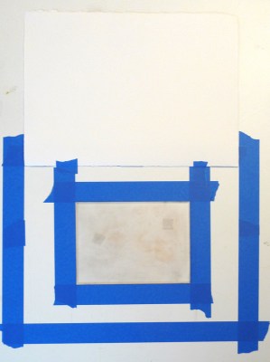
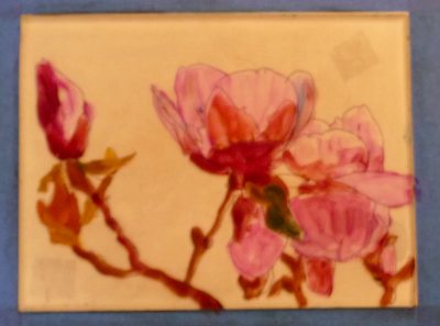
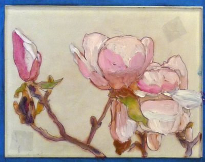
After watching a demo of how Golden’s new Open Acrylics can be used for monoprinting (since they stay wet 10 times longer than regular acrylic paint) I was excited to give it a try. I love monoprinting but working with oil-based inks can be messy and the cleanup isn’t fun so using acrylics seemed like a great option.
I think Golden’s Open Acrylics have a lot of promise as a painting medium, and seem to combine good features of oil and acrylic, but I wasn’t at all happy with the way they worked with monoprinting. As a matter of fact, these two preliminary painting layers (above and below) on the plexiglass plate, pleased me much more than the prints I pulled from them. I had much better luck previously when I used printing inks (see previous posts Persimmon Monoprint, Magnolia Monoprint andTurtle to Swan monoprints).
Paint on plexi plate 2
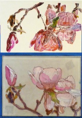
Below are steps along the way:
1. Tools and palette
2. Setting up the registration
3. First layer print
4. “Cartoon” on back of plexiglass
5. Paint on plexi
6. Plexi and print
7. Paint on plexi plate 2
8. Print above, plexi below
9. Paint on plexi plate 3
10. 1st print final
11. 2nd print final
12. 3rd print final
13. 4th print, final
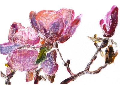
14. Original photo
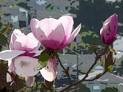
15. Photo reversed and posterized in Photoshop
To read the details about the photos above, or find out how you can watch the video demo that inspired me to try this by artist Tesia Blackburn, please click Continue: