Categories
Bookbinding Drawing Illustration Illustration Friday Monoprint Other Art Blogs I Read photoshop Quick Sketch Still Life Virtual Paint-Out

Boring? Not!

Peet's Coffee Corner, El Cerrito, ink & watercolor, 7x5"
View north from Peet's Coffee, El Cerrito, ink & watercolor, 7x5"

At first glance, the corner of San Pablo Avenue and Carlson in El Cerrito is boring, boring, boring: a wide busy avenue with boxy buildings. But when viewed on a lovely summer day from a cafe table outside Peet’s Coffee with pen in hand, it transforms itself into a sketching delight full of fun details and color.

San Pablo Ave. Wells Fargo, El Cerrito, ink & watercolor, 5x7"
View South down San Pablo Ave. Wells Fargo, El Cerrito, ink & watercolor, 5x7"

Looking the other way down San Pablo, the Wells Fargo Bank building holds little hope for drawing inspiration. But start sketching and it too transforms itself. There are trees of all kinds and colors. A cerulean sky with only a hint of clouds, a pink apartment building and a gold dentist office. Sun, shadows, banners.

Not boring! I don’t think I’ve ever felt bored when I was sketching. Years ago a friend told me that when I was sketching I looked like I was roller-skating. Whee! Let’s skate!

Categories
Acrylic Painting Flower Art Monoprint Painting Print making

Monoprint Experiment with Golden Open Acrylics

Paint on plexi plate 3

After watching a demo of how Golden’s new Open Acrylics can be used for monoprinting (since they stay wet 10 times longer than regular acrylic paint) I was excited to give  it a try. I love monoprinting but working with oil-based inks can be messy and the cleanup isn’t fun so using acrylics seemed like a great option.

I think Golden’s Open Acrylics have a lot of promise as a painting medium, and seem to combine good features of oil and acrylic, but I wasn’t at all happy with the way they worked with monoprinting. As a matter of fact, these two preliminary painting layers (above and below) on the plexiglass plate, pleased me much more than the prints I pulled from them. I had much better luck previously when I used printing inks (see previous posts  Persimmon Monoprint, Magnolia Monoprint and Turtle to Swan monoprints).

Paint on plexi plate 2

Below are steps along the way:

To read the details about the photos above, or find out how you can watch the video demo that inspired me to try this by artist Tesia Blackburn,  please click Continue:

Categories
Flower Art Monoprint

Magnolia Monoprint 1

Magnolia Monoprint 1-A

Monoprint; Gamblin oil-based etching ink on Arches 88 paper, 6×8″
(To enlarge, click image, select All Sizes)

I made two different monoprints of this image, applying ink to the glass plate and then wiping it away and drawing in it to make the design, working from the same drawing for each. I’m just posting one for now but I’m going to add watercolor to each of them with two different color schemes. I’m too tired tonight to add the color but now that the ink is dry I thought I’d go ahead and post one in black and white. Tomorrow I’ll add the color to both monoprints and post the colored versions.

I successfully delegated one of my most dreaded monthly work projects to a colleague this week who did a great job with it, and saved me hours…no days…of misery and made it look easy. I’m so delighted by this and also by our hiring a new support person today which means being able to delegate even more projects to our support team. I’m hoping that will mean not having to work quite as hard so that I still have some energy and a little brains left for artwork and play when I get home in the evenings.

Categories
Monoprint Watercolor

From Sea Turtle to Swan

Monoprint 4 -w/Watercolor

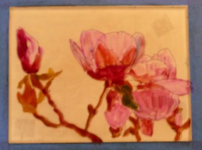
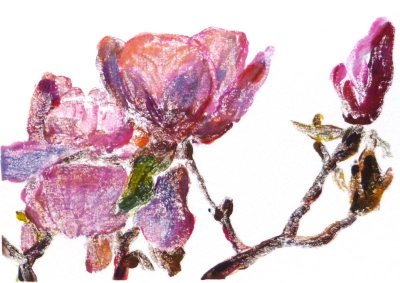
Monotype 2: Swan. Ink & watercolor on Arches 88 printmaking paper
(To enlarge, click images, select “All Sizes”)

Monoprint 4 - B&W

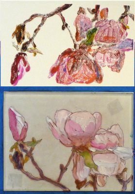
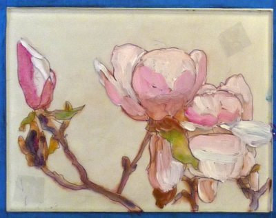
Monotype 2: Sea Turtle, Ink on Arches 88
(Same monotype as above but in original orientation and scanned before painting)

Monotype 3

Monotype 1 – Massage Dream. Ink & watercolor on Arches 88
(Click to enlarge)

I was working without too much of a plan for these monotypes. I started with the image directly above (Monotype 1) with an idea from a dream I had about a massage. I rolled the ink onto a plexiglass plate, removed it in places, and then printed onto paper. Then I started over with Monotype 2 with no image in mind, just making marks, until a swimming sea turtle appeared, which soon had long flowing hair. (No I wasn’t high, just being playful, not attached to the outcome. It was sort of like watching clouds float by, seeing shapes appear in the clouds.)

Today the prints were dry so I added watercolor, using the same playful, “see what happens” attitude. I’d never painted on Arches 88 printing paper before and it was really interesting. The smooth, unsized paper immediately absorbs the paint — there’s no moving it, blotting it or changing it, except to add more color. I painted #1 (the massage picture) first and was thrilled with the colors that appeared and how it seemed to turn into an underwater scene. When I prepared to paint #2, I turned the paper around a few times to see which direction worked best. Turned 180 degrees I saw a swan-like creature so that’s what I painted.

A note on printing ink. I’ve been testing printing inks to determine which I like best for “reductive” monotypes. I used Graphic Chemicals Bone Black Etching Ink for these, and liked it a lot. It’s easy to apply and wipe off, and prints a rich, dark black. I also experimented with Daniel Smith oil-based relief ink and a sample that Gamblin sent me of their Portland Black oil-based ink. The prints I made with those inks are still wet so I can’t scan them yet. The Daniel Smith was the stickiest and hardest to wipe (though it can be thinned with burnt plate oil to make it easier to work with) and the Gamblin ink was somewhere inbetween the GC and DS. So far I like the Graphic Chemical ink best.

Categories
Colored pencil art Monoprint Outdoors/Landscape Sketchbook Pages

Monotype – Larkspur Landing

SirFrancis-monotype

Monotype and colored pencil on Arches 88 paper 6″x8″
(To enlarge, click image, select “All Sizes”)

This is the second monotype I made of this scene  from this sketch. Monotypes are one of a kind, so if you goof it up, you start over from scratch. With this kind of “reductive” monotype, you spread the ink on the plate (a piece of plexiglass) and then using Q-tips, rags, pointy things, and/or fingers, you wipe away the ink in the places that you want to be white or where you want to apply color later. It’s sort of like carving a woodblock or linoleum block except that instead of ending up with an image you can print repeatedly, once you press the paper on the ink to make a print, you have nothing left.

The first monotype I made of the scene printed too lightly and when I tried to press it again (by hand using a flat disk called a baren), the plate slipped. So all my work creating the image was lost because it made an off-register double image that was still too light (see below). So I wiped all the ink of the plate, reapplied it, and starting over, removing the ink to create the image above. When it was theoretically dry I applied colored pencils.

Bad print - Larkspur

It’s double-vision image is sort of interesting, so I might still play with it a bit, adding some color and seeing what happens. The thing I love about monotype is that forces you to let go of control and play and experiment.

A note about inks: I used water-based Akua Intaglio ink on these, and though I like the way the one at the top turned out after being colored, I didn’t like this ink. It continues to smear and is still water-soluable weeks after it was printed. I’ve found that oil-based inks are much nicer to work with, make a darker image, don’t dissolve if you add watercolor and dry more quickly than this ink. To my surprise, they clean up with a little vegetable oil and some soap — no need for solvents.

Categories
Monoprint

Persimmon Monotype #1

Persimmon 1

Akua Kolors on Arches 88 paper, 6×8″
To enlarge, click image, select “All Sizes”

Monotypes are really interesting to make and really confusing. I’m just barely finding my way with the process. For one thing, in order to make the final print not be a mirror image of your original drawing or photo, you trace the original and then put the tracing paper upside down under the acrylic printing plate as a template. That doesn’t seem to difficult until you also try to refer to the original drawing or photo which is now a mirror image of the one you’re working with. So if you want to see what color something is in the original, it’s all backwards. I finally solved that problem by looking at my original photo in a mirror I propped up beside it.

The other complicated part is that I was doing three printings on the same paper of yellow, blue and red — sort of like glazing in watercolor — in order to mix additional colors by layering them on the paper. First I applied yellow on the printing plate (a sheet of acrylic) where I wanted the image to end up with yellow (or green or orange after applying blue and red), and wiping it off where the image should not be yellow and then printed it. Then I did the same with the blue ink, wiping it off where I wanted the yellow to stay yellow, not become green, or where I was going to want purple later and then printed that layer. Then I did the same for the red, trying to get some oranges over the yellows, purples over the blues and dark brows for the branches by combining all three colors there. I was going to do one more layer to add some black lines but had to stop and get ready to go out for the evening.

Tomorrow I’m going to explore some more with monotype (I’ll photograph my process and post that too, which will probably be easier to understand than my explanation above). I’m also going to finally begin a full-sheet watercolor painting I’ve been meaning to get started with for way too long.

Categories
Colored pencil art Drawing Monoprint Still Life

Monoprint experiment

Monoprint Lantern

Black water-based printing ink & colored pencils on Stonehenge paper, 7×9 inches
(To enlarge, click image, select “all sizes”)

Today I experimented with making monoprints, having been inspired by Belinda del Pesco‘s amazing monoprints, and Kris Shank’s woodcuts. This is the same candle lantern I drew and posted a couple days ago. I’ve drawn it so many times now — for each monoprint you have to do the drawing again. I think some of the others were better drawn but this one was dry and I could add color, so its the one that gets posted.

I’d never made monoprints before and didn’t know anything about how to make them so I read a few articles on the internet and then went to the art store. I bought both water-based and oil-based printing ink and a brayer to roll it out with and some print-making paper. I tried lots of different approaches and had a good time learning what works and what doesn’t. My usual way of learning things is quite different: read lots of books, research all the details, make sure I have all the right equipment and supplies and know what I’m doing before I do it. This time I just experimented, letting it be an adventure, saying “let’s see what happens if…” I made many interesting mistakes and a bit of a mess but since I wasn’t too attached to the outcome it was a great day.

There’s several approaches to doing monoprints and the one I liked best was to apply the ink on a sheet of acrylic and then sort of carve away and push around the ink using various implements, none designed for that purpose (stumps, rubber clay tool, coffee stirrer, paintbrush handle). Once I had the drawing done, I put a sheet of paper on top of the plastic and used my rolling pin to press the paper and ink together. The water-based ink dried fairly quickly on the paper so I was able to add colored pencil to it this evening. I tried applying watercolor but it melted the ink. I think I’ll be able to add watercolor to the oil-based prints once they’re dry. I made half a dozen prints. Two were complete flops and the rest were not bad for a first try.

I also bought a couple of linoleum blocks and carving tools so I’m going to try that next. Then it’s back to watercolor — I have several paintings just begging to be painted.