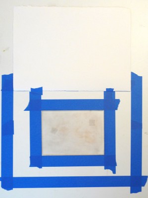
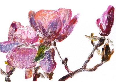
Linoleum block print 4″x5″ DS water-based ink on Arches cover paper
(To enlarge any of the images, click image, then select “All Sizes”)
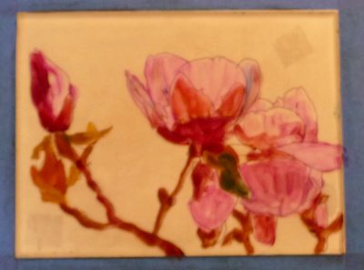
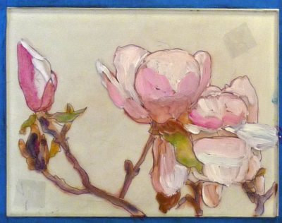
Yes, I’m back to the lantern image again. This time I drew it on paper, traced it on a linoleum block and then carved all the areas that appear white in the image. Then I inked the block and rubbed the paper onto the block. I’ll add watercolor when the ink is dry.
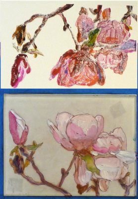
Doing all the carving gave me a terrible stiff neck from looking down so long. I also tried adding some colored ink designed for monoprinting that was too wet and didn’t quite work out (below).


Linoblock print with DS black ink and Akua Color yellow, red and blue monoprint inks on Stonehenge print paper
Today I also started my experiment with oil paints, although I’m wondering if I should have gone to acrylics instead. I’ve long been admiring Andrea’s acrylic paintings and Carla Kurt’s beautiful acrylic painting here. Both of these artists have generously shared information with me about acrylics that have tempted me to jump right in and try them. But I’ve already got oil paints and love their consistency so I need to give them another go first. I dug out my old oil painting kit from 20 years ago and sorted out the paints and did some color tests. I’m worried about getting oil paint on my hardwood floors, clothes and cats, though I assume the problem is the same with acrylics. I guess I’ve been spoiled by the easy cleanup and low toxicity of watercolor which will probably always be my #1 medium.
I feel so sentimental about my old oil paint kit (just smelling the linseed oil brings back many happy memories of my life back then) so I took a picture of it. Here’s the kit and my paint tests:


(Painting kit, oil paints, flesh tone color mixing chart)
It was a good art day. I also took some photos for a possible still life painting. I put these veges together for my class on Saturday and stuck the setup in the fridge so I could photograph it. But after a couple shots my camera battery died and when it was charged again, the sun disappeared so I wasn’t able to get just what I wanted. I think the one with the white cloth is my favorite except there are no shadows since the sun was behind a cloud. I’ll probably just combine elements from the photos once the veges themselves get funky.
What do you think? (ignore the background–the grass and fence won’t be in the painting).


(Comments welcomed on acrylic vs. oils, photo selection or anything else — but you have to scroll back to the top to click on Comments.)