Categories
Art supplies Art theory Flower Art Published work Sketchbook Pages Still Life Studio Watercolor

Refusing to Fail or Quit: It was either me or the orchid…


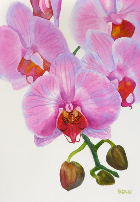
Orchid in watercolor #2, 12x9"


On Wednesday night I completed the last page in a sketchbook with some writing about the frustrating process I’d been through with the orchid painting. And then, as I did one last sketch of the orchid in the book (below) I realized how I might be able to actually make the painting I’d originally envisioned. It would be one I could do simply and be able to write about as the six-step process the publishers needed.

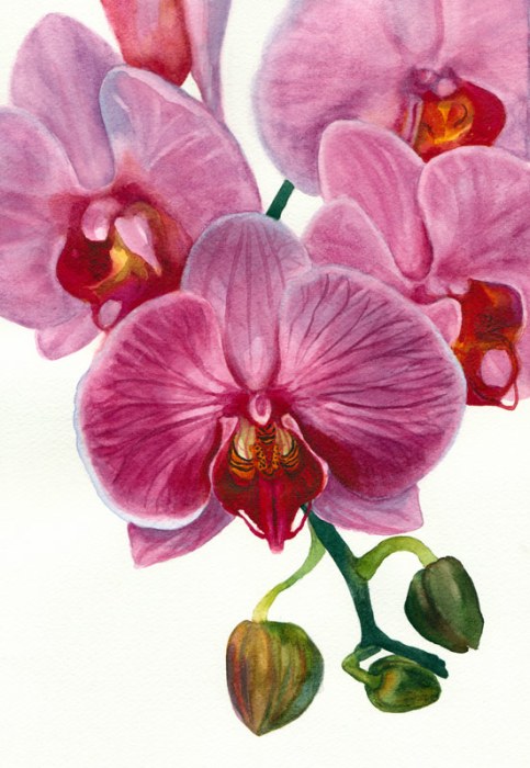
When I woke up on at 6:00 a.m. on Thanksgiving morning I realized I had to give it another try. The image above is the happy result.
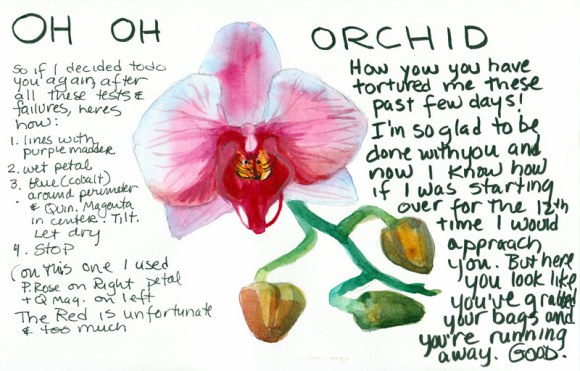
 

Oh Oh Orchid!
My sketchbook breakthrough

Tonight my watercolor group met for dinner and a chance to share what we’ve been painting this month. When I showed them the two versions of the painting they liked both but Susie said that in the first version they looked like evil man-eating orchids, which is certainly how they felt to me. In the sketch above I thought the orchid looked like it had packed his bags and was running away, suitcases in hand. (Good riddance!)

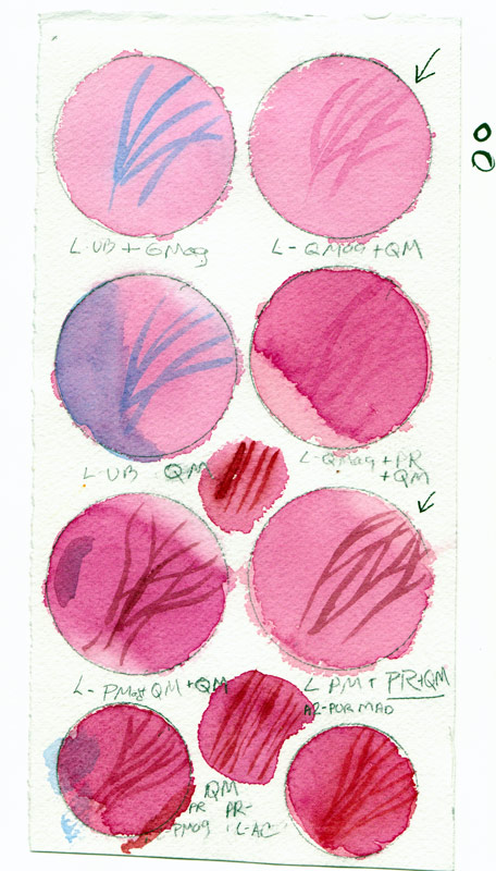
Here is one of the MANY pages of tests and samples I made in trying to find the right pigment combinations to make this painting work.
Orchid watercolor test page

I decided the pigment that gave me the color I wanted was Winsor Newton’s Quinacridone Magenta but like most quinacridones,  it wasn’t very civilized, trying to spread everywhere.
Orchid Painting Steps

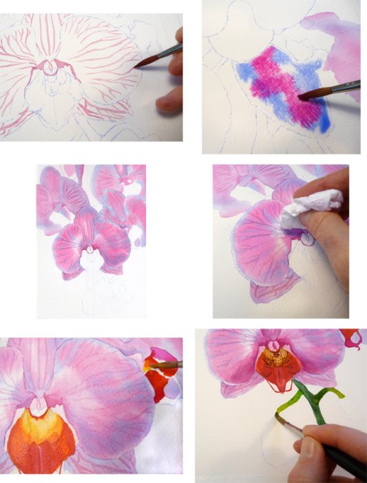
What finally worked was painting the veins first on dry paper, wetting a petal, painting cobalt blue just inside the perimeter and then dropping in the Quinacridone Magenta in the center, letting it spread and then blotting up a bit of the paint as needed.
Busby relaxing amidst orchid chaos

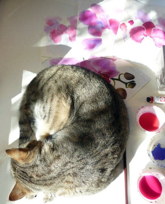
At least someone got to relax in the sun. When I left to make a cup of coffee Busby napped amidst the orchid chaos on my desk. You can see the original reference photo peeking out from under him, with a pile of false starts at the painting behind that.
 

Categories
Art theory Flower Art Painting Still Life Watercolor

Orchid Painting in Watercolor for the book but….

Orchid painting in watercolor, 8.5" x 11.5"

So here’s the frustrating thing: I learned that the publisher wants me to write the text accompanying the step by step photos as instructions (first do this, now do that) rather than a description of what I’ve done. Sometimes watercolors go as planned and that would be simple to do, because what I did is how I would tell someone else to do it.  But with this painting there was just as much taking off of paint as there was putting it on. Some of that was about softening edges with a damp brush and then blotting, but some of it was just removing paint that wasn’t working. I’ve never seen a “how to” book that says paint on a nice wash. Now wipe it off.

My biggest problem with this painting was the photo I had to work from. Like many artistic photos of flowers, it was shot without shadows or directional light and therefore everything was very flat with little dimensionality. Even more difficult, everything except the front center flower was intentionally out of focus. That makes for a lovely photo but not an easy watercolor painting project. And there is no variation in color: they’re all just cotton candy pink with dark magenta veins. And I picked the stupid photo and thought it would be easy. But for me, what is easy is lots of detail and variations in color, shape and value.

I started over four times, each time getting a little further and then abandoning ship. If I was just painting for myself any of those starts would have been fine and enjoyable to paint but I was finding myself exaggerating shapes and colors and losing fidelity with the photo.

Now I’m not sure what to do: Paint this again in order to be able to do write a logical “how to” that doesn’t include undoing previous steps? Write a “how to” and leave out the do-overs? Enjoy my vacation this week and forget about the whole project? (the latter sounds most appealing)

I think I’ll send a photo of the painting to my editor and see if she even likes the painting. My persistent (compulsive?) side really wants to paint the painting again, trying to do it more simply and cleanly. But my (sane?) side says “Go have a bowl of ice cream and watch a movie.” I wonder which side will win and how late the ice cream shop is open?

Categories
Art theory Flower Art Painting Plants Still Life Watercolor

Painting for the book: Part III ~ Finale

"Sunny Serenade", watercolor, 15.5"x10.5"
"Sunny Serenade", watercolor, 15.5"x10.5" (click to enlarge)

The editor requested that I name the finished painting (above). Corny painting names are a pet peeve of mine and so I rarely name them. But as I was uploading the image the name “Sunny Serenade” came to me. I know that’s about as sappy a name as you could try to invent, but since it seemed to name itself, so it shall be.

To finish sharing the steps in the painting, here they are in order, continuing from the previous post.

Painting the green leaves, flowers and stems

The next step was to work on all of those leaves, stems, buds and little yellow green flowers. Using a variety of mixed greens, some neutralized with Burnt Sienna, I painted the first layers of the leaves. I also glazed details over the yellow green flowers I’d painted previously.

Adding the darks
Adding the darks

I mixed up several puddles of these dark mixtures: Winsor Green, Alizarin Crimson, and Burnt Sienna; Ultramarine Blue and Burnt Sienna; Sap Green and Sepia with a dab of Winsor Red; Winsor Green and Winsor Violet. Then I loaded my brush with one and started painting a section, switching to another one of the puddles as the background colors changed. I was careful to stay within the dark shapes and to negatively paint around lighter shapes. Because watercolor dries lighter, I tried to mix colors that would be dark enough in one layer.

I thought I was finished and signed the painting. The next day I studied the painting with fresh eyes and realized I needed to make some adjustments. I glazed in some more darks on the right of the pitcher and on its handle on the left. I added a middle-dark green mixture to the long leaf that hangs down along the right side of the pitcher and on some other leaves as well. (Compare the pitcher in the top two pictures in this post to see the changes).

While some people have commented that this painting seemed very challenging, in fact an image broken into many small complicated shapes is much easier to paint and more forgiving of “mistakes” than one composed of large simple shapes.

My editor liked the painting and immediately requested the next one, due the end of November. It will be a completely different project: a close up view of some pink orchids with a light background. I will be working much more loosely, mostly wet into wet.


Categories
Art theory Flower Art Painting Published work Still Life Watercolor

Painting for the book: “Must Paint Watercolor Flowers” – Part II

Starting orange flowers; softening an edge

Continuing on from Part I, here is a close up as I began to paint the yellow and orange flowers. For the first layer of this flower I painted the darker sections and then used clear water in a damp brush to pull/feather the color out into the flower so it didn’t make a hard edge.

Yellow underpainting of some flowers
Yellow underpainting (click to enlarge)

For the three large zinnias, I outlined all the petals with Holbein Cadmium Yellow Light. Then I brushed a ring of clear water around the center of each of those flowers and painted a narrower ring of yellow inside that so the paint would softly spread in the water to not quite the edge of the water, producing a soft edge. When that dried I painted the flower’s very dark center with a mixture of Winsor Newton (WN) Burnt Sienna and Winsor Violet. Then I painted the gold ring between them with WN Cadmium Orange mixed with Daniel Smith (DS) New Gamboge.

Painting one petal at a time

I began applying mixtures of WN Cadmium Orange, WN Permanent Rose and DS New Gamboge to one petal at a time while avoiding painting over the yellow outlines on the petals,. You can see the juicy puddle of color I like to put down. I’m careful to let it dry without shifting the tilt of the paper to avoid backwashes.

Orange flowers completed

I worked all over the paper, turning the painting sideways and upside down instead of reaching across, to complete all of the yellow and orange flowers. Some of them will get touch-ups before the painting is completely finished.

Next time: more greens, the dark background, and the finished painting. Meanwhile, I’ve been assigned the next painting to do: a lovely orchid which I will approach in a completely different manner.

Categories
Art supplies Art theory Drawing Flower Art Painting Published work Sketchbook Pages Still Life Watercolor

Painting for the book: “Must Paint Watercolor Flowers” – Part I

Rehearsal: Sketchbook pages

I was given permission to post some of my work on the upcoming book, “Must Paint Watercolor Flowers” (Quarto Publishers, London) for which I’ve been commissioned to paint three floral watercolors.  The painting is the easy part; taking the photos, correcting them in Photoshop, and writing about each of the steps takes much more time and isn’t nearly as much as fun. I thought I’d break this into a few posts so they won’t be too long.

My first step after being given my choice from a couple dozen excellent photos (which I’m not permitted to post) was to do some rehearsals in my sketchbook. I used several pages to experiment with how I wanted to approach the metal pitcher,  mixing colors for the leaves, the buds and the yellow-green flowers (above). Then I experimented with color mixtures for the orange flowers and the large amount of darks (below — combinations of Winsor Green and Alizarin Crimson, Ultramarine Blue and Burnt Sienna, Sap Green and Sepia, Winsor Green and Winsor Violet).

Rehearsal - Sketchbook p. 2

Next step was to transfer the photo to my watercolor paper. Initially I was going to make the painting small enough to fit on my scanner but decided to use the maximum size the publisher allowed since it was such a complex painting.  I chose a 12 x 16″ Arches 140 lb. cold press watercolor block  (block is easier to set up for photographing). If I’d been given more time and/or if the photo wasn’t so complex, I probably would have transferred the image by drawing freehand or using a “gridding up” method but with a two-week deadline I used a quicker method.

Transferring the photo to watercolor paper

I enlarged the photo in Photoshop and printed it in sections (before figuring out I could have more easily used my copier to do the same) and taped them together. Then I placed a sheet of Saral Transfer Paper on top of my watercolor paper and laid the enlarged print on top of the Saral. Using a ballpoint pen, I traced over the shapes of the flowers, leaves, stems and shadows which transferred graphite lines from the Saral paper onto the watercolor paper.

Cleaning up the drawing

See what I mean about how complicated the image is! I’d left too much of an overlap on the tiled together enlarged photo and some areas didn’t get a good transfer so had to freehand some of the drawing, clean up some lines and darken others. This is my new favorite mechanical pencil, the Papermate PhD Ultra.

Masking near the pitcher

I wanted to paint the pitcher wet-into-wet and so I applied Winsor and Newton Colourless Art Masking Fluid to some of the shapes around and projecting into the pitcher to make it easier to paint wet into wet more freely. I used a cheap disposable brush to avoid messing up my good ones. I prefer Cheap Joes Golden Fleece rounds for watercolor and even though they aren’t expensive, I don’t want to ruin them with masking fluid.

Pitcher painted, removing masking fluid
Detail: Pitcher painted, removing masking fluid

I like pulling off the mask with the rubber cement pick up tool. I think it’s made out of the same stuff Vibram shoe soles are made from. The pitcher and the table have had their first washes. Next step is starting on the flowers and that will be in the next post.

Categories
Drawing Flower Art Ink and watercolor wash Painting Plants Sketchbook Pages Still Life Watercolor

Wednesday Night with Hydrangeas and Windows 7

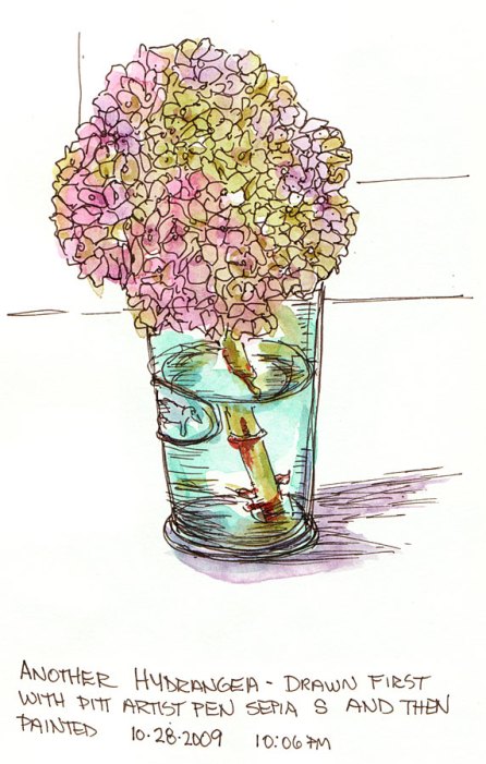
Hydrangea #3, ink and watercolor, 9x6"
Hydrangea in Cow Glass #3, ink and watercolor, 9x6"

I just needed some peaceful time at my watercolor table tonight to unwind. I’ve been admiring this hydrangea that’s been on my dining table in a little cow glass, the last remaining from a bouquet I’d picked. It’s soft pinks and greens were inspiring so I put on a book on CD and sketched and painted and listened to the story unfold.

Above is the third one, drawn first with a Pitt Artist Pen Sepia Superfine and then painted quickly with watercolor.

Below is the second one, painted directly without drawing first except with my brush and paint.

Hydrangea in Cow Glass #2, watercolor

And here is the first one, drawn first with pencil, then I wet the flower area, dropped in different colors and when dry painted a bit over it. This one got a bit overworked but had some nice moments along the way:

Hydrangea in Cow Glass #1, graphite and watercolor

You can see my notes in my sketchbook about never being able to remember the name of these flowers. I always go through a list of wrong names first and then have to look it up. It’s like the spot on my mental hard drive that once held the name “Hydrangea” has been corrupted and I just can get there anymore. But then I never really learned the name until a few years ago; we always called them “popcorn ball plants” when I was growing up.

I hope the colors look OK. I updated my computer to Windows 7 last night (finishing the final steps this evening) and things look a little different. Windows 7 is fantastic so far and the upgrade process was almost flawless. (Just one glitch with my graphics card driver that got resolved pretty easily.)

Categories
Drawing Flower Art Ink and watercolor wash Life in general Painting Sketchercize

No Power So Sketchercize & Play

Peets Coffee Drinkers, Ink & watercolor

It’s been a weird weekend. As the song says, “It never rains in California in the summer” except it did on Saturday morning after a night of thunder and lightening (also rare in the Bay Area). It was supposed to be a plein air painting day but the combination of rain and a headache convinced me to stay home and paint instead.

Then the power went out. It was too dark in the studio to paint without some lights and I needed coffee to try to get rid of the headache so I walked to Peets to sketch there. I used my sepia Copic Multiliner and then did a watercolor wash (mixing a few colors on my mini-watercolor palette to match the ink color.

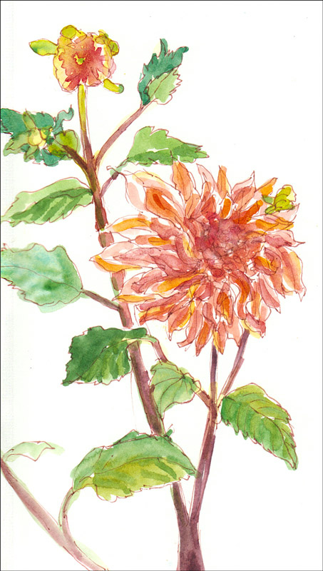
Alejandro's Dahlias, ink & watercolor

When I got home I called the electric company and they said to expect repair or a report by 11:00 p.m. that night so I made plans to go out to dinner and to the movies. I didn’t want to open the fridge so my food would stay cold as long as possible. Then I sat my sketching stool in the driveway next to my neighbor’s flower bed and sketched and painted a couple of his dahlias.

Then I took another long walk with  a friend, grabbed a fish burrito and went to see Julie & Julia which I loved! It had been ages since I’d been to the movies and even longer since I’d gone alone. I sat near another woman singleton who had the most infectious laugh and we laughed together throughout the delightful movie.

I appreciated the movie’s nod to the challenges faced by tall women (being one myself). The obsession with eating and cooking rich French food made me curious to know whether Julia Child ever dealt with body image issues or weight problems.I found these quotes from her in an interview in Business Week magazine in 2000:

Q: Could you sum up your feelings about the low-fat food movement? A: I don’t go for that at all…our motto is: “Small helpings. No seconds. No snacking. A little bit of everything, and have a good time.” If you can follow that, it keeps your weight and health in good form. Even if you’re going to have some rich dessert, you can always just have a little spoonful to taste it and keep your spirits up. Then I don’t think you have to go into that miserable, low-fat stuff.

Q: That’s more the French way of eating, I think. Americans always wonder why the French aren’t fat even though they eat rich foods.
A:
It’s because the French don’t eat these great big helpings. It’s really horrifying to them to go to Disneyland and see these great big fat Americans plodding along, always eating something. No snacking is very important, I think.

I have a feeling she’s right about the snacking, but I know I find it a lot easier to maintain my weight if I cook and eat simply than if I’m surrounded by delicious, rich food and try to just eat a spoonful to taste it. But then I’d always rather be in the studio than in the kitchen, and am just as happy with a bowl of brown rice, broccoli and tofu than fancy French cooking.

P.S. The electricity came back on the next morning, 24 hours later.

Categories
Drawing Flower Art Glass Ink and watercolor wash Life in general Painting Sketchbook Pages Still Life

Attack of the Insidious Shoulds

Attack of the Shoulds #1, Mixed media

Sunday I got into one of those funks where no matter what I was doing I felt like I should be doing something else. It was a beautiful day: I should be out painting plein air. But there were paintings in progress in the studio that were calling to me. And then there were shoulds about the medium to use: I should be painting in oil, no acrylic, no watercolor…I was driving myself nuts!

So I sat myself down at the drawing table and just started writing  in my sketchbook journal all the shoulds I was hearing in my mind (but who was saying them–aren’t I the only one in there?). When all else fails I default to flowers. I picked a hibiscus, stuck it in a little bottle and started sketching. I got it wrong. I drew with a pen dipped in ink, I added wax crayon, watercolor crayon, rubbed it with a paper towel, rubber stamps, more ink, more crayon, and just kept angrily abusing the page, trying to dump the shoulds.

Attack of the Shoulds #2, Ink and watercolor

I wrote on the page: “Accept that it is all impossible.It will be wrong. It will be bad. It is pointless. And do it anyway. Because you can. And doing it badly is better than not doing it. Break the cycle. Stop the nonsense!” When there was nothing more to do the first page spread I started on the next, feeling freer. I tackled the hibiscus again, and did #2 above.

Attack of the Shoulds #3, watercolor and ink

For #3 above, I sketched with pencil, added watercolor and then outlined everything afterwards with a Pitt Sepia F pen.

Attack of the Shoulds #4, ink & watercolor

It was almost time to go to a dinner party but I squeezed in one more, which I mucked up a bit with too heavy outlining so added some fun scribbly white pen. The good news is that I did break the cycle, got over the shoulds and got back to having fun in the studio today.

Categories
Drawing Flower Art Painting Sketchbook Pages Watercolor

Painting Roses in the Hot Dark

White Rose #2, pencil & watercolor 5x5"
White Rose Version #2, pencil & watercolor 5x5"

This morning when I was watering the roses I noticed that the one I sketched yesterday (see below)  had opened and was even prettier today. But it was way too hot to sketch outside so I cut the rose and brought it in. Then it was way too hot in the studio too, even with  all the blinds closed and the lights off.

Trying to ignore the heat, I put the rose in a vase on the drawing table and shined one small light on it, with no light on my sketchbook and tried to really focus on the drawing instead of just approximating the shapes. It’s amazing how focusing on drawing makes the problems and discomforts of the world just drop away. But when the drawing was done, I couldn’t take the heat anymore and dragged the portable air conditioner into the studio. Ahhh relief.

I tried to be more careful with the washes for the shadows than I was yesterday, to keep the white rose white and let the shadows define the form. I’m happy with the way it turned out.

But yesterday, when I drew Rose version #1 below, I really liked my initial pencil drawing. Then I added watercolor on just the rose and liked that too [shoulda stopped]…but then I painted in the background and felt like I lost the definition of the form [shoulda stopped] …

White Rose #1, ink & watercolor 5x5"
White Rose Version #1, ink & watercolor 5x5"

…so then I added some lines with my Micron Pigma which just made it worse. At that point there was nothing I could do but close the sketchbook and look forward to the day when I finally learn the lesson of stopping while I was ahead!

Categories
Faces Flower Art Gouache Ink and watercolor wash International Fake Journal Month Life in general Other Art Blogs I Read People Sketchbook Pages

Who Am I? (Fake Journal Month)

Who Am I, Sepia Micron Pigma Ink & Gouache, 5.5x7.5"

This is the beginning of my contribution to International Fake Journal Month (read on for more about this). To participate, I’m filling a journal this month as a woman who doesn’t know who she is and is trying to find out. (Maybe she’ll learn how she lost her memory too.) I started by Googling “Who Am I” and clicked the first link, a YouTube video by Casting Crowns which inspired the rose and waves besides my pondering self.

Then I checked iTunes and found more than 100 songs named “Who Am I.” I shall play detective, listening to each song, reading the lyrics looking for clues to who “I” am. I’m looking forward to Snoop Dogg’s “Who Am I” day. As I write and draw what I learn, I’ll fill the journal and by the end of the month may have discovered my true identity.

International Fake Journal Month

Roz Stendahl of Roz Wound Up and The International Fake Journal Month blogs is one of my favorite artist bloggers. This month she introduced a quirky and wonderful concept: The Fake Journal. The idea is to create a journal for a month, where you take on a new persona, and fill that journal with the writings and sketches of that person as he or she evolves. To learn more about Fake Journal Month and Roz..