The only thing I like in this painting is the Matilija poppy and maybe the shadows. I’ve painted Matilija Poppies (much better) before like this one that also appears in the book “The Watercolor Artists Bible” along with several other of my watercolors. For some reason I find it much harder to paint flowers successfully in oils.
I started this mostly yucky painting by first using Procreate to design a color plan to work from (below) that I unfortunately didn’t exactly stick to. I like the digital version much better. Then I did a black and white underpainting in acrylic before painting in oils.
Color plan done in Procreate and black and white photo for valuesPhoto of set up
I was given permission to post some of my work on the upcoming book, “Must Paint Watercolor Flowers” (Quarto Publishers, London) for which I’ve been commissioned to paint three floral watercolors. The painting is the easy part; taking the photos, correcting them in Photoshop, and writing about each of the steps takes much more time and isn’t nearly as much as fun. I thought I’d break this into a few posts so they won’t be too long.
My first step after being given my choice from a couple dozen excellent photos (which I’m not permitted to post) was to do some rehearsals in my sketchbook. I used several pages to experiment with how I wanted to approach the metal pitcher, mixing colors for the leaves, the buds and the yellow-green flowers (above). Then I experimented with color mixtures for the orange flowers and the large amount of darks (below — combinations of Winsor Green and Alizarin Crimson, Ultramarine Blue and Burnt Sienna, Sap Green and Sepia, Winsor Green and Winsor Violet).
Rehearsal - Sketchbook p. 2
Next step was to transfer the photo to my watercolor paper. Initially I was going to make the painting small enough to fit on my scanner but decided to use the maximum size the publisher allowed since it was such a complex painting. I chose a 12 x 16″ Arches 140 lb. cold press watercolor block (block is easier to set up for photographing). If I’d been given more time and/or if the photo wasn’t so complex, I probably would have transferred the image by drawing freehand or using a “gridding up” method but with a two-week deadline I used a quicker method.
Transferring the photo to watercolor paper
I enlarged the photo in Photoshop and printed it in sections (before figuring out I could have more easily used my copier to do the same) and taped them together. Then I placed a sheet of Saral Transfer Paper on top of my watercolor paper and laid the enlarged print on top of the Saral. Using a ballpoint pen, I traced over the shapes of the flowers, leaves, stems and shadows which transferred graphite lines from the Saral paper onto the watercolor paper.
Cleaning up the drawing
See what I mean about how complicated the image is! I’d left too much of an overlap on the tiled together enlarged photo and some areas didn’t get a good transfer so had to freehand some of the drawing, clean up some lines and darken others. This is my new favorite mechanical pencil, the Papermate PhD Ultra.
Masking near the pitcher
I wanted to paint the pitcher wet-into-wet and so I applied Winsor and Newton Colourless Art Masking Fluid to some of the shapes around and projecting into the pitcher to make it easier to paint wet into wet more freely. I used a cheap disposable brush to avoid messing up my good ones. I prefer Cheap Joes Golden Fleece rounds for watercolor and even though they aren’t expensive, I don’t want to ruin them with masking fluid.
Detail: Pitcher painted, removing masking fluid
I like pulling off the mask with the rubber cement pick up tool. I think it’s made out of the same stuff Vibram shoe soles are made from. The pitcher and the table have had their first washes. Next step is starting on the flowers and that will be in the next post.
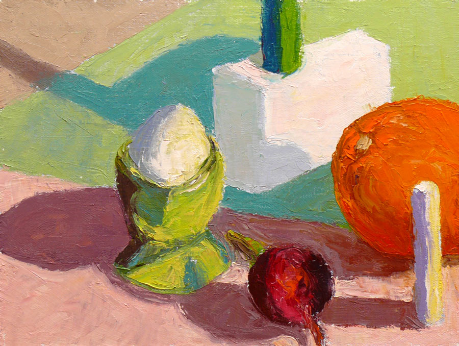
Inspired by Casey’s success with the Carder Method and frustrated with my own slow progress at oil painting, I bought the Carder Method video and Color Checker tool. Below are step by step photos of my using the method to paint this still life, a brief review of the Carder Method and photos of my studio set up for working with it.
The Carder Method is designed to eliminate many of the problems that can make painting difficult. By creating an carefully lit, controlled environment, a painter can focus on learning to clearly see color and value differences while eliminating problems caused by variables such as changing light.
Click “Continue Reading” to see photos and read more….
Color study of blocks under halogen light, 9x12 in, oil on panel
I painted from this setup (not from this bad photo)
This study was done to practice seeing, mixing and and painting the relationships of color and light on different planes. Theoretically these colored block studies should be done outdoors with natural light, but it was a cold windy day and I wasn’t feeling well (and still don’t—first it was stomach flu and now a cold) and so worked indoors. When I compare this indoor painting to those I did outdoors and posted here, I can see why it’s better to work outdoors.
“Charles Hawthorne was the first painter…to put the “Impressionist concept of seeing” into a teaching principle. Hawthorne spent the last fifteen years of his life trying to understand what Monet looked for and how he painted.
Henry Hensche, an assistant to Hawthorne, perfected the concept of seeing and teaching color after Hawthorne’s death in 1930. Mr. Hensche taught and practiced this visual language of color from that first Summer in 1930 until his death in 1992.” [emphasis added]
I’ve studied on and off the past year with Camille Przewodek, a fantastic plein air colorist and former student of Hensche and I think I’m beginning to comprehend the concepts at a basic level (although the study above is a poor representation of that). Another painter who studied with Hensche, John Ebersberger, has created a Hensche Facebook group that is open to the public, for former Hensche students and others who are interested in Hensche’s approach to seeing and painting color relationships. There are wonderful photos posted there of Hensche paintings and paintings by the artists who have carried on his approach to color, and to my mind, have advanced it even further. Their discussions and critiques on the groups discussion board are also quite illuminating.
Painting colored blocks under different light is one of the techniques Hensche used to teach students to see that in every plane change there is also a hue or color change (not just a tone or value change), and how these colors change according to the light key (foggy grey light, bright sunlight, early morning light, afternoon light).
This is not an easy approach and takes years of practice and study, best done with an experienced teacher like Camille Przewodek, John Ebersberger, Carole Gray-Weihman, Dale Axelrod (great links and examples on his website), and others at Atelier aux Couleurs Art Academy who offer workshops locally and internationally. I have found one book, Painting the Impressionist Landscape, that does explains the concepts (although I don’t think that author’s paintings provide stellar examples, especially compared to those listed above).
Even if I never learn to see and paint like they do, I’m sure the concepts I am learning will enrich my painting and it has already changed the way I think about light and color and form.
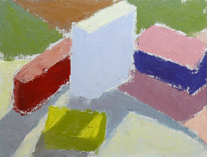
On Monday mornings I’m taking a painting class from Camille Przewodek in Petaluma. I first read about her on Ed Terpening’s blog and when I saw her absolutely stunning work I was thrilled to be able to study with her.
As I understand it, the focus of her class is learning to develop one’s ability to see light, atmosphere, and their effects on the subject one is painting and to develop the ability to interpret that in paint. Camille bases her teaching on Henry Hensche‘s, with whom she studied and then spent many years further expanding upon his work. Hensche was a student of Charles Hawthorne who was a student of William Merrit Chase, an American Impressionist who developed his color theories via his study of Monet‘s groundbreaking work.
Camille’s paintings are simply stunning. A slide show of her paintings brought tears to my eyes with their beauty…something that has only happened to me once before when I saw Renoir’s Luncheon of the Boating Party in person.
Newcomers to the class begin by doing plein air still life color studies of colored blocks. Using blocks simplifies the subject matter in order to focus on using changes in color hue and temperature to create the illusion of form and depth. There’s an explanation of this process in the book, Painting the Impressionist Landscape: Lessons in Interpreting Light and Color byLois Griffel, who took over Hensche’s art school after he died.
Above is the first block study I did in class while everyone else was painting beautiful marshland. The process for doing the studies is to block in the masses with a palette knife, leaving white space between color areas, breaking each shape into two values: shade and light. You start with one color and move to the next, focusing on the relationship between each color and the next.
Elio Camacho, my other wonderful painting teacher, also strongly emphasizes the importance of the relationship between contiguous colors. They both explain that there’s no such thing as a “muddy” color—that the appearance of muddiness results from the relationship not being right between a color and it’s neighbor.
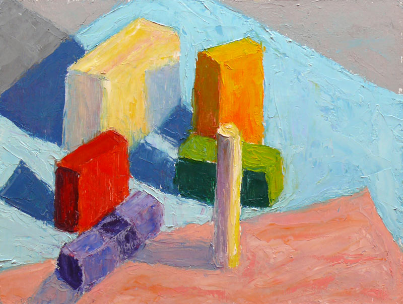
The one above was done at home under a bright light, trying to simulate sunlight on a dark and rainy day. When I brought the original version of this painting to class for critique, Camille pointed out that blue cloth was too dark because in the bright light it shouldn’t be darker than the shadow on the white block so I worked on it some more, lightening the cloth. If you want to see how it looked before, and the steps in getting there, including the photo of the blocks, just click “continue reading” below.


