This was a quick little painting from life that happened spontaneously one afternoon when my tenant came out to my studio and presented me with some freesias in a vitamin bottle.
It might have been a more interesting painting if I’d a) included the lettering on the bottle and b) taken time to do a preliminary thumbnail sketch so that the flowers weren’t almost touching the top of the panel. I was interested in looking at white in shadow and gray in light and shadow and the colors found in both from the warmish light and flower reflections.
Photo of set up (slightly different perspective and light)
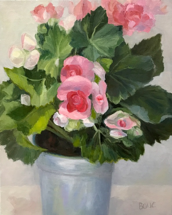
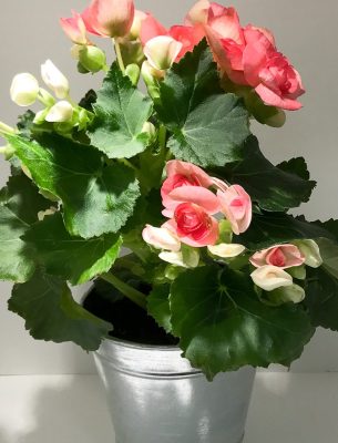
Winter Begonias in Tin Pot, Oil on Linen Panel, 10×8″ (SOLD)
It was time to face something more cheerful than my own face in the studio. This pretty pot of begonias was just what I needed. I worked on them a bit at a time, between visits to my mother in hospice. My mom passed away very peacefully last week, in no pain and with family at her side. She taught me many things in life; her final and maybe most important lesson was how to let go and fearlessly accept this final passage with grace (and the help of amazing hospice nurses).
This painting is sold. Below are the steps in the progress of the painting.
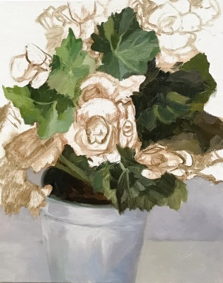
Winter Begonias in Tin Pot, WIP-A
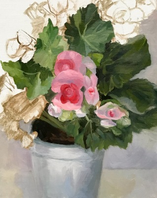
Winter Begonias in Tin Pot, WIP-B
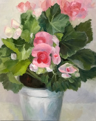
Winter Begonias in Tin Pot, WIP-C
Winter Begonias in Tin Pot, Oil on Linen Panel, 10×8″ (SOLD)
Mom’s Perugia Italian Vase, Oil on Arches Oil Paper, 12×9 inches
My mother loaned me this beautiful vase years ago to paint. When I was looking for a subject to paint this week it called out to me from the shelf where it’s been waiting for so long. Below is the step-by-step progress of the painting, which is available on DailyPaintworks here.
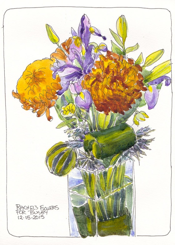
Bouquet for Busby, ink and watercolor, 11×8.5 inches
On this shortest day of the year here are some cheery flowers to brighten the darkness.
While I was away visiting my mom last weekend, my cat-sitter Rachel (of McGraw’s Paws) cat-sat for the first time since Busby my tabby cat died. She was sad not seeing him too and left me this stunning bouquet of flowers in his honor and a lovely card with these wise and beautiful words about sorrow that are worth remembering for any loss:
‘When you are sorrowful, look again in your heart and you shall see that in truth you are weeping for that which has been your delight.”
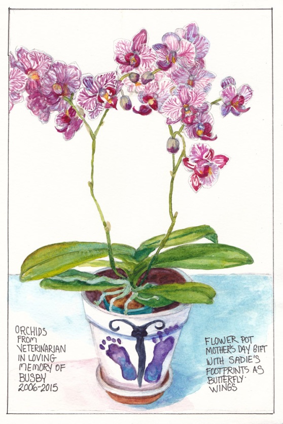
Orchid for Busby in Sadie Footprint Pot, graphite and watercolor, 11×7 in
For Mothers’ Day my daughter-in-law Brittney gave me this adorable flower-pot that she and her mom decorated with my grandbaby Sadie’s footprints (dipped in paint) as the wings of a butterfly. Then last week a florist delivered a beautiful double orchid plant to me from my veterinarian in memory of my kitty Busby who, sadly, had died the previous week.
The orchids were a perfect match for the Mothers’ Day pot and combining the two helped ease my mind and lift my spirits. I see the orchid and feel sad for Busby and then see the pot and feel happy about little Sadie. It was fun and challenging to draw while trying to keep track of which flower and bud were which.
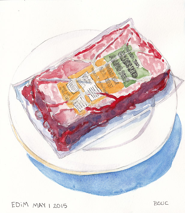
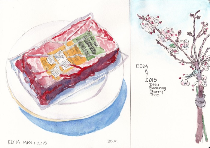
EDiM 1: Food Food: Defrosting Burger, graphite and watercolor, 8×7.25 in
Day 1 of Every Day in May 2015 is supposed to be a favorite food and although I do enjoy the occasional burger, ground beef isn’t really a favorite eat…but this vacuum-sealed package of defrosting-as-I-drew meat was certainly a favorite to draw.
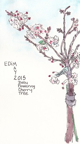
EDiM 2: Tree (Baby Cherry Tree), ink and watercolor, 4.5×8 in
Day 2’s cue is “A nearby tree” and my next-door neighbor’s adorable little baby flowering cherry called out to be drawn before the puffy flowers fall. I meant to fit the whole tree on the page but I started in ink with the top left branch and drew too big so only the top left side of the tree fit. Oh well.
EDiM 1 and 2: Full page in sketchbook, ink and watercolor, 8×10 in
It felt so good to just draw for fun in my sketchbook again after weeks of working on two commissioned paintings that are finally approaching completion. I needed to get back to playing in my sketchbook again, whether the paintings were finished or not, so EDiM came along just at the right time.
For me, it will probably be more like Every-ish Day… or (Almost) Every Day… or Some Days in May since I have a lot of other things going on this month. However many days it is, any day that I get to draw is a good day!
If you want to join in the fun, check out the Facebook Group or the Flickr Group and click to join. Everyone is welcome to play any time during the month.
I painted Kathleen (from the Julia Kay Portrait Party) side by side with the flower below but decided to post them as separate images. I’m loving gouache but really struggling with the way light colors turn so much darker when it dries. I actually lightened the sketch above in Photoshop so that it wouldn’t look so scary.
Azalea in Gouache, 7×5 x 5.5 inches
I found this flower (I think it’s an azalea) growing along the sidewalk in the neighborhood and picked off a blossom to paint. The flower is too dark because of my lack of experience with gouache, but I had fun painting it. Gouache is so much fun and I’m especially loving M. Graham Gouache. Now to just learn to mix colors about 4 shades lighter than they look! I mastered doing the opposite with watercolor so I’m (almost) sure I can do it with gouache too.
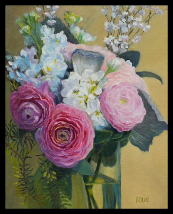
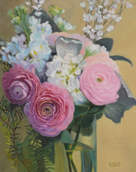
Thank you to everyone who responded to my previous post and offered feedback about whether to try to fix the right-hand rose that was bugging me. I figured if everyone said leave it I would, but if others saw the problem too, I’d try again to fix it. They did, so I did, and now I can look at it without feeling frustrated.
To solve the problems with the rose, I turned the photo and the painting upside down and could immediately see I had the shape wrong. Then I converted the photo to gray-scale to check values. I reshaped and repainted the rose using grayed-down, paler colors. I touched up a few other spots in the painting (back top right flowers, some leaves and small changes to both left roses). I added a black border to simulate how it will be framed.
Now I think the focal point (the middle rose) stands out, and the minor right rose recedes. FYI, the reason these roses don’t look that rose-like is because although I started working from life, I could quickly see that the flowers were about to completely fall apart (it was several days after the wedding) so I took a photo of the almost over roses.
Below Left (AFTER): fixed final painting; Below Right (BEFORE): before adjustments and fixes.
I started this painting of my daughter-in-law’s wedding flowers soon after the wedding in January 2014 but wasn’t thrilled with the way it turned out so set it aside. I began reworking it again recently, and after several times reaching a point of saying, “Finished” and then working on it some more, I remembered the saying, “Art is never finished, only abandoned” and decided it was simply time to stop.
But there’s still one thing that bugs me in this painting: the pink rose on the right just feels too Barbie pink to me. Every time I look at the painting it irks me. But I’ve repainted it 5 times and perhaps because the photo I’m working from isn’t very good, especially of that rose, it keeps turning out the same. I may try one more time. What do you think? Leave it or try again? Or maybe find another photo of the set up with a different view of that rose and try again from that photo?
My challenge in painting is always how to maintain the freshness of my original inspiration, color choices and brush strokes while holding back my inner perfectionist who wants to keep noodling around forever. Another challenge with returning to an older painting is that the fresh flowers are long gone and only a so-so photo remains to work from. Likewise all my new fresh ideas about painting have to be set aside to work on something from the point of view of a year ago.
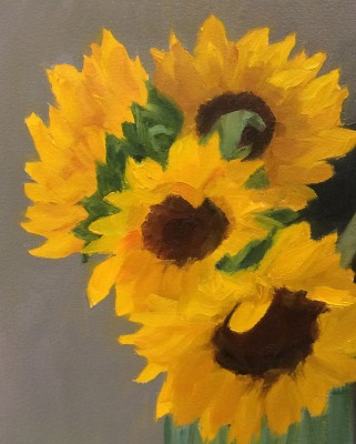
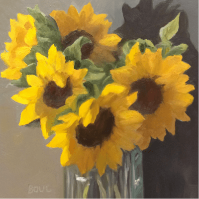
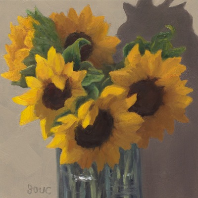
Sunflowers in Spaghetti Jar, oil on panel, 6×6 inches
This was supposed to be a quick and easy project that went totally out of control. I wanted to try out Arches Oil Paper and quickly paint a bouquet of sunflowers in a tall glass jar meant for holding spaghetti noodles. I made and transferred a sketch (see below for process) and started painting on the paper, which I absolutely hated. It was dry, absorbent and paint wouldn’t slide or move on it. It just sucked in the paint and I was having no fun. I quit halfway through and cut off the parts of the painting I hadn’t finished. This is where I left it:
Session 1: Sunflowers in Spaghetti Jar, oi study on Arches Oil Paper , 8×10 inches
The next day I started over on a 6×6 inch panel that I’d sanded down from a previous failed painting. Again I intended to paint for an hour or two and move on to something else. Instead I worked and reworked over and over until I finally had a painting I could stand to look at (at top of post). Sometimes I think reusing panels is a mistake because the bad juju from the first one hangs around and messes up the next one.
The one nice thing about Arches Oil Paper is that it can be cut down and cropped easily like watercolor paper. Although it does not need to be gessoed I’m going to try gesso on it next time to see if that will make it more enjoyable to use.
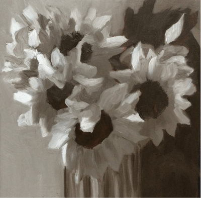
Below are the process photos from start to finish.The painting on paper is Version 1 and on panel is V2. The ones labeled “Photoshopped” were photos of work in progress adjusted in Photoshop to try to solve the problems and then the next image is those changes implemented in the painting. If you’d like more detail about the process you can open this PDF of my full process chart with notes about each step.
Session 1 V 1 Photo
Session 1 V1 Sketch
Session 1: Sunflowers in Spaghetti Jar, Arches Oil Paper