Categories
Acrylic Painting Art supplies Landscape Outdoors/Landscape Painting Places Virtual Paint-Out

Virtual Paintout Norway & Golden Open Acrylics

Norway farm landscape painting, Acrylic, 9x12"

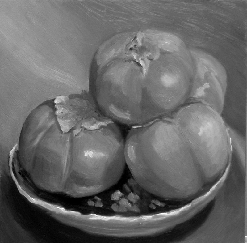
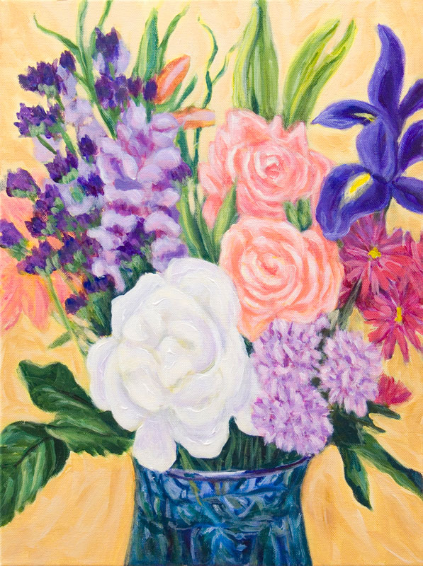
This month’s Virtual Paint-out is taking place in Norway. When I picture Norway it’s always snowing—silly me. I was amazed to wander the roads and see the beautiful summer light and perfectly maintained buildings and fields. There was so much gorgeous scenery it was hard to pick, but I couldn’t resist all the different greens in this scene.

Here is the original scene from Google Earth. I used Windows 7 cool “Snipping Tool” that lets you select an area of the screen to copy and save:

Google Earth photo with address
Original Google photo

If you click to enlarge the image you will see the address of this farm in the top left. I played around in Photoshop to compose and crop the scene. Then I used the “Content Aware Scaling” feature in CS4 that allows you to compress a scene without distorting elements such as buildings or people. I wanted to fit the image on a 9×12″ canvas:

Scaled in photoshop
Cropped/Scaled in Photoshop

What’s really exciting to me about this painting is that I used Golden Open Acrylics to paint it. I am in love with these paints! [SEE less enthusiastic UPDATE AT BOTTOM]. They have all features that I love about oils and acrylics with none of the features I don’t like. I’ve been struggling with both those mediums for months and was going through an artistic crisis, considering giving them both up.

The problem with acrylics

I couldn’t stand working with regular acrylics because I like to layout a palette of paint and work intuitively, mixing as I go. Acrylics dry too fast to do this. (Yes I know you can mist the paint regularly and that there are special stay-wet palettes but I found they turn the paint to soup and smell bad after a couple of days). I also like to blend colors on the canvas and to be able to wipe off a passage if it’s not quite right. None of this is easy to do with regular acrylics.

The problem with oils

Because I try to use solvents as little as possible with oils due to their toxicity and smell, I can’t start with juicy washes for the first layer as I like to do when sketching out the composition with oils. And even with the minimal use of the least toxic odorless solvent (Gamsol mineral spirits) I found there was an odor (probably from linseed oil going rancid that was left in the solvent) that bothered me anyway. And then there’s the cleanup up dozens of brushes after a painting session.

Why I love[d] Golden Open Acrylics

Golden Open Acrylics do not smell, stay workable about as long as oil paints [update: they don’t really], can be diluted with medium and/or water, clean up with water, do not dry on brushes (for 24 hours at least), blend nicely and are just a dream to work with. When I quit painting last weekend I stuck a small, damp sponge on the palette, and closed my Masterson “Palette Seal” box. I opened it today, a week later, and the paint was still in perfect working condition, better than oil paint would have been.

While I admire thick, expressive, brush strokes in paintings, it’s not really my thing. I prefer working more thinly and that’s just the way Golden Open Acrylics are meant to be used: in layers less than the thickness of a penny. They can also be mixed with regular acrylics to modify the texture or the drying time. Or they can be combined in different layers, although it’s suggested to use regular acrylics as the first layer(s) before adding the Opens or waiting for the layers of Open Acrylics to thoroughly dry (2 weeks) before applying a layer of regular acrylics.

I think these paints are also  going to transform my plein air painting. [update: they didn’t work for plein air; got tacky too quickly] I won’t need to bring solvent or a slew of brushes. I haven’t figured out what to carry for a water container or how much water I will need to carry for brush washing between colors.

Our first plein-air session of the new season is next Friday and I’m looking forward to playing with my new medium in a Non-Virtual paint-out too.

UPDATE June 30, 2010

After working the Golden Open Acrylics for three months I’m considerably less enthusiastic about them. The deal breaker is that the paint dries darker (about 10%, varies between colors) which requires guessing when mixing paint how much lighter to make it and makes it impossible for me to try to match colors I’m seeing . Other problems are the drying time which depends on the humidity and wind which makes painting outdoors with them next to impossible in my area. Unless there is no breeze and high humidity, even indoors, you have to work quickly before the painting starts getting tacky within an hour or so. But then it can take a really long time for the paint to dry completely. When trying to glaze on top of a seemingly dry layer, I’ve ended up lifting the previous layer instead and had to give up glazing.

I’ve now switched to Holbein Duo Aqua water soluble oils and so far and am finding them the best of all worlds. No color shift, artist quality pigments and pigment load, no toxics, no smells, easy clean up. I write about them here.

Categories
Acrylic Painting Art supplies Art theory Painting

Acrylic Painting Technique Practice

Acrylic Practice, 24 x 24"

After I started working on a series of paintings in acrylic I realized I needed to learn more about acrylic technique and materials if I wanted to make better progress. Although I’d read several good books and seen a couple of brief demonstrations I needed more.

Although there are hundreds of oil painting and watercolor videos, I could find only a few for acrylics. I rented a couple of awful ones from Netflix and viewed an online video from Artistsnetwork.tv that I found useless. Then I found the video that provided the lessons from which I did the exercises above. The video is “16 Acrylic Painting Techniques: A Studio Workshop with Jackie Miller.” Miller demonstrates and carefully explains how to prepare the support and create each of the 4.5″ square paintings.

I played the DVD on my computer in my studio, and worked along with it, pausing and rewinding as needed. Below are close-ups of the 4.5″ technique squares with a little information about each.

#1 - Discrete Brush Strokes
#1: Discrete Brush Strokes

1. Discrete Brush Strokes. Apply a flat, gradated blue background and many layers of individual brush strokes to create optical color mixing (and theoretically the illusion of water and sun reflections).

#2: Stencil and Stamp Painting

2. Stencil and Stamp Painting. Used a variety of materials as stencils, such as plastic embroidery mesh, hardware cloth, plastic decorative stencils. Multiple layers of paint were applied with a stencil brush and with q-tips and a rubber stamp. Fun!

#3: Energized Brush Strokes Alla Prima

3. Energized Brush Strokes Alla Prima. Using glazing liquid to keep paint workable a bit longer, applied layers of brush strokes freely, letting colors blend into each other.

#4: Impasto with Sgraffito

4. Impasto with Sgraffito (scraping). On top of flat underpainting, applied paint mixed with gel medium and before it dried, scraped through it with a variety of implements including popsicle stick, rubber combs, and paint shapers.

#5: Glazing and Scumbling

5. Glazing and Scumbling. Applied underpainting of blue, leaving white hole in the center. Then half the blue was glazed with a very thin layer of the same blue mixed with glazing medium (to see how it enriches the color and removes chalkiness). The center hole was painted red. Then turquoise paint was scumbled (scrubbed with a dry brush) on top of the blue and softly over the edge of the red.

#6: Cross-hatch Brush Stroke

6. Cross-hatch Brush Stroke. I need more practice with this one. A flat, dark underpainting was done first and then the idea was to make brush strokes that cross each other in hundreds of little X’s with a fairly dry brush to create soft gradations with many layers. The original actually looks better than this photo shows because of glare, but I still found it difficult to make those X’s.

#7: Soft-edge & Hard-edge

7. Creating soft- and hard-edged transitions. A dark, flat background was painted first and then the edge of the section at the top left was masked with masking tape and lighter red painted in that area. The transition at the bottom was created with layers and layers of softly scumbled paint lightly scrubbed on with a nearly dry brush, always starting at the corner and moving towards the center so there was less paint on the brush as it approached the transition area.

#8: Glazes, Wipe Removal & Combing

8. Glazes, Wipe Removal & Combing. On top of a flat, mauve background, layers of paint mixed with glazing medium were applied and then wiped back with a damp cloth and combed through using a rubber, multi-sided comb.

#9: Finger Painting & Mixed Media

9. Finger Painting & Mixed Media. Started by finger painting with grey paint (she used Graphite Gray meant to look like graphite) and then added water soluable crayons, Sharpie marker, pencil, layer of acrylic medium, and more crayons and pens, finishing with medium to seal the crayon layer.

#10. Staining
#10: Staining

10. Staining. On the video she left this square of the canvas raw, but since I was using watercolor paper, I gessoed the whole sheet and then covered this square with Absorbent Ground Medium which creates an absorbent surface, similar to ungessoed paper. The paint was mixed with a high proportion of water and allowed to move and blend wet into wet. It didn’t work as nicely as watercolor does wet into wet. Mixing more than 25% water with acrylics can cause them to fail to bond with other acrylic layers, but that’s not important when working with an absorbent ground since it will sink ito the fibers.

#11. Alla Prima as Underpainting

11. Alla Prima as Underpainting. The underpainting was created like #3 using bold strokes of paint, wet into wet. When dry it was painted over with various techniques including combing and glazing. On the video she did the over-painting with oil paint. I used acrylic.

#12: Painted Gel Relief

12. Painted Gel Relief. First a a pile of heavy clear gel was applied to the surface and then pushed around and smoothed and shaped with various implements. When it was dry to the touch after 24 hours I painted it with Micaceous Iron Oxide, Copper and Bronze acrylic paint.

#13: Found-Object Collage

13. Found-Object Collage. A flat layer of heavy gel was applied and then random stuff stuck into it (twine, match stick, pennies, plastic stretcher bar “key”, electrical wire thingees, some glitter for texture). When dry it was painted.

#14: Rubber Cement & Tape Masking

14. Rubber Cement & Tape Masking. Rubber cement was applied and when dry, the square was painted. Then rubber cement was removed, another layer of rubber cement painted over a different area, another layer of paint, cement removed. Masking tape applied and then painted over, etc.

#15: Paper and Fabric Collage

15. Paper and Fabric Collage. Acrylic medium was used as an adhesive to attach scraps of fabric, string, lace and paper. When dry the surface was painted  using various colors and Iridescent Gold paint.

#16. Water Soluable Crayon
#16: Water Soluble Crayon

16. Water Soluble Crayon. This was supposed to also include bits of dried acrylic paint film but I didn’t quite see the point of using scraps of dried up paint. I’m not sure I really got the point of drawing with the water soluble crayons and then coating them with acrylic medium (they smear) either, but I gave it a try.

IMPRESSIONS:

I was suprised how much I enjoyed the more abstract, random, textural pieces; a nice respite from my usual striving to capture what I see in a somewhat realistic fashion. I can see many possibilities for exploration with acrylics, but I’m still not convinced of their suitability for my work right now, although I haven’t given up yet. I’ve gone back to working on the paintings in progress with more understanding and skill but still feel like I’m fighting the medium. More about that later.

Categories
Art theory Colored pencil art Drawing Life in general Outdoors/Landscape People Places Sketchbook Pages Sketchercize

Sketchercizing My Grocery Shopping

El Cerrito Natural Grocery, Copic cobalt multiliner & Polychromos colored pencils
El Cerrito Natural Grocery, cobalt Copic multiliner and colored pencils

I had to make my morning coffee with the last drops of non-fat milk (yuck, 1% is OK but non-fat in coffee just doesn’t cut it) and there were no peaches or milk for my Cheerios. A trip to the market couldn’t be put off. But I had a full day of experiments in the studio planned and I needed some exercise. Easy solution:

  1. take the long way around, up and down big hills, to my favorite grocery store, El Cerrito Natural Grocery (cardio)
  2. sketch the market using the cobalt Copic Multiliner I wanted to experiment with (I think I prefer the sepia)
  3. shop
  4. carry groceries home in a loaded backpack plus another full bag (weight lifting)
  5. add colored pencil to the sketches to try out the new Polychromos colored pencils (LOVE THEM!)
BART riders, cobalt Copic Multiliner and colored pencils
Quick subway sketches with the cobalt Copic Multiliner and colored pencils

I’m trying to simplify my choices with my art supplies, wanting to narrow down the pens, ink, pencils and colored pencils to keep handy and those I’ll give away. I did tests today on drawing pencils, sepia liquid inks and sepia pens and will post them and my preferences tomorrow.

I’m also working on painting a grid of 16 different acrylic painting techniques to improve my understanding of acrylic techniques and possibilities. It became clear this was needed when I started a series of paintings in acrylic and realized I didn’t have the “chops” to accomplish what I wanted. I was trying to use oil painting techniques and was getting nowhere fast (and ruining brushes with all the scrubbing I was doing with them which seemed the only way to get the smooth transitions I wanted).

Each medium has its own capabilities and pitfalls. Why not make good use of the characteristics of the media instead of trying to force it to be something it’s not? Despite people claiming acrylic can be used like oils and like watercolor,  I’m going to try to learn to use it like acrylics instead and have fun with all the crazy stuff it can do. This series of large paintings wants to be in acrylic and so it shall, and soon I hope.

Categories
Acrylic Painting Colored pencil art Drawing Illustration Life in general Painting

Why I’m Not Here + Intuition, Velcro, Broccoli

Lovers Mongrels Curs #1 M.H., Acrylic on canvas 28x22"
"Lovers Mongrels Curs #1 M.H.", Acrylic on canvas, 28x22"

It’s not what you might think, based on the above work in progress. It’s that I finally started the series of paintings that I’d been waiting on for over a year. I hadn’t realized it, but I was waiting for the painting to tell me how to paint it (see below about intuition and broccoli).

I’m just having so much fun with the series  and haven’t wanted to use time I have for painting being on the computer. Also I wasn’t sure if I was ready to post what I’m working on yet. I’m also not sure how much I want to share about each painting and the series as a whole, except to say that it’s sort of auto- and bio- graphical, about the men who’ve played a role  in my life, hence the title of the series: “Lovers, Mongrels and Curs.”

This painting  is the first in the series and it is still a work in progress; a little sketchy but I like it that way and may just leave it…or not.

I followed the saying, “If you don’t know what to do, just wait until you do,” instead of forcing the start of the series. It just took some down time to conceptualize how the series needed to be painted and for the ideas to bubble up (literally: I was on vacation, lying on my back on the deck of my little, private, open-roofed, hot-tub room at Albany Sauna, watching the clouds float by overhead while the hot tub bubbled beside me when it came to me that the series needed to be painted large, in acrylic.)

I wanted to work on two paintings simultaneously,  side by side on the wall so first thought of using gessoed paper or unstretched canvas, finally settling on stretched canvases. But how to hang them?

Using Velcro to Hang Canvases on the Wall  for Painting

After some brainstorming I found an easy way to mount two canvases side by side on the wall without harming the wall or making holes with nails.

hanging 2 canvases
2 canvases mounted on bulletin board with Velcro

I applied a few strips of Velcro along the top rail of my 36×48″ metal framed bulletin board already hanging on that wall (the cork is covered by a sheet of paper pinned to it). Then I measured and matched the other half of the Velcro strips to the backs of the canvases and stuck them together. To stabilize the canvases a bit I put a few large push pins along the bottom and sides. It’s working great!

Listen to Your Broccoli, colored pencil, 16x14"
Listen to Your Broccoli poster, colored pencil, 16x14", created after reading Bird by Bird in 1994

Intuition: Listening to Your Broccoli

As Annie Lamott said in Bird by Bird: Some instructions on Writing and Life:

“There’s an old Mel Brooks routine, on the flip side of the ‘2,000-Year-Old-Man,’ where the psychiatrist tells his patient, ‘Listen to your broccoli, and your broccoli will tell you how to eat it.’ And when I first tell my students this, they look at me as if things have clearly begun to deteriorate. But it as important a concept in writing as it is in real life.

It means, of course, that when you don’t know what to do…you get quiet and try to hear that still small voice inside. It will tell you what to do. The problem is that so many of us lost access to our broccoli when we were children. When we listened to our intuition when we were small and then told the grown-ups what we believed to be true, we were often either corrected, ridiculed, or punished. God forbid that you should have your own opinions or perceptions–better to have head lice.

. . . So you may have gotten in the habit of doubting the voice that was telling you quite clearly what was really going on. It is essential that you get it back.

. . . Get your confidence and intuition back by trusting yourself, by being militantly on your own side.

. . . Get your intuition back and make space for it, when you stop the chattering of the rational mind. The rational mind doesn’t nourish you. . . Rationality squeezes out much that is rich and juicy and fascinating.

. . . If you don’t know which way to go, keep it simple. Listen to your broccoli. Maybe it will know what to do. Then, if you’ve worked in good faith for a couple of hours but cannot hear it today, have some lunch.”

Categories
Oil Painting Painting Sketchbook Pages Still Life

Pile Of Persimmons

Pile of Persimmons, Oil on Gessobord, 8x8"

This was so pleasurable to paint. I experimented with doing an underpainting in acrylic first to put in the darks without having to wait for paint to dry. Then I tried to focus on values and color temperature, but  I think I got sidetracked by all the interesting shapes of light, color, reflections and hazy surfaces  (they were organic persimmons and some of the skin had a kind of filminess like blueberries have).

I’m also working on trying to see and mix just the right color of paint, and apply strokes once (instead of guessing, putting paint down, scraping it off, trying again). Last night when I realized I’d been painting for an hour with dirty brushes and not mixing specific colors but just using random paint left on the palette I dragged myself away from the easel and went to bed, finishing the painting this afternoon.

I’m pretty happy with this one but would like to try again getting closer with color temperature changes and stronger values. Below are the steps I took along the way, including a change in composition. Although I liked the rich dark in the corner, it was drawing too much attention to itself.

If you click on one thumbnail you’ll be taken to a big picture with another thumbnail to click to go to the next.

Categories
Flower Art Painting

Mothers Day Bouquet

MothersDayBouquet

Acrylic on canvas, 12 x 16″
Click to enlarge

On Mothers Day Robin brought me a lovely bouquet which I started painting that afternoon. The picture below is as far as I got that day. I was liking how loose, free and sketchy it started out:

first layer-mothersdayBouquet

Then it was back to the office for the week. By the time I returned to painting, the flowers had moved and changed. I kept trying to work from the flowers, but once they got stinky I gave up and used a photo reference I’d taken, but it was from a  slightly different point of view:

Bouquet

My main goal in doing this painting was learn more about working with acrylics and to try to find a way to make them work and blend more like oils. I’ve been told that you can do everything with acrylics that can be done with oils but I’m not convinced yet. I did learn a whole bunch while doing this, and did find a good way to blend (misting the canvas before applying the paint which has been mixed with gloss glazing medium or gloss gel…and not the satin medium I’d been using which has dulling matting agent added).

The thing I’m having the most trouble with is mixing the colors I want and getting bright light colors. Acrylics dry quite a bit darker than they look when wet because the acrylic medium is white which makes the colors seem lighter until they dry because then the medium is transparent, no longer white. Also I’m finding that acrylics seem more transparent than oils  and don’t cover as easily (although you can always go over any area mid-painting with gesso for an instant undo).

I don’t like how stiff this painting is and how corny (although I do like the way the vase turned out). I think that for me to enjoy easel painting I’m going to have to work bigger

Any suggestions or advice would be greatly appreciated!

Categories
Photos Studio Watercolor

In the studio & Wanna be tagged?

Studio - Work in Progress 2

A watercolor in progress (about 1/3 done) on my watercolor table with my helpers standing by, waiting to help (or get in the way). This is a commissioned portrait of a house with the family’s 3 cats in the window.

Studio - Work in Progress 1

An acrylic painting in progress on my easel in the opposite corner of the room.

If you click on the pictures to look at them on Flickr you’ll see little notes of what stuff is.

Tagged

Now, about this tagging business. This week I’ve been “tagged” by three different art bloggers. When you get tagged you’re supposed to list seven little known facts about yourself and then list seven blogs you like to visit and then tell each of those people they’ve been tagged. It’s sort of like a chain letter. Since I don’t know who’s already been tagged, and since I was tagged 3 times in 3 days, I have a feeling people are running out of people to tag…which makes me feel a little like I did in high school gym class where I was always the last to be picked for a team since I was such a klutz.

So instead of tagging other people, I’m going to invite people to be tagged. That way I won’t be imposing on anyone and won’t re-tag already tagged people. Will I get in trouble for breaking the chain? If you want to play and haven’t been tagged yet, just leave me a comment and I’ll toss you a tag…

Here are the 7 random facts about me:

1. I live in a house that used to be a duplex so I have 2 living/dining room rooms, 2 kitchens, 2 bedrooms, 2 bathrooms and 2 laundry rooms. (One living/dining room/kitchen is my studio and 1 laundry room is a pantry now.)

2. I have two cats who sleep on top of my computer monitor and tv with their tail hanging over the screen.

3. I love doing dishes and cleaning the cat litter box but dislike doing other housework because it takes too long.

4. I like to read manuals for computer software and electronic gadgets and I subscribe to PC Magazine.

5. I hate shopping for clothes but love shopping for art supplies and books.

6. I download books from Audible.com to my computer and iPod and listen to them while I watercolor (but oil or acrylic painting I listen to music).

7. I have a spinning bike (exercise bike) in my living room and I like to ride it while watching American Idol on my TiVo with the sound played through my stereo.

And here are links to the lovely artists who tagged me:

Claudia of Time Passages whose garden sketches are sensational!

Kerstin Klein of Snowflakes and Black Vampires who has been participating in the portrait party where people trade doing each other’s portraits.

Dinahmow (sounds like “Dynamo”) of Idle Thoughts of an Idle Woman  whose printmaking and photography is stunning.

So, I know I’ve done this all wrong. I haven’t listed 7 new tagged people…but I’m tossing the ball to you and calling out TAG, You’re IT.  If you wanna be tagged, just leave me a comment and I’ll link you in the next post.