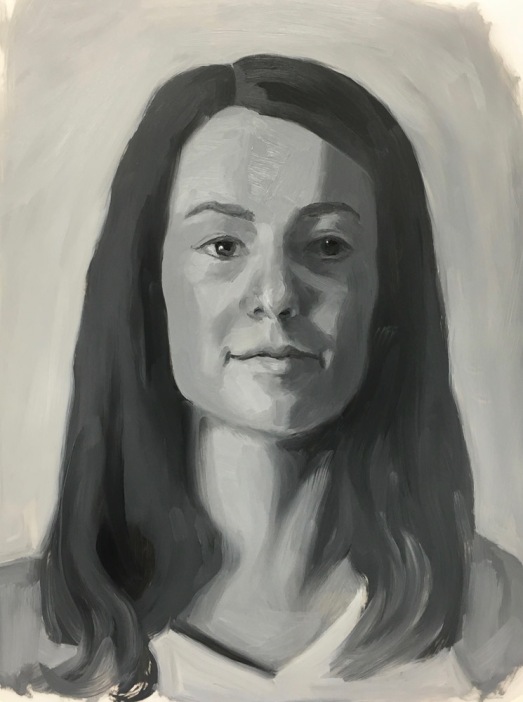
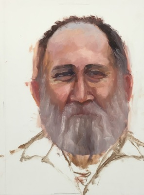
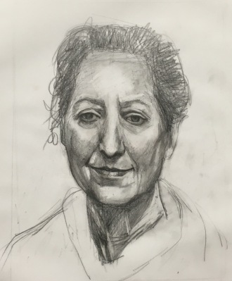
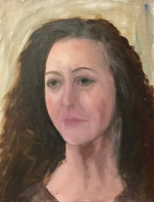
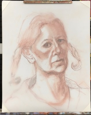
Color Boot Camp Part I Monochrome. Left to right: Color reference photos, B&W converted ref photo, my two studies
When my art friend Chris Beaven commented on the previous version of this post that it would be interesting to see my studies compared to the black and white versions of the photo references, I did a virtual dope slap (Of course! What a perfect way to see if I got the values right!) and then decided to redo this blog post to show that comparison (above).
While I often convert color photos to black and white to see the values, when I did these studies from Bill Perkins’ Color Boot Camp on New Masters Academy I wanted to try to do the conversion in my artist brain instead of using technology. But putting my studies next to the converted photos gives me just the reality check I needed. I can see that I did pretty well in painting the values from the color photos.
In the lesson he set up one model in four different lighting situations and then demonstrated doing a 30-minute painting of each in black and white. He recommends doing the studies in no more than 30 minutes, emphasizing that it’s more important to do many starts, without worrying about getting a likeness or making finished paintings. I have to admit spending longer than 30 minutes, probably up to 3 hours on some, and in retrospect, the longer I worked the less effective the study was.
If you want to see Bill Perkin’s studies and mine in greater detail, click the “read more” link below.
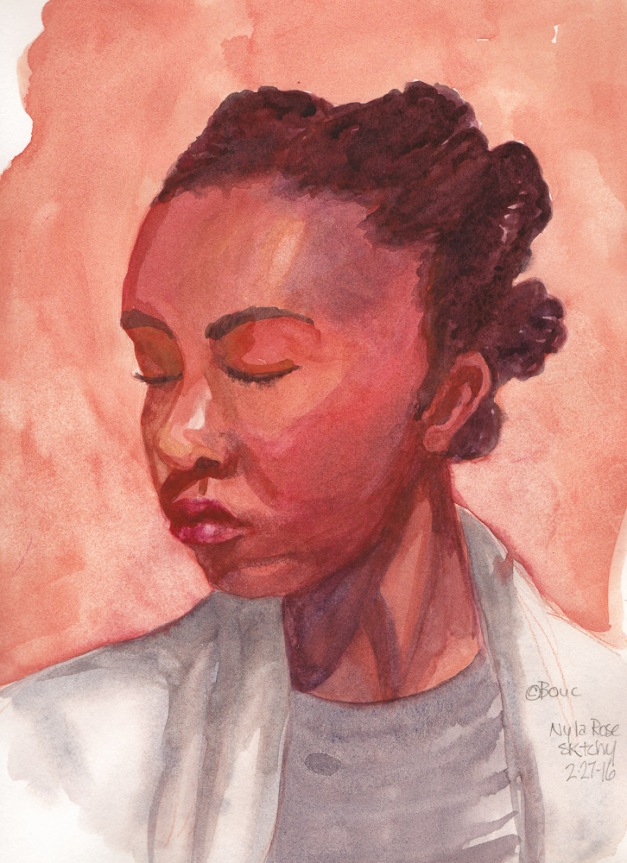
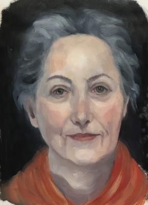
CBC Part 1-3, Janas #1 High Key, High Contrast Study (My favorite of 8 below)
Being a member of the New Masters Academy is like having a treasure chest of jewels to explore, with new art classes added all the time. The only downside is that I have to assess my own work and be my own teacher since NMA doesn’t offer feedback to the video lessons’ assignments.
I revised this post by publishing a new version of it so I’ve deleted the content here. Please see the next post for the rest of the content from this post.
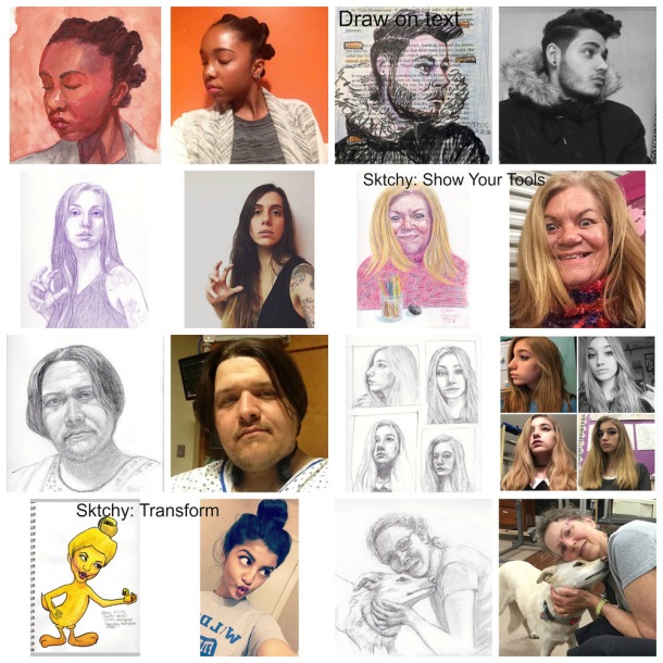
Sketching from Sktchy App photos (I explained it here) is a great warmup exercise and opportunity to practice drawing a wide variety of faces and expressions. Each week they offer a Weekend Art Exploration (#WAX) challenge and 3 of the drawings marked in the collage below were for WAX. All are in a 12×9″ sketchbook.
Collage of sketches and inspiration photos from Sktchy. (Click on image two times to enlarge.)
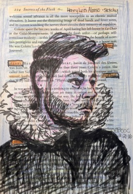
The challenge marked in the top row was to draw on text; mine is on a page of “Secrets of the Flesh: The Life of Collette.” The challenge in row two was to show your tools used to create the art so I put my colored pencils in front of “Crazy Eyes,” as she titled her photo. The bottom row challenge was to use the magic of art to transform a photo into something else (I combined Tweety Bird with the girl making a bird face). The last sketch above is from a photo I uploaded for others to draw. I did a better job on Millie than me.
Below are larger versions of a few from this batch (click to see larger):
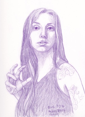
Audrey Henry, Colored Pencil
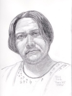
Artist known as “Foggy 365” in the hospital, graphite and conte pencil
Henry Luis Alonso on Secrets of the Flesh
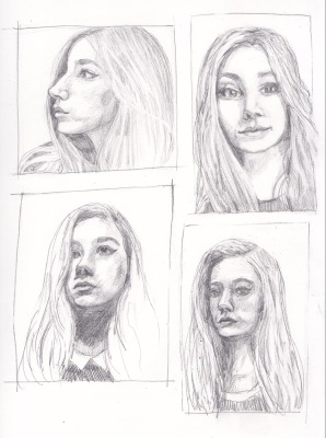
4 views of “Moon Child Luna 2” in graphite
This weekend the challenge is to draw from the same photo twice, once with each hand. Wish me luck! I don’t think my left hand knows how to do anything except type.
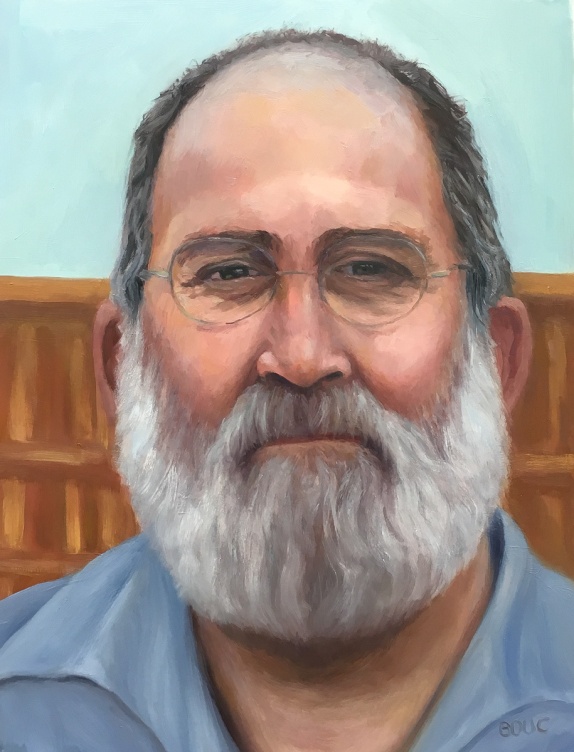
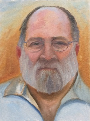
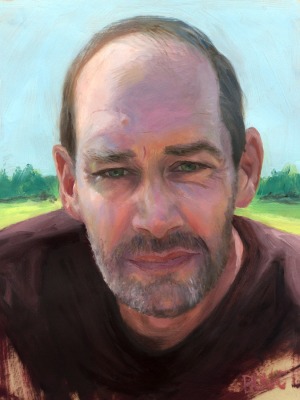
JR Handyman #3 Final, oil on DuraLar, 12×9 inches, 2016
When Jeff the Handyman (who does excellent carpentry and electrical work) came over to look at a job, he was kind enough to let me take his photo for the series I’m painting of people at work in my neighborhood. I tried three times, before and after I started studying head structure and anatomy. With the third study (above) I felt like I’d said what I had to say, with the skills I have at this point, and was ready to move on.
Above is the final study and immediately below are all three attempts in chronological order.
JR #1 Final, oil on panel, 12×9 inches, 2015
JR #2 Final, Oil on DuraLar, 12×9 inches, 2015
JR Handyman #3 Final, oil on DuraLar, 12×9 inches, 2016
My favorite part of all three above is the sky reflecting on the top of his head. With each attempt my drawing improved a bit. The more I learn, the more I see, and the more I see, the more I know I need to learn!!!. Below are all three studies with work in progress (WIP) steps. I’m not offering the WIP to show how it “should” be done; just the approach I was experimenting with. I am always trying on techniques of other artists I admire but haven’t yet found the approach that “just works” for me.
JR #1-C, oil on panel, 12×9 inches
JR #1-B, oil on panel, 12×9 inches
JR #1 Final, oil on panel, 12×9 inches, 2015
JR #2-A, Oil on DuraLar, 12×9 inches. I always like this sketchy stage the best.
JR #2-B, Reference photo and painting start
JR #2 Final, Oil on DuraLar, 12×9 inches, 2015
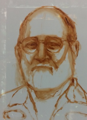
JR #3-A, Portrait start with reference photo
JR #3-A Portrait Start, Oil on DuraLar, 12×9 inches
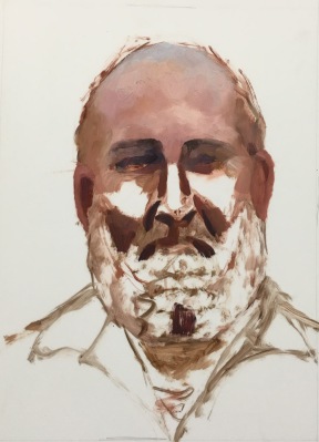
JR #3-B WIP, Oil on DuraLar, 12×9 inches
JR #4-C WIP. Realized nose was too long.
JR #3-D WIP, Shortened nose, started glasses
JR #3-E WIP. Beard got too wide.
JR #3-F WIP. Narrowed beard & hair, redid shirt
JR #3-F WIP with my Parallel Palette, which I like a lot.
JR Handyman #3 Final, oil on DuraLar, 12×9 inches, 2016
Marcy #24 “Sleepy Sister” Oil on DuraLar, 9×12 inches
When my sister Marcy offered to pose for me for my birthday, I had no idea it would take me 6 months, more than 2 dozen mostly awful drawings and painting attempts (pictures at bottom of post), and lots of study before I could produce a portrait that actually: a) looks human and b) resembles my sister (as I see her).
Although I have a long way to go before I feel competent at this, I am choosing to pause here briefly to honor and share my progress before I raise the bar again on my study of portraiture.
Attempt #1: Painted live in about 2.5 hours. I learned how much I didn’t know about painting portraits
After my first try (above) and many more failed attempts (displayed at bottom of post) I realized I needed a better understanding of head anatomy. I accepted that I can’t fix a bad drawing with pretty paint. I studied my books and videos, tried to memorize proportions and divisions of the head (e.g. eyes are halfway between top of head and chin) and did some head drawing exercises (again…) that I still didn’t quite understand. And I continued failing at drawing and painting Marcy from the photo I took when she sat for me the first time, again from life on another visit and then from other photos.
I’ve done portraits I liked in the past, either by drawing freehand and then correcting again and again, or by enlarging a photo and tracing it onto canvas or paper. But I just couldn’t reliably draw one from life. So I read more books, watched online videos and investigated in-person and online classes. I found a comprehensive online academy last month that is giving me just what I wanted to learn. I think you can see how it is making a difference, starting with #18 below, drawn from life when Marcy posed for me again. In my next post I will review and share links to the learning resources I found.
You can see the progression, from the hilarious to the hideous to the almost-but-no, sorted with most recent first. Some are just bare starts; as soon as I could tell it was unsalvageable, I added the piece to the pile of fails and started over. The paintings are all oil, 12×9″ on Matte Dura-Lar except for the earliest ones on panels. The drawings are mostly on Vidalon Vellum except for the first few 14×11″ on paper.
Marcy #24, oil on Duralar
#23, Drawing for #24, graphite and conte
Photo for #23-#24
#22, “Almost” – completed.
#22, “Almost,” start. I like this earlier stage better than the finished version.
#21, start, discarded (see #20 visible beneath Duralar).
#20, drawing for #21 and #22. I LIKE IT! Conte on Vidalon.
Photo for #21 and #22
#19, drawn from life, completed.
#18, drawn from life, start, conte on Vidalon
*AFTER THIS I STARTED STUDYING HEAD ANATOMY. #17 Oilon Duralar
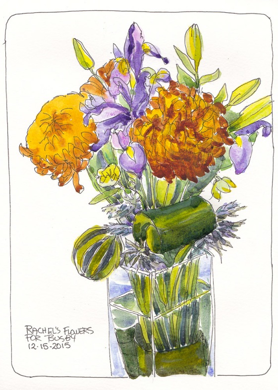
Bouquet for Busby, ink and watercolor, 11×8.5 inches
On this shortest day of the year here are some cheery flowers to brighten the darkness.
While I was away visiting my mom last weekend, my cat-sitter Rachel (of McGraw’s Paws) cat-sat for the first time since Busby my tabby cat died. She was sad not seeing him too and left me this stunning bouquet of flowers in his honor and a lovely card with these wise and beautiful words about sorrow that are worth remembering for any loss:
‘When you are sorrowful, look again in your heart and you shall see that in truth you are weeping for that which has been your delight.”
Self-Portrait, Zorn Palette, oil on Mylar, 12×9 inches
I might look grumpy or serious from concentrating, a little cross-eyed (eyes drawn too close together), big-nosed and scrawny, but I’m really happy with this painting because it was fun to do! The hardest part was lighting my face without blinding myself with the glare.
Below you can see the setup I used in the studio, with the giant mirror I got for $10 (!) at Home Depot; it was half priced and had a few scratches so they took off another $5. I had a hard time supporting the mirror so that it was tall enough to see myself. Finally I found a solution: propped it up on an open drawer, held in place with two bungee cords wrapped around the studio chest of drawers.
Big Mirror in Studio (bungee corded onto dresser used for supplies)
Initial drawing on Mylar
A fresh sheet of Mylar on top of sketch
Initial block in of darks
Inspired by Myriam Yee (be sure to check out her amazing series of Zorn palette self-portraits here), I used the “Zorn” limited palette of Ivory Black, Cadmium Red Medium, Yellow Ochre and Titanium White. Myriam uses Williamsburg Cold Black instead of Ivory Black, which has some Ultramarine Blue mixed in and provides a wider range of colors. I bought a tube and am experimenting with it now.
I painted on Dura-Lar Matte Film again but this time (see previous post) I did the drawing on one sheet and then imposed a second sheet over it to paint on. This way, if I wanted to try a second painting of the same drawing or just want to save the drawing I still have it.
My first attempt at painting Sylvia, a lovely young Bulgarian architecture student, ended in an abandoned failure, displayed at the bottom of this post in 6 steps. I altered my course for the second attempt (above), starting with a better drawing, and was able to complete the study more successfully. I tried to practice for alla prima painting, not going for a “finished” portrait, even though I painted from her reference photo on Julia Kay’s Portrait Party, instead of from life.
2-A Drew from reversed photo
#2-B. Turned over to tone and paint
What made the difference between failure and success was that I took the time to make a more accurate drawing first (above). I drew on one side of a sheet of Dura-Lar Matte Film (after first reversing the reference photo in Photoshop) and painted on the other side. Then I turned the sheet over, toned it with a transparent umber stain, and reversed the photo back to normal. That way I had the lines of the drawing to refer to, along with the photo without obliterating the drawing. It’s still visible on the back of the painting and could be traced over onto another sheet of Dura-Lar if I wanted to paint her again from the same drawing.
Below is the failed first attempt, where impatience and hubris led to a quick, sloppy drawing (with the evil thought, “I can always correct the drawing when I paint,” which I need to ignore in the future!). The captions describe what went wrong at each step:
A=Awful, sloppy, inaccurate drawing only leads to failure and frustration.
B = Big blunder not noticing how much darker the right side of her face was in the photo and painting it way too light.
C=Continuing on with wrong values and bad drawing.
D=Depressing Disappointment. This isn’t going well.
E=Error, Exasperated! Face too long and narrow, googly eyes…
F=FAIL. Abandon ship! Start over with better drawing and make right side darker.
Wanting to continue my alla prima portrait painting practice but without a live model, I picked a photo of Nick K. from Julia Kay’s Portrait Party to paint.
I recently looked up the saying, “Perfection is the enemy of good” and read about the Pareto principle, the 80/20 rule or the law of diminishing returns that states it “takes 20% of the full time to complete 80% of a task, while to complete the last 20% of a task takes 80% of the effort.” This is so true with my painting. I can enjoy and complete the majority of a painting in 6 hours or less and then easily spend another 60 hours tweaking, finessing details, and overworking it until I’m sick of it. I stopped painting this one as soon as I’d said what I had to say, way before I usually consider a painting “finished,” but also long before it stops being fun.
After toning a sheet of Mylar (see previous post) with raw umber and letting it dry, I sketched out the image in thinned raw umber. Then I took a photo on my iPhone and using the Miira app, traced lines on my drawing to compare it to the original photo (first photo below). I could see I’d completely missed the boat and started another sketch on a fresh sheet, tested it again, and decided I was close enough to begin painting.
Later, I realized the mouth was in the wrong place and moved it. I discovered that when you turn a painting on Mylar over you can see the original drawing through the film (see the red arrow on the reversed image below, pointing to where I moved the mouth). I’m really trying to see the shapes and planes that make up the face and head. Holding up a bamboo skewer or knitting needle along the angles and “plumb lines” of the face really helps to visualize what lines up with what, and is helping my drawing tremendously.
Discarded sketch edited in Miira app, wrong angles made visible.
Beginning to paint
Continuing the painting
Almost done (bad photo)
Reverse side of finished painting: you can see how I moved mouth
Portrait of Pigeon, oil on Mylar Duralar Matte, 12×9″
I took a fantastic 1-day Alla Prima Portrait Workshop with the amazing Elizabeth Zanzinger at her studio in Oakland. I spent most of the day watching and listening to her, which was my goal; to observe and learn from her. It was a revelation to see her approach to alla prima painting, which begins with dots to mark the edges of shapes and features and then proceeds with small tiles of color and value painted along the planes of the form. You can see her completed demo painting on her Instagram.
In the late afternoon I started my own painting but ran out of time. Fortunately, our model, the exquisite Pigeon Plumtree III, generously allowed us to take photos of her for a small fee. Although my iPhone wasn’t quite up to the task because of the lighting, it gave me enough information to make another attempt at painting her.
We painted our portrait studies on Mylar Dura-Lar Matte Film, similar to the Canson Vidalon Vellum that Sadie Valeri uses, but twice as heavy. Elizabeth tones the Duralar first with a thin film of raw umber which she allows to dry before starting to paint. I absolutely love painting on this surface; it is so smooth but not too slippery and very forgiving. It’s archival and can be mounted to a panel later to be framed.
Below are a few steps in the work in progress. Click any image to enlarge or view as slide show (and then click the x in the top left corner to return to this page).