

I might look grumpy or serious from concentrating, a little cross-eyed (eyes drawn too close together), big-nosed and scrawny, but I’m really happy with this painting because it was fun to do! The hardest part was lighting my face without blinding myself with the glare.
Below you can see the setup I used in the studio, with the giant mirror I got for $10 (!) at Home Depot; it was half priced and had a few scratches so they took off another $5. I had a hard time supporting the mirror so that it was tall enough to see myself. Finally I found a solution: propped it up on an open drawer, held in place with two bungee cords wrapped around the studio chest of drawers.

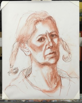
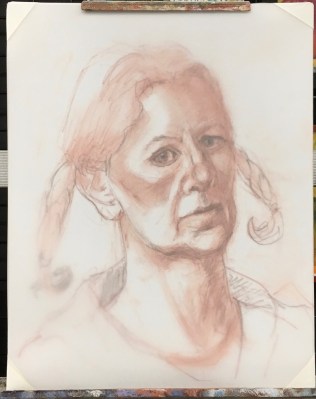

Inspired by Myriam Yee (be sure to check out her amazing series of Zorn palette self-portraits here), I used the “Zorn” limited palette of Ivory Black, Cadmium Red Medium, Yellow Ochre and Titanium White. Myriam uses Williamsburg Cold Black instead of Ivory Black, which has some Ultramarine Blue mixed in and provides a wider range of colors. I bought a tube and am experimenting with it now.
I painted on Dura-Lar Matte Film again but this time (see previous post) I did the drawing on one sheet and then imposed a second sheet over it to paint on. This way, if I wanted to try a second painting of the same drawing or just want to save the drawing I still have it.

10 replies on “Alla Prima Self-Portrait in Oil with Steps in Progress”
Oh wow, I love the finished piece and it’s so interesting to see your process! I haven’t had the time to properly plan and think out any of my recent self portraits and it makes such a difference. Thanks for sharing!
LikeLike
Thank you Lilly! I’m not sure how how well I thought out and planned this one, but I guess I did have some intentions, which always helps! I looked for self-portraits on your blog but it said there was no content. Is that true?
LikeLike
I have two blogs, one is empty. selfieadaybyday.wordpress.com is all self portraits- one a day for a year (hopefully!)
LikeLike
I replied on your Selfie blog.
On Tue, Dec 22, 2015 at 4:22 AM Jana Bouc, Artist wrote:
>
LikeLike
I love it- although I think you are far prettier than this self portrait suggests! But I know the concentration required screws our faces in funny ways😜. Thanks for describing and posting the setup area. Very helpful. I’d love to see a 360 photo image of your studio sometime!! Well done!
From Nicole (Nickie) Gently Emerging Artist: http://www.artbynicolemonique.blogspot.com http://www.Facebook.com/nicolemoniqueart
LikeLike
Thanks Nickie! There’s a 360 degree video tour of my studio when it was first remodeled here.
LikeLike
Very interesting and thanks for sharing, great job.
LikeLike
Great portrait Jana… I understand about the ‘intense look’ that results from that focus and strong concentration… but I think it makes it a more interesting painting. I find it fascinating how you are going through the process of using that limited palette in a pretty similar way that I did. My first effort was pretty monochromatic focusing on accuracy of tone, as I think yours is. What I did with my next one, was to look at the zorn colour chart and mix quite a number of those hues and tones, and tried to use them as is, resisting moderating them too much when applying to the canvas. Its a bit scary, but fun to do, and the results are always quite surprising.
Love to see some more of the portraits!
LikeLike
Thanks Myriam. I love the idea of mixing and using the colors selected from the chart. I haven’t done a Zorn chart in oil (did one in gouache) but have done the full set of Richard Schmid color charts and while a good exercise and lovely to look at never used them much. This seems like a great way to use a color chart!
LikeLike
Thanks Janette!
LikeLike