
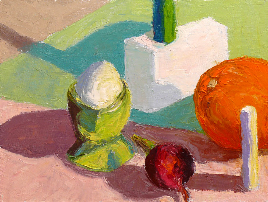
Oil on panel, 9×12″ (Larger)
On Monday mornings I’m taking a painting class from Camille Przewodek in Petaluma. I first read about her on Ed Terpening’s blog and when I saw her absolutely stunning work I was thrilled to be able to study with her.
As I understand it, the focus of her class is learning to develop one’s ability to see light, atmosphere, and their effects on the subject one is painting and to develop the ability to interpret that in paint. Camille bases her teaching on Henry Hensche‘s, with whom she studied and then spent many years further expanding upon his work. Hensche was a student of Charles Hawthorne who was a student of William Merrit Chase, an American Impressionist who developed his color theories via his study of Monet‘s groundbreaking work.
Camille’s paintings are simply stunning. A slide show of her paintings brought tears to my eyes with their beauty…something that has only happened to me once before when I saw Renoir’s Luncheon of the Boating Party in person.
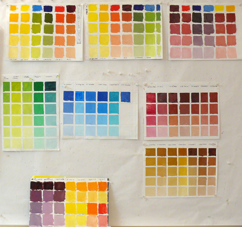
Newcomers to the class begin by doing plein air still life color studies of colored blocks. Using blocks simplifies the subject matter in order to focus on using changes in color hue and temperature to create the illusion of form and depth. There’s an explanation of this process in the book, Painting the Impressionist Landscape: Lessons in Interpreting Light and Color by Lois Griffel, who took over Hensche’s art school after he died.

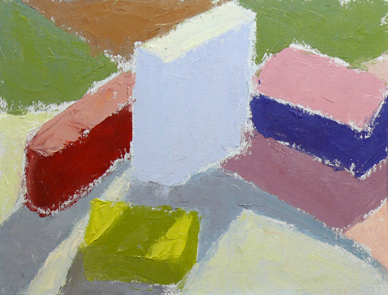
Oil on panel, 9×12″ (larger)
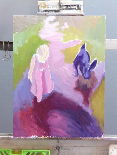
Above is the first block study I did in class while everyone else was painting beautiful marshland. The process for doing the studies is to block in the masses with a palette knife, leaving white space between color areas, breaking each shape into two values: shade and light. You start with one color and move to the next, focusing on the relationship between each color and the next.
Elio Camacho, my other wonderful painting teacher, also strongly emphasizes the importance of the relationship between contiguous colors. They both explain that there’s no such thing as a “muddy” color—that the appearance of muddiness results from the relationship not being right between a color and it’s neighbor.

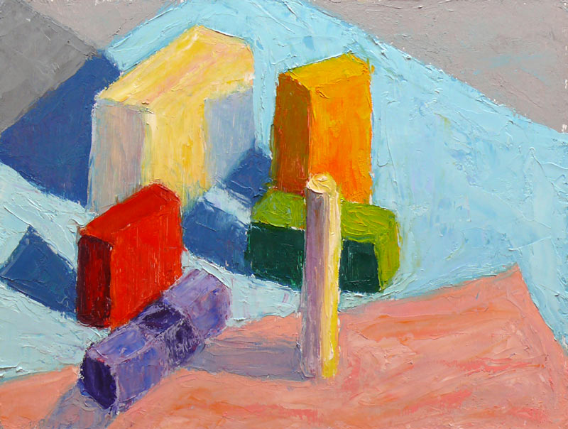
Oil on panel, 9×12″ (Larger)
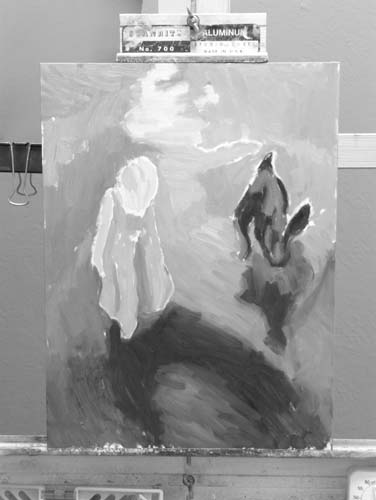
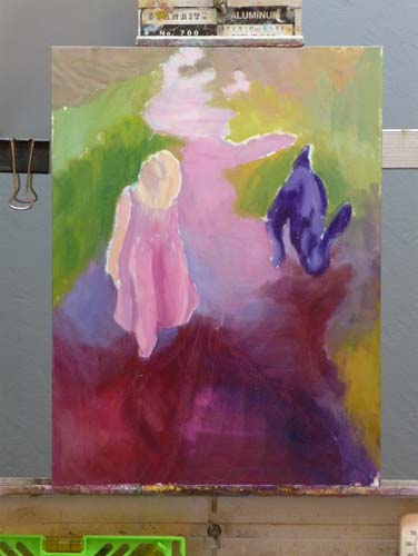
The one above was done at home under a bright light, trying to simulate sunlight on a dark and rainy day. When I brought the original version of this painting to class for critique, Camille pointed out that blue cloth was too dark because in the bright light it shouldn’t be darker than the shadow on the white block so I worked on it some more, lightening the cloth. If you want to see how it looked before, and the steps in getting there, including the photo of the blocks, just click “continue reading” below.


