
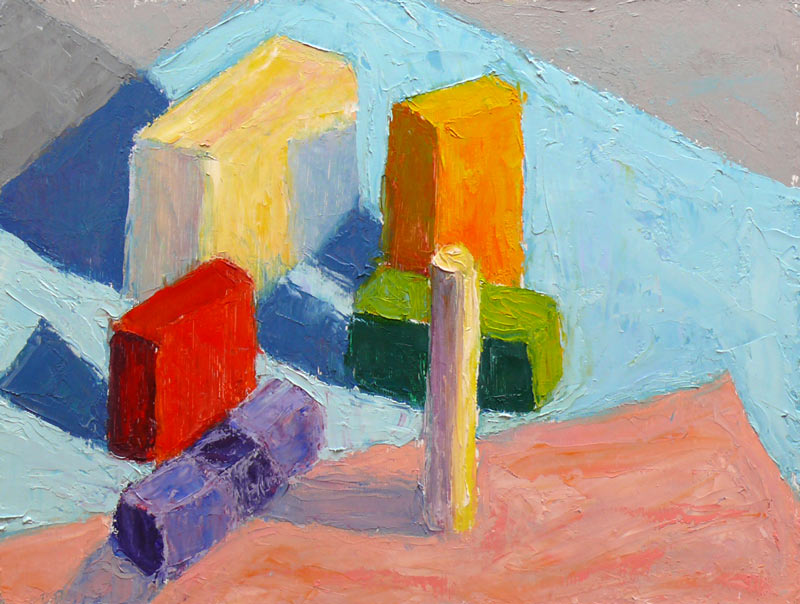
Oil on panel, 9×12″ (Larger)
On Monday mornings I’m taking a painting class from Camille Przewodek in Petaluma. I first read about her on Ed Terpening’s blog and when I saw her absolutely stunning work I was thrilled to be able to study with her.
As I understand it, the focus of her class is learning to develop one’s ability to see light, atmosphere, and their effects on the subject one is painting and to develop the ability to interpret that in paint. Camille bases her teaching on Henry Hensche‘s, with whom she studied and then spent many years further expanding upon his work. Hensche was a student of Charles Hawthorne who was a student of William Merrit Chase, an American Impressionist who developed his color theories via his study of Monet‘s groundbreaking work.
Camille’s paintings are simply stunning. A slide show of her paintings brought tears to my eyes with their beauty…something that has only happened to me once before when I saw Renoir’s Luncheon of the Boating Party in person.
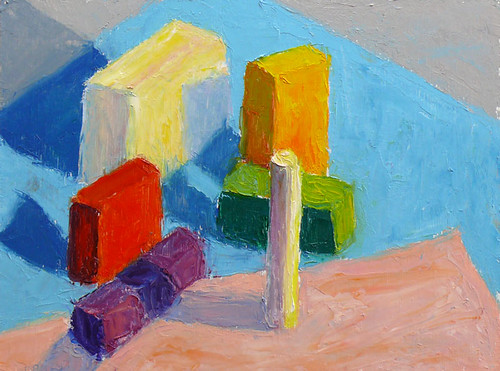
Newcomers to the class begin by doing plein air still life color studies of colored blocks. Using blocks simplifies the subject matter in order to focus on using changes in color hue and temperature to create the illusion of form and depth. There’s an explanation of this process in the book, Painting the Impressionist Landscape: Lessons in Interpreting Light and Color by Lois Griffel, who took over Hensche’s art school after he died.

Oil on panel, 9×12″ (larger)
Above is the first block study I did in class while everyone else was painting beautiful marshland. The process for doing the studies is to block in the masses with a palette knife, leaving white space between color areas, breaking each shape into two values: shade and light. You start with one color and move to the next, focusing on the relationship between each color and the next.
Elio Camacho, my other wonderful painting teacher, also strongly emphasizes the importance of the relationship between contiguous colors. They both explain that there’s no such thing as a “muddy” color—that the appearance of muddiness results from the relationship not being right between a color and it’s neighbor.

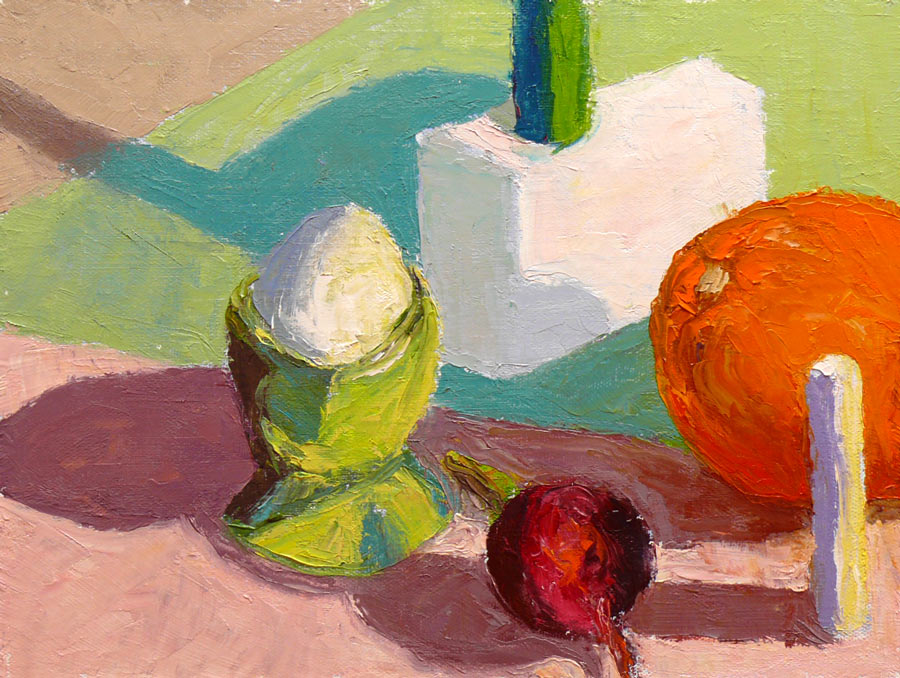
Oil on panel, 9×12″ (Larger)
The one above was done at home under a bright light, trying to simulate sunlight on a dark and rainy day. When I brought the original version of this painting to class for critique, Camille pointed out that blue cloth was too dark because in the bright light it shouldn’t be darker than the shadow on the white block so I worked on it some more, lightening the cloth. If you want to see how it looked before, and the steps in getting there, including the photo of the blocks, just click “continue reading” below.
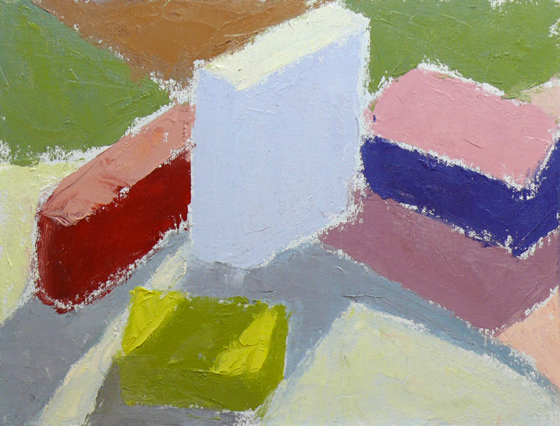
Above is the way it looked when I brought it to class critique with the darker cloth.

Above is the first block in, trying to save white space between shapes.

Above is a photo of the “still life” of blocks on my desk next to my easel. In class we use blocks made from 2x4s and painted in primary colors but I just went to the local consignment used toy store and bought a bag of random kids’ blocks plus painted white one chunk of 2×4 and a few of the blocks. They’re a little small but good enough.

14 replies on “Learning to See Color”
Interesting exercise. I may try it with watercolor since I have sooo much to learn about light and shadows. What is the rationale for leaving the white space?
LikeLike
That looks like fun. Wish I was there painting with you.
LikeLike
Jana, Glad to read you discovered Camille through my blog. I agree, her work is just stunning. Really unique, distinctive. And she’s a great person, too! I’m taking her workshop in Kauai end of this month, can’t wait.
LikeLike
Jana, thanks for sharing this information with us. So much to remember….. I appreciate your posting all this information. I’ll make sure and take notes since I’m too far away to enjoy a class. Thank you, thank you.
LikeLike
WOW! What an idea! And yes, to be able to SEE all those wonderful hues and temperatures ah — some day! These are terrific, Jana — I also think it’s one thing to SEE them and quite another to interpret them .. both challenging to be sure!
LikeLike
Very informative post! Loved checking out Camille’s work. Reminds me a lot of Wolf Kahn — another colorist whom I admire.
LikeLike
Thanks for sharing that process with the blocks. I’ve also heard very good things about her class, I can’t wait to hear more.
LikeLike
Jana, every time I visit your blog I learn so much! There’s a lot to digest here, and I plan to spend some time on it. thank you for the introduction to these wonderful painters and for sharing what you’ve been learning.
LikeLike
Good to be in a class with a focus on colour etc. It helps to see the relationships and how colours affect one another. We don’t have to paint ‘what we see’ at all, just slow down and change the colours to make a good painting. Says I, who do not practice what I preach about, but fiddle and faddle with pens and pencils!
w.
LikeLike
When Camille’s first painting came up, I thought to myself, “Hmm, maybe I don’t get it.” then as the next few paintings slid by in her slide show, I wanted to get up and start dancing. The movement is as exciting as the color. Beautiful. Thank you. I am always so impressed with your process in learning, Jana.
LikeLike
At your suggestion I have been listening to the book on CD of Renoir’s Luncheon of the Boating Party. It is an interesting perspective I think, and fun to read about that period of history.
LikeLike
I love seeing your exercises. I learned much about color from “Painting the Impressionist Watercolor” which is the watercolor version of the Lois’ book, written by Lee Boynton. He’s not a traditional watercolorist, but instead is all about getting the colors right, and doesn’t hesitate to use Chinese White to lighten up a color. He doesn’t care about transparency, and I must say after I read his book and followed his method, my paintings were transformed from watered-down looking watercolors to brilliant color. In his book he says to his students “SCREAM at me with color” and you really do!
LikeLike
Hello Jana,
Those are good block study efforts…
In reading some of your comments noted that “…Lois Griffel took over the Cape School after Hensche died….” comment.
That is incorrect…the actual events ending in the transfer of Hensche’s property to Lois Griffel occurred several years before HH’s death in 1992. There was also a court ruling on the legality of this transfer. You may be able to get the factual record of events from the court… I did not attend the court hearings so cannot provide you the details…
LikeLike
Happy ! Discovered Camille ! Loved your exercices!
LikeLike