Peet's Coffee after Manet, Graphite, ink & watercolor
When I walked up to the woman at the counter at Peet’s to order my coffee I started babbling that she looked just like someone in an Impressionist painting. She humored me and asked for my order. I ordered my latte, went back to my table, and Googled “Impressionist Bar Painting” on my iPhone. It didn’t take long before I found it.
Manet, Bar at Folies Bergère
I showed her the image on my phone and asked if she’d pose for me like the woman in the painting and she agreed. I don’t have permission to post her photo so all I can show you is my sketch, which is a study for a larger painting.
Needless to say, I left a good tip for my coffee (and modeling services). And fortunately there wasn’t a line of people waiting for their coffees.
I can see that I need to go back to Peet’s to sketch and take more photos so that I can replace the computer monitor on her left with something more beautiful. Or maybe it’s appropriate to be there? But it sure isn’t as pretty as Manet’s oranges and flowers in crystal.
Sketches from visit to Birth of Impression, ink & colored pencil
I’m not a fan of crowds, blockbusters or standing in line, but I put up with all the above to visit the Birth of Impressionism show in San Francisco’s De Young Museum in Golden Gate Park. I had planned to sketch in the park after the show but various delays only left time for these done while traveling there and back on BART and SF Muni.
I made a number of discoveries at the show and am looking forward to seeing it again, hopefully at a time when it will be less crowded. I really enjoyed many of the exquisite pre-impressionist paintings, and especially loved seeing the quite large “Whistler’s Mother” in person. Although the mother’s face appears soft and doughy, I could see in her eyes the universal worries, hope, dreams and sorrow all mothers experience.
Whistler's Mother (click to enlarge)
I liked the detail of the little foot stool her son provided for her comfort but my niece and I chuckled about the ugly shower curtain hanging to her left. (Seriously, it looks just like a plastic shower curtain I saw on sale recently.)
I was also struck by how unskillfully made some of the early impressionist paintings appeared to me. I found myself thinking that if I’d painted them I wouldn’t have been satisfied with them. That made me consider what a harsh judge I must be of my own work. Then I wondered whether all the paintings in the show (and in museums generally) are considered fine works of art or are included in collections simply because they are historical records of work by famous artists?
And now for an abrupt change of topic….
Have you ever seen a gopher close up?
As we left the museum I saw a gopher pop his head out of a hole in the grass. He continued popping up and down, busy pushing dirt out of his hole. I thought he was so cute until I saw the close up (below) on the screen.
Gopher Close Up (click to enlarge if you dare)
Yikes! We had gophers in my first San Francisco house. I kept planting things in the garden and the next morning they’d be gone, pulled under ground by a network of gophers. I finally gave up gardening at that house. Between the fog and the gophers it was hopeless.
I have a theory about the paths we take in life, and how important it is to notice what I call “Angels Holding Up Signs” along the way. Sometimes those angels take the form of a person offering helpful information or silently pointing the way by example, an intuitive thought, or an unexpected turn of events that makes you pause. When I see or hear an angel holding up a sign, whether it’s “Yield”, “STOP,” or “Go This Way” with an arrow, I consider it a gift and give it serious consideration.
Disclaimer: I’m not a New-Age angels and crystals sort of girl. But I do believe there are angels all around us; good, kind, generous people, like Adam at Kragen Auto Parts today who helped me dispose of gallons of old motor oil and their containers that had been abandoned in my garage (long story; don’t get me started!). Thanks Adam!
…And like the angels who’ve held up signs in my art life lately, including Kathryn Law and Ed Terpening who’ve both helped me to a breakthrough in my understanding about why simplifying is important in oil painting, especially when painting plein air. I’m always attracted to details, and so I’ve fought against that principle, and then fought my paints trying to put those details into my paintings.
Then I saw these paintings (below) by Ed Terpening on his blog, Life Plein Air, made during a workshop in which the instructor, Peggi Kroll-Roberts, challenged the class to break the scene into as few large shapes as possible and paint those shapes with a large, fully loaded brush in one brush stroke.
Each study evoked in me a mood and my mind created a whole life story for each of these women. A mom at the beach trying to keep her kids in line; a sad, matron, wondering where her life had gone; a glamorous, young society lady at the country club watching a tennis game while sipping a martini….
How did so much come from such simple paintings? Leaving out the details left it to my mind to fill them in. This is something I so needed to learn: that simplifying and omitting detail doesn’t make a painting boring—it lets the viewer’s mind play and be creative, making for an exciting, rewarding experience. Thanks, Ed, for holding up that signpost!
Another sign-toting angel came via email this week: a request to purchase this plein air oil painting I made last summer at Lake Temescal. There I was at the crossroads, wondering whether to give up plein air oil painting, and this angel popped up with a sign saying, “You’re on the right path, don’t turn back.”
And now about my process with today’s painting. First I tried to simplify by painting large color shapes with the plan to create a color study for a work to be done in the studio. I also focused on the composition, picking a focal point, being careful not to divide the canvas in half as I have a tendency to do, making the subject (the water) the largest portion.
Here’s how it looked when I’d covered the whole panel:
Lake Temescal Reflections, Phase 1
I’d worked quickly, using a palette knife, going for big shapes of color. I should have stopped there and gone for a walk. But instead I messed around for another hour and muddied up the design and the colors:
Temescal Reflections (muddied), Phase 2
But the great thing about palette knife painting is that it’s easy to scrape off passages and repaint them. So later that evening I put the photo of Phase 1 on my computer monitor side-by-side with a photo of the scene and worked on the painting until I was satisfied with it (as posted at top).
And I’m very happy with another breakthrough: the way I was able to enjoy the plein air painting process without worrying about making a Painting with a capital P while I was out there.
The weather was too perfect to paint indoors but I didn’t feel like driving anywhere. My next door neighbor was out pruning his pansies and he’d pulled out a whole bucketful he was about to put in the compost bin. Voila! A perfect painting subject. I stuffed a big clump of the pansies into a pitcher and set them on a table in the backyard.
I’d made the pitcher as a gift for my friend Barbara in the late 70s when I was a ceramic artist and she was a silversmith. She’s now a brilliant and prolific ceramic artist herself and she recently gave me the pitcher back. She was no longer using it due to a leaky crack and a house full of her own ceramics. I’ve been enjoying using it in still life set ups while fondly remembering it being filled with Mimosas every year for the annual Easter egg hunt and brunch her family held every year while our kids were growing up.
I knew that time was very limited before the shade moved across the yard onto the table so I worked quickly and had a great time.
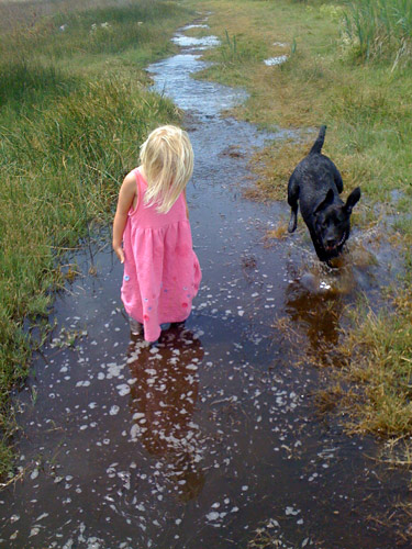
My friend Gina emailed me a photo with a note saying, “I like the light in this photo– for some reason I always think of you when I look at it.” Although I rarely paint from photos, especially those taken by other people, I just had to paint this one. My computer monitor is set up so that I can paint directly from the image on the screen which is a lot better than working from the limited colors in a printed image.
I’m not sure if I’m done yet, but I couldn’t see what else was needed so I stopped. If you have any suggestions for improving the picture, I’d love to hear.
Below are some stages of the painting. I used a bit of artistic license: I gave Hannah a bit of a haircut and deleted Gina’s wonderful dog Bella because:
The dog was competing with Hannah as the focal point and was about the same size.
I couldn’t get Bella to “read” as a dog; no matter how hard I tried to draw her correctly, she just kept turning into a jackrabbit.
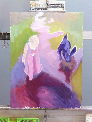
Hannah’s Reflection, Oil on Gessobord, 16×12
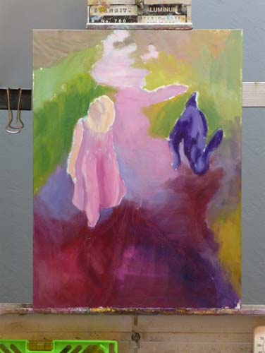
Painting phase 1
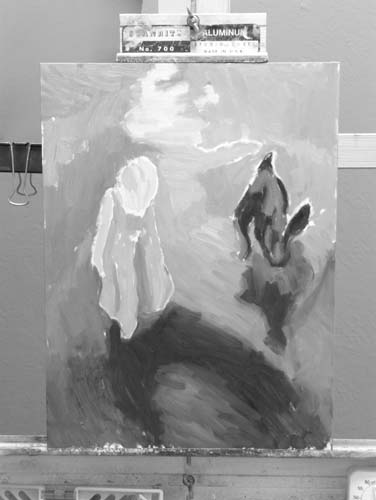
B&W value check
Painting phase 2
Painting Phase 3
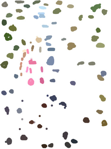
Color spots
Photo, B&W w/2 values
Photo, B&W w/3 values
Original Photo
Top row: 1) the finished painting; 2) my painting start; and 3) a black and white version of the start to see if my values were on track.
Middle row: 1) & 2) the next two steps in the painting. 3) a view of a “color spot” layer that I made in Photoshop. I created a new layer, and used Photoshop’s Paintbrush tool to select (Alt-click) and paint spots of those colors because it can be easier to see the colors when they’re isolated. Even more helpful than the color spots is a color-mixing tip I learned from Dianne Mize on Empty Easel: you apply the color to the edge of a small card and compare it to the subject until you get it right.
Bottom row: three views of the original photo. 1) “Posterized” in Photoshop down to two values; 3) posterized with three values; 3) Gina’s original photo.
P.S. This park, which Hannah affectionately calls the “swamp adventure,” is part of the East Bay Regional Parks. It is a river front park next to McAvoy harbor in Bay Point. It’s a little delta oasis in the sprawl of East Contra Costa County.
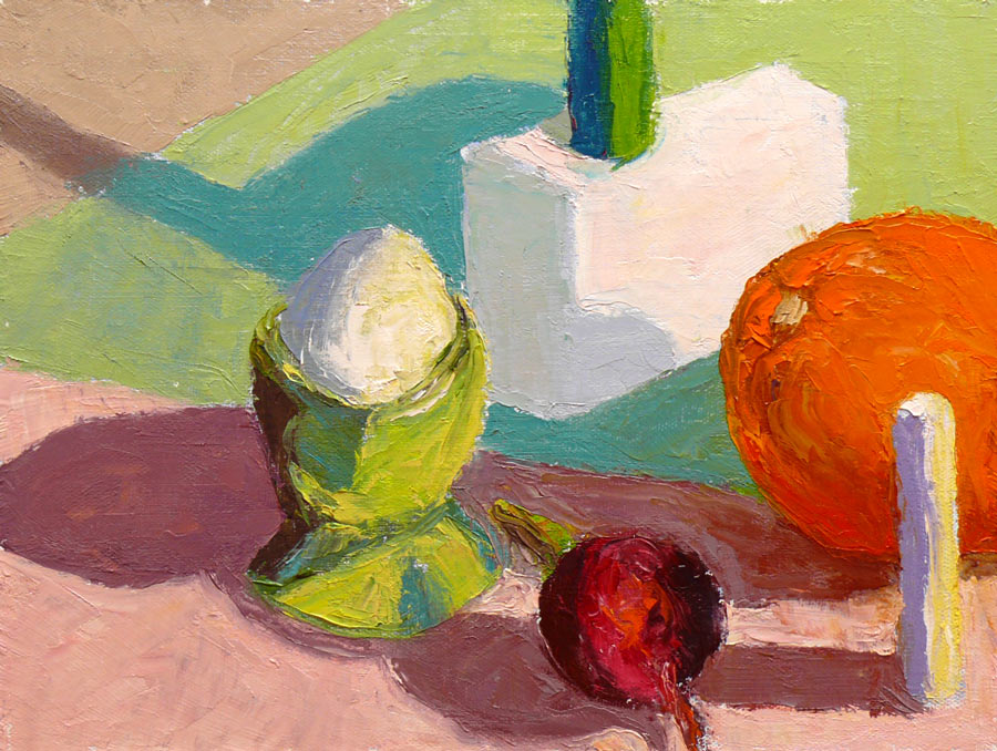
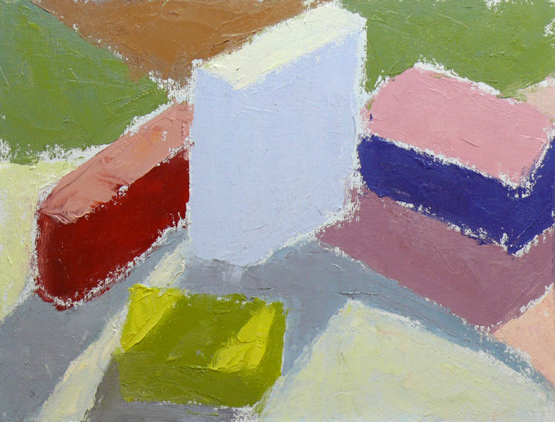
Color study of blocks under halogen light, 9x12 in, oil on panelI painted from this setup (not from this bad photo)
This study was done to practice seeing, mixing and and painting the relationships of color and light on different planes. Theoretically these colored block studies should be done outdoors with natural light, but it was a cold windy day and I wasn’t feeling well (and still don’t—first it was stomach flu and now a cold) and so worked indoors. When I compare this indoor painting to those I did outdoors and posted here, I can see why it’s better to work outdoors.
“Charles Hawthorne was the first painter…to put the “Impressionist concept of seeing” into a teaching principle. Hawthorne spent the last fifteen years of his life trying to understand what Monet looked for and how he painted.
Henry Hensche, an assistant to Hawthorne, perfected the concept of seeing and teaching color after Hawthorne’s death in 1930. Mr. Hensche taught and practiced this visual language of color from that first Summer in 1930 until his death in 1992.” [emphasis added]
I’ve studied on and off the past year with Camille Przewodek, a fantastic plein air colorist and former student of Hensche and I think I’m beginning to comprehend the concepts at a basic level (although the study above is a poor representation of that). Another painter who studied with Hensche, John Ebersberger, has created a Hensche Facebook group that is open to the public, for former Hensche students and others who are interested in Hensche’s approach to seeing and painting color relationships. There are wonderful photos posted there of Hensche paintings and paintings by the artists who have carried on his approach to color, and to my mind, have advanced it even further. Their discussions and critiques on the groups discussion board are also quite illuminating.
Painting colored blocks under different light is one of the techniques Hensche used to teach students to see that in every plane change there is also a hue or color change (not just a tone or value change), and how these colors change according to the light key (foggy grey light, bright sunlight, early morning light, afternoon light).
This is not an easy approach and takes years of practice and study, best done with an experienced teacher like Camille Przewodek, John Ebersberger, Carole Gray-Weihman, Dale Axelrod (great links and examples on his website), and others at Atelier aux Couleurs Art Academy who offer workshops locally and internationally. I have found one book, Painting the Impressionist Landscape, that does explains the concepts (although I don’t think that author’s paintings provide stellar examples, especially compared to those listed above).
Even if I never learn to see and paint like they do, I’m sure the concepts I am learning will enrich my painting and it has already changed the way I think about light and color and form.
Morning light study, Petaluma, oil on panel, 12x9Afternoon light study, Petaluma, oil on panel, 12x9
I ran a red light right in front of a police car on my way to painting class on Monday. If that wasn’t bad enough, I didn’t even realize I’d done it.
I even thought to myself as I drove past the police car that was waiting for the light to change, how nice it is that police don’t look at women like me suspiciously the way they might at young men in loud cars.
Seconds later I heard the siren, saw the flashing red lights, and pulled over. The cute, young officer was shaking his head, it was so ridiculous. He couldn’t believe what I’d done and, trying to make sense of it, asked if I was distracted, was looking at a light further ahead, etc.
Camille offered an extra afternoon session Monday so that we could do both a morning study as usual, and a late afternoon study of approximately the same scene to capture the difference in light. I simplified the buildings, trees and landscape to abstract shapes or puzzle pieces, so that I could focus on the colors and light effects.
In the morning the foreground and midground was mostly in shadow while the distance was in open sun and the sky appeared a weak yellowish to slightly pink color. In the afternoon everything was front lit with a very warm light.
It was a long day and after Camille made some adjustments to my afternoon study and gave suggestions for doing more, I realized I was too tired to paint any longer. I lay down on the grass in the park and spent the last half hour of class sketching a palm tree on my back (I mean I was on my back in the grass; it’s hard enough drawing palm trees, let alone sketching one on my own back!).
It had been too long since I laid in the grass on a summer day in the shade of a tree looking up at the sky. I need to do more of that and less rushing around distracted!
On Monday mornings I’m taking a painting class from Camille Przewodek in Petaluma. I first read about her on Ed Terpening’s blog and when I saw her absolutely stunning work I was thrilled to be able to study with her.
As I understand it, the focus of her class is learning to develop one’s ability to see light, atmosphere, and their effects on the subject one is painting and to develop the ability to interpret that in paint. Camille bases her teaching on Henry Hensche‘s, with whom she studied and then spent many years further expanding upon his work. Hensche was a student of Charles Hawthorne who was a student of William Merrit Chase, an American Impressionist who developed his color theories via his study of Monet‘s groundbreaking work.
Camille’s paintings are simply stunning. A slide show of her paintings brought tears to my eyes with their beauty…something that has only happened to me once before when I saw Renoir’s Luncheon of the Boating Party in person.
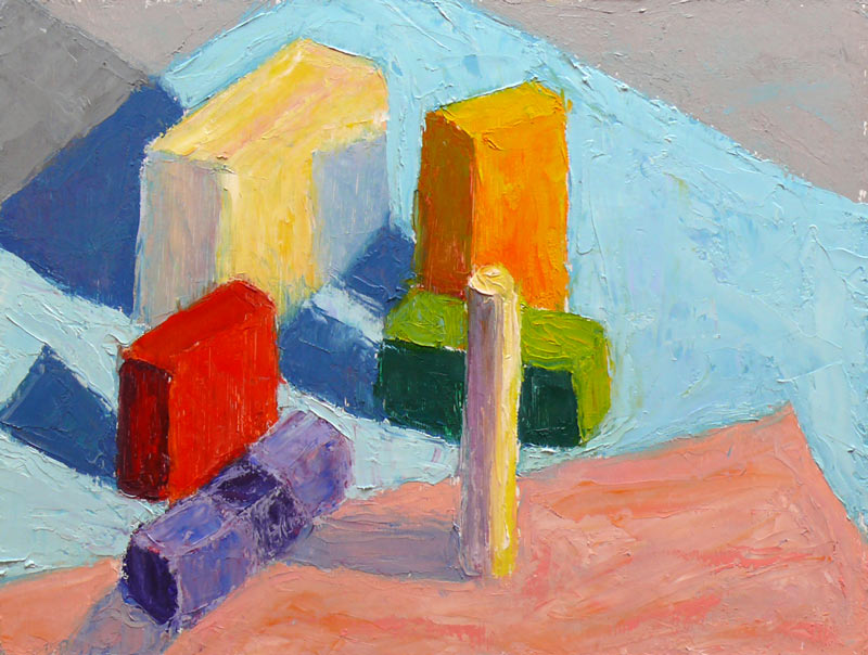
Newcomers to the class begin by doing plein air still life color studies of colored blocks. Using blocks simplifies the subject matter in order to focus on using changes in color hue and temperature to create the illusion of form and depth. There’s an explanation of this process in the book, Painting the Impressionist Landscape: Lessons in Interpreting Light and Color byLois Griffel, who took over Hensche’s art school after he died.
Above is the first block study I did in class while everyone else was painting beautiful marshland. The process for doing the studies is to block in the masses with a palette knife, leaving white space between color areas, breaking each shape into two values: shade and light. You start with one color and move to the next, focusing on the relationship between each color and the next.
Elio Camacho, my other wonderful painting teacher, also strongly emphasizes the importance of the relationship between contiguous colors. They both explain that there’s no such thing as a “muddy” color—that the appearance of muddiness results from the relationship not being right between a color and it’s neighbor.
The one above was done at home under a bright light, trying to simulate sunlight on a dark and rainy day. When I brought the original version of this painting to class for critique, Camille pointed out that blue cloth was too dark because in the bright light it shouldn’t be darker than the shadow on the white block so I worked on it some more, lightening the cloth. If you want to see how it looked before, and the steps in getting there, including the photo of the blocks, just click “continue reading” below.


