Categories
Colored pencil art Drawing International Fake Journal Month Life in general People Sketchbook Pages

Janas (Fake) Journal: Spell for Art Making

Play Your Art Instrument, gel pen and colored pencil
Play Your Art Instrument, gel pens and colored pencil

I heard an interview with musician Bobby McFerrin on NPR yesterday and he said something about work, play and creativity that really struck me. He was talking about having always just wanted to be a working musician (rather than a famous celebrity). Then he stopped to correct himself about the word “work” vs. the importance of “play”:

“When we’re doing our lessons, the teacher doesn’t say, ‘Ready, set, work.’ They say, ‘Ready, set, play,’ and I always took that word seriously.”

When I heard his spontaneous and inspired music, I understood exactly. Without the spirit of play, art becomes work, serious work. And serious isn’t fun. You rarely see the adjective serious describing something you want. It usually appears before words like illness, accident,  mistake, and problem.

Of course there are serious artists who make serious work. I watched a series about artists on PBS called “Art:21.” The producers must have told all the artists to refer to their paintings, sculptures, prints as “work”  (e.g. “I made this work last year…” or “This work is about…” or “When I am making work…”). It just sounded so pretentious, self-important and overly serious.

So now, when I find myself working hard (and enjoying it less) whether in the studio, the sketchbook or life in general, I will remember the spell for joyful art making and apply it once again.

If you want to try the spell too, all you have to do is open your mind, heart, spirit, eyes, arms and PLAY!

(For more information about International Fake Journal Month click here).

Categories
Acrylic Painting Art theory Blake Gardens Ink and watercolor wash Landscape Outdoors/Landscape Painting Places Plein Air Sketchbook Pages

Blake Gardens: Tulips, Tulip Trees: Sketches and Paintings

Blake Gardens Tulips & Tulip Tree, ink & watercolor, 7x5"

The tulip trees (Saucer Magnolias) and tulips were blooming when we painted at Blake Gardens on a sunny Friday a week ago. Of the multiple sketches and paintings I did of the scene, I think I’m happiest with the one above, done in my journal when I got home, from a combination of memory and photo. I clipped the text from their brochure and pasted it on the journal page.

Here is the final painting and below that are the steps in between:

Blake Tulips & Tulip Tree, Acrylic, 10x8" on Gessobord

After I picked my spot to paint and set up my easel, I did several thumbnail sketches (left below) to plan my composition. While each thumbnail improved on the one before it, none were great compositions and as a result neither was the plein air painting I did on site.

Journal spread with thumbnail sketches
Journal Spread with thumbnails

I was working with Golden Open Acrylics, my first time trying them outdoors. A Golden expert suggested I put a drop of Golden Open Acrylic Thinner atop each blob of paint to keep them moist when painting outdoors. Instead, thinking I was so clever, I mixed about 25% thinner with 75% water in a spray bottle and misted the paints occasionally.

But I should have taken her advice as my method didn’t work. She’d warned me that adding water to the Open paints will make them dry faster, which it did, and they started getting icky-sticky about the time I needed to quit and head for the critique anyway. Indoors they stay wet all day and in a closed palette, for a week or two.

The plein air painting was so UGLY that I’m glad I only expect my plein air paintings to be learning studies. My plein air painting goal is to fully experience and participate in a scene and embed my memories of color, light, texture, sounds and scents.

Very BAD Plein air study
Plein air study

And there were sounds and scents: not only were the many magnolias overly fragrant, but shortly after I set up, two gardeners fired up a gas-powered industrial-strength chain saw, cut down a huge tree and sawed it to pieces about 20 feet away from me. The sound was horrible and the smell was worse.

Below is a photo taken when I first arrived,  cropped into a more pleasing composition. I like the diagonals and the way shapes of shadows and colors lead the eye into and around the painting.

Photo at Blake Gardens

From my watercolor sketch and the photo above, I started working on a studio version of the painting. Below is the  underpainting with the main shapes and colors blocked in.

Underpainting in acrylic
Acrylic under painting

I liked just as it was and was hesitant to paint over it so I left it for a few days before working on it again until it decided it was finished.

Categories
Art theory Berkeley Drawing Ink and watercolor wash Painting Places Sketchbook Pages

Berkeley Firehouse Part II: Cathy’s Sketches

Hazardous Materials Truck Exhaust Hose,
Hazardous Materials Truck Exhaust Hose

When we go on our Tuesday night sketchcrawls I learn so much from seeing how Cathy approaches sketching, with her years of experience and vision as a graphic designer. This sketch is a good example of the way she designs a page, including both the detail and the context, while connecting elements to the edges of the page.

Firefighters' Jacket Rack

Cathy’s sketches often display groups of objects in interesting patterns. She also edits the subject to make a better composition, in this case removing a few jackets to simplify. She first draws a group of objects as one shape as in contour drawing and then adds the interior lines. Again in this sketch above she shows the context as well as the detail, so that it’s not just a rack of jackets and helmets, but with the bit of fire truck you know they’re firemen’s jackets. Notice also her wonderful sketchy and free lines, which she achieves by holding the pen closer to the end than to the point.

Engine No. 2
Engine No. 2

I love the way she got so much detail in the fire truck above but loosely, and with good perspective. Most of her sketches also include informative notes about the subject, placed in a location that adds to the good design. When I asked Cathy how she starts a sketch she said she always tries to start with the thing that interests her most to make sure it fits on the page and that it gets on the page. (It’s so easy to start drawing and run out of page before you ever get to the thing that attracted you first).

Engine No. 2 Side View

More cool details: all the gizmos on the side of the truck.

Gizmo close up
Gizmos close up

When she was sketching this (above), one of the firemen told her that when they are learning their equipment they also sketch all the gear and label it to help them study.

Boots and pants
Boots and pants

Here’s her version of the ready-to-step-into boots and pants.

Cathy sketches with ink in a spiral-bound 4×6″ Strathmore 400 Drawing notebook, focusing on making as many quick sketches as she can. She makes tiny pencil notes over the sketch about color to use when she adds watercolor later in the studio.

All images copyright 2010 by Cathy McAuliffe, used with permission.

She sketches with ink in a 4×6″ Strathmore 400 Drawing Paper pad, focusing on making as many quick sketches as she can. She makes tiny pencil notes over the sketch about color to use when she adds watercolor later in the studio.
Categories
Art theory Drawing Flower Art Painting Plants Watercolor

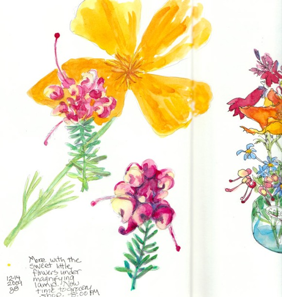
Magnified Teensy Flowers

Magnified teensy flowers
Magnified teensy flowers, ink & watercolor 8x6

The teensy bouquet was still holding up and the complicated shapes in these flowers intrigued me. So I stuck them under my magnifying lamp and drew them again in sketchbook opposite the bouquet side. The California poppy had opened up and wanted to play too so I stuck him in behind the little flowers after I painted them. It’s fun drawing what’s under the magnifying glass and getting to see all the neat details.

Then it was back to work on the third painting I’ve been asked to do for the book, Must Paint Watercolor Flowers. This time it’s a peach colored begonia with really interesting veiny leaves.

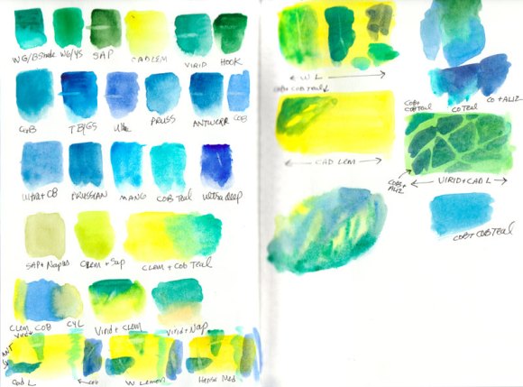
Begonia leaf colors
Begonia leaf color tests

My first step was to test colors and try to find the pigments that will mix to the right values, colors and textures. On the tests above I experimented with glazing with different yellows, blues and greens, and tried lifting color for the veins in the leaves to see which worked best for that.

Begonia petal test colors

I found just the right mixture of colors for the petals with a color I’ve rarely ever used because it is more opaque than I usually prefer: Naples Yellow. When mixed with combinations of Cadmium Orange, Permanent rose, and Quinacridone gold, it looks like it will give me perfect petals. But now it’s back to “day job” work for the rest of the week. That will give me time to focus more on how I will approach the painting so once I have brush in hand I’m ready to go.

I don’t always plan things out so carefully, but it can help prevent wasted time and do-overs which becomes more important when I’m also photographing each step and writing about it for the book.

Categories
Art theory Collage Drawing Food sketch Sketchbook Pages

Don’t Replace, Reface: Dealing with a “Bad” Sketchbook Page

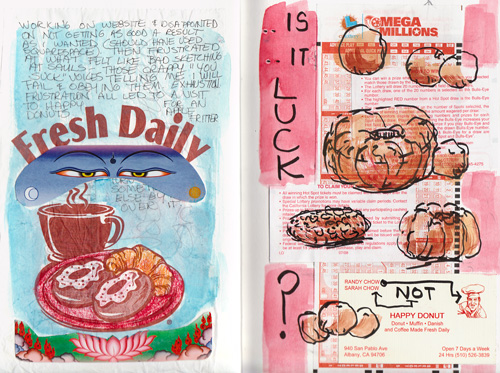
Fresh : Luck, collaged pages
Fresh : Luck, collaged spread in 6x9 Fabriano Venezia sketchbook

Are you tempted to tear out the page in your sketchbook when a sketch goes bad? I used to do that.

When we were sharing sketchbooks Tuesday night, I pointed proudly to three pages that had terrible drawings on them of an object that simply wasn’t draw-able (or nameable–more about that in a minute). I said, “Look! I wasted three pages and they’re really ugly and I’m OK with letting them just be there.” Cathy the graphic designer, said, “Well, you know, you could just paste stuff over them.”

Is It Luck?
Is It Luck? Ink & gouache lottery tickets and business card (click to enlarge)

So when I visited my local donut shop in a moment of weakness (apple fritter: my drug of choice) I collected some random stuff they had on the counter: a postcard advertising a Tibet Day, some California lottery slips, the proprietor’s card, and the bag my fritter came in. I thought the picture they chose for the card— an Italian-looking chef—was funny since the store is owned and run by an Asian family. I cut stuff up and pasted it down (the bag was already sticky!), wrote and drew on them, colored with crayons, and painted on some gouache. You see a bit of the bad drawing/writing about it coming through the bag/blue paint.

Fresh Daily, collaged page
Fresh Daily, collaged page: post card pieces on bakery bag pasted over bad sketch, and crayons and paint

When I wrote “Is it luck?” I was referring both to the lottery tickets and getting a good drawing. Is it luck when a drawing turns out well? Sometimes it feels like a sketch or painting can’t fail—it seems to paint or draw itself—a total gift. Other times it’s just the opposite and I have the feeling from the very start that the project will be a big FAIL. I try to recognize those negative thoughts and make them stop when I do, but sometimes they just won’t go away.

Oh… and the undrawable thing I was trying to draw? It’s something I found in a “Free” box on a neighborhood walk. A cute little wooden sorting device with numbered slots for 31 days on a sliding thingee, with three little  drawers that could hold paperclips or other small stuff. It looks like a funky version of  this only in oak color and without the clock.

Sorter, sort of
Sorter, sort of

I thought I might be able to use it for drying paintings on panels, but the slots were too narrow. It was way too boring and complicated to draw so after three tries I put it in the garage to take to the thrift shop with some other donations. I thought about returning it to the neighbor’s “Free” box but that seemed like cheating.

So when the sketch turns into a big mess, now I know what to do: don’t rip it out, don’t just leave it there glaring in its butt ugliness; just do what those TV commercials for kitchen cabinets advertise: “Don’t replace, reface!” And when the subject isn’t fun and/or interesting to draw, stop. Life is too short to waste what is meant to be fun time not having fun!

Categories
Art theory Drawing Food sketch Ink and watercolor wash Painting Sketchbook Pages

Macaroon Marathon

Macaroon Take-Out Page 1

After struggling with sketching a coconut macaroon at Saul’s last night, I brought it home in a take-out container and then sketched it eight more times, in a duet with the takeout box.

Macaroon Take-Out Page 2

Then I had my way with the sketches I didn’t like that I’d done at the restaurant (below).

Macaroon with note to self

Before I’d started the sketch above,  I used the edge of the page to make a bunch of little thumbnails to play with composition ideas. This was inspired by a conversation I had with my sketch buddy Cathy. She’s a graphic designer with years of experience. Her sketches are wonderful with exciting line and great composition.

I asked Cathy what she thinks about when she starts a sketch. She said the first thing she considers is how the subject will interact with the edge of the page (or the border she sometimes draws first). She said she never “floats” a subject in the middle of the page; subjects are always cut off on one or more edges. Despite my thumbnails I ended up with way too much table and plate compared to macaroon and was mad at the sketch. So I used the space to write a note to myself about making better use of the page.

Macaroon mountain (Grammercy Park)

Then I went back to the second macaroon sketch from Saul’s and started doodling around with it. My doodles reminded me of the fence around Gramercy Park that was just outside the hotel I stayed in on a trip to New York a long time ago. With the fence, the scale of the macaroon seemed mountainous (or at least boulder-like).

Two other discoveries I noted on the page: 1) I’d divided the page almost perfectly in half (a design no-no), and 2) that I don’t like cropping things because I don’t want to miss out on a single detail or insult the object by lopping off some of it. How silly is that? I’d like to overcome this quirk and learn to put more focus on design, not just detail.

Categories
Art supplies Art theory Flower Art Published work Sketchbook Pages Still Life Studio Watercolor

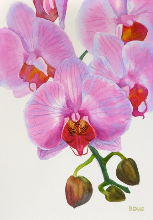
Refusing to Fail or Quit: It was either me or the orchid…


Orchid in watercolor #2, 12x9"


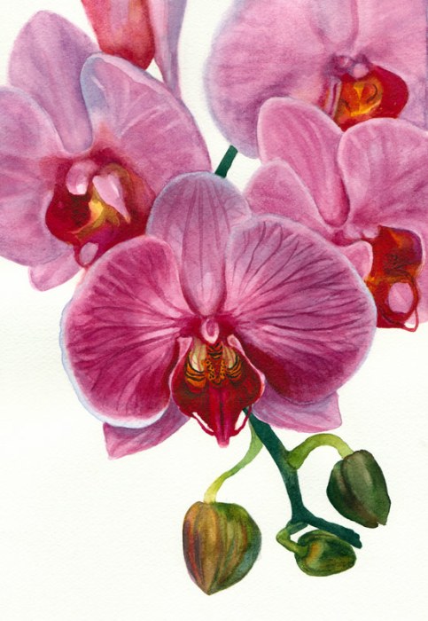
On Wednesday night I completed the last page in a sketchbook with some writing about the frustrating process I’d been through with the orchid painting. And then, as I did one last sketch of the orchid in the book (below) I realized how I might be able to actually make the painting I’d originally envisioned. It would be one I could do simply and be able to write about as the six-step process the publishers needed.

When I woke up on at 6:00 a.m. on Thanksgiving morning I realized I had to give it another try. The image above is the happy result.


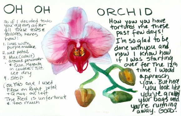
Oh Oh Orchid!
My sketchbook breakthrough

Tonight my watercolor group met for dinner and a chance to share what we’ve been painting this month. When I showed them the two versions of the painting they liked both but Susie said that in the first version they looked like evil man-eating orchids, which is certainly how they felt to me. In the sketch above I thought the orchid looked like it had packed his bags and was running away, suitcases in hand. (Good riddance!)

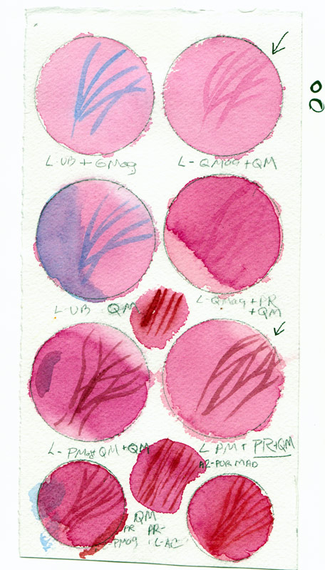
Here is one of the MANY pages of tests and samples I made in trying to find the right pigment combinations to make this painting work.

Orchid watercolor test page

I decided the pigment that gave me the color I wanted was Winsor Newton’s Quinacridone Magenta but like most quinacridones,  it wasn’t very civilized, trying to spread everywhere.

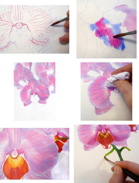
Orchid Painting Steps

What finally worked was painting the veins first on dry paper, wetting a petal, painting cobalt blue just inside the perimeter and then dropping in the Quinacridone Magenta in the center, letting it spread and then blotting up a bit of the paint as needed.

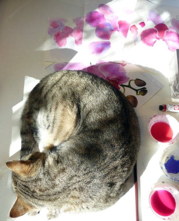
Busby relaxing amidst orchid chaos

At least someone got to relax in the sun. When I left to make a cup of coffee Busby napped amidst the orchid chaos on my desk. You can see the original reference photo peeking out from under him, with a pile of false starts at the painting behind that.


Categories
Art theory Flower Art Painting Still Life Watercolor

Orchid Painting in Watercolor for the book but….

Orchid painting in watercolor, 8.5" x 11.5"

So here’s the frustrating thing: I learned that the publisher wants me to write the text accompanying the step by step photos as instructions (first do this, now do that) rather than a description of what I’ve done. Sometimes watercolors go as planned and that would be simple to do, because what I did is how I would tell someone else to do it.  But with this painting there was just as much taking off of paint as there was putting it on. Some of that was about softening edges with a damp brush and then blotting, but some of it was just removing paint that wasn’t working. I’ve never seen a “how to” book that says paint on a nice wash. Now wipe it off.

My biggest problem with this painting was the photo I had to work from. Like many artistic photos of flowers, it was shot without shadows or directional light and therefore everything was very flat with little dimensionality. Even more difficult, everything except the front center flower was intentionally out of focus. That makes for a lovely photo but not an easy watercolor painting project. And there is no variation in color: they’re all just cotton candy pink with dark magenta veins. And I picked the stupid photo and thought it would be easy. But for me, what is easy is lots of detail and variations in color, shape and value.

I started over four times, each time getting a little further and then abandoning ship. If I was just painting for myself any of those starts would have been fine and enjoyable to paint but I was finding myself exaggerating shapes and colors and losing fidelity with the photo.

Now I’m not sure what to do: Paint this again in order to be able to do write a logical “how to” that doesn’t include undoing previous steps? Write a “how to” and leave out the do-overs? Enjoy my vacation this week and forget about the whole project? (the latter sounds most appealing)

I think I’ll send a photo of the painting to my editor and see if she even likes the painting. My persistent (compulsive?) side really wants to paint the painting again, trying to do it more simply and cleanly. But my (sane?) side says “Go have a bowl of ice cream and watch a movie.” I wonder which side will win and how late the ice cream shop is open?

Categories
Art theory Flower Art Painting Plants Still Life Watercolor

Painting for the book: Part III ~ Finale

"Sunny Serenade", watercolor, 15.5"x10.5"
"Sunny Serenade", watercolor, 15.5"x10.5" (click to enlarge)

The editor requested that I name the finished painting (above). Corny painting names are a pet peeve of mine and so I rarely name them. But as I was uploading the image the name “Sunny Serenade” came to me. I know that’s about as sappy a name as you could try to invent, but since it seemed to name itself, so it shall be.

To finish sharing the steps in the painting, here they are in order, continuing from the previous post.

Painting the green leaves, flowers and stems

The next step was to work on all of those leaves, stems, buds and little yellow green flowers. Using a variety of mixed greens, some neutralized with Burnt Sienna, I painted the first layers of the leaves. I also glazed details over the yellow green flowers I’d painted previously.

Adding the darks
Adding the darks

I mixed up several puddles of these dark mixtures: Winsor Green, Alizarin Crimson, and Burnt Sienna; Ultramarine Blue and Burnt Sienna; Sap Green and Sepia with a dab of Winsor Red; Winsor Green and Winsor Violet. Then I loaded my brush with one and started painting a section, switching to another one of the puddles as the background colors changed. I was careful to stay within the dark shapes and to negatively paint around lighter shapes. Because watercolor dries lighter, I tried to mix colors that would be dark enough in one layer.

I thought I was finished and signed the painting. The next day I studied the painting with fresh eyes and realized I needed to make some adjustments. I glazed in some more darks on the right of the pitcher and on its handle on the left. I added a middle-dark green mixture to the long leaf that hangs down along the right side of the pitcher and on some other leaves as well. (Compare the pitcher in the top two pictures in this post to see the changes).

While some people have commented that this painting seemed very challenging, in fact an image broken into many small complicated shapes is much easier to paint and more forgiving of “mistakes” than one composed of large simple shapes.

My editor liked the painting and immediately requested the next one, due the end of November. It will be a completely different project: a close up view of some pink orchids with a light background. I will be working much more loosely, mostly wet into wet.


Categories
Art theory Flower Art Painting Published work Still Life Watercolor

Painting for the book: “Must Paint Watercolor Flowers” – Part II

Starting orange flowers; softening an edge

Continuing on from Part I, here is a close up as I began to paint the yellow and orange flowers. For the first layer of this flower I painted the darker sections and then used clear water in a damp brush to pull/feather the color out into the flower so it didn’t make a hard edge.

Yellow underpainting of some flowers
Yellow underpainting (click to enlarge)

For the three large zinnias, I outlined all the petals with Holbein Cadmium Yellow Light. Then I brushed a ring of clear water around the center of each of those flowers and painted a narrower ring of yellow inside that so the paint would softly spread in the water to not quite the edge of the water, producing a soft edge. When that dried I painted the flower’s very dark center with a mixture of Winsor Newton (WN) Burnt Sienna and Winsor Violet. Then I painted the gold ring between them with WN Cadmium Orange mixed with Daniel Smith (DS) New Gamboge.

Painting one petal at a time

I began applying mixtures of WN Cadmium Orange, WN Permanent Rose and DS New Gamboge to one petal at a time while avoiding painting over the yellow outlines on the petals,. You can see the juicy puddle of color I like to put down. I’m careful to let it dry without shifting the tilt of the paper to avoid backwashes.

Orange flowers completed

I worked all over the paper, turning the painting sideways and upside down instead of reaching across, to complete all of the yellow and orange flowers. Some of them will get touch-ups before the painting is completely finished.

Next time: more greens, the dark background, and the finished painting. Meanwhile, I’ve been assigned the next painting to do: a lovely orchid which I will approach in a completely different manner.