Rose in Mom’s Antique Yellow Glass Bowl, 8×8″ Oil on Panel
I’ve been working on doing Alla Prima (all at once) paintings in order to become more decisive about the paint I put down instead of noodling around. It requires getting the drawing right, understanding what I’m seeing and if it fails, starting again instead of trying to keep fixing, which usually goes badly. This was the third attempt at painting a rose in my mom’s yellow glass bowl. The previous attempts and photos of the set up (as the rose opened) are below.
Thanks to Kaelin on Sktchy app for the twinkle in her eyes that inspired me to sketch her on my ancient Winnie the Pooh book’s last page map of Pooh Corners. Digital ink in Procreate.
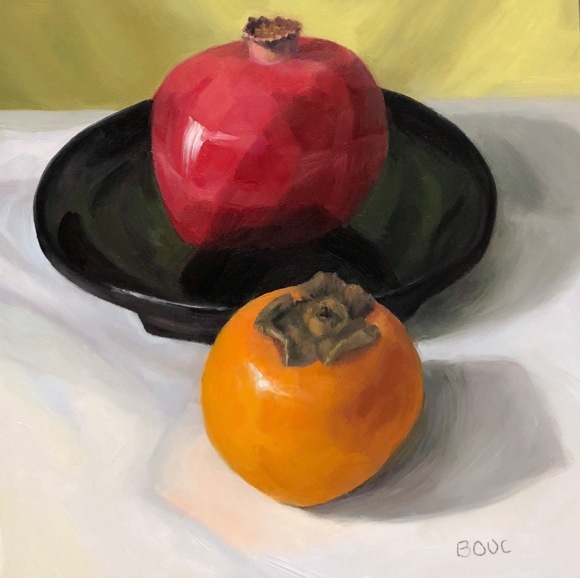
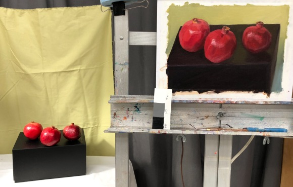
Queen Pom and Princess Persimmon, oil on panel, 8×8 inches (Available to purchase here)
There was something regal about these two, hence the name, despite the queen sitting in a soap dish, not a throne. I started out thinking “values and planes” and then, as usual, got seduced by color and detail. I did manage to keep some of the planes I saw in this pomegranate (which was becoming more faceted as it became more elderly, having been painted a few times over the past couple weeks). However, I’m not sure the painting actually benefitted from leaving the planes (or so many of them) visible.
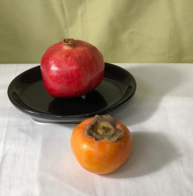
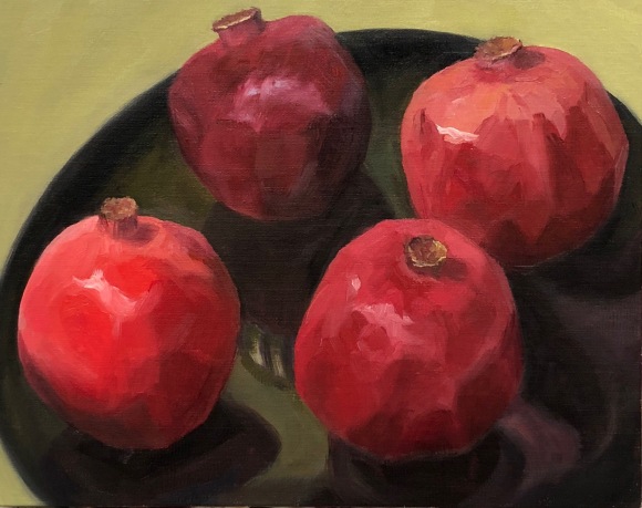
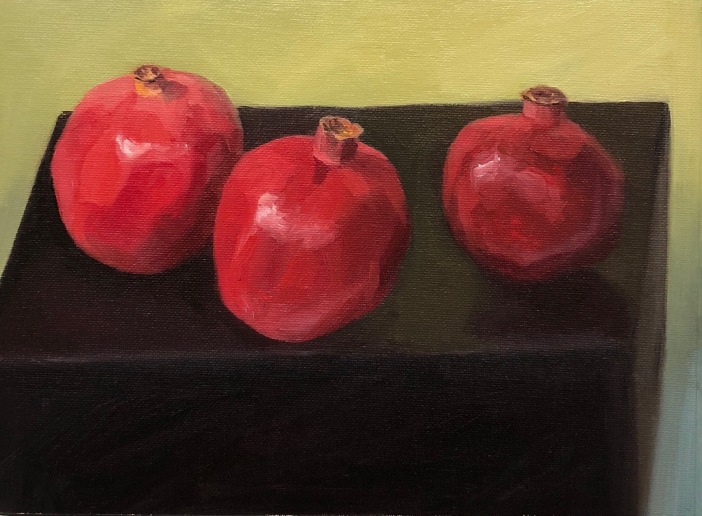
Below is a photo of the set up and below that the two previous pom/persimmon paintings that were a nice warmup and introduction to the subject, though perhaps not terribly successful in terms of paint application, composition and/or drawing.
Photo of setup for Queen Pom4 Poms on a Black Plate, oil on panel, 8×10″3 Poms on a Black Box, oil on panel, 8×10″3 Poms on a Box painting on easel and still life set up
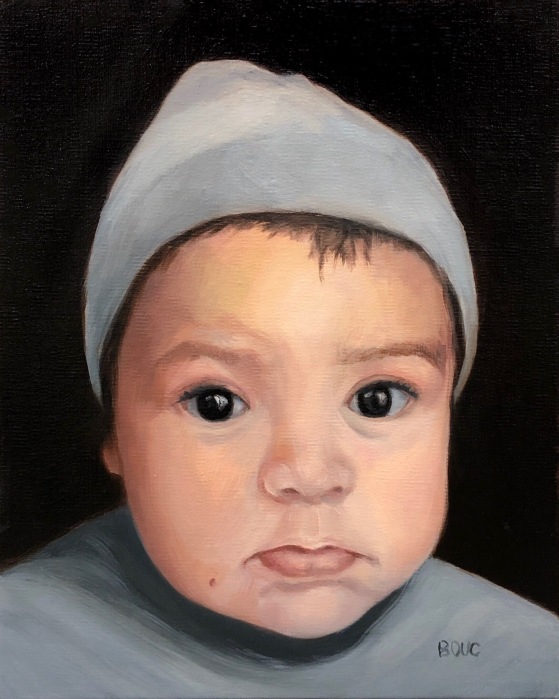
Portrait of Baby Toa, oil on linen panel, 10×8 inches
I really enjoyed making this painting of my friend’s grandson Toa. The biggest challenge was working from a cellphone photo taken in a carseat in the dark where his skin looked dark and bright orange. Fortunately I was able to see some other snapshots with better skin color.
I’ve been taking a new approach to painting; focusing on the joy of creating and letting go of the internal “committee” that demands perfection. I have accepted that my work will never be perfect and that perfect art bores me anyway. A bit of wonkiness, even in a portrait, is ok with me, if I feel I have captured the spark of the subject. I’m painting for myself; if it pleases someone else too that’s a bonus, but not at all a requirement. Giving myself this freedom has completely changed my life.
Below are my initial sketches, a picture of the setup with the photo, and an early stage in the painting.
Grandma’s Laundry Sprinkler and Apples, oil on canvas, 9×12 inches. Click Image for Purchase Info
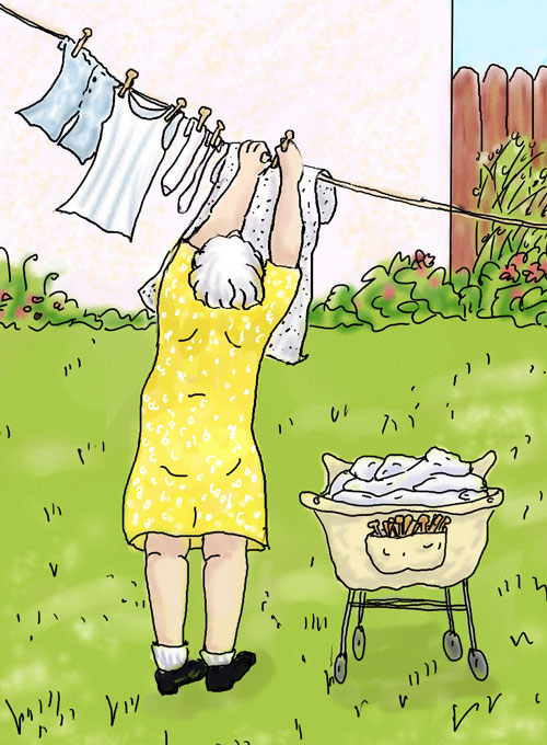
My grandmother ironed everything including underwear and sheets! Doing laundry was a major project. My mother bought her a dryer but she refused to use it, preferring to hang everything out to dry on the backyard clothesline. She dragged her wheeled canvas laundry cart with a big pocket for wooden clothespins (see sketch below) down the stairs and then pinned everything up to dry in the sun.
Before she ironed she sprinkled the stiff, dry laundry with water, using her special sprinkler cork (in painting above) stuffed in a bottle. Steam irons made laundry sprinklers obsolete but I wanted to honor this artifact of my grandma’s life in a painting. A few years ago I also made this sketch of her hanging laundry (below). I always loved playing with the clothespins and hanging out with my sweet grandma on laundry day.
Grandma hanging laundry with her laundry cart, Digital sketch.
Here is a photo of the setup (which I painted from life, not from the photo).
Finally I’m back in my studio and painting again after a two-month reconstruction of my backyard that made it impossible to get in there. These sturdy plums waited for me in the studio fridge all that time, then sat on a table by the easel for nearly two weeks during a heat wave. Some days it was just too hot to paint–well over 90 degrees. I was afraid they would have exploded, fermented, or worse. But nope, due to the magic of non-organic, supermarket fruit, they were still holding their own (unlike the beautiful, expensive, organic fruit from my natural grocery that goes squishy and grows fur if not eaten in a day or two) and I could finish the painting.
Below is the value study I did in Procreate on the iPad before starting the painting, my sketch on canvas and a photo of the setup, which I painted from life.
I’ve spent the past few months studying Munsell color notation and color mixing with Paul Foxton. My goal was to learn to discern value and color more accurately and to be able to efficiently mix those colors in paint. I’ve posted some of my course studies below. The above painting was done outside of the course, and doesn’t represent what is taught in the course. It is just a fun little alla prima still life, done before taking down my shadow box and lighting set up used in the course. I learned so many important things in the class. I think the number one thing I learned is how much lower chroma (aka less saturation/vibrant) most things are. Most things, including people, are much less colorful than I thought. Also, regardless of race, we humans are all low chroma orange (or as Munsell would have it, Yellow-Red).
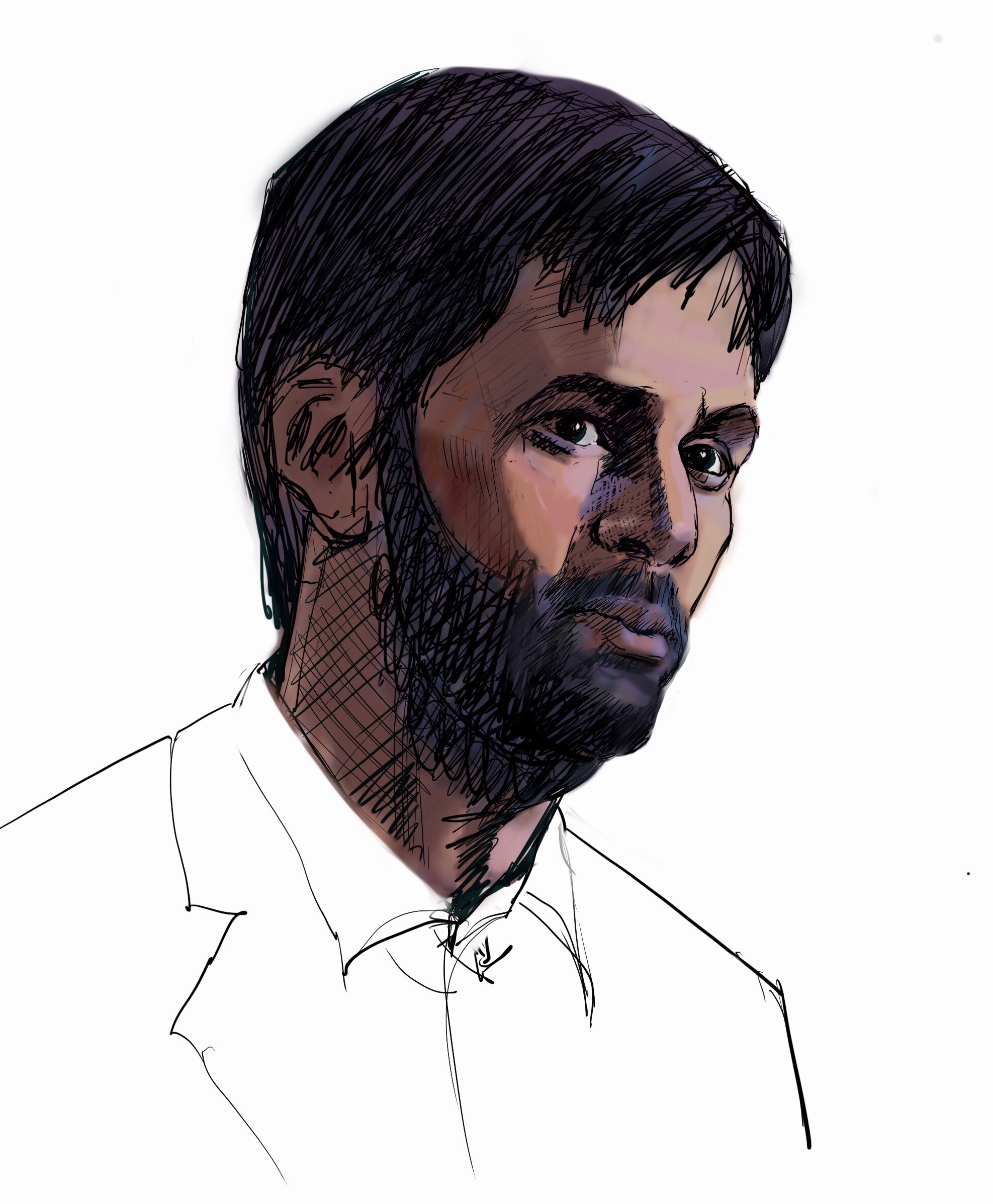
I’ve been enjoying using my new jumbo iPad Pro 12.9 and Apple Pencil with the Procreate App to sketch interesting characters on TV shows I watch. It’s fun getting back to drawing faces, especially when the actors are emoting. It’s fun and addictive experimenting with what the app has to offer and trying to learn about all the different brushes and features.
Above from Broadchurch — not quite a likeness and lots wrong with the drawing but had to stop sketching and watch the rest of the episode! ( (it’s back for Season 3 on BBC America). All of these sketches are done in Procreate, with Apple Pencil and jumbo IPad Pro. This one used a combination of airbrush and technical pen. The other two below mostly used the 6B pencil.
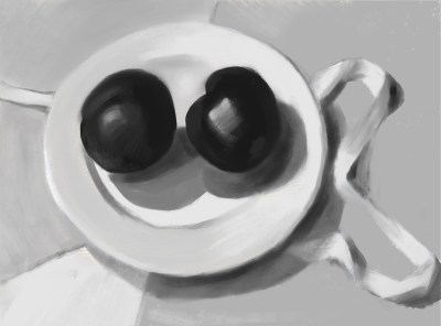
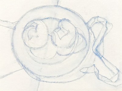
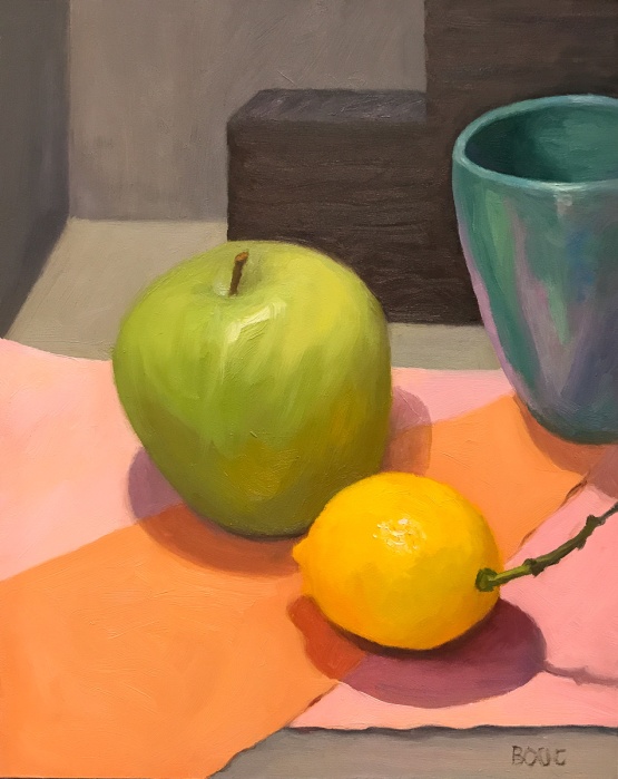
Apple, Lemon and Turquoise Cup, oil on panel, 10×8″
I painted this a couple of months ago and I’m finally getting around to posting it. I was focusing on composition and just having some fun with color. and shapes. The gray/black stair-step shape in the back is styrofoam packing material. Below are the steps in the process of the painting.
Sketched out composition and value study/under-painting
Painted Lemon
Painted backgrounds
Painted apple
Apple, Lemon and Turquoise Cup, oil on panel, 10×8″