These lemons came from my little Meyer Lemon tree which produces the sweetest, plumpest lemons. I planted the tree from a small pot about 5 years ago and now it’s as tall as me. I really like the Centurion Oil Primed Linen Panel I painted this on, except that it takes much longer for the paint to dry than when painting on Gessobord because it doesn’t sink in to the oil priming.
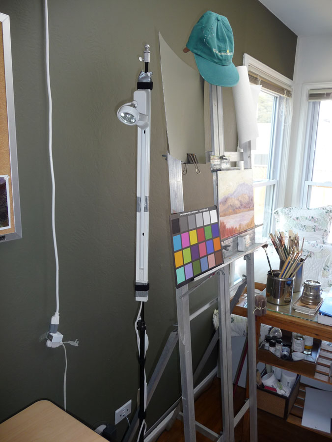
A= Still life table beside easel
I set up the bowl of lemons on my new rolling, adjustable (from 28″ to 45″ high) still life stand, also known as an Over the Bed Table on Amazon where I got it with free shipping (good thing because it’s not light). Since I was taking a picture of it I thought I’d also describe the other items in the photo since I’m so happy with my painting set up.
B = Karen Jurick’s “Alter Easel” which I love for holding thin panels instead of trying to balance them between the narrow supports on my easel. Works great!
C = Daylight Studio Lamp for lighting the still life (not visible is the Daylight Artists Easel Lamp that is attached to the top of my easel to light the painting (that I was given for free by the company and liked so much I bought the standing light).
D = A silly maul stick (just the top shows) that doesn’t work very well. I’ve seen people using canes instead, hooked over the top of the painting to provide support for your hand when painting details.
E = Masterson Artist Palette Seal with a lid that seals like Tupperware and with a pad of palette paper inside (the palette paper is a recent discovery that I LOVE because it saves so much time from having to clean the palette.) I keep the palette in my freezer when I have paint left over. Once thawed (in a few minutes) it’s in perfect condition for the next painting session. The palette is on top of an upside down plastic drawer from a defunct rolling cart to raise it up high enough for me to use without bending over (I’m 5’10”).
Not lettered but in the picture is the beautiful silk sari fabric my friend Barbara gave me for my birthday for just this purpose and the ancient microwave cart that holds my palette and supplies. Not shown is the rolling plastic taboret I’ve had for 20 years that holds my brushes and other stuff.
OK, I know I’m a gadget girl and many of these things are not necessary. But I feel like painting (and life) are hard enough, why not have great tools to make it easier? There are lots more pictures of my studio under the category “Studio.”
Daylight Professional Artists Lamp & Karin Jurick Easel Panel Holder with painting in progress
Two recent discoveries have made my painting life easier, brighter and more enjoyable: the new Daylight Artists Professional Lamp and a new prototype version of Karin Jurick’s tabletop easel that serves as a panel holder in a regular easel.
Happy New Year! Thanks for hanging out with me this past year! Even though I’ve had a nasty cold all week I managed to get in some pomegranate painting between nose blowing, naps, and chicken soup breaks, but not nearly as much as I’d hoped to do over my year-end vacation.
Pomegranate value study in oils, 8x5"
I only had enough energy to be in the studio for a couple of hours a day but fortunately the pom waited nicely for me. I started by doing a value study in oils (above), trying to sort out where the darkest darks and lightest lights are and just how dark and light they are.
Pomegranate quick study, oil on board, 5x7"
I did a small study next since I knew I didn’t have more than an hour or so of painting energy. I had fun with this and feel like I’m starting to find a way to get loose and sketchy with oils.
Pom under Reveal bulb
I used a GE Reveal light bulb in my lamp which gave everything a pinkish-lavender cast and that’s why I named the painting “Pomegranate Revealed.” GE says they are “specially made to filter out the dull yellow rays produced by standard incandescent bulbs.” I’d bought it originally thinking it would simulate daylight but it doesn’t at all. I usually use a fluorescent 5000K bulb 40 watt bulb (equal to 150 watts) which does a better job of producing clean light.
Cropped in Photoshop to 8x10"
When I compared the final painting and the studies I realized I liked the original composition with less background better so I experimented with cropping the painting in Photoshop. It’s not hard to cut the board down if I decide to crop it for real.
What do you think? Do you like this cropped version or the “final” version at the top of the post better?
On Wednesday night I completed the last page in a sketchbook with some writing about the frustrating process I’d been through with the orchid painting. And then, as I did one last sketch of the orchid in the book (below) I realized how I might be able to actually make the painting I’d originally envisioned. It would be one I could do simply and be able to write about as the six-step process the publishers needed.
When I woke up on at 6:00 a.m. on Thanksgiving morning I realized I had to give it another try. The image above is the happy result.
My sketchbook breakthrough
Tonight my watercolor group met for dinner and a chance to share what we’ve been painting this month. When I showed them the two versions of the painting they liked both but Susie said that in the first version they looked like evil man-eating orchids, which is certainly how they felt to me. In the sketch above I thought the orchid looked like it had packed his bags and was running away, suitcases in hand. (Good riddance!)
Here is one of the MANY pages of tests and samples I made in trying to find the right pigment combinations to make this painting work.
Orchid watercolor test page
I decided the pigment that gave me the color I wanted was Winsor Newton’s Quinacridone Magenta but like most quinacridones, it wasn’t very civilized, trying to spread everywhere.
Orchid Painting Steps
What finally worked was painting the veins first on dry paper, wetting a petal, painting cobalt blue just inside the perimeter and then dropping in the Quinacridone Magenta in the center, letting it spread and then blotting up a bit of the paint as needed.
Busby relaxing amidst orchid chaos
At least someone got to relax in the sun. When I left to make a cup of coffee Busby napped amidst the orchid chaos on my desk. You can see the original reference photo peeking out from under him, with a pile of false starts at the painting behind that.
Inspired by Casey’s success with the Carder Method and frustrated with my own slow progress at oil painting, I bought the Carder Method video and Color Checker tool. Below are step by step photos of my using the method to paint this still life, a brief review of the Carder Method and photos of my studio set up for working with it.
The Carder Method is designed to eliminate many of the problems that can make painting difficult. By creating an carefully lit, controlled environment, a painter can focus on learning to clearly see color and value differences while eliminating problems caused by variables such as changing light.
Click “Continue Reading” to see photos and read more….
After deconstructing one artichoke to paint in watercolor (previous post) I decided they were too old and worn out to bother cooking them, so why not paint them instead. I’m finding how important it is to take breaks when I’m painting. Each time I took one (because someone came to the door, I had to go to sleep or have lunch) I was surprised at seeing the painting with fresh eyes. It gave me a chance to strategize, stop futzing around in one area that wasn’t working and just needed to be scraped off and started over, notice that the values needed strengthening, etc.
At a certain point I recognized that this is as good as I can do for now. I’ll learn a little more and be able to a better on the next piece. That is so much more satisfying than trying to bring the piece to the level of the bar I keep raising or trying to make it as good as the painting of other artists’ work I admire. As a good friend said to me yesterday, “Compare…and despair!” and he was so right. Another friend pointed me to this from Desiderata:
If you compare yourself with others,
you may become vain or bitter,
for always there will be greater and lesser persons than yourself.
Artichokes, easel & palette in the studio
The multi-colored card on my easel is a Gretagmacbeth ColorChecker that I use when I photograph art work. Sometimes I use the white square to set my cameras “white balance. I always include some or all of the card when I take the photograph so I can compare the colors on the card to the colors on my monitor to see if I’ve got it right.
With the card included in the photo, I can correct the colors in the photo using the Levels tool in Photoshop:
Select the “white” eyedropper in the Levels menu and click it on the white square. This sets the white level so that white in the photo is pure white, not greyish. Sometimes this is all that’s needed.
If the black square doesn’t look black enough, I do the same with the black eyedropper in the black square. Setting this range of black to white really helps, especially when there is no black or white in the painting.
To remove a color cast (e.g. when the gray square looks greenish pinkish) I use the grey eyedropper on various spots on any of the gray squares until the color cast is gone and gray is gray.
I’ve made some improvements to lighting and comfort in my studio and wanted to share what I’ve learned in the process. In the picture below you can see some of the changes from my previous post about reorganizing the studio. These include the floor mat, the wall paint, and a still-life lighting setup.
This post could also be called, “What I Bought Myself for My Birthday” as these goodies were all birthday presents to myself. (Click the images to enlarge.)
Studio with new cushy floor mat, lighting and dark painted wall
FLOOR MAT
The floor mat pictured above makes a huge difference in comfort. I got the idea at my hairdressers when I wondered how she stands all day. She pointed out her floor mat and when I felt how cushy it was, I had to get one. I work standing at a computer or at the easel much of the time. Without a cushion my feet tend to hurt by the end of the day. I tend to sit until my back hurts and then stand until my feet hurt and then switch agin. The mat makes it comfortable to stand comfortably for much longer.
WALL PAINT
I painted the wall behind my easel and desk Benjamin Moore “1490 Country Life” using their new Aura line of which is nearly odor free and covers in one coat. I’d noticed studio walls painted this color in many of the painting videos I’ve watched. Finally one of the artists actually specified that this 1490 color was especially popular with portrait artists for their studios because of how the color sets off skin.
But it also reduces the glare off of the previously white wall I was getting from my overhead light and helps to cut unwanted bounced light and the resulting double shadows on a still life that I’m lighting with a strong directional light (more about that in a minute).
I still have to wear the hat you see hanging on the ease—the overhead fixture does a beautiful job of lighting a canvas without reflection, but with a relatively low ceiling it’s pretty bright on the eyes.
STORAGE
Below is the wonderful canvas and supply rack that my next door neighbor built for me.
Canvas storage rack in closet
It can be free standing but was built to fit inside this closet. The four sections on the far left hold already painted panels and for now, the rest hold panels and canvases ready to paint. The structure is seriously overbuilt due to a slight miscommunication. We speak in a combination of English (my native language) and Spanish (his) and sometimes we think we understand each other but don’t. It’s so sturdy it may even hold up the house in the case of an earthquake.
To the right of the structure is still a bit of closet hanging space where I hang my painting smock and my plein air painting outfit, a very lightweight, ventilated, long sleeved, sunproof shirt so I don’t need sunscreen and lightweight pants that are also sunproof that turn into shorts when you unzip and remove the legs.
The top shelf of the structure (below) provides a place to put my other plein air gear: my Soltek easel, my brushes in a canvas brush carrier, and two canvas carriers from RayMar Art, the company from which I also buy my painting panels (they are archival, don’t warp and are less expensive than most of this quality).
Shelf for easel and other plein air equipment
LIGHTING
Below is the setup for lighting still life that I’m finally satisfied with, after trying numerous other lightbulbs, fixtures, and other accessories. I wanted a way to get a strong directional light on the still life so there was good contrast in values, modeling of the shape and structure of the object(s), a strong shadow shape without double or triple shadows caused by interference from other lights, and a light color/temperature that gives the illusion of sunlight. A tall order indeed!
Still life lighting set up
As you can see above this system creates a nice swath of directional light, with a strong single shadow (though the photo doesn’t do it justice–it’s hard to photograph lighting!). Below is another picture of how I have it set up.
I went to a local lighting store and we tried out all sorts of things. It took them awhile to understand that I wasn’t buying lighting to light a painting, but to light a still life I was going to paint. They recommended a short section of halogen tracklighting with a narrow-beam floodlight halogen bulb. They added a cord and switch for me since I was going to keep it nearby rather than permanently install it on the ceiling. Then I attached the track light to a cheap old lighting stand I had from photography days.
Track light attached to light stand
The ugly cord and switch on the left above is an inelegant solution that allowed me to avoid having to have an electrician wire the overhead light. It just plugs in and switches on and off. Too bad the cord isn’t the right length.
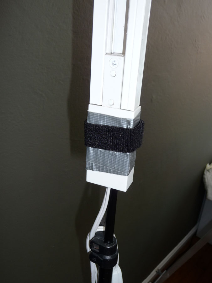
On the two pics below you can see how I used duct tape and a strip of velcro 2-sided strapping to attach the track light to the stand.
Track light with halogen spot attached to old light standDuct tape/velcro attachment
Below is the lighbulb we found that works perfectly for this application: Sylvania Tru-Aim Brilliant Halogen (50MR16/B/NFL25) which I think means it’s a 50 watt narrow-beam flood light.
Lightbulb box for track light
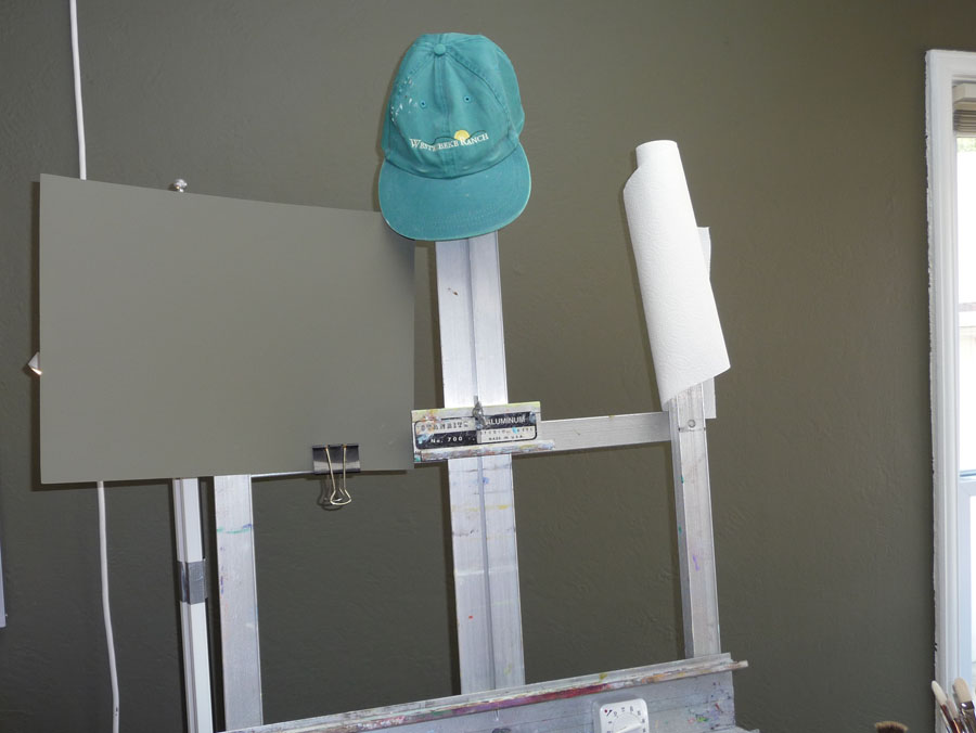
SInce the light was so bright I made this cardboard shield and painted it the same color as the wall and clipped it on to the easel so I could study the still life without also looking at the light. I’m sure there’s a more elegant solution, but this works. The paper towels sit on a funky paintbrush which is stuck into a slot at the top of the easel.
Cardboard painted with wall paint to shade light, paper towel "holder"
My WorkRite electric desk, which holds my computer and monitor not only allows me to work sitting or standing but I discovered that I can use the end of the table by the easel to place a still life at whatever height I like. I can also display a photo on the monitor and scoot the monitor closer to the easel to work from.
Set up for still life with electric desk
I can hang different colored cloths as still life backdrops from the bulletin board with pushpins and I like having artwork on it that inspire me.
The painting to the left isn’t usually there. I hung it when a gallery owner came over for a studio visit because she was interested in including it in an upcoming show (it will be there next month — more about that later).
Another view
I should also say that I have no financial or other interest in any of the companies or products I mentioned in this post. I just like them.
Have you ever been so sleepy you’re just slap-happy silly? That’s how I was yesterday. I’ve been trying to change my schedule to get up early and go to bed early but after a few days of doing the former but not the latter, I was so sleep-deprived yesterday afternoon that I just stopped making sense, even to myself.
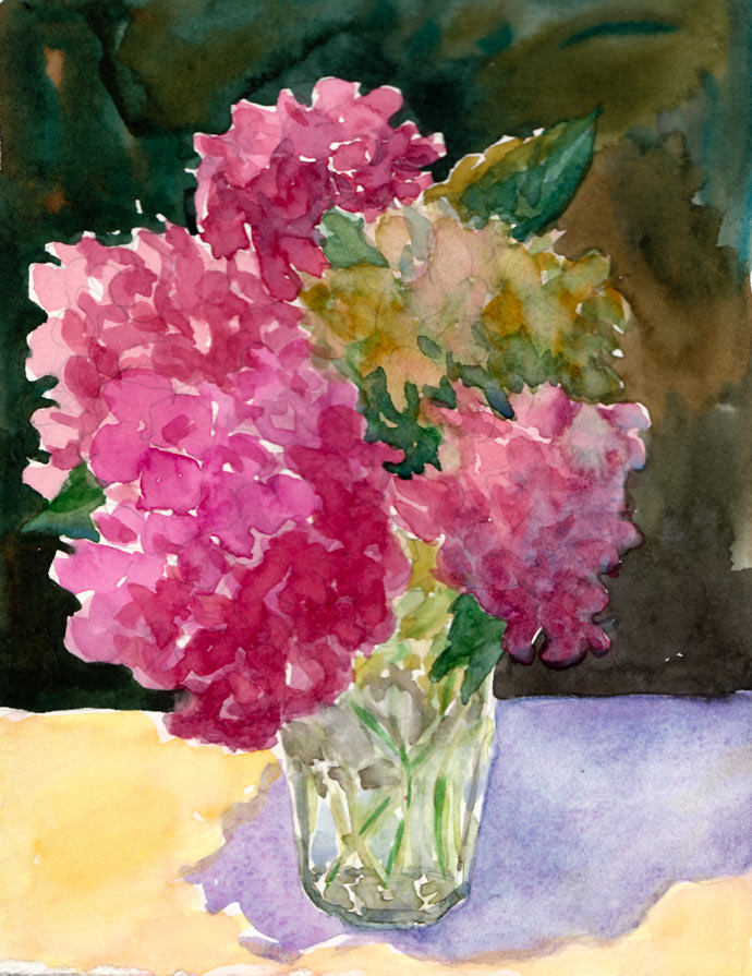
When I get over-tired, instead of thinking, “sleep,” I think I’m hungry and crave carbs (and now research is showing that sleep deprivation causes weight gain and other health risks…see here and here). So instead of eating popcorn (or going to bed at 7:00), I decided to paint these “popcorn ball flowers” (as my sister and I used to call hydrangeas when we were kids…and I thought everybody did until I Googled “popcorn ball flowers because I can never remember their real name, and discovered only recipes for making flowers out of popcorn and no references to hydrangeas!).
First I had to refill my watercolor palette because a couple weeks ago I’d washed out all the funky old paint that had been in there for too long. Some of it was getting moldy and all of it was dirty. Before refilling my palette, I did color tests of all my paints to decide which pigments I wanted to use now. I love organizing things, so this was a perfectly soothing task for a tired mind.
Finally I was ready to paint, and grabbed my homemade 6×8” sketchbook filled with hot pressed Fabriano Artistico paper, and this bouquet of hydrangeas from my yard that I’d plopped into a drinking glass the day before. Instead of starting with my usual ink drawing, I used pencil and then painted using more of an oil painting technique, starting with the darkest darks instead of the lights.
Maybe it was because I was so tired, but I had so much fun, just being playful as I painted and not worrying about the outcome. As usual I wished I’d stopped about 10 minutes sooner and someday I’ll learn that “when you’re 75% finished you ARE finished!” Some day….
If you’d like to know which pigments I settled on, click “Continue Reading for the details….
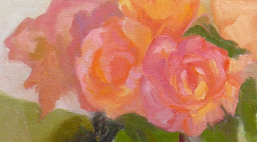
I’m learning to appreciate the bits of paintings that work while letting go of the parts that won’t/can’t be fixed. These two sections pleased me, even though the original paintings as a whole were not successful. In both cases I started off boldly, got the big shapes blocked in and immediately painted the two segments above.
Then I got tired, the sun went down and the room in the light changed, the flowers opened in the heat, the floodlight I was using burned out and I didn’t have another, the setup got moved (thanks kitties…see below) and although I tried to fix both paintings over and over I finally decided to cut my losses once again and move on.
I learn so much with each painting, whether it works as a whole or not. I’ve started putting labels on the backs with the year, a serial number and a few words about what worked, what didn’t and what I learned. It will be fun at the end of the year to review my progress.
Fiona taking up modeling:
Rose set up day one (and on my bulletin board art by Pete, Alison and John Sonsini‘s wonderful portraits):
Painting blocks to use in light and color-study still-life as explained in this previous post. (Newly gessoed panels drying in little rack behind the blocks).
After jumping head first (or was it feet first?) into oil painting, and then flailing about, trying to find my way, I realized it was time to go back to basics. Just as with writing or speaking, a basic vocabulary is essential to expressing oneself.
But I was trying speak “oils” using the vocabulary of color I’d learned with watercolor, assuming that Red is Red, whether it’s watercolor or oils. Unfortunately, I’m finding that’s like assuming if you can speak English you can speak French since they use the same alphabet.
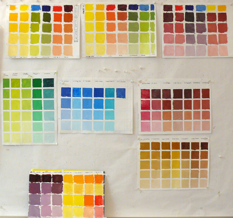
Oil painting tests of different brands of color to choose my basic palette
(Click Images To Enlarge)
When I first started painting with watercolor, I made dozens of color charts, testing the various pigments to learn about their natures, alone and mixed with other colors. In watercolor this is really essential since there are so many characteristics that affect the flow of the paint: whether it charges into neighboring paint or resists it; whether it’s opaque or transparent; sedimentary (leaving little spots of sediment), staining or lifts easily, how it mixes with other colors and more.
I hadn’t done this with oil painting. But watching Camille Przedowek demonstrate a couple of weeks ago, I was struck by her huge “vocabulary” of color. She was quickly mixing up and painting with colors I couldn’t even name! I realized my oil painting color vocabulary is about that of a 4-year old from a foreign country.
(CLICK “Continue Reading” to read and see the rest…)


