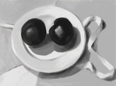
Finally I’m back in my studio and painting again after a two-month reconstruction of my backyard that made it impossible to get in there. These sturdy plums waited for me in the studio fridge all that time, then sat on a table by the easel for nearly two weeks during a heat wave. Some days it was just too hot to paint–well over 90 degrees. I was afraid they would have exploded, fermented, or worse. But nope, due to the magic of non-organic, supermarket fruit, they were still holding their own (unlike the beautiful, expensive, organic fruit from my natural grocery that goes squishy and grows fur if not eaten in a day or two) and I could finish the painting.
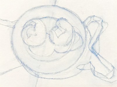
Below is the value study I did in Procreate on the iPad before starting the painting, my sketch on canvas and a photo of the setup, which I painted from life.
I’ve spent the past few months studying Munsell color notation and color mixing with Paul Foxton. My goal was to learn to discern value and color more accurately and to be able to efficiently mix those colors in paint. I’ve posted some of my course studies below. The above painting was done outside of the course, and doesn’t represent what is taught in the course. It is just a fun little alla prima still life, done before taking down my shadow box and lighting set up used in the course. I learned so many important things in the class. I think the number one thing I learned is how much lower chroma (aka less saturation/vibrant) most things are. Most things, including people, are much less colorful than I thought. Also, regardless of race, we humans are all low chroma orange (or as Munsell would have it, Yellow-Red).
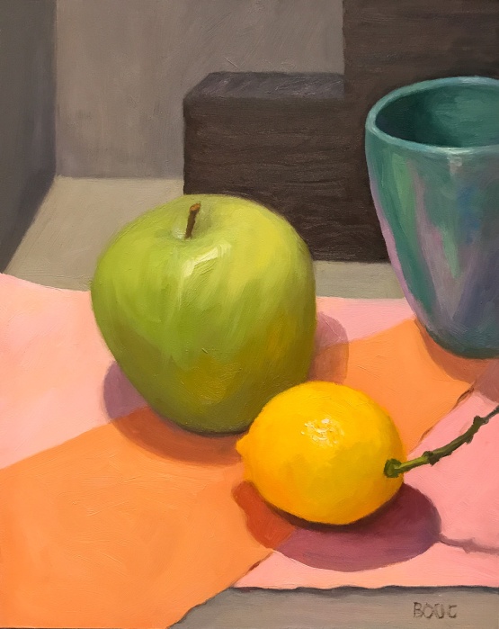
Apple, Lemon and Turquoise Cup, oil on panel, 10×8″
I painted this a couple of months ago and I’m finally getting around to posting it. I was focusing on composition and just having some fun with color. and shapes. The gray/black stair-step shape in the back is styrofoam packing material. Below are the steps in the process of the painting.
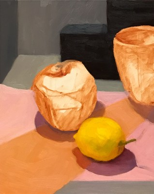
Sketched out composition and value study/under-painting
Painted Lemon
Painted backgrounds
Painted apple
Apple, Lemon and Turquoise Cup, oil on panel, 10×8″
Red and Green Okra, graphite and colored pencil, 8×10″
Getting back to daily sketching….yay! Some lovely and odd-looking produce from the local organic grocery. I hope to paint it too, before I cook it but I’m not sure how long it will last.
This was a quick little painting from life that happened spontaneously one afternoon when my tenant came out to my studio and presented me with some freesias in a vitamin bottle.
It might have been a more interesting painting if I’d a) included the lettering on the bottle and b) taken time to do a preliminary thumbnail sketch so that the flowers weren’t almost touching the top of the panel. I was interested in looking at white in shadow and gray in light and shadow and the colors found in both from the warmish light and flower reflections.
Photo of set up (slightly different perspective and light)
I’ve developed the goofy habit of storing my leftover cucumber in the bell pepper half when I prepare a salad. It always makes me laugh so I decided to paint it. My sister called it veggie porn. I hope it makes you chuckle too.
I’m trying out a new format for my blog posts, a simple list with images of what I’ve been working on, successes, challenges and what else is going on in the studio and my life. Theoretically it will mean less writing and more frequent posting. So here goes…let me know what you think.
CHALLENGES: I’ve been struggling with composition, discovering half way through a painting that the composition sucks and the painting will never be an enjoyable thing to look at.
Veggie Porn Thumbnail sketches
Photo of the set-up
SUCCESSES: I finally got the willingness to begin all paintings with some thumbnail sketches. I realized that COMPOSITION is simply the structure that directs the eye around the painting, creates a feeling of action or stillness and (if done well) delights the eye. Two of my favorite painters, Susan Jane Walp and Giorgio Morandi use composition in unexpected ways, and both delight the eye (or at least my eyes) whether they are following or breaking the “rules” of composition or making their own.
LETTING GO OF A BAD PAINTING: This one started off really happily but ended up in the trash, after scraping and redoing it over and over until I killed it so dead it couldn’t be revived. I just felt there was too much red, that it was too “hot” somehow. A friend suggested adding black. That was the final nail in the coffin. I’m not sure why I’m even sharing it at all.
FAIL: Bad Begonias, oil on panel, 10×8″
SKETCHES: I try to do a sketch from the SKTCHY App at least weekly. Here is a recent one.
Ms. I. T, from Sktchy photo reference, graphite, 12×9″
WHAT I’M READING: “Irresistible: The Rise of Addictive Technology and the Business of Keeping Us Hooked.” Great book about how our devices and apps are designed to keep us using them. I waste way too much time web-surfing on my phone. This book gave me some tools for changing my habits along with a good talking to! I think it’s a must-read for parents especially.
WHAT I’M LISTENING TO: Ed Sheeran and Alicia Keys on Amazon music, which I like much better than Apple music. (If you’re interested, here’s a link to Amazon Music Unlimited 30-Day Free Trial)
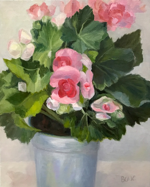
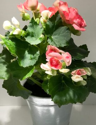
Winter Begonias in Tin Pot, Oil on Linen Panel, 10×8″ (SOLD)
It was time to face something more cheerful than my own face in the studio. This pretty pot of begonias was just what I needed. I worked on them a bit at a time, between visits to my mother in hospice. My mom passed away very peacefully last week, in no pain and with family at her side. She taught me many things in life; her final and maybe most important lesson was how to let go and fearlessly accept this final passage with grace (and the help of amazing hospice nurses).
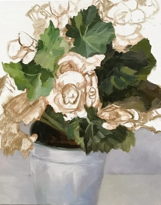
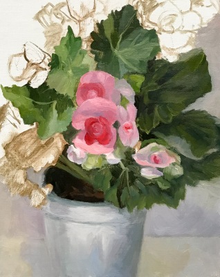
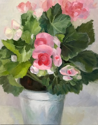
This painting is sold. Below are the steps in the progress of the painting.
Winter Begonias in Tin Pot, WIP-A
Winter Begonias in Tin Pot, WIP-B
Winter Begonias in Tin Pot, WIP-C
Winter Begonias in Tin Pot, Oil on Linen Panel, 10×8″ (SOLD)
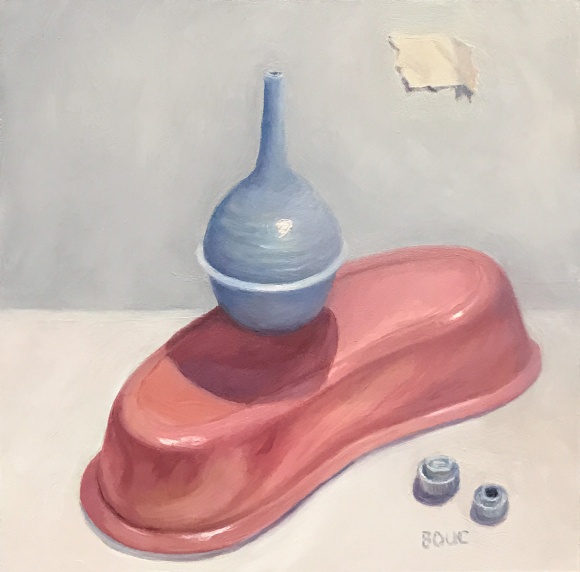
Medical Still Life #1 Final, oil on Gessobord, 8×8″
My attention, time and energy have been focused on elder care and family needs rather than art for the past couple months. Creating a still life out of medical supplies (plus a couple of caps from used-up tubes of oil paint) made sense on the day I started the project.
I intended this to be a one-afternoon painting but each time I thought it was finished there was one more thing to “fix” or change. Fiddling with it became a way to squeeze in a little painting when time and energy permitted. I finally called it done so I could start something else (a series of rather dark self-portraits, which I’ll be posting soon).
To show you all the fiddling, I thought a slide show might be good. Click on the image or link below to start the slide-show if you receive this post in your email.
Pomegranates and Corks, oil still life on linen panel, 10×8″
I’m still having fun painting poms and trying to understand them. Below is the process I used, with photos of the set up. I like starting with a Pitt pastel pencil to sketch in the composition and then go to thinned down transparent oil paint.
I’ve switched back to working on panels again from paper in order to have a slicker surface that allows wiping off more easily than the Arches Oil Paper which is very absorbent.
Pomegranate, Persimmons, Brick, Oil on Arches Oil Paper, 10×10″
(SOLD) This painting went through so many changes. I started it before I got the awful cold that kept me out of the studio for over a week. I lost my focus while painting the cloth draped in the background and at the end of the day scraped off the afternoon’s work. When I came back the next day, my foam core shadow box had collapsed and was on the floor along with the drapery and the LED light that I’d perched atop on a piece of plexiglass. Fortunately the brick held steady as did the fruit.
That accident gave me the opportunity to try a different background. I removed the white paper I’d been using to cover the black walls of the shadow box and painted the now darker background. I had fun painting the persimmons and the brick and I think I did a good job understanding them; the pom not so much. It should have a more geometric, boxy shape, not be so rounded.
Below are the stages in trying to get this thing painted, along with the set up as it changed. Click on an image to see full picture, scroll over images to read captions.