I was taking a walk today, trying to find my way back into to the world of the living from the Zombie world I’d been in the past few days, when these tulips seemed to jump out at me. Although I had my sketchbook with me, I was multitasking on this walk, carrying groceries home from the market while talking to my mother on my cellphone. Since I couldn’t really stop and sketch, I took a few pictures and sketched in ink from the image on my computer monitor when I got home.
I’m feeling so grateful for the simple things in life right now: being able to eat and sleep and walk and sketch and breathe and be warm and dry and cozy in my own home. Sometimes it’s worth having a few days of awfulness to be reminded of just how good life is.
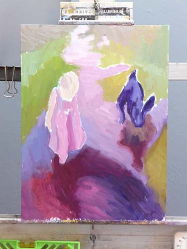
My artist friend Laura (of Laurelines) offered some wonderful suggestions for improving the original version of this painting.
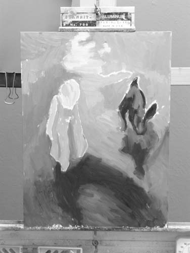
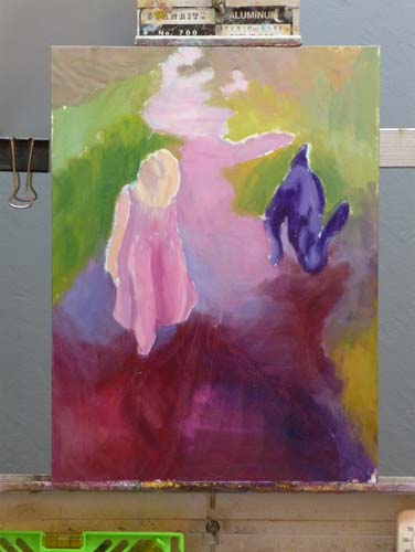
Original version
Laura said:
“One thing I’ve noticed about your oil paintings is that you don’t have the same strong value differences within objects that you do in your watercolors.”
I agreed with her and gave it another go-around, this time adding some dark glazes in the dark area and more lights in the light area. I was working from a photo (since the original artichokes are long gone), so the colors were a little different than the original.
I am so appreciative of the wonderful community of art bloggers and the sharing we do with each other. Laura and I continued the conversation, and talked a bit about plein air painting and impressionism. Then she said:
Your watercolors are pure 21st century YOU. They are clear, strong, bold, and sometimes, though not always, quirky. Your flower paintings are YOU. In oil, it seems to me, anyway, that you’re trying to be someone else or are being encouraged to try to be someone else. That way lies horrible frustration. YOU can use oils in transparent glazes, with shimmering lights and darks, that will feel like you. YOU can use complements to create shadows. YOU can do all those nifty things in oil that you do in watercolor.
What a gift it is to have someone speak from the heart like that. She so hit the nail on the head about what I was struggling with in oil painting. I told her that in watercolor I found my direction early on, knew what I liked, what I wanted to do and developed the skill to do it. In oil I started out wanting to paint like I do in watercolor and everybody told me that “you don’t do that” in oils. I had to learn about the importance of brush strokes, edges, filling the canvas rather than putting an interesting object on a white page, etc. All the books and blogs stressed alla prima, completing a painting a day, impressionism, etc. Somewhere along the way I lost my direction.
I sometimes picture life as a series of turns made when angels have perched on the signpost and pointed in the next good direction to take (sometimes the guides aren’t angels but rather tricksters saying turn left when the correct direction is right — heaven knows I’ve made many unfortunate turns in my life). I think she might have been one of those angels, pointing me back to my right path.
I’m not sure if this version is better than the first. There are definitely more darks, but it seems to have lost its glow, partly due to working from a photo rather than the brightly lit subject. What do you think? Does it need more work or is it overworked?
A new storm is on its way in but this morning was sunny so I took a walk in the neighborhood and discovered Spring had arrived overnight. The magnolias were blooming along with some other flowering trees.
Spring Trees, ink & watercolor wash
The Jehovah’s Witnesses were also out in full bloom, a whole parade of them canvassing the neighborhood. These folks were waiting while their colleagues knocked on the door of a house on the top of the hill.
Witnesses on the Hill, Ink & watercolor wash
One of their team told me she liked to paint too, and then offered me some reading materials. “No thanks,” I said. “But it’s really, really small,” she said. It was a small pamphlet, but why would she think that would change my mind, I wonder.
Can't Stop the Seasons, Photo
I thought about drawing this but decided a photo was good enough. Seeing the new season bursting forth in front of a sign saying “STOP” made me think about the ways we try to control things by making laws and rules and posting signs, and yet Mother Nature rolls along, no matter what we puny humans have to say about it.
I’m trying to use one sketchbook at a time and so, despite being tempted to switch to a Moleskine watercolor sketchbook, I continued on in my Strathmore Drawing sketchbook. It’s not watercolor paper but is great for ink, is my favorite size (6×8″) and is light for carrying because it only has 24 sheets. It does wrinkle a bit from the watercolor, and it’s not good for lifting out color or heavy application, but it’s a good compromise between quality of paper and size and weight.
I’ve been listening to a dumb book, Freddy and Fredericka, when I’m painting and I’m so glad I finally finished it. I don’t know why I kept listening for all 26 hours. It’s a silly farce about a bumbling, imaginary Prince and Princess of Wales sent by the King and Queen to New Jersey on a quest to take back America (but really just to get the couple out of the country because they were embarassing fools).
The funniest part of the book was unintentional. It’s the way the book is read aloud. It’s narrated by a gentleman with an uppercrust English accent who doesn’t even try to do American accents. So all the Americans in the book, from southerners in Alabama to New Jersey motorcycle gang members speak with the same English accents as the Royals. The only laugh I got from the book was hearing the motorcycle tough guy talking with an English accent instead of with a New Joisey accent.
The book makes fun of the British monarchy as well as American politicians and culture. Maybe you have to be British to enjoy the book or maybe it’s just me. I’ve never been a fan of farcical humor that uses silly names, misunderstandings and ridiculous plot lines to get laughs.
After deconstructing one artichoke to paint in watercolor (previous post) I decided they were too old and worn out to bother cooking them, so why not paint them instead. I’m finding how important it is to take breaks when I’m painting. Each time I took one (because someone came to the door, I had to go to sleep or have lunch) I was surprised at seeing the painting with fresh eyes. It gave me a chance to strategize, stop futzing around in one area that wasn’t working and just needed to be scraped off and started over, notice that the values needed strengthening, etc.
At a certain point I recognized that this is as good as I can do for now. I’ll learn a little more and be able to a better on the next piece. That is so much more satisfying than trying to bring the piece to the level of the bar I keep raising or trying to make it as good as the painting of other artists’ work I admire. As a good friend said to me yesterday, “Compare…and despair!” and he was so right. Another friend pointed me to this from Desiderata:
If you compare yourself with others,
you may become vain or bitter,
for always there will be greater and lesser persons than yourself.
Artichokes, easel & palette in the studio
The multi-colored card on my easel is a Gretagmacbeth ColorChecker that I use when I photograph art work. Sometimes I use the white square to set my cameras “white balance. I always include some or all of the card when I take the photograph so I can compare the colors on the card to the colors on my monitor to see if I’ve got it right.
With the card included in the photo, I can correct the colors in the photo using the Levels tool in Photoshop:
Select the “white” eyedropper in the Levels menu and click it on the white square. This sets the white level so that white in the photo is pure white, not greyish. Sometimes this is all that’s needed.
If the black square doesn’t look black enough, I do the same with the black eyedropper in the black square. Setting this range of black to white really helps, especially when there is no black or white in the painting.
To remove a color cast (e.g. when the gray square looks greenish pinkish) I use the grey eyedropper on various spots on any of the gray squares until the color cast is gone and gray is gray.
Artichoke Heart, Ink & watercolor on hotpress Arches paper
I think the soft, flowery heart inside a prickly artichoke perfectly illustrates my feelings about Valentines Day. I love artichokes and the heart is always the best part, but you have to work to win the right to savor it. I was surprised how soft, gentle and flexible the leaves were when I peeled them off to get to the heart, compared to how tough they are when they’ve been boiled. I’m sure there’s a good analogy there about love and tenderness, but I’ll leave that to the poets.
I first tried to do this painting using a sketchbook I hadn’t tried before: Maruman Art Spiral, that has what looks like cold press watercolor paper in it. It started dissolving when I tried to lift paint or glaze more than one layer. Yuck. I wasn’t at all happy with the first try below and started over.
First attempt on crummy paper
As I wrote in my last post, the past few weeks have been rough. When I finally got in the studio today. I began by wasting an hour trying to rescue a painting of 3 artichokes I’d started last night and finally decided it was unsalvageable. I felt uninspired, clumsy and like everything I tried to do is crap.
Then my cat jumped on the drawing table to sunbathe under my lamp. I had a brush in my hand, my gouache palette open, a sketchbook I wanted to finish and a willing model. So I did quick kittie sketches with paint, trying to get back in the flow. It helped get the juices flowing again, although my inner critic was still harping at me, telling me these were crap too.
Maybe they are, maybe they aren’t, but they’re bright and colorful and were fun to do, and the stupid sketchbook is filled and on the shelf.
No, the injury and insult referred to in the title of this post does not refer to this painting of a Tangelo. It explains why I haven’t posted lately.
First I had the stomach flu (or was it food poisoning from the dreaded peanut/salmonella scare?) The next week while waiting at the doctor’s for my flu shot, I felt a little tickle in my throat and wondered if I might be getting a cold. I was. It wasn’t terrible, and went to work all week.
When the weekend arrived I expected to feel better and get to paint. But the cold (or was it the flu?) hit full force. For the next 5 days it hurt to think, let alone do anything creative. On day 10 my doctor prescribed antibiotics and I began to recover.
That Friday night after a 10-hour work day, my cat Fiona begged me to come play tag with her. She loves to run through the house chasing me, and me, her. My house is perfect for this game because it’s quite long. It was originally two flats, mirror images, that I connected with a doorway, so it’s a nice long run.
We look completely ridiculous, but it gets us both a bit of exercise. We’ve tried to teach Busby, my other cat, to play, but he doesn’t get it. He comes out of the closet that he’s been sleeping in to watch us, with a confused look on his face.
So there I was running after Fiona when I felt a “snap” in my calf and then a sharp pain that made it nearly impossible to walk, except with a sort of peg-leg gait. When I called the advice nurse he ruled out all the really bad possibilities (broken things, torn apart things, blood clots, etc.) so apparently it’s just going to take some time to heal. It’s been four days and I’m still limping (and coughing).
Despite the limp I was determined to paint this weekend, and chose a delicious Minneola tangelo sitting on the lid of a glass refrigerator container. I liked its funny little poofy crown. I learned that Minneola is both a city in New York and a combination of a Duncan grapefruit and a Dancy tangerine.
I wish I could push rewind and go back one stage on this painting. Knowing when to stop is one of the hardest things in painting.
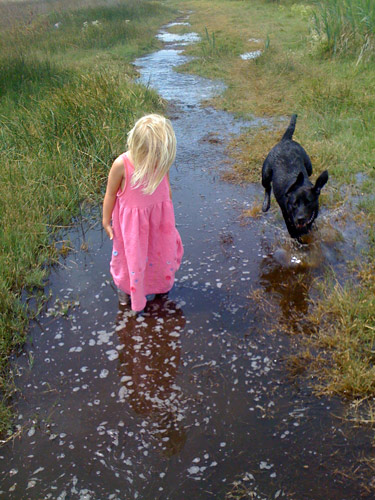
My friend Gina emailed me a photo with a note saying, “I like the light in this photo– for some reason I always think of you when I look at it.” Although I rarely paint from photos, especially those taken by other people, I just had to paint this one. My computer monitor is set up so that I can paint directly from the image on the screen which is a lot better than working from the limited colors in a printed image.
I’m not sure if I’m done yet, but I couldn’t see what else was needed so I stopped. If you have any suggestions for improving the picture, I’d love to hear.
Below are some stages of the painting. I used a bit of artistic license: I gave Hannah a bit of a haircut and deleted Gina’s wonderful dog Bella because:
The dog was competing with Hannah as the focal point and was about the same size.
I couldn’t get Bella to “read” as a dog; no matter how hard I tried to draw her correctly, she just kept turning into a jackrabbit.
Hannah’s Reflection, Oil on Gessobord, 16×12
Painting phase 1
B&W value check
Painting phase 2
Painting Phase 3
Color spots
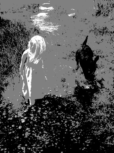
Photo, B&W w/2 values
Photo, B&W w/3 values
Original Photo
Top row: 1) the finished painting; 2) my painting start; and 3) a black and white version of the start to see if my values were on track.
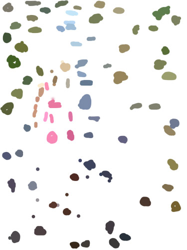
Middle row: 1) & 2) the next two steps in the painting. 3) a view of a “color spot” layer that I made in Photoshop. I created a new layer, and used Photoshop’s Paintbrush tool to select (Alt-click) and paint spots of those colors because it can be easier to see the colors when they’re isolated. Even more helpful than the color spots is a color-mixing tip I learned from Dianne Mize on Empty Easel: you apply the color to the edge of a small card and compare it to the subject until you get it right.
Bottom row: three views of the original photo. 1) “Posterized” in Photoshop down to two values; 3) posterized with three values; 3) Gina’s original photo.
P.S. This park, which Hannah affectionately calls the “swamp adventure,” is part of the East Bay Regional Parks. It is a river front park next to McAvoy harbor in Bay Point. It’s a little delta oasis in the sprawl of East Contra Costa County.
Color study of blocks under halogen light, 9x12 in, oil on panelI painted from this setup (not from this bad photo)
This study was done to practice seeing, mixing and and painting the relationships of color and light on different planes. Theoretically these colored block studies should be done outdoors with natural light, but it was a cold windy day and I wasn’t feeling well (and still don’t—first it was stomach flu and now a cold) and so worked indoors. When I compare this indoor painting to those I did outdoors and posted here, I can see why it’s better to work outdoors.
“Charles Hawthorne was the first painter…to put the “Impressionist concept of seeing” into a teaching principle. Hawthorne spent the last fifteen years of his life trying to understand what Monet looked for and how he painted.
Henry Hensche, an assistant to Hawthorne, perfected the concept of seeing and teaching color after Hawthorne’s death in 1930. Mr. Hensche taught and practiced this visual language of color from that first Summer in 1930 until his death in 1992.” [emphasis added]
I’ve studied on and off the past year with Camille Przewodek, a fantastic plein air colorist and former student of Hensche and I think I’m beginning to comprehend the concepts at a basic level (although the study above is a poor representation of that). Another painter who studied with Hensche, John Ebersberger, has created a Hensche Facebook group that is open to the public, for former Hensche students and others who are interested in Hensche’s approach to seeing and painting color relationships. There are wonderful photos posted there of Hensche paintings and paintings by the artists who have carried on his approach to color, and to my mind, have advanced it even further. Their discussions and critiques on the groups discussion board are also quite illuminating.
Painting colored blocks under different light is one of the techniques Hensche used to teach students to see that in every plane change there is also a hue or color change (not just a tone or value change), and how these colors change according to the light key (foggy grey light, bright sunlight, early morning light, afternoon light).
This is not an easy approach and takes years of practice and study, best done with an experienced teacher like Camille Przewodek, John Ebersberger, Carole Gray-Weihman, Dale Axelrod (great links and examples on his website), and others at Atelier aux Couleurs Art Academy who offer workshops locally and internationally. I have found one book, Painting the Impressionist Landscape, that does explains the concepts (although I don’t think that author’s paintings provide stellar examples, especially compared to those listed above).
Even if I never learn to see and paint like they do, I’m sure the concepts I am learning will enrich my painting and it has already changed the way I think about light and color and form.
Oyster Shells, Ink and Gouache in large watercolor Moleskine (SOLD)
When I had lunch at Hog Island Oysters a few weeks ago, I asked for a doggy bag to take home these oyster shells so that I could sketch them. I finally did it, and enjoyed drawing all the rumples and bumps and ridges. Then I painted them with gouache and voila! another sketchbook completed.
I’m finding that using M. Graham and Schmincke gouache paints as if they were watercolors is a very pleasing way to work. I haven’t quite gotten the hang of using them properly opaquely, but using them transparently is quite exciting as they have more pigment load than regular watercolor.
To see if I could figure out what I was doing wrong, I studied my beloved Moira Kalmanbook, The Principles of Uncertainty, since she paints her wonderful, quirky illustrations in gouache. I saw that what I was considering flaws and errors in my application are actually—at least in her work— just part of the character of painting with gouache.
Gouache is such a flexible medium. You can use it opaquely, flat and smooth as in posters; painterly like with oil paints; or transparently as if it were watercolor. Now I’m craving oysters again — some to eat and some to paint.