Categories
Building Drawing Gouache Outdoors/Landscape Places San Francisco Sketchbook Pages Sketchcrawl Urban Sketchers Watercolor

Sketchcrawl 46 – Bernal Heights, San Francisco

SF Bernal Heights Sketchcrawl (original) ink and watercolor in XL WC Moleskine
SF Bernal Heights Sketchcrawl, ink, watercolor, gouache, 7.5 x 11″

When it was time to leave for the Sketchcrawl in San Francisco I couldn’t find my sketch kit containing all my favorite sketching tools. I scoured the studio and the house. No sketch kit. I feared I’d left it at my figure drawing class the day before at the community college where it had probably already been adopted by a needy art student. Sad and frustrated, I cobbled together some pens, pencils, brushes and paints, threw them in a bag and drove across the Bay Bridge to San Francisco.

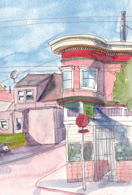
Catching up with my friend Susan Cornelis who came down from Sebastopol for the day, and connecting with some other local sketch buddies helped me forget about my missing precious pens and paints for a little while. Since I was so late, after a quick walk around the neighborhood, I decided to sketch what I could see from a bench on the porch in front of the library where the final meet up would be. The lamp post in the sketch above was up on the porch too, which is a little confusing perspective-wise, being up about 8 steps from the sidewalk in this hilly neighborhood.

The good news is that I had a great time at the sketch crawl AND the next day when I was getting ready to go out to the studio I picked up the basket I use to carry things back and forth from house to studio and my sketch kit was in the basket! YAY! And I put a “Reward for return” note in the bag with my name and phone number on it in case it ever disappears again.

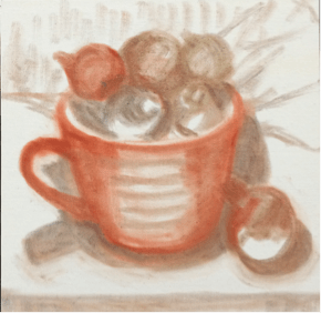
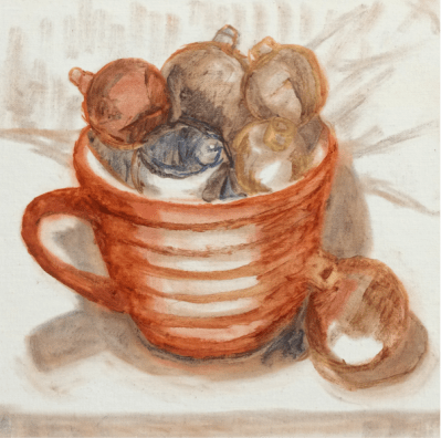
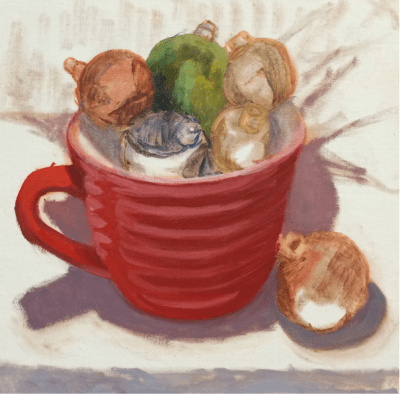
I think I like the sketch better broken into two separate ones (below). What do you think?

Categories
Faces Gouache People Portrait

Julia Kay’s Portrait Party: Portrait in Gouache

Portrait of Jan Jaap for Julia Kaye's Portrait Party, gouache in XL WC Moleskine, 9x6.5"
Portrait for Julia Kaye’s Portrait Party, gouache in XL WC Moleskine, 9×6.5″

When I learned that Julia Kay’s Portrait Party (Facebook) (Flickr) was coming to SF in March for a weekend of live portrait party events I signed up. My goal for 2015 is to develop my portrait drawing and painting skills and this seemed a perfect way to get started, along with the excellent 4-hour figure/portrait drawing/painting class I’m taking at my local community college.

Since I’ve been experimenting and teaching myself to paint with  gouache (more about that soon, with reviews of paint and brushes for gouache). I thought it would be a perfect medium for my first Portrait Party attempt. One thing that I know about gouache but am not yet accustomed to, is that it dries significantly darker than it looks on the palette (unlike watercolor which dries lighter). That explains the very vibrant tones in the portrait above compared to the original photo (which I don’t have permission to post here)! Below is the original sketch that I painted over in my X-large Watercolor Moleskine.

Sketch of Jan Jaap for Julia Kaye's Portrait Party, graphite, 9x6.5"
Sketch of Jan Jaap for Julia Kaye’s Portrait Party, graphite, 9×6.5″
Categories
Flower Art Oil Painting Painting Rose Still Life

Wedding Bouquet (FIXED!)

Wedding Bouquet (Fixed), oil on panel, 10x8"
Wedding Bouquet (Fixed), oil on panel, 10×8″

Thank you to everyone who responded to my previous post and offered feedback about whether to try to fix the right-hand rose that was bugging me. I figured if everyone said leave it I would, but if others saw the problem too, I’d try again to fix it. They did, so I did, and now I can look at it without feeling frustrated.

To solve the problems with the rose, I turned the photo and the painting upside down and could immediately see I had the shape wrong. Then I converted the photo to gray-scale to check values. I reshaped and repainted the rose using grayed-down, paler colors. I touched up a few other spots in the painting (back top right flowers, some leaves and small changes to both left roses). I added a black border to simulate how it will be framed.

Now I think the focal point (the middle rose) stands out, and the minor right rose recedes. FYI, the reason these roses don’t look that rose-like is because although I started working from life, I could quickly see that the flowers were about to completely fall apart (it was several days after the wedding) so I took a photo of the almost over roses.

Below Left (AFTER): fixed final painting; Below Right (BEFORE): before adjustments and fixes.

Categories
Flower Art Glass Oil Painting Rose Still Life

Wedding Bouquet (Finished or Fix?)

Wedding Bouquet, oil on linen panel, 10x8"
Wedding Bouquet, oil on linen panel, 10×8″

I started this painting of my daughter-in-law’s wedding flowers soon after the wedding in January 2014 but wasn’t thrilled with the way it turned out so set it aside. I began reworking it again recently, and after several times reaching a point of saying, “Finished” and then working on it some more, I remembered the saying, “Art is never finished, only abandoned” and decided it was simply time to stop.

But there’s still one thing that bugs me in this painting: the pink rose on the right just feels too Barbie pink to me. Every time I look at the painting it irks me. But I’ve repainted it 5 times and perhaps because the photo I’m working from isn’t very good, especially of that rose, it keeps turning out the same. I may try one more time. What do you think? Leave it or try again? Or maybe find another photo of the set up with a different view of that rose and try again from that photo?

My challenge in painting is always how to maintain the freshness of my original inspiration, color choices and brush strokes while holding back my inner perfectionist who wants to keep noodling around forever. Another challenge with returning to an older painting is that the fresh flowers are long gone and only a so-so photo remains to work from. Likewise all my new fresh ideas about painting have to be set aside to work on something from the point of view of a year ago.

Categories
Faces Oil Painting Painting People Portrait

Meet Morton Skullman

Morton Skullman the Man Skull, oil on panel, 12x9"
Morton Skullman the Man Skull study, oil on panel, 12×9″

I painted my skull model, whom I call Mortie Skullman, to kick off my painting for 2015 since my plan for this year is to focus on portraits, mostly of people (but also of dogs of course, my favorite subject). The process I followed for this study was based on the approach David Jon Kassan takes on his online skull painting video, “Premier Coup” (only $1.95 to rent for 1 week). It was fun painting along with him, taking inspiration from the thoughts he shared as he worked.

The process starts by drawing and blocking in with PanPastels using Sofft Tools and then moves on to oil paints. You can paint over PanPastels without need for drying time or fixative and they can be completely erased with any eraser, making them ideal for underpainting.

Below is the setup and most of the painting sessions in progress.

Categories
Art supplies Found Oil Painting Still Life

Christmas Balls in Red Cup

Christmas Balls in Red Cup, oil on panel, 8x8 inches
Christmas Balls in Red Cup, oil on panel, 8×8 inches

Happy Holidays! As Leonardo da Vinci said, “Art is never finished, only abandoned.” That’s especially true of this painting because the reflections, ridges and facets kept changing appearance as I moved or the light changed, and I could have worked on it forever. I’d planned to post it before Christmas but just couldn’t “finish” in time.

This is another painting (available here) in my “Found and Free” series: both the cup and ornaments were found on walks in “free” boxes set out on the curb.

You’ll see in the steps below that I was experimenting with using Panpastels and Sofft Tools to do the initial drawing on my panel. They are amazing: the pastels go on smoothly like paint but are completely erasable with any eraser and disappear into the oil paint so there’s no fixative required.

Below are photos of the work in progress.

Categories
Art supplies Lighting Oil Painting Still Life

Montessori Pink Tower and Turnips (plus great new studio lights)

Montessori Pink Tower and Turnips, oil on linen panel, 10x10 inches
Montessori Pink Tower and Turnips, oil on linen panel, 10×10 inches

This painting was inspired by my neighbor’s childhood Montessori Pink Tower blocks arranged like a little cityscape on his coffee table. I found the blocks irresistible and had to paint them. The turnips I’d bought to cook for dinner seemed like a perfect addition (I know, I’m weird, right?) The painting is available on my Daily Paintworks gallery here.

If you’d like to see my full notes with goals and outcomes for each painting session, you can open this small PDF file.  Life intervened between sessions which made painting from life difficult as you can see in the photos below taken at the beginning and end of the painting process: the turnips had started to sprout and wrinkle.

Categories
Flower Art Oil Painting Painting photoshop

Sunflowers in Spaghetti Jar

Sunflowers in Spaghetti Jar, oil on panel, 6x6 inches
Sunflowers in Spaghetti Jar, oil on panel, 6×6 inches

This was supposed to be a quick and easy project that went totally out of control. I wanted to try out Arches Oil Paper and quickly paint a bouquet of sunflowers in a tall glass jar meant for holding spaghetti noodles. I made and transferred a sketch (see below for process) and started painting on the paper, which I absolutely hated. It was dry, absorbent and paint wouldn’t slide or move on it. It just sucked in the paint and I was having no fun. I quit halfway through and cut off the parts of the painting I hadn’t finished. This is where I left it:

Sunflowers in Spaghetti Jar, oi studyl on Arches Oil Paper , 8x10 inches
Session 1: Sunflowers in Spaghetti Jar, oi study on Arches Oil Paper , 8×10 inches

The next day I started over on a 6×6 inch panel that I’d sanded down from a previous failed painting. Again I intended to paint for an hour or two and move on to something else. Instead I worked and reworked over and over until I finally had a painting I could stand to look at (at top of post). Sometimes I think reusing panels is a mistake because the bad juju from the first one hangs around and messes up the next one.

The one nice thing about Arches Oil Paper is that it can be cut down and cropped easily like watercolor paper. Although it does not need to be gessoed I’m going to try gesso on it next time to see if that will make it more enjoyable to use.

Below are the process photos from start to finish.The painting on paper is Version 1 and on panel is V2. The ones labeled “Photoshopped” were photos of work in progress adjusted in Photoshop to try to solve the problems and then the next image is those changes implemented in the painting. If you’d like more detail about the process you can open this PDF of my full process chart with notes about each step.

Categories
Art theory Oil Painting Plants Still Life

Persimmon and Green Beans Still Life and Steps

Persimmon and String Beans, oil on panel, 6x6 inches
Persimmon and String Beans, oil on panel, 6×6 inches

This was one of the those magical paintings that just worked from beginning to end. Maybe it was painting on Gessobord, which I love, or maybe it was because I tried to stay really focused. It’s available here on Daily Paintworks.

I was careful to paint the string beans from the garden and their leaves first since I knew they would change quickly. I stopped when I found myself getting tired or losing focus and took a break. And I closely followed my pre-planned goals for each session.

See my session chart for Persimmon and String Beans (pdf) with all the steps, plans and session images or see the images of the steps below without details. One new step I added this time was studying the nearly finished painting in Photoshop on a large screen before declaring it finished and then finding and noting areas that needed adjustments, including completely changing the background value at top.

Let me know if you’re finding these charts or step by steps interesting. I do them for myself but if others find it interesting it’s worth posting them.

Categories
Oil Painting Painting Still Life

Pumpkin and Gourd on Black Glass

Pumpkin and Gourd on Glass, oil painting on linen panel, 10x10 in
Pumpkin and Gourd on Glass, oil on linen panel, 10×10 inches

What an interesting painting challenge this was: strong warm light on a white gourd and a small pumpkin, with reflections and shadows on a shiny black plexiglass surface. Below are the steps as I worked on this painting (available for purchase on my DailyPaintworks gallery).

As usual there was one session where I did some “unauthorized painting” (see previous post for explanation) so the next session was all about trying to restore those areas. I’m trying to learn when to preserve the freshness of the “alla prima” first attempt and when to rework it. To see notes about each step and misstep, here is the link (PDF) to the Session Chart at the bottom of the post.

Screen Shot 2014-10-25 at 11.10.44 AM
To see notes about each step and misstep, here is the link to the PDF Session Chart pictured above.

To see notes about each step and misstep, here is the link to the PDF Session Chart pictured above.

Have you downloaded a Session Chart? Do you find it interesting enough for me to keep uploading them? Do you prefer just seeing the work in progress steps without detailed commentary? Thanks for visiting!