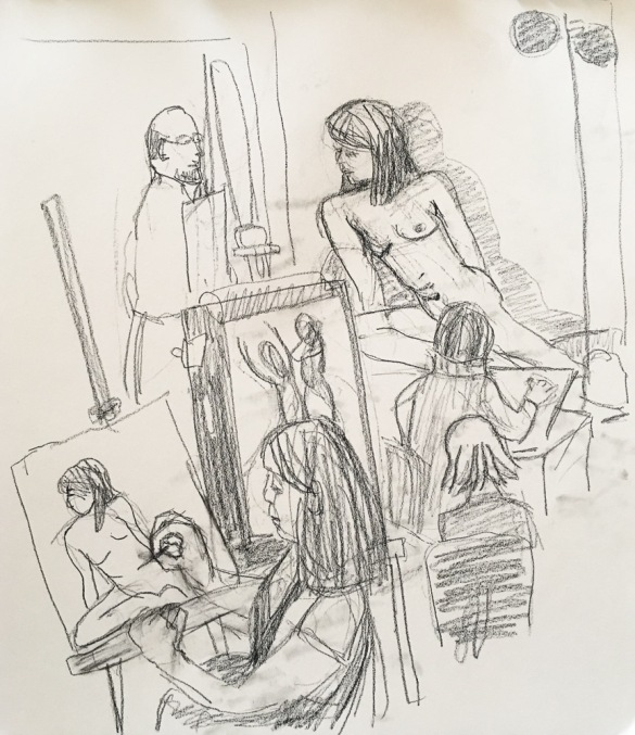
Sketching people drawing the model during a “boring” pose
I love my Friday figure drawing studio and our wonderful models. In the morning I draw the figure during the shorter poses and then switch to a portrait for the final hour-long pose after lunch. In the sketch above I decided to draw the crowded room and other artists instead of the model since I had an obstructed view of what struck me as a boring pose.
Fallon, charcoal on toned paper, life-size.
Fallon is one of my favorite models. She is so beautiful and strong, with unique features and she always brings interesting costumes and music to play for us.
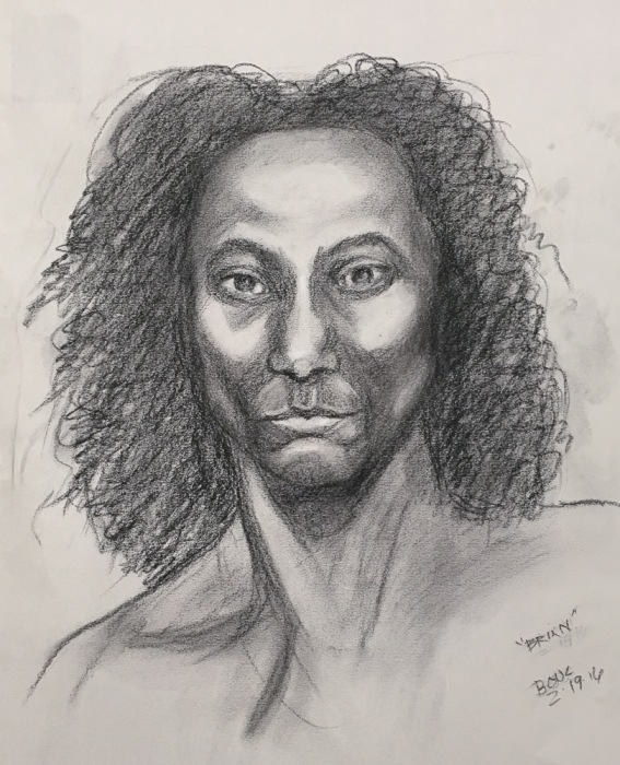
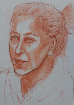
Brian, charcoal on toned paper, life size
Brian is very unusual looking, tall, muscular and lean, with prominent facial bone structure and a small, pouty (not potty!) mouth. I think I went too far with the dark charcoal as there’s too much contrast with the lighter areas but I think I did get a likeness, despite the clumsy shading and unfinished hair.
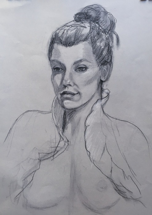
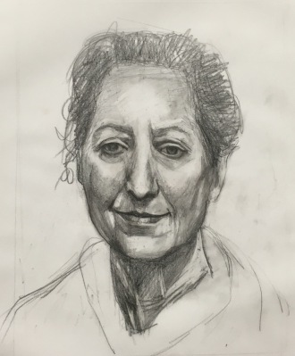
Brigitte, charcoal and conté on tan paper, life-size.
I thought the drawing above was going great until I saw it on my camera’s screen as a mirror image and it looked all wrong. I tried to fix it, but couldn’t figure out what the problem was. She looks so sour and grumpy and really was just a little sleepy from the long pose.
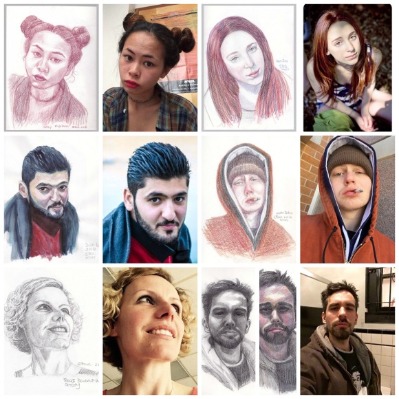
I’ve had so much fun since I discovered the SKTCHY app. It’s so simple: people upload photos and artists use them as inspiration to draw from and then upload snapshots of their artwork. (click on collection below twice to enlarge.)
Collage of recent sketches and their Sktchy.com inspiration photos
Above are my sketches and their Sktchy reference photos from the past week in a collage (made using free PicMonkey online). The Sktchy app is super easy to use, with an incredibly wide variety of people to draw and really interesting artists’ work to be inspired by. Join me there! It’s big fun!!! (FYI, it’s currently only available for iPhone/iPad; Android version is in the works).
Click on any of my sketches below to see larger or in a slide show. They are all in a 12×9″ sketchbook.
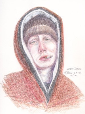
Walter Justice, colored pencil
France Belville Van-Stone, graphite
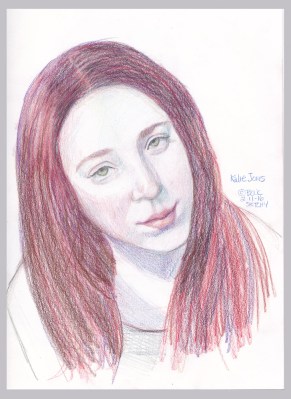
Kalie Jones, colored pencil
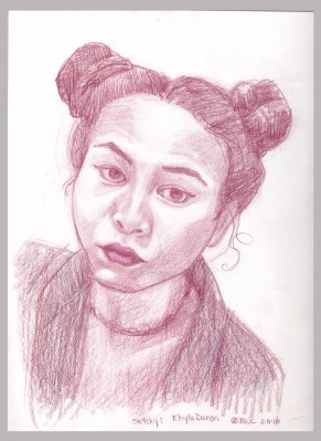
Khyla Duran, colored pencil
Shwan Kamal, photo ref, watercolor
Fernando Quijano, Jr. Graphite, attempt #2
Fernando Quijano, Jr., Colored pencil & Graphite, attempt #1
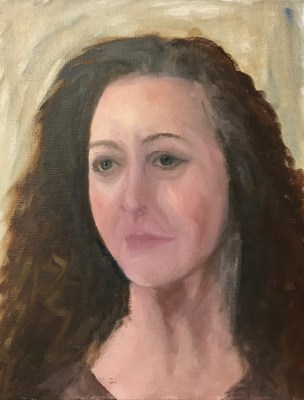
Marcy #24 “Sleepy Sister” Oil on DuraLar, 9×12 inches
When my sister Marcy offered to pose for me for my birthday, I had no idea it would take me 6 months, more than 2 dozen mostly awful drawings and painting attempts (pictures at bottom of post), and lots of study before I could produce a portrait that actually: a) looks human and b) resembles my sister (as I see her).
Although I have a long way to go before I feel competent at this, I am choosing to pause here briefly to honor and share my progress before I raise the bar again on my study of portraiture.
Attempt #1: Painted live in about 2.5 hours. I learned how much I didn’t know about painting portraits
After my first try (above) and many more failed attempts (displayed at bottom of post) I realized I needed a better understanding of head anatomy. I accepted that I can’t fix a bad drawing with pretty paint. I studied my books and videos, tried to memorize proportions and divisions of the head (e.g. eyes are halfway between top of head and chin) and did some head drawing exercises (again…) that I still didn’t quite understand. And I continued failing at drawing and painting Marcy from the photo I took when she sat for me the first time, again from life on another visit and then from other photos.
I’ve done portraits I liked in the past, either by drawing freehand and then correcting again and again, or by enlarging a photo and tracing it onto canvas or paper. But I just couldn’t reliably draw one from life. So I read more books, watched online videos and investigated in-person and online classes. I found a comprehensive online academy last month that is giving me just what I wanted to learn. I think you can see how it is making a difference, starting with #18 below, drawn from life when Marcy posed for me again. In my next post I will review and share links to the learning resources I found.
You can see the progression, from the hilarious to the hideous to the almost-but-no, sorted with most recent first. Some are just bare starts; as soon as I could tell it was unsalvageable, I added the piece to the pile of fails and started over. The paintings are all oil, 12×9″ on Matte Dura-Lar except for the earliest ones on panels. The drawings are mostly on Vidalon Vellum except for the first few 14×11″ on paper.
Marcy #24, oil on Duralar
#23, Drawing for #24, graphite and conte
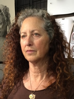
Photo for #23-#24
#22, “Almost” – completed.
#22, “Almost,” start. I like this earlier stage better than the finished version.
#21, start, discarded (see #20 visible beneath Duralar).
#20, drawing for #21 and #22. I LIKE IT! Conte on Vidalon.
Photo for #21 and #22
#19, drawn from life, completed.
#18, drawn from life, start, conte on Vidalon
*AFTER THIS I STARTED STUDYING HEAD ANATOMY. #17 Oilon Duralar
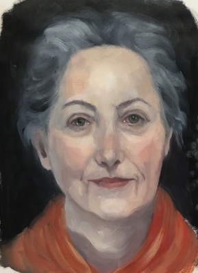
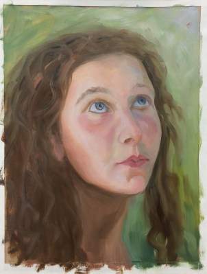
My first attempt at painting Sylvia, a lovely young Bulgarian architecture student, ended in an abandoned failure, displayed at the bottom of this post in 6 steps. I altered my course for the second attempt (above), starting with a better drawing, and was able to complete the study more successfully. I tried to practice for alla prima painting, not going for a “finished” portrait, even though I painted from her reference photo on Julia Kay’s Portrait Party, instead of from life.
2-A Drew from reversed photo
#2-B. Turned over to tone and paint
What made the difference between failure and success was that I took the time to make a more accurate drawing first (above). I drew on one side of a sheet of Dura-Lar Matte Film (after first reversing the reference photo in Photoshop) and painted on the other side. Then I turned the sheet over, toned it with a transparent umber stain, and reversed the photo back to normal. That way I had the lines of the drawing to refer to, along with the photo without obliterating the drawing. It’s still visible on the back of the painting and could be traced over onto another sheet of Dura-Lar if I wanted to paint her again from the same drawing.
Below is the failed first attempt, where impatience and hubris led to a quick, sloppy drawing (with the evil thought, “I can always correct the drawing when I paint,” which I need to ignore in the future!). The captions describe what went wrong at each step:
A=Awful, sloppy, inaccurate drawing only leads to failure and frustration.
B = Big blunder not noticing how much darker the right side of her face was in the photo and painting it way too light.
C=Continuing on with wrong values and bad drawing.
D=Depressing Disappointment. This isn’t going well.
E=Error, Exasperated! Face too long and narrow, googly eyes…
F=FAIL. Abandon ship! Start over with better drawing and make right side darker.
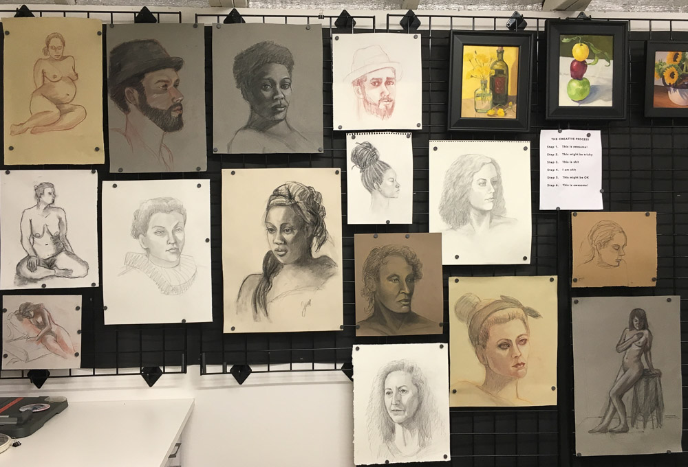
I just made a big leap in my understanding of figure and portrait drawing so wanted to share previous sketches and paintings before the new work. Above is a photo of the “figure drawing wall” in my studio. I’d covered this wall with black non-fade bulletin board paper to avoid reflected light when I’m at my easel (that stands just to the right of this photo). Then I hung black metal grid panels that I got super cheap on Craigslist and use little magnets to stick the drawings to the grid wall. Now it’s easy to add, move or replace drawings with better ones as my skill improves and I can hang framed paintings from it with grid wall picture hooks.
Below are assorted figure and portrait drawings from past Friday Figure Drawing sessions. Click on any image to go to slide-viewing mode and click through them using the arrows on each side.
Charcoal on paper
Pregnant Mama, conte on paper
Woman with headdress, charcoal on paper
Charcoal on paper
Fallon in Elizabethan Collar, Pencil drawing
Top Knott, charcoal on paper
10 Minutes, charcoal on paper
Hat Guy, Conte on Paper
Conte drawing from first 20 minute session for underpainting
Brian in conte, 1 hour, trying to see the planes of his face
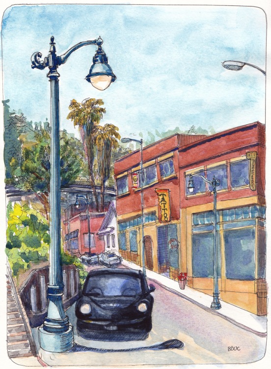
Inspired by a wonderful urban plein air painting workshop and demo by one of my favorite artists, Randy Sexton, I sketched the main street in the funky little town of Crockett that houses his studio, Epperson Gallery and a tattoo parlor. Randy is one of the nicest gentlemen I’ve ever met, as well as a highly skilled and talented painter, and a gifted teacher.
Crockett is home to many oddball characters and funky old bars and shops. When I said I’d love to paint portraits of some of the local denizens he said he’d been doing just that, starting from when a professional model didn’t show up for a figure painting session. He and his fellow artists just popped in to one of the neighborhood dive bars and recruited a regular to come pose for cash and beer.
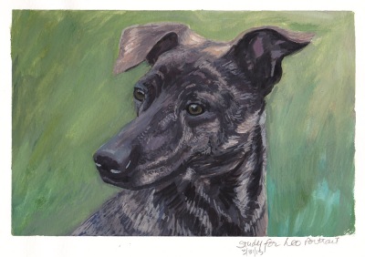
After I varnished Leo’s painting and was going to deliver it to the family that commissioned it, I realized I wasn’t satisfied with the background. I asked for and was granted permission to adjust it. It’s a good thing Leo’s people are very patient: I asked for an extra two weeks but then my dog Millie started having epileptic grand mal seizures and my cat Busby got sick and I was spending more of my time nursing animals than painting them.
Finally, after many visits to the emergency vet hospital, my family vet, and a veterinary neurologist (thank goodness for pet insurance) Millie has stabilized on her meds (no seizures in over a week), and Busby has sadly has passed on to Kitty Heaven. He was a beautiful cat and my remaining kitty Fiona misses him, even though he was a bit of a bully, like big brothers can sometimes be.
Back in the studio I explored how to rework the background. What bothered me was the way the it divided the painting in half vertically and how vague it was. With my realistic approach to the dog, it felt like the background needed more detail so I tried to suggest some of the actual greenery in Leo’s Northern California backyard (see photo below) and added some sky to add depth.
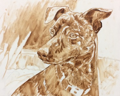
Below, copied from the previous post, are the reference photo and the work in progress before I got to the finished painting above.
Sketch on paper for study
Study for Leo Dog Portrait, gouache on paper, 8×10 in
Monochrome underpainting/block-in on panel
Color block-in/first layer
Portrait of Leo, Formosan Mountain Dog, oil on panel, 8×10 in
EDiM 5-6-7: Hot, Bristles, Envelope, ink and watercolor, 8×10
May 5 was “Draw Something Hot.” I went for the obvious, a cup of hot tea because I like this cup and I was short on imagination and time due to some “first world problems” (iPhone went bad and required way too many wasted hours to restore it).
May 6 was “Something with Bristles.” I wanted to draw the odd, bristly whiskers under my dog’s chin but she wouldn’t hold still long enough. Instead here’s a bristly bottle brush with a bonus soft cotton tip. I bought it to clean something I apparently no longer own since I haven’t used it in years and can’t remember what it was for. I created the bristles by painting in watercolor and then adding white gel pen.
May 7 was “Envelope” and this is the Mothers Day card and envelope I sent to my mom after I sketched it.
I really tried to focus on two things with this portrait, getting the drawing right and keeping the gouache colors light (gouache dries darker). For once I managed to keep a tilted head tilted in my drawing–for some reason my brain always wants to make everything upright and symmetrical. It doesn’t surprise me since I learned that the image that comes in from our eyes is upside down and it’s our brains that convert it to right-side up. My brain definitely has a mind of its own…oh wait a minute–it is my mind!
Below is the original pencil drawing over which I painted the gouache. I wish I could show you the photo I worked from, but I think those are only meant to be visible to members of Julia Kay’s Portrait Party, which you can apply to join on Flickr and play too, if you want to.
Zorn Palette color chart in gouache, 10×8 inches in A4 Moleskine
In trying to learn more about gouache I made a few color charts. I’m using mostly M. Graham gouache which I like much better than the Winsor & Newton and Schmincke I used before. The Graham gouache is creamy and brilliant, rewets well and doesn’t smell (like the W&N). I found that using fresh-squeezed gouache is more fun to work with than rewetting dried paint, but frugality keeps me trying to reuse dried. The best solution is to set up a palette for each session, squeezing out tiny blobs, adding more as needed.
Above is an exploration of the Zorn palette in gouache, a limited palette using only Yellow Ochre, Cadmium Red, White, and Black. The black paint, when mixed with white, is meant to serve as blue since it is a cool color that can look blue next to warm colors. Next I want to try using it in an actual painting.
M. Graham Gouache paint chart, gouache in A4 Moleskine, 10×4 inches
Above is a chart of my gouache colors straight from the tube and mixed with white and each other. Sadly when I removed the masking tape it pulled off some of the paper from the extra large Moleskine watercolor notebook that is my current journal. I don’t recall previous Moleskine WC notebooks having that problem but I’ve switched to low-tack tape now.
Before ordering any new brushes specifically for gouache I wanted to see how the brushes I already had might work so did the test below. I found a few that I liked and ordered a couple of others. I’ll do another post about my gouache palette and brushes I’ve settled on soon.


, conte on paper")