Categories
Art supplies Bookbinding

New Journals Bound, New Problems/Questions

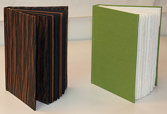
Newly Bound Journals

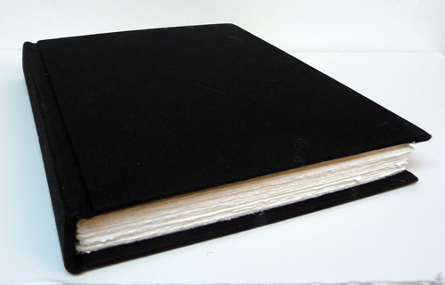
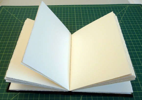
On the left is the new journal I bound for International Fake Journal Month and on the right is my next all purpose journal that I bound with Legion Multimedia 140 pound watercolor paper.

Since it had been a few months since my epic journal binding learning experience, I had to replay many of the videos and look at my notes to figure things out. And I made a bunch of new mistakes to learn from.

I have one big, confusing question. (UPDATE: See Comments for answer from Roz and note from Shirley) When I punched sewing holes I followed Roz’s video, along with Shirley’s tip to use a phone book to support the signatures. I punched four holes just like Roz did in her video demo, instead of the five I punched last time. But when it was time to sew the signatures together I couldn’t figure out how an even number of holes could work. When you have an odd number of holes and you start on the outside of the folded signature you always end up on the outside at the end of each row so you can attach each signature to the next. But with four, if you start on the outside you end on the inside. I’m guessing Roz was preparing a different sort of book.

Fortunately I had torn down extra sheets, thinking I’d bind two journals but I put aside the set I’d punched with four holes and punched five holes in the second set. Either I’ll find out how to bind with four holes or I’ll go back and make one more hole in each signature before binding them.

I also used Shirley’s tip to glue up the binding board and then place it down on the book cloth instead of putting glue all over the cloth and that was sooo much easier.

Some new mistakes I’ve learned from this time:

  • MEASURE TWICE, CUT ONCE! (or in my case measure 3 times just to be sure).
  • After gluing down the board pieces to the book cloth, I should have burnished them with the bone folder to ensure a consistently strong bond (a few small wrinkles showed up in the cover where it didn’t bond 100%).
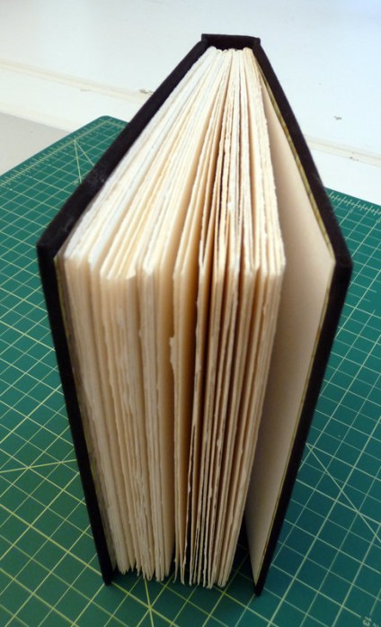
  • Don’t make the book so thick; use fewer signatures so it is lighter and less tiring to hold when sketching standing up.
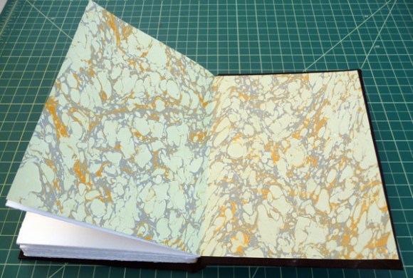
  • When you use “self-endpapers” that doesn’t mean adding yet another folded sheet, making the book even thicker. It means just gluing the book block directly to the covers (I think–correct me if I’m wrong). I had picked an ancient map print to use as end papers in the green journal but decided I didn’t like it at the last minute. I liked Shirley’s idea of just using colored drawing paper instead.
  • Make the  sewing thread long enough so you don’t have to join it in the middle (thus having to once again struggle with knot-tying from diagrams that are totally confusing).
  • Don’t use white thread and white headband ribbons on black books.

Now I’m coming to the end of my journal bound with 90 lb Arches cold press paper. I will be sad to put “The Mutt” as I named it, on the shelf, as it has become a trusted friend and companion. And I really came to enjoy the paper, once I started using my Lamy Safari fountain pen to draw with.

Soon I’ll be getting to know a new journal, with new paper and new possibilities. I think I shall name it Froggie, given its green color, warts, and all. Someday maybe I’ll make a journal that is elegant and give it a posh name but for now, mutts and toads R Us.

Mechanical FrogAnd I’ll write more about the black/brown journal in April when I start using it for International Fake Journal Month.
Categories
Acrylic Painting Art supplies Landscape Outdoors/Landscape Painting Places Virtual Paint-Out

Virtual Paintout Norway & Golden Open Acrylics

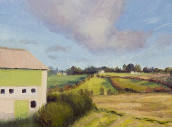
Norway farm landscape painting, Acrylic, 9x12"

This month’s Virtual Paint-out is taking place in Norway. When I picture Norway it’s always snowing—silly me. I was amazed to wander the roads and see the beautiful summer light and perfectly maintained buildings and fields. There was so much gorgeous scenery it was hard to pick, but I couldn’t resist all the different greens in this scene.

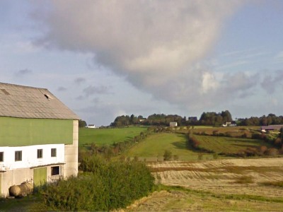
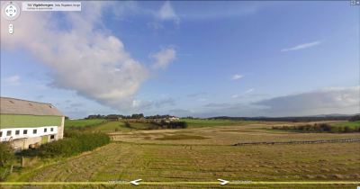
Here is the original scene from Google Earth. I used Windows 7 cool “Snipping Tool” that lets you select an area of the screen to copy and save:

Google Earth photo with address
Original Google photo

If you click to enlarge the image you will see the address of this farm in the top left. I played around in Photoshop to compose and crop the scene. Then I used the “Content Aware Scaling” feature in CS4 that allows you to compress a scene without distorting elements such as buildings or people. I wanted to fit the image on a 9×12″ canvas:

Scaled in photoshop
Cropped/Scaled in Photoshop

What’s really exciting to me about this painting is that I used Golden Open Acrylics to paint it. I am in love with these paints! [SEE less enthusiastic UPDATE AT BOTTOM]. They have all features that I love about oils and acrylics with none of the features I don’t like. I’ve been struggling with both those mediums for months and was going through an artistic crisis, considering giving them both up.

The problem with acrylics

I couldn’t stand working with regular acrylics because I like to layout a palette of paint and work intuitively, mixing as I go. Acrylics dry too fast to do this. (Yes I know you can mist the paint regularly and that there are special stay-wet palettes but I found they turn the paint to soup and smell bad after a couple of days). I also like to blend colors on the canvas and to be able to wipe off a passage if it’s not quite right. None of this is easy to do with regular acrylics.

The problem with oils

Because I try to use solvents as little as possible with oils due to their toxicity and smell, I can’t start with juicy washes for the first layer as I like to do when sketching out the composition with oils. And even with the minimal use of the least toxic odorless solvent (Gamsol mineral spirits) I found there was an odor (probably from linseed oil going rancid that was left in the solvent) that bothered me anyway. And then there’s the cleanup up dozens of brushes after a painting session.

Why I love[d] Golden Open Acrylics

Golden Open Acrylics do not smell, stay workable about as long as oil paints [update: they don’t really], can be diluted with medium and/or water, clean up with water, do not dry on brushes (for 24 hours at least), blend nicely and are just a dream to work with. When I quit painting last weekend I stuck a small, damp sponge on the palette, and closed my Masterson “Palette Seal” box. I opened it today, a week later, and the paint was still in perfect working condition, better than oil paint would have been.

While I admire thick, expressive, brush strokes in paintings, it’s not really my thing. I prefer working more thinly and that’s just the way Golden Open Acrylics are meant to be used: in layers less than the thickness of a penny. They can also be mixed with regular acrylics to modify the texture or the drying time. Or they can be combined in different layers, although it’s suggested to use regular acrylics as the first layer(s) before adding the Opens or waiting for the layers of Open Acrylics to thoroughly dry (2 weeks) before applying a layer of regular acrylics.

I think these paints are also  going to transform my plein air painting. [update: they didn’t work for plein air; got tacky too quickly] I won’t need to bring solvent or a slew of brushes. I haven’t figured out what to carry for a water container or how much water I will need to carry for brush washing between colors.

Our first plein-air session of the new season is next Friday and I’m looking forward to playing with my new medium in a Non-Virtual paint-out too.

UPDATE June 30, 2010

After working the Golden Open Acrylics for three months I’m considerably less enthusiastic about them. The deal breaker is that the paint dries darker (about 10%, varies between colors) which requires guessing when mixing paint how much lighter to make it and makes it impossible for me to try to match colors I’m seeing . Other problems are the drying time which depends on the humidity and wind which makes painting outdoors with them next to impossible in my area. Unless there is no breeze and high humidity, even indoors, you have to work quickly before the painting starts getting tacky within an hour or so. But then it can take a really long time for the paint to dry completely. When trying to glaze on top of a seemingly dry layer, I’ve ended up lifting the previous layer instead and had to give up glazing.

I’ve now switched to Holbein Duo Aqua water soluble oils and so far and am finding them the best of all worlds. No color shift, artist quality pigments and pigment load, no toxics, no smells, easy clean up. I write about them here.

Categories
Art supplies Bookbinding Drawing Ink and watercolor wash Painting Sketchbook Pages

Testing Paper for Journal Bookbinding + Junk Drawer Still Lifes

Junk Drawer #1, Legion Multi-Media Paper, ink & watercolor
Legion Multi-Media Paper, ink & watercolor

I used random items from my junk drawer as still-life subjects to test paper for binding my next journal.  The paper I’ve chosen is Legion Multimedia Aquarelle 300 gsm (a little thinner than 140 lb). An employee at my local Artists & Craftsman store suggested it when I was unsuccessfully seeking the Fabriano Soft Press 140 lb recommended by Shirley of Paper and Threads.

Legion Test #2
Legion Test #2

Legion Multimedia/Aquarelle

I was delighted to find that the texture of the Multimedia/Aquarelle  paper is perfect for writing on with the finest of pen points (unlike my current journal’s Arches CP paper). It took watercolor washes and multiple layers of glazes beautifully without buckling, pooling, or pilling. Color lifted off easily when rubbed with a damp brush.

The paper is nicely sized to prevent the paper from soaking up the paint, but not so extremely sized as the Arches 90 pound cold press that practically resists the ink.

It has two deckle edges and is relatively inexpensive. The Legion Multimedia/Aquarelle paper cost $2.69 a sheet at my Blick store while the Fabriano Soft Press 140 lb paper was $4.99 a sheet. Unlike the Fabriano, this paper is also available in 90 lb weight which I will try next, but I think that will have to be a special order through Artists & Craftsman since Blick only carries the 300 gsm paper.

Dick Blick’s website says about the Legion Multimedia paper:

“Use any painting and drawing media you choose on this fine quality, crisp white paper! Multimedia/Aquarelle Paper consists of 100% cotton fiber, is acid-free, and has a neutral pH. The paper is 140 lb (300 gsm) weight, and has an uneven textured surface. Available in two different surfaces — Cold Press and Rough. Cold Press is available in sheets and pads, Rough is available in sheets only, and comes in 200 lb (380 gsm) weight.”

I tested the paper for grain direction and it runs the long way, making it possible to tear it down for a journal just the size I like: 5.5″ x 7.5″, with no waste, which is not possible with the Fabriano whose grain runs the short way.

I finally was able to buy a sheet of Fabriano Soft Press (which has a similar surface texture, between hot press and cold press) and tested it too:

Fabriano Soft Press 140 lb: Test #1

Fabriano Soft Press

The Fabriano Soft Press paper had some things in its favor but ultimately the cons outweighed the pros in my mind. It seems like good sturdy paper, and the paint lifted OK without surface damage, but it was slightly less pleasant to write on with a fine-point pen, even though the surfaces of the two papers are very similar.

Since the grain runs the short way (which means the pages will need to fold the short way) you either end up wasting some of the paper or have fewer size options for the book. Also, the paper is thicker and stiffer, which means fewer sheets per book or a thicker, heavier book. And it is more expensive.

But what bothered me the most was the sizing. According to Blick:

“Fabriano papers are synthetically sized both internally and externally so that no animal by-products are used.”

In fact, Fabriano uses an acrylic sizing as opposed to the organic sizing (gelatin) that other companies use. I found that juicy washes on this paper took forever to dry and I assume it has to do with the non-porosity of acrylic sizing.

Fabriano Soft Press Test #2

Despite waiting and waiting and finally using a hair dryer before adding the next layer of glaze, the paint still wasn’t dry and glazes bled into each other.

I also tested the Arches 90 lb Cold Press in my journal (below). Washes, glazing, lifting worked fine, but just isn’t pleasant to use with a fine point pen.

90 lb Arches Cold Press test

I’m looking forward to binding my new book and then giving the Legion Multimedia Aquarelle paper a true test of its journal-goodness and whether it really is the “perfect” watercolor journal bookbinding paper for me.

Categories
Art supplies Bookbinding Drawing Ink and watercolor wash Outdoors/Landscape Painting People Pinole Sketchbook Pages Subway drawings

Pinole and Pen, Paper, Ink Tests

Pretty Pinole from Peets, Ink and Watercolor

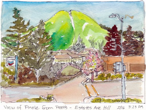
Warm sun, green hills, blossoming trees and a great Peet’s cappuccino to sip at an outdoor table while sketching was made even better by a pen that actually worked in my sketchbook. After struggling to find a pen that would not skip, scratch, smear, show through or bleed on the Arches 90 lb cold press paper I’d bound in my journal, I discovered that my Lamy Safari fountain pen was just right.

Pens

All of the pens I normally use were giving me problems. The Sakura Pigma Micron skipped, scratched over the textured paper when drawing, and was even worse for writing in the journal, whether I used my favorite .01 or a fatter-tipped .05.

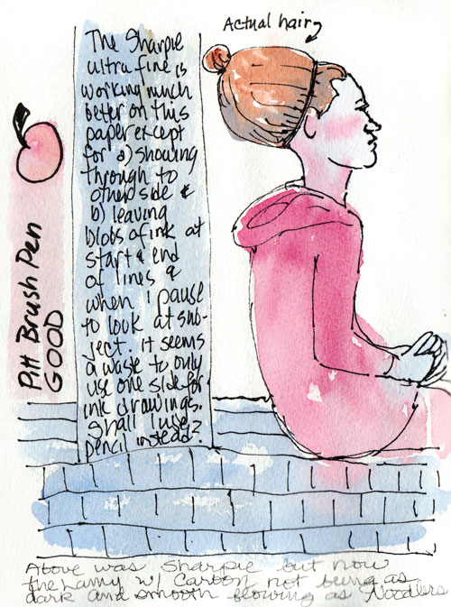
Pitt Artist Pen and Sharpie tests

I tried using an Ultra-Fine Point Sharpie since it would at least produce a strong line (above). But I found that the ink flowed too quickly, bleeding and spreading if held in one spot and worse, showed through to the other side.  I also tried the Pitt Artist Brush Pen on this page, which worked OK but was a thicker line than I like for general sketching. The black ink in the finer-point Pitts seemed paler than the Microns, but it might also be that they resist the sizing on the paper more.

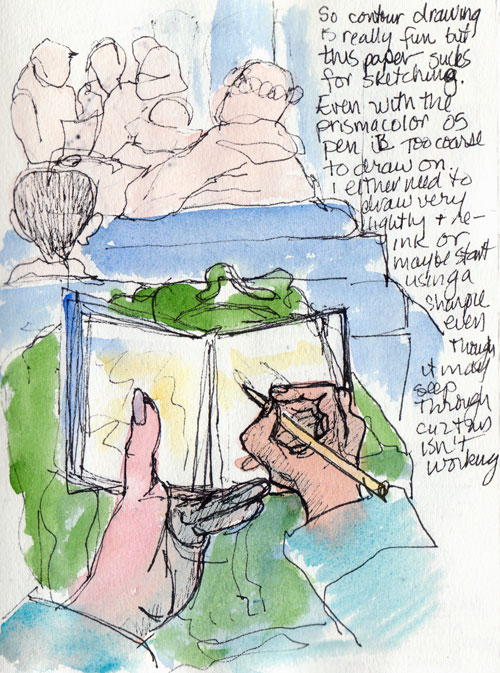
Testing Prismacolor .05 Pen

Prismacolor Illustration pens are similar to the Sakura Pigma Micron and Pitt Artist Pens and are very nice and comfortable to hold. But they too performed poorly on the Arches CP. In the sketch above I was trying to do a contour drawing of what I saw on the BART train but my lines were barely visible until I redrew them with a Sharpie.

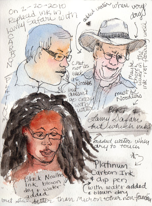
Testing Noodlers & Carbon Platinum Ink

Then I tested my Lamy Safari F-point fountain pen and was delighted to see that it was a pleasure to write and draw with on the Arches CP paper.

Ink

I’d last filled the Safari with Noodlers Black Bulletproof ink, which is supposed to be waterproof but actually bleeds a fair amount when a wash is applied after it’s dry. I used a dip pen to test Platinum Carbon Ink and it held up better, barely bleeding at all.

So I squirted out the remaining Noodlers in my Lamy and refilled it with the Carbon Platinum ink. I’ve been a happy sketcher ever since. The ink is a rich black, doesn’t bleed, is great to write with on this bumpy paper, and is comfy to hold. Yay!

Paper

Now that I’m halfway through my journal it’s time to prepare for binding the next one. I’ve been testing papers and I think I’ve found the one. When I finish my tests I’ll post them. I have a feeling I might have found the perfect paper for ink and watercolor journaling.

Categories
Art supplies Ink and watercolor wash Painting People Places Sketchbook Pages

Signs of Spring

Blossoms, blue ink & watercolor

Signs of spring were sprouting everywhere on my walk and I couldn’t resist stopping to sketch and paint. But I stopped so many times that before I’d gone half a mile I was so hungry I had to return home for lunch before heading out again.

The sketch above graces the first page of my new sketchbook, bound with Arches 90lb cold press watercolor paper. It’s quite different from the Fabriano Venezia sketchbooks I’ve been using the past year.

Princess flower bush blossoms, ink & watercolor

I’m really enjoying the way the book opens flat, it’s size (7.5″ tall x 5.5″ wide) and weight, how comfortable it is to hold and to hold open for working across the spread, the texture of the paper for painting and the way the pages don’t ripple, pill, or show through to the other side. The paper takes a lot of abuse and layering, which is both a good and a bad thing. Good because it holds up, but bad because it allows endless diddling around which isn’t really the point of sketching (but is a bad habit of mine).

Peets people, ink & watercolor

And what’s a nice walk on a spring-like day without a stop at Peets for a Cappuccino at a sidewalk table and a bit of sketching/painting.  I’m still finding my way with this paper, trying to get a sense of how much paint to use, and which pens work best with it.

One thing I’ve determined for sure is that I prefer painting on site when I go out sketching, as I did with these, and not just drawing on site and adding paint later as I did last week with my sketching group. I just spent the evening painting the drawings from last week’s outing and it just didn’t have the zing that painting from life on site does.

You can make many more sketches and have more control of the paint when you save the painting for later, but then you either have to work from memory (of which I have too little) or photos (which never capture what you really see in person) or by using a pencil to softly write “Y” in areas that are yellow, “B” for blue, etc.) While I loved those “paint by number” kits when I was a kid, I’m not crazy about painting by letter now.

Categories
Art supplies Food sketch Painting Sketchbook Pages Watercolor

Rubber Mallet $5.95 and Tangerines

Mallet and Tangerines, watercolor & graphite

After a lifetime of not even knowing rubber mallets existed outside of cartoons, twice in the past year while working on projects I read directions to “tap with a rubber mallet.” I thought to myself, “Who has a rubber mallet? Not me.” And then used a regular hammer which didn’t work out too well to put it mildly.

So when I was shopping for bookbinding supplies at my local Dick Blick art store and I saw a rubber mallet sitting on a nearby shelf for only $5.95 I couldn’t resist. It was just so funny looking. I have no idea why they were selling it at Blick’s and what artists would be using it for, or how it could sell for less than a toilet plunger at the hardware store.

So I found a good use for it in the studio—as a still life subject—and it fits right in, don’t you think? Tangerines, rubber mallets, why not? Maybe my next still life will be of smashed fruit and a juicy mallet. But that will have to wait for a sunny day. No way I’m smashing fruit in the studio. It’s messy enough as it is.

Meanwhile I thought I’d check out what rubber mallets are really for and I found this on About.com‘s Home Renovation tools page:

“Admittedly, the rubber mallet is not the first thing on your tool list. But once you have a rubber mallet, you begin to discover many uses. Here are some common uses:

  • For ceramic tile, it helps gently tap tile into place.
  • Laminate flooring: great for this brittle material.
  • Tap carpeting onto tacking strips.
  • A “sounding device” if you need to hear what is behind a wall or in a pipe.
  • PVC pipe work.
  • Two tight-fitting sections of drywall.”

I can’t help picturing cartoon versions of each of these uses, especially with me behind the mallet accidentally tapping something into smithereens. And how funny is it that my blog’s spell checker thinks “smithereens” is spelled correctly but that the word “blog’s” is not.

Categories
Art supplies Bookbinding

Bookbinding a Watercolor Sketchbook Journal: Learning from My Mistakes

The Mutt: My first casebound sketchbook

The most important thing I learned in binding my first hardbound sketchbook journal is that the process is very forgiving and not rocket science. In fact, despite making every possible mistake along the way, it still turned out as a quite usable little mutt of a book.

Inside the Mutt
Inside the Mutt

I took notes as I worked: reminders what NOT to do next time, which parts to skip, what really matters and what doesn’t. And now, using the medical school approach for teaching surgery (“See one, do one, teach one”) I’ll share what I’ve learned. Fortunately this isn’t brain surgery, since I’ve literally only seen one and done one.

UPDATE: I have refined the process described below; the most up-to-date version is always available as a download on the Resources page here. You may also find my more recent bookbinding posts by selecting “Bookbinding” from the Categories pull down menu on the right. Now, to continue on with the original post…

Side view
Side view

I will simply refer you to the resources I used and try to serve as a sort of docent on the journey through the process. If you are an experienced bookbinder PLEASE share any suggestions, advice or corrections and I will update this post with them.

Open and ready to play
Open, not perfect, but ready to play

I’ve divided the post here to hide the details since it’s long…

Categories
Art supplies Gouache Ink and watercolor wash Life in general Sketchbook Pages

Waiting for the Book to Press

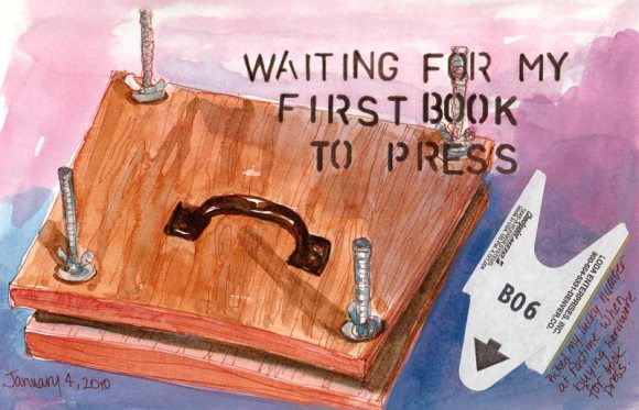
Waiting for the Book to Press, mixed media
Home-made book press, ink, watercolor, gouache, stencil, hardware store ticket

I made a book press as part of the process of learning to bind my own sketchbook. This of course required a trip to the wonderful Pastime Hardware store.  I was so excited that the ticket I pulled from the little red take-a-number thingee for the helpful hardware guy (or in this case gal) had both my initial and my birth month/”lucky” number on it so I saved it for posterity in my sketchbook. (I put quotes around “lucky” since the number has never actually been lucky for anything but I call it my lucky number anyway.)

Just like any project that requires tools, measuring, fractions, or spatial relations, building this simple press was not easy for me. First I had to saw the wood. I didn’t want to have to go to Home Depot (ick) to get someone to do it for me I had a piece of fake oak shelving I’d bought but hadn’t used.

So I used my funky little hand saw (that I bought when I became a home owner and thought I should have a basic set of tools in a toolbox “just in case”) to cut the shelf in half into two one0-foot square pieces. It took forever and my cut was wobbly, uneven and made a mess of the veneer.

Then I measured in from each corner one inch and drilled holes, guessing how big they should be. Unfortunately, since my cut wasn’t even, the holes didn’t line up right and they were too small. So when I assembled all the pieces the boards were all tilty and got stuck. I finally got it all apart again and redrilled the holes larger. This solved the problem and the press worked fine.

Like every step in the bookbinding process, I learned something valuable along the way. In this case I learned I should have clamped the two boards together and just drilled right through both of them to make the holes line up.

In my next post I’ll offer some resources for do-it-yourself bookbinding including the tips I learned from my mistakes.

Categories
Art supplies Art theory Flower Art Published work Sketchbook Pages Still Life Studio Watercolor

Refusing to Fail or Quit: It was either me or the orchid…


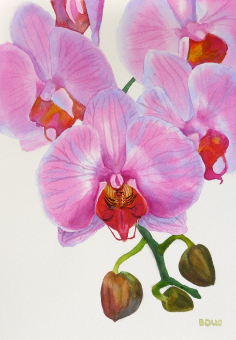
Orchid in watercolor #2, 12x9"


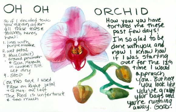
On Wednesday night I completed the last page in a sketchbook with some writing about the frustrating process I’d been through with the orchid painting. And then, as I did one last sketch of the orchid in the book (below) I realized how I might be able to actually make the painting I’d originally envisioned. It would be one I could do simply and be able to write about as the six-step process the publishers needed.

When I woke up on at 6:00 a.m. on Thanksgiving morning I realized I had to give it another try. The image above is the happy result.


Oh Oh Orchid!
My sketchbook breakthrough

Tonight my watercolor group met for dinner and a chance to share what we’ve been painting this month. When I showed them the two versions of the painting they liked both but Susie said that in the first version they looked like evil man-eating orchids, which is certainly how they felt to me. In the sketch above I thought the orchid looked like it had packed his bags and was running away, suitcases in hand. (Good riddance!)

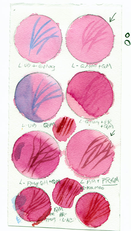
Here is one of the MANY pages of tests and samples I made in trying to find the right pigment combinations to make this painting work.

Orchid watercolor test page

I decided the pigment that gave me the color I wanted was Winsor Newton’s Quinacridone Magenta but like most quinacridones,  it wasn’t very civilized, trying to spread everywhere.

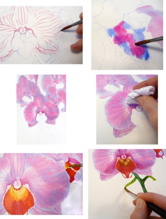
Orchid Painting Steps

What finally worked was painting the veins first on dry paper, wetting a petal, painting cobalt blue just inside the perimeter and then dropping in the Quinacridone Magenta in the center, letting it spread and then blotting up a bit of the paint as needed.

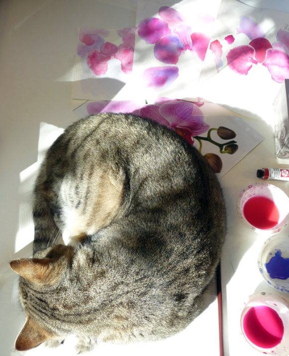
Busby relaxing amidst orchid chaos

At least someone got to relax in the sun. When I left to make a cup of coffee Busby napped amidst the orchid chaos on my desk. You can see the original reference photo peeking out from under him, with a pile of false starts at the painting behind that.


Categories
Art supplies Art theory Drawing Flower Art Painting Published work Sketchbook Pages Still Life Watercolor

Painting for the book: “Must Paint Watercolor Flowers” – Part I

Rehearsal: Sketchbook pages

I was given permission to post some of my work on the upcoming book, “Must Paint Watercolor Flowers” (Quarto Publishers, London) for which I’ve been commissioned to paint three floral watercolors.  The painting is the easy part; taking the photos, correcting them in Photoshop, and writing about each of the steps takes much more time and isn’t nearly as much as fun. I thought I’d break this into a few posts so they won’t be too long.

My first step after being given my choice from a couple dozen excellent photos (which I’m not permitted to post) was to do some rehearsals in my sketchbook. I used several pages to experiment with how I wanted to approach the metal pitcher,  mixing colors for the leaves, the buds and the yellow-green flowers (above). Then I experimented with color mixtures for the orange flowers and the large amount of darks (below — combinations of Winsor Green and Alizarin Crimson, Ultramarine Blue and Burnt Sienna, Sap Green and Sepia, Winsor Green and Winsor Violet).

Rehearsal - Sketchbook p. 2

Next step was to transfer the photo to my watercolor paper. Initially I was going to make the painting small enough to fit on my scanner but decided to use the maximum size the publisher allowed since it was such a complex painting.  I chose a 12 x 16″ Arches 140 lb. cold press watercolor block  (block is easier to set up for photographing). If I’d been given more time and/or if the photo wasn’t so complex, I probably would have transferred the image by drawing freehand or using a “gridding up” method but with a two-week deadline I used a quicker method.

Transferring the photo to watercolor paper

I enlarged the photo in Photoshop and printed it in sections (before figuring out I could have more easily used my copier to do the same) and taped them together. Then I placed a sheet of Saral Transfer Paper on top of my watercolor paper and laid the enlarged print on top of the Saral. Using a ballpoint pen, I traced over the shapes of the flowers, leaves, stems and shadows which transferred graphite lines from the Saral paper onto the watercolor paper.

Cleaning up the drawing

See what I mean about how complicated the image is! I’d left too much of an overlap on the tiled together enlarged photo and some areas didn’t get a good transfer so had to freehand some of the drawing, clean up some lines and darken others. This is my new favorite mechanical pencil, the Papermate PhD Ultra.

Masking near the pitcher

I wanted to paint the pitcher wet-into-wet and so I applied Winsor and Newton Colourless Art Masking Fluid to some of the shapes around and projecting into the pitcher to make it easier to paint wet into wet more freely. I used a cheap disposable brush to avoid messing up my good ones. I prefer Cheap Joes Golden Fleece rounds for watercolor and even though they aren’t expensive, I don’t want to ruin them with masking fluid.

Pitcher painted, removing masking fluid
Detail: Pitcher painted, removing masking fluid

I like pulling off the mask with the rubber cement pick up tool. I think it’s made out of the same stuff Vibram shoe soles are made from. The pitcher and the table have had their first washes. Next step is starting on the flowers and that will be in the next post.