Categories
Landscape Life in general Oil Painting Outdoors/Landscape Painting Plein Air

China Camp & Two Surprise Parties

Old boat on rails at China Camp State Park

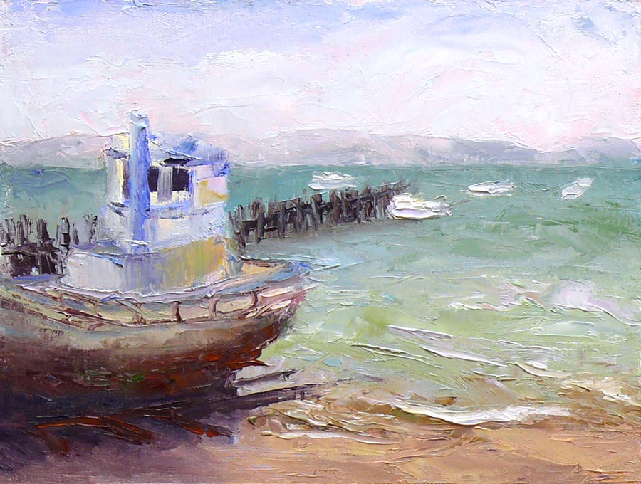
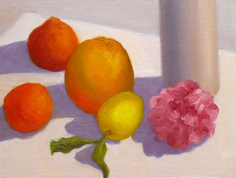
Old Boat on Rails, Oil on panel, 9×12″ (larger)

Blazing hot sun on the beach made plein air painting a challenge Sunday at China Camp State Park, an historic site where Chinese immigrants lived in a shrimp fishing village in the 1880s. It is a fabulous place to paint, with a small ghost town and old boats, (many with Chinese lettering) beautiful views of bay and marshland and hiking and biking trails that go for miles.

I was painting with the Benecia Plein Air Painters, a wonderful group of painters led by Jerry Turner. Many painters stayed until sunset, capturing the sunset and late afternoon glowing light. I painted from about noon until 3:30 (minus a break for a suprise birthday party lunch for Jerry) and after a little splashing around in the water, headed home to the fog belt to cool off.

I’d been given my own surprise birthday party the day before by my wonderful neighbors. I was completely stunned and delighted to find all my dearest friends and family and coworkers standing there throwing confetti and yelling Happy Birthday!

What a feast my neighbors made for me, with all of my favorite traditional Mexican foods that C & A are famous for, plus a beautiful cake and decorations galore. Their backyard was covered in balloons, and signs and banners and a banquet’s worth of delicious food.  What a special birthday treat!

One of my party favors was a purple hat that says “At my age, Happy Hour is a NAP!” I love it! My yearlong birthday celebration continues….

Categories
Life in general Oil Painting Painting Still Life

Jumbo Apricots – Quick Oil Study

Jumbo Apricots - Quick oil sketch

(larger)

I did this painting before bed last night, giving myself just an hour or two to complete an oil sketch. The panel I was using was a bit slick so the paint wasn’t sticking as well as I’d have liked but I was reasonably pleased with the attempt.

While I was painting my wonderful next door neighbors brought me a huge bouquet of flowers for my birthday. For some reason, as each of the three kids and their parents said “Happy Birthday!” and gave me a hug I said “Happy Birthday to you too!” It wasn’t until I’d said it three or four times that I realized it made no sense. Since English is their second language, maybe they thought that’s just another odd American custom (or another odd Jana-ism). They already thought it was weird enough that I was spending my birthday evening by myself in my studio.

But of course painting is what makes me happy and I get to do what makes me happy on my birthday. I told them I’d paint the flowers the next day (and then realized I’d already started painting them as I’d answered the door with several painty brushes in my hand, and the paint was getting all over the bouquet wrapper.

I started the day with my annual tradition of a hike to Fat Apples Restaurant for a French Apple Pancake with my sister, my niece, and my best friend Barbara. We’ve been doing this every year for at least ten years and it was great spending time together and the pancake/souffle was perfect.

About the painting: Oil on panel, 10×8

Categories
Flower Art Gardening Life in general Oil Painting Outdoors/Landscape Painting Plants Plein Air Still Life

Hydrangeas Plein Air & Creativity Interview

Hydrangeas plein air

Oil on panel, 6×8″ (larger)

It felt so good to get outside and paint this sunny afternoon, even if it was only for an hour on the side of my house by my trash cans where this small hydrangea is finally starting to blossom and grow.

Creativity Interview

I was interviewed by Creativity Coach, Liz Massey and she posted the interview on her blog today. If you’d like to read about my creative process, thoughts on inspiration, overcoming artistic blocks, etc., please stop by her excellent blog. While you’re there, check out some of her other interviews. I was especially intrigued by her post about “clutter-busting with one sentence journaling.”

Painting lessons learned the hard way

This week I’ve been mucking about in the studio trying to fix the compositional problems with my painting of the ladies at the farmer market. Today I gave up on it and moved on.

The struggles I had with it were a good reminder for me about how important it is to resolve compositional issues before starting to paint (like the area where you couldn’t tell hands from plastic bag from shopping cart handle).  Also a good lesson that if a painting’s initial framework isn’t working, it’s better to start over than to spend hours and hours trying to fix it. Although I really liked many parts of that painting, it just wasn’t working as a whole.

Inspiration at 87

My sister and I joined my vibrant and adorable 87 year old aunt and her two sons (our cousins) who I hadn’t seen for 30 years for lunch today. It was so inspiring to see how youthful my aunt is — she drives, goes bowling with her girlfriends, and takes long walks several times a day with her Border Collie.

Categories
Faces Oil Painting Painting People

Farmers Market Friends (Work in Progress)

Farmers Market Freinds
Larger

I’m really happy with the way this painting (from a photo I took at the Farmers Market) is progressing and since I couldn’t finish it tonight and it’s back to the office tomorrow, I decided to share it as a work in progress.

Questions for you:

  1. Can you tell that the woman on the left is resting her hands on her shopping cart handle and that there’s a plastic bag of stuff in the cart?
  2. Is the way her hands are mostly one light shape confusing?
  3. Is that area of hands/cart handle/plastic bag distracting? (Before I pointed it out.)
  4. Do you think I should leave their shirts alone or add the patterns that were really on their shirts?
  5. Anything you see that needs fixing (other than the list above and below)?

I still need to add paint to the truck in the background to get the color right, paint in the lettering and add some contrast to the lady on the right (and maybe adjust her face a bit).

Categories
Painting Sketchbook Pages

Infinite Color & Joy: Charting My Palette

Color Chart of my oil palette

11 colors x 11 colors = Joy! (Larger)

Richard Schmid said it best, when writing about his experience with doing these charts when he was an art student:

“When I finished I knew more about my paint than I had ever thought possible. It was an astonishing experience—imagine being taken into the kitchen of a great chef and shown everything he could do with flavors—that was what it was like for me! There was nothing tedious or boring about doing the charts; each was a revelation of the power that awaited me…”

I’ve been working on these charts for about two weeks and it has been an amazing experience, just as Schmid described. I’ve had moments of sheer delight at the unexpected appearance of a beautiful coppery color or a lovely mulberry. I was flown back in time to memories of dipping easter eggs in dye and seeing the colors emerge, and could almost smell the scent of the redwood forest with the appearance of sharp dark greens and rich deep reds.

The purpose of doing the charts is to see, understand, and remember how they behave. They also provide a wonderful resource to refer to again and again. I mixed 11 colors with each other and then lightened them in 5 steps, so that the first row is pure color and the last row is a tinted white. Adding more colors, more steps…the possibilities are endless! These could also be done with watercolor, using water instead of white paint.
(Please click “Continue Reading” for more…).

Categories
Drawing Painting Sketchbook Pages Watercolor

Hotel Mac, Pt. Richmond Plein Air

Hotel Mac, Pt. Richmond, Ink & Watercolor

Ink & watercolor, 8×6″ (larger)

When we had all our paintings lined up to view after our plein air paint-out today, a very cheery homeless man passed by, examined everyone’s work, and announced that my oil painting (below) was the only one he would buy, repeating this several times. It wasn’t as high praise as one of the others in the group got: this is the third week in a row she’s sold her painting right off her easel!

I started the day with the oil painting below, trying to make use of some of the color mixing theory I’ve been studying. I was hungry to do some more detailed drawing too, so after the critique, I put away my painting gear and got out my sketchbook to do the ink and watercolor above.

Hotel Mac, Pt. Richmond, Oil

Oil on panel, 8×10″ (larger)

Brick buildings are rare in California as they do not tend to survive earthquakes. But Hotel Mac, this three-story, red brick building in Pt. Richmond, a quaint, bayside community, was built in 1911, and must have weathered many quakes over the years.

Pt. Richmond is only a 15 minute drive from my house but I’d never been there before. I was pleasantly surprised by this little town on a hill. The street is lined with charming cafes and just over the hill is a huge, beautiful waterfront park (Miller/Knox Regional Shoreline) with gorgeous views of San Francisco across the water, a lagoon, and a railroad museum. I’m definitely going back there to paint again!

Categories
Art theory Oil Painting Painting Studio

Back to Basics – Color Vocabulary

Painting Blocks to Paint Blocks

Painting blocks to use in light and color-study still-life as explained in this previous post. (Newly gessoed panels drying in little rack behind the blocks).

After jumping head first (or was it feet first?) into oil painting, and then flailing about, trying to find my way, I realized it was time to go back to basics. Just as with writing or speaking, a basic vocabulary is essential to expressing oneself.

But I was trying speak “oils” using the vocabulary of color I’d learned with watercolor, assuming that Red is Red, whether it’s watercolor or oils. Unfortunately, I’m finding that’s like assuming if you can speak English you can speak French since they use the same alphabet.

Testing Colors to Choose a Palette

Oil painting tests of different brands of color to choose my basic palette
(Click Images To Enlarge)

When I first started painting with watercolor, I made dozens of color charts, testing the various pigments to learn about their natures, alone and mixed with other colors. In watercolor this is really essential since there are so many characteristics that affect the flow of the paint: whether it charges into neighboring paint or resists it; whether it’s opaque or transparent; sedimentary (leaving little spots of sediment), staining or lifts easily, how it mixes with other colors and more.

I hadn’t done this with oil painting. But watching Camille Przedowek demonstrate a couple of weeks ago, I was struck by her huge “vocabulary” of color. She was quickly mixing up and painting with colors I couldn’t even name! I realized my oil painting color vocabulary is about that of a 4-year old from a foreign country.

(CLICK “Continue Reading” to read and see the rest…)

Categories
Art theory Oil Painting Painting Plein Air Still Life

Citrus and Camelia Plein Air

Citrus & Camelia Plein Air

Oil on panel, 9×12″ (Larger)

You really have to work fast to do a still life outdoors in the afternoon. In less than two hours the sun moved overhead far enough that I had to stop because everything was in shadow. I’d gotten all the objects and their shadows well blocked in and probably should have stopped there, calling it a sketch or a study. But of course I couldn’t.

I had to bring it into the studio to “just touch up the edges.” Then I was going to do another quick painting. But I spaced out and before I knew it, overworked areas that I’d originally painted very freely, made more problematic since I’d forgetten exactly what the pattern of light and shadow was on the objects.

Someday I’ll learn to stop while it’s fresh. Nevertheless, I think I did capture the feeling of a bright sunny afternoon, which was my main goal.

Categories
Art theory Oil Painting Other Art Blogs I Read Painting Photos Plein Air

Learning to See Color

Color study with blocks and food

Oil on panel, 9×12″ (Larger)

On Monday mornings I’m taking a painting class from Camille Przewodek in Petaluma. I first read about her on Ed Terpening’s blog and when I saw her absolutely stunning work I was thrilled to be able to study with her.

As I understand it, the focus of her class is learning to develop one’s ability to see light, atmosphere, and their effects on the subject one is painting and to develop the ability to interpret that in paint. Camille bases her teaching on Henry Hensche‘s, with whom she studied and then spent many years further expanding upon his work. Hensche was a student of Charles Hawthorne who was a student of William Merrit Chase, an American Impressionist who developed his color theories via his study of Monet‘s groundbreaking work.

Camille’s paintings are simply stunning. A slide show of her paintings brought tears to my eyes with their beauty…something that has only happened to me once before when I saw Renoir’s Luncheon of the Boating Party in person.

Newcomers to the class begin by doing plein air still life color studies of colored blocks. Using blocks simplifies the subject matter in order to focus on using changes in color hue and temperature to create the illusion of form and depth. There’s an explanation of this process in the book, Painting the Impressionist Landscape: Lessons in Interpreting Light and Color by Lois Griffel, who took over Hensche’s art school after he died.

Color Study plein air with blocks

Oil on panel, 9×12″ (larger)

Above is the first block study I did in class while everyone else was painting beautiful marshland. The process for doing the studies is to block in the masses with a palette knife, leaving white space between color areas, breaking each shape into two values: shade and light. You start with one color and move to the next, focusing on the relationship between each color and the next.

Elio Camacho, my other wonderful painting teacher, also strongly emphasizes the importance of the relationship between contiguous colors. They both explain that there’s no such thing as a “muddy” color—that the appearance of muddiness results from the relationship not being right between a color and it’s neighbor.

Color Study, cloth lightened

Oil on panel, 9×12″ (Larger)

The one above was done at home under a bright light, trying to simulate sunlight on a dark and rainy day. When I brought the original version of this painting to class for critique, Camille pointed out that blue cloth was too dark because in the bright light it shouldn’t be darker than the shadow on the white block so I worked on it some more, lightening the cloth. If you want to see how it looked before, and the steps in getting there, including the photo of the blocks, just click “continue reading” below.

Categories
Landscape Oil Painting Outdoors/Landscape Painting Plein Air

Viano Vineyards in Martinez

Viano Vineyards, Martinez

Oil on masonite, 9×12″ (larger)

Disclaimer: Elio made those lovely brushstrokes on the big tree on the left when he was showing me how to rescue its dorky shape that I was complaining about.

We were grateful to have been given permission to paint in this lovely private vineyard in Martinez. The fields were covered in bright yellow-green mustard grass and the constantly changing and moving clouds made the light very dramatic (and chilly, even in the weak winter sun).

I had a few celebratory moments when an area of this painting worked right and I felt like I was really getting it. And then of course there were the sad moments when I ruined a perfectly good passage, and the hilarious moments when I tried to make marks indicating the rows of vines which were just plain laughable (gone now).

For now I’ll take the improvement of the painting above over the two lame plein air paintings below that I did the previous few weeks:

Oakland Inner Harbor Park

Oil on canvas panel, 9×12″ (larger…but why?)

I painted the one above from Chappel Hayes observation tower in the Western Pacific Mole area of Oakland Middle Harbor Park at the Port of Oakland, right beside the docks where huge container ships are loaded by giant cranes that look like creatures from Star Wars. It’s a great new park with wonderful views, walking trails, and a perfect place to bring active kids to watch all the activity. An old Railroad man stopped by to chat and explained that the area where we were painting used to be where the railroads went all the way up to the ships to load the freight. We could see the rails now embedded in the grass and paved trails.

Crocket from Benicia State Park

Oil on masonite, 9×12″ (larger)

This one was painted on a hill in the cold fog at Benicia State Park’s Glen Cove. I’m pretty sure that’s the C&H Sugar Factory across the Carquinez Straights in the little town of Crockett but I’m not positive. It was a fun couple of hours on December 30 when Elio and I joined the Benicia Plein Air Painters for this paint out. It was a small gathering due to the cold, mud and fog and I didn’t last too long.