Categories
Art theory Drawing Oil Painting Other Art Blogs I Read Painting Photos Sketchbook Pages Still Life

Full Circle: Painting my Pottery Pitcher

Temoku Pitcher & Fruit, Oil on canvas, 16x20"

The pitcher in this painting is one of the few remaining pieces from my years as a potter, though not a favorite.  I’d assumed I’d always be a potter and could always make more so didn’t worry when I sold nearly everything pre-Christmas one year. Then life changed.

I got married, had a baby (who I intended to just strap in a papoose on my back and continuing working at the wheel, up to my elbows in wet mud–Ha!) and we moved to a row house in San Francisco where I could no longer have a kiln. So that was the end of pottery, but the beginning of drawing and painting.

Below you can see the steps I took in making this painting. Although I was working live from my own still life set up, I was also following along with an excellent painting video by Don Sahli. I tried to set up a still life similar to the one he paints in the video but ate  the second orange so substituted a lemon.

[You can see a demo of the Sahli video here.]*

I’d already watched the video and had many “Aha!” moments with it and wanted to practice what I’d learned from it. This weekend I stayed in the studio instead of going out to paint plein air. I played a chapter of the video,  doing that step on my canvas then played the next section. It took Don an hour to do the entire painting but it took me the whole weekend.

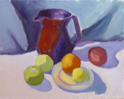
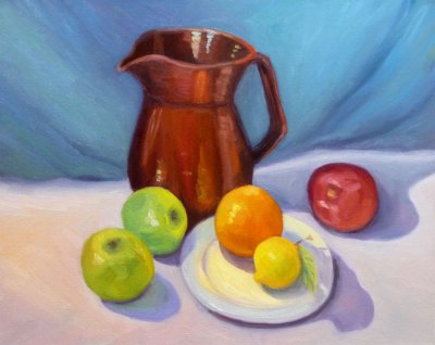
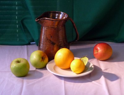
Don Sahli is a wonderful teacher and painter who was the last apprentice of Russian painter Sergei Bongart. He breaks painting down to these 4 stages and I photographed those stages (above) as I went along:

  1. Drawing;
  2. Abstract stage (where you do 80% of the work, starting with the darkest dark and then continually ask yourself what color, value, temperature and you paint in one color shape after another);
  3. Modeling (where you finish giving the objects a 3-dimensional appearance, delineating the planes using value, and color temperature.
  4. Final details (adding highlights, caligraphic strokes, dark accents).

After watching the video and doing this exercise, I finally understand so many concepts that I’d read about, been taught, but had still been struggling with, especially the one illustrated below that starts the 3-dimensional appearance of the objects by finding and focusing on the dark/light,  warm/cool color shapes.

*P.S. I have no financial or other interest in Don Sahli’s videos. Just wanted to share a good resource.

Categories
Art theory Landscape Other Art Blogs I Read Sketchbook Pages Subway drawings

Finding my way as an artist

Thumbnails of BART view

Who am I as an artist? What really interests me enough to spend hours painting it? Do I really like painting landscapes? Do I really like painting plein air? Do I even like looking at plein air landscape paintings?

After making 100 plein air landscape studies and only liking 2 of them, it seemed like a good time to reevaluate and those are the questions I’ve been asking myself.

Before I took up oils a year or so ago I was fascinated by details and enjoyed seeing and painting the reflections in glass, faces that told stories (human and non-human animals), the world inside a flower, urban scenes from around my quirky home town.

Then I started painting mostly plein air landscapes in oils and was told I needed to lose the details; simplify;  just paint the big shapes; soften the edges, go for design and composition rather than content. But the more I simplified the less I enjoyed painting. I started to question whether I wanted to continue with oil painting and plein air painting.

Then I serendipitously discovered a book of Charles Sheeler‘s paintings at a used book store. I’d never been much interested in his work before, but when I looked at the images and started reading I was led to the answers I’d been looking for. I saw in his landscapes (mostly urban/industrial), still lifes and interior scenes a specificity, strong point of view, personality, AND great design. I saw a way I could translate what gave me joy in watercolor into my oil painting.

I realized that what interests me is the PARTICULAR, not the general; the close up, personal view that tells a story; a portrait of an object, a person or a place; not the general widescreen view as I’ve been doing.

In trying to better define my thoughts, while waiting for my train at the at the El Cerrito Plaza BART station I sketched the thumbnails at the top and bottom of this post (which can be enlarged by clicking either image).  Below is a photo of the scene, though a slightly different point of view:

Photo of similar view from BART
Photo of similar view from BART minus foreground

And here is what I discovered and wrote in my sketchbook, thumbnail by thumbnail:

1: No focus, BORING. What I’ve been doing: including every single detail from the window frame in the foreground to the cars, parking lot, city, bay, hills across the bay, and the sky.

2. A little more interesting. Focus on the Cerrito Theatre marquis sticking up with foreground and background being less important.

3. A close up view but no focal point, still boring. 3 trees. Who cares?

4. BORING. Sky mountain water. Big Fat So What!

5. Maybe… a portrait of specific trees and lamp post but still not interesting enough to bother painting.

6. Now this interests me! A person waiting, a bench, a sign, a particular tree.

Thumbnails of BART view

Now I just hope I can find a way to implement this new way of viewing and painting with oil paints. I wrote several more pages about these ideas in my sketchbook, but I’ve probably bored you enough for today. Now off to paint!

Categories
Flower Art Glass Other Art Blogs I Read Painting Sketchbook Pages Still Life Watercolor

Last Chances: October Roses in Watercolor

October Roses, Ink & Watercolor 8x6"
October Roses in Annie's Vinaigrette Bottle, Ink & Watercolor 8x6"

It seems like fall is a time of last chances. These might be my last roses of the year and the last chance to paint them so I couldn’t resist, even though they’re a bit stunted and scrawny. The lovely Indian summer we’re having in California has that feel of Last Chance too. Under the warm gusts of Santa Ana winds I can detect the hint of coming chill. Each peach I’ve eaten in the past month has come with the thought, “This is probably the last peach I’ll have this year.”

There’s a feeling of sweet longing and sadness that fall brings. Artist Dee Farnsworth painted the Last of the Summer Corn last month and I saw that same sense of loneliness and loss in her painting. I’m trying not to grasp after summer, resist fall or regret the coming winter. I know acceptance of what IS allows me to live in the present moment and enjoy it. I try to remember that each day is the last chance to experience that day. It will never come again.

Sorry to sound melancholic. I’m actually happy (despite the changing of the season, the terrible news in the world, a tweaked back, and losing every cent I’ve saved this year in the stock market) because my dear neighbor fixed the light over my easel today and now I can paint in good light again. Yippee!

About the painting:

I drew with my long neglected Lami Safari pen, forgetting that the Noodlers Ink isn’t completely waterproof. It seemed even less so on Arches hot press paper, smudging like crazy and then melting and bleeding into the watercolor. I do like the effect here though, the way it creates a softer line than my usual Micron Pigma pens.

Categories
Landscape Oil Painting Outdoors/Landscape Painting

Inspired by El Cerrito Recycling Center

(Not) El Cerrito Recycling Center, oil on panel, 12x9"

Despite the light fixture over my easel getting blinky and unusable and then climbing on a step stool to try to fix it and throwing my back out and then having to clip on a couple of lamps whose bulb color is too pink, I was determined to make an attempt at this painting. I gave myself two hours and got it done.

The painting is inspired by the view of the hills behind the El Cerrito Recyclying Center on a slightly foggy morning last week. I was attracted to the turquoise color I saw in the rocky hills so that was my focus. I deleted parked cars and the Goodwill truck and let the road continue on into the hills instead of ending at a dead end.  I let myself just play around and not try to get it exact.

Now I’m going to take something strong for my back and go to bed. I have lots more painting planned for Sunday and Monday so I’m hoping my back will cooperate after some rest.

Categories
Landscape Oil Painting Outdoors/Landscape Painting Plein Air

View from China Camp (Ick I hate this painting!)

View from China Camp, Plein Air, Oils, 12x9"

The weather on Sunday was absolutely perfect and although I really wanted to stay home and start a large studio painting, I couldn’t resist the chance for another summery plein air painting opportunity before the weather changes. We met at China Camp again for an all day paintout and barbeque but I was only there for the afternoon.

[I started several times to describe the day and the scene, with children playing in the sand, catamarans being launched, the waspy buzzing thingees (yellow jackets?) that tried to share my lunch, how tired I was, etc., but decided it was too boring…]

So I’ll just say a bit about the painting and call it a night: After hunting for a painting spot I realized that what really interested me was the sky and the distant hills and the sparkle on the water. After doing a couple thumbnails to try to fit all of that into the scene, I sketched out the big shapes on the canvas.

Then I decided to just start at the top and paint my way down like I was icing a cake, trying to capture the right colors in relation to each other as I went. Here’s a picture Sue took at China Camp when I was 3/4 done:

In progress shot at China Camp
In progress at China Camp

And here’s the painting as finished plein air:

China Camp as finished on site

After I got home and had dinner, I looked at it again and thought the water looked more like a meadow and not like what I’d seen. Even though I was really exhausted, I decided to try to fix the water, working on it for about 2 hours, painting and scraping it off, over and over. I must have gone through the equivalent of a tube of paint! Finally I wiped the water portion off completely and went to bed (which is what I should have done in the first place, since I was too tired to think clearly about what I was doing).

Tonight, working from memory only, I tried doing the water again and am satisfied enough to move on.

Categories
Sketchbook Pages

Jessica Cooking

Jessica cooking, ink & watercolor, 8x6"
Jessica Cooking, ink & watercolor, 8x6"

I had a wonderful evening at my son Cody’s house, painting and drawing with his stepdaughter Mariah, and enjoying the delicious food his partner Jessica, cooked for us. They just moved into their first house, and did an amazing job at remodeling in a very short time, replacing floors, painting walls, completely remodeling a bathroom, and making their house a lovely home.

I brought over a set of watercolors, a set of acrylics and a sketchbook for Mariah and she couldn’t wait to get started. I wish I’d thought to take photos of the drawing she did of me and the one I did of her while Jessica cooked.

Mariah is an incredibly talented artist, with an innate sense of design and skill at drawing way beyond her young age (she’s a 4th grader). She manages to capture so much personality in her drawings. I have one she did of my sister and me on my bulletin board at work and I love to look at it.

We decided after dinner that that she should call me “Granny Jannie” — which made us all laugh and made me quite happy.

Categories
Sketchbook Pages

Modeling and Painting Each Other

Jana by Susie Gallagher (with imagined beach embellishments) watercolor, 1/4 sheet

When my painting group met tonight we took turns modeling for each other. I put on an old bikini that I hadn’t worn in at least 15 years (and even then only to sun bathe in my own backyard).

I loved the paintings everyone did of me (above and below). It was so relaxing to pretend that I was lying on the beach (though I was really on my comfy studio window seat with a light shining on me).

From top left, clockwise, watercolors of Jana by Sharon, Judith and Lea

We set a timer for 20 minutes for each pose and listened to podcasts of PRI’s Selected Shorts. The short stories were well written and amusing and made the time pass quickly for the models. We listened to David Mean’s “The Secret Goldfish” read by Charles Keating, and “In Vino, Veritas” by Roald Dahl.

Since the other two members who modeled tonight got partially naked, I won’t say who painted or posed for the following except to say I did the pencil sketch in the middle (the rest of mine were rubbish).

If you click any of the pics below to enlarge them, you can click the title of the post to return here. You can also scroll through large versions of the pics below by clicking one and then clicking the little thumbnail image on the bottom right of the enlarged image.

Categories
Drawing Faces Oil Painting Other Art Blogs I Read Painting People Portrait

Self Portrait in Pigtails

Self portrait in pigtails, 16x12", oil
Self portrait in pigtails, 16x12", Oil on canvas

I met a very quirky 76 year-old woman artist who has made her home, her car and her self into a wonderful, crazy work of art. I’ll share more about her next time, but today wanted to post this self-portrat she inspired.

I’d been feeling discouraged about oil painting after doing a terrible plein air painting on Saturday but meeting that woman on my walk today, I was inspired to braid my hair and decorate myself with make up and do a self portrait in oils.

I started by setting up a mirror but found it awkward to paint while having to keep looking in a mirror to my right and making the same face.  So I took photos, shooting into the mirror, and then displayed the best one on my computer monitor and worked from that. Here’s the photo I used:

Reference photo of me

I started by drawing with white pastel pencil on an already toned canvas (actually a reused canvas: the first painting I did when I picked up oils a year or so ago — a portrait of my sister that was so terrible that I scraped it and covered it in a warm brown oil paint to be used again). I like sketching with a pastel pencil because it rubs off easily from a primed canvas and disappears into the oil paint without streaking or smearing.

Pastel drawing on toned canvas

Then I photographed the drawing bove and pasted the image as another layer in Photoshop on top of the reference photo, adjusting the new layer to 60% opacity. That allowed me to see where my drawing was off and make the adjustments on my canvas. You can see in the overlay below that I’d missed in many places, despite my attempt at accuracy.

Drawing overlapping photo

I’ve learned the hard way that an incorrect drawing just leads to a bad painting.  I could have just enlarged the photo and traced it right onto my canvas, but I love drawing and wanted the challenge of drawing myself somewhat accurately. I think the final painting does look a bit like me and it was definitely fun to do.

I’m going to wear my hair like this to work tomorrow. And I’m not going to give up oils.

Categories
Painting Sketchbook Pages Still Life Watercolor

Figs: the Oysters of the Fruit Family

Figs, Watercolor, 8x6"

When I was a young mother with a newborn babe, the house where we lived had a huge, old fig tree in the backyard. I didn’t know I liked figs then, butI loved the fig tree and so did all the birds and squirrels in the neighborhood.

My infant son and I spent many days that first summer after his birth resting, playing or crying (yes both of us) on the grass beside the tree. The tree’s sheltering, quiet grace and the broad reach of it’s branches lent me strength and helped me feel grounded during those very difficult sleepless weeks and months.

A few weeks ago I ate my first figs and fell in love with them. I was always a little scared to try them; something about their soft squishiness bothered me. But once I took that first delicious bite I realized what I’d been missing.

Now I think of figs as the oysters of the fruit family, just as I think of oysters as the peaches of the fish family. When I slide a succulent raw oyster into my mouth and bite into it, I’m immediately brought back to the happy days spent in the warm salty sea growing up in Southern California.

And now that I’ve painted these little beauties, I’m gonna go eat ’em!

Categories
Art theory Landscape Life in general Oil Painting Painting Plein Air

Confessions of a Dangerous Driver

Morning light, Petaluma, oil on panel, 12x9"
Morning light study, Petaluma, oil on panel, 12x9
Afternoon light color study, Petaluma, oil on panel, 12x9"
Afternoon light study, Petaluma, oil on panel, 12x9

I ran a red light right in front of a police car on my way to painting class on Monday. If that wasn’t bad enough, I didn’t even realize I’d done it.

I even thought to myself as I drove past the police car that was waiting for the light to change, how nice it is that police don’t look at women like me suspiciously the way they might at young men in loud cars.

Seconds later I heard the siren, saw the flashing red lights, and pulled over. The cute, young officer was shaking his head,  it was so ridiculous. He couldn’t believe what I’d done and, trying to make sense of it, asked if I was distracted, was looking at a light further ahead, etc.

I never even saw the other car he told me had had to slam on the brakes to avoid me, and who then looked at the cop as both of them shrugged and shook their heads in amazement for a moment.

I eventually figured out what happened. Because I was distracted,  the traffic signal had registered in my mind as a stop sign. So I stopped politely, feeling immune to police scrutiny, and then drove on, leaving the officer sitting behind me at the light.

Thank goodness there was no damage or injuries (other than to my pride and pocketbook—it’s going to be an expensive ticket). It was a good lesson about driving distracted.  I’d been thinking about how late I was AND (hate to admit it) I was on the phone leaving a message for someone (although using the required headset).

About the paintings

Camille offered an extra afternoon session Monday so that we could do both a morning study as usual, and a late afternoon study of approximately the same scene to capture the difference in light. I simplified the buildings, trees and landscape to abstract shapes or puzzle pieces, so that I could focus on the colors and light effects.

In the morning the foreground and midground was mostly in shadow while the distance was in open sun and the sky appeared a weak yellowish to slightly pink color.  In the afternoon everything was front lit with a very warm light.

It was a long day and after Camille made some adjustments to my afternoon study and gave suggestions for doing more,  I realized I was too tired to paint any longer. I lay down on the grass in the park and spent the last half hour of class sketching a palm tree on my back (I mean I was on my back in the grass; it’s hard enough drawing palm trees, let alone sketching one on my own back!).

It had been too long since I laid in the grass on a summer day in the shade of a tree looking up at the sky. I need to do more of that and less rushing around distracted!