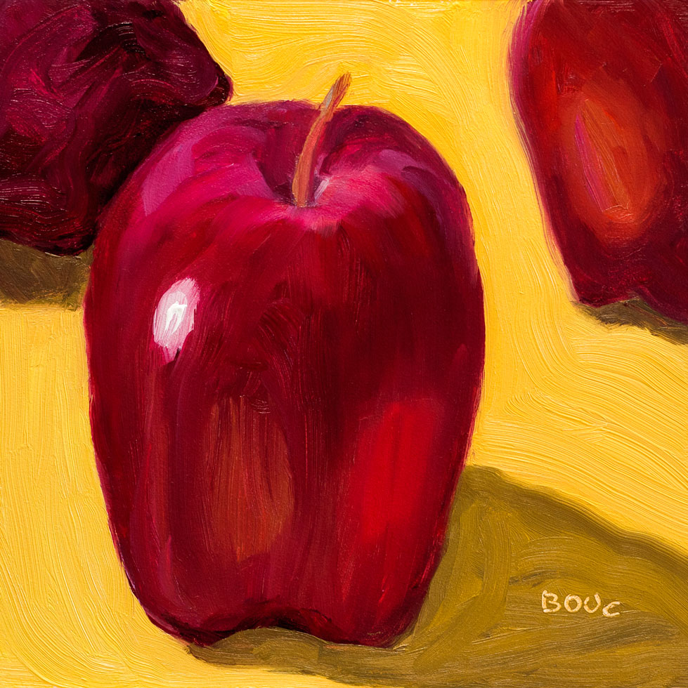
It’s funny how a small apple on a small panel can look so big! In the lunch room at the office where I work, people bring in boxed lunches from a nearby cafe. The boxes always include a petite Delicious apple but nobody eats them, preferring the sandwich on homemade bread, chips, and giant cookie.
So the apples are abandoned on the lunchroom table and I take them home to use as still-life objects. I have about a dozen of them now (they seem to last forever) and like setting them up to interact with each other like actors on a stage.
Peet’s Coffee is selling coffee scoops in three sizes that measure exactly the right amount of coffee for their French press coffee makers. Although I was happy with my French press pot and coffee scoop, I couldn’t resist the promise of the perfect cup of coffee.
Haha. It holds exactly the same amount that I already use. And it’s too wide to dump the coffee into my little French press pot without some of it landing on the counter and the handle is too short to comfortably scoop out of the bag or canister. So, while useless in the kitchen it is earning its keep as a model in the studio.
Value study/under-painting for Scoop and Cork, oil, 5x7"
This week’s Daily Paintworks challenge is to do a value study using only burnt umber, and to vary the amount of dark, medium and light so that there is a majority of one, some of the other, and a smidgen of the other. This is done by applying a thin layer of burnt umber, wiping it down for mid value, painting in the darks using only burnt umber, and wiping with paper towel or q-tips dipped in mineral spirits for the highlights.
I was going for a majority of dark, some middle, and smidgen of light. Not sure if I accomplished that. It seems like there’s almost as much middle as there is dark. I’ve done plenty of value studies and monochrome paintings, but I’d never done it this way before and enjoyed it. I like the way the finished study kind of glows but used it as a the under-painting for the painting at the top of this post.
Lightbulb, ink & watercolor, in 7x7" Stonehenge Wirebound Journal
I was trying to find a way to make this old blue photography light bulb (purchased back in the days of film) stand up so I could sketch it. I tried using tape rolled into a double-sided ball and sticking it to the table but it fell over. Then I found this little glass yogurt container about the size of a baby food jar that I’d bought primarily for the jar. Perfect. (Sketched for Every Day in May, EDM #108).
Stonehenge Wirebound Journal Mini-Review
The short version: Nope.
I loved the idea of a 7″ square journal and the paper seemed like it would be nice for pen and watercolor. The description on JerrysArtarama included this bullet point:
Excellent surface for graphite, colored pencil, printmaking, pen and ink, pastel, silverpoint, watercolor and more! [italic/bold added]
But it’s a no-go for watercolor. I couldn’t get a rich smooth wash anywhere on the page. When I tried to add a darker glaze over the first wash for the shadow on the table, no matter how light a touch I had, my brush picked up the first layer of paint instead. On the underside of the bulb I had a similar problem. And then there’s the mystery line across the top of the bulb. Something embossed the page in the brand new book and the color sank into it. Perhaps the edge of the ruler I used to pencil in a border before drawing in ink left an imprint, but I’ve never had that happen before.
When I ordered the sketchbook I thought I remembered Roz writing a couple of positive reviews of the paper but when I checked again, I saw that her third and final review came to much the same conclusion for watercolor.
You know how dog owners shout “Leave it!” when they are about to roll in something stinky or eat garbage off the ground? (the dog, not the owners rolling in it). I’m taking a similar approach with my ink drawings and watercolor sketches.
If the line is wrong, if there’s a typo or the wash comes out funny, I say to myself: “Leave it!” Let it be. Fresh is (almost always) better than Fixed. Mistake is just another word for Interesting.
Do you see what I got wrong in this picture and just left it? (hint–it’s a typo…er… “writeo.”) I showed it to my sketch group and nobody could find it (but maybe it’s because we were in a dark pub?)
This was done for Every Day in May #106: Something sour or tart. I’m loving the extra practice in drawing I’m getting from the EDiM project.
Every time I paint I learn something. This time I learned some new tricks with different brushes and mediums and also about how much easier it is to paint in a good mood than a bad one. I painted the radishes for last week’s Daily Paintworks challenge, “Paint your vegetables.” It is available there on my new Daily Paintworks page.
I painted the radishes over Sunday’s painting of cucumbers that didn’t work because of my bad composition (or my bad mood when I was painting it) not sure which. I liked the lemon slice in the painting so I took a photo before I scraped off the panel for reuse. Here is the happy little corner of the painting with the lemon slice (and without the two big ugly cukes at the top):
Cucumbers and Lemon, corner of painting
And here is the promised Still Life With Cat, shot when I put the radishes back in the fridge and silly Busby decided my still life light box would make a nice kitty sauna.
Still Life with Cat
I’d probably look grouchy too if someone tried to take a picture of me in the sauna!
This was the first rose I cut from my rose bushes this year which led to the first cut on my hands from the rose thorns (likely not the last). And it was the first sketch I did of the first rose. My intention was get the essence of the delicate rose with as few lines and as few washes as possible. I drew it with a gold gel pen, painted directly in one layer and stopped.
Rose Reverence, oil on Gessobord panel, 10x10" - SOLD
My riotously rampant roses were bursting forth from their bushes so I had to put other plans aside and paint them. Their fruity scent was as intoxicating as their vibrant colors. These were two different kinds of roses, both of which change colors and shape as they open so I had to work quickly to complete this painting in one session.
I left the still life set up just in case I needed to fix anything the next morning. But of course by then they were completely different roses. And the painting was complete.
I know the title sounds like random word salad but since the still life objects are equally random I think it is fitting. The tin can in the painting is from a can of Trader Joe’s Split Pea Soup.
I was fidgeting with the can while the soup was warming in a bowl in the office microwave and in the process removed the label. I was struck by how pretty the can was and so to my office mates’ amusement, I washed out the can to take it home and paint it. It needed companions in the composition; an apple was handy as was a paint brush.
Apple Can Brush, drawn on panel with pastel pencil
I focused on seeing planes values, and putting the paint down and leaving it. The picture above shows the way I sketched out the composition with the planes on the panel with pastel pencil before painting.
I really enjoyed the process and the results. Can’t ask for more than that!
White teapot on wrapping paper, oil on panel, 6x6"
The Daily Paintworks‘ challenge last week was to paint a white object sitting on patterned fabric using only primary colors and white. For this attempt I decided to use some turquoise, patterned wrapping paper instead. The wrapping paper had clever little snowmen all over it but after giving one snowman a try, I realized I didn’t have the patience or interest to try to paint all the details on them (top hat, scarf, etc.).
So I gave myself permission to abstract the snowmen into the circular, swirly shapes I saw reflected on the teapot. Since it was meant to be a painting exercise, I didn’t get too concerned with perfecting the painting. I just wanted to experiment with seeing reflections and building the form of a white object on a cool background.
I bought this decorative Indian corn around Thanksgiving, planning to sketch it but it took a cold, rainy night in February to get around to it. I was tired and grumpy and needed something fairly mindless to do: drawing hundreds of little corn kernels from life was just the meditation I needed.