How to Remove an Elephant Hat Spell, gel pens & colored pencils
For International Fake Journal Month 2010 I bound a journal with dark papers which, as you can see by the title below, is being filled with useful spells and unspells. I say that in passive voice because it is an alternate Jana who is filling it, one with great wisdom and special skills.
Janas(Fake)Journal, Book of Spells & Unspells
The papers I used to cover the book board is made of some kind of bark I think. It was in the special paper drawer at Dick Blick. Here is the full spread of the Elephant Hat spell page:
Elephant Hat Spell, full spread
In case you’re wondering when one might need such a spell, it recently came in handy for me. At my day job I was used to changing hats constantly, putting on the desktop publishing hat, then the finance hat, swapping that with the web-work hat, then the customer relations hat, database, marketing, etc. Such is life in a small non-profit during difficult financial times.
But then the hats got sticky and I couldn’t get them off; I was wearing all the hats all the time. And one morning I noticed that one of the hats had a huge, heavy elephant on it. I was sinking fast. I needed help. I tried the Elephant Hat Removal Spell. Then I asked nicely.
I got the help I needed: Half of those hats have been handed off and my schedule has been reduced to half time. The elephant disappeared and the hats are now a comfortable fit—when worn one at a time.
El Cerrito Natural Grocery, cobalt Copic multiliner and colored pencils
I had to make my morning coffee with the last drops of non-fat milk (yuck, 1% is OK but non-fat in coffee just doesn’t cut it) and there were no peaches or milk for my Cheerios. A trip to the market couldn’t be put off. But I had a full day of experiments in the studio planned and I needed some exercise. Easy solution:
take the long way around, up and down big hills, to my favorite grocery store, El Cerrito Natural Grocery (cardio)
sketch the market using the cobalt Copic Multiliner I wanted to experiment with (I think I prefer the sepia)
shop
carry groceries home in a loaded backpack plus another full bag (weight lifting)
add colored pencil to the sketches to try out the new Polychromos colored pencils (LOVE THEM!)
Quick subway sketches with the cobalt Copic Multiliner and colored pencils
I’m trying to simplify my choices with my art supplies, wanting to narrow down the pens, ink, pencils and colored pencils to keep handy and those I’ll give away. I did tests today on drawing pencils, sepia liquid inks and sepia pens and will post them and my preferences tomorrow.
I’m also working on painting a grid of 16 different acrylic painting techniques to improve my understanding of acrylic techniques and possibilities. It became clear this was needed when I started a series of paintings in acrylic and realized I didn’t have the “chops” to accomplish what I wanted. I was trying to use oil painting techniques and was getting nowhere fast (and ruining brushes with all the scrubbing I was doing with them which seemed the only way to get the smooth transitions I wanted).
Each medium has its own capabilities and pitfalls. Why not make good use of the characteristics of the media instead of trying to force it to be something it’s not? Despite people claiming acrylic can be used like oils and like watercolor, I’m going to try to learn to use it like acrylics instead and have fun with all the crazy stuff it can do. This series of large paintings wants to be in acrylic and so it shall, and soon I hope.
"Lovers Mongrels Curs #1 M.H.", Acrylic on canvas, 28x22"
It’s not what you might think, based on the above work in progress. It’s that I finally started the series of paintings that I’d been waiting on for over a year. I hadn’t realized it, but I was waiting for the painting to tell me how to paint it (see below about intuition and broccoli).
I’m just having so much fun with the series and haven’t wanted to use time I have for painting being on the computer. Also I wasn’t sure if I was ready to post what I’m working on yet. I’m also not sure how much I want to share about each painting and the series as a whole, except to say that it’s sort of auto- and bio- graphical, about the men who’ve played a role in my life, hence the title of the series: “Lovers, Mongrels and Curs.”
This painting is the first in the series and it is still a work in progress; a little sketchy but I like it that way and may just leave it…or not.
I followed the saying, “If you don’t know what to do, just wait until you do,” instead of forcing the start of the series. It just took some down time to conceptualize how the series needed to be painted and for the ideas to bubble up (literally: I was on vacation, lying on my back on the deck of my little, private, open-roofed, hot-tub room at Albany Sauna, watching the clouds float by overhead while the hot tub bubbled beside me when it came to me that the series needed to be painted large, in acrylic.)
I wanted to work on two paintings simultaneously, side by side on the wall so first thought of using gessoed paper or unstretched canvas, finally settling on stretched canvases. But how to hang them?
Using Velcro to Hang Canvases on the Wall for Painting
After some brainstorming I found an easy way to mount two canvases side by side on the wall without harming the wall or making holes with nails.
2 canvases mounted on bulletin board with Velcro
I applied a few strips of Velcro along the top rail of my 36×48″ metal framed bulletin board already hanging on that wall (the cork is covered by a sheet of paper pinned to it). Then I measured and matched the other half of the Velcro strips to the backs of the canvases and stuck them together. To stabilize the canvases a bit I put a few large push pins along the bottom and sides. It’s working great!
Listen to Your Broccoli poster, colored pencil, 16x14", created after reading Bird by Bird in 1994
“There’s an old Mel Brooks routine, on the flip side of the ‘2,000-Year-Old-Man,’ where the psychiatrist tells his patient, ‘Listen to your broccoli, and your broccoli will tell you how to eat it.’ And when I first tell my students this, they look at me as if things have clearly begun to deteriorate. But it as important a concept in writing as it is in real life.
It means, of course, that when you don’t know what to do…you get quiet and try to hear that still small voice inside. It will tell you what to do. The problem is that so many of us lost access to our broccoli when we were children. When we listened to our intuition when we were small and then told the grown-ups what we believed to be true, we were often either corrected, ridiculed, or punished. God forbid that you should have your own opinions or perceptions–better to have head lice.
. . . So you may have gotten in the habit of doubting the voice that was telling you quite clearly what was really going on. It is essential that you get it back.
. . . Get your confidence and intuition back by trusting yourself, by being militantly on your own side.
. . . Get your intuition back and make space for it, when you stop the chattering of the rational mind. The rational mind doesn’t nourish you. . . Rationality squeezes out much that is rich and juicy and fascinating.
. . . If you don’t know which way to go, keep it simple. Listen to your broccoli. Maybe it will know what to do. Then, if you’ve worked in good faith for a couple of hours but cannot hear it today, have some lunch.”
After I posted this painting a few weeks ago I realized I’d left off the foamy bubbles on top of the water. Last weekend I worked on the painting some more, at first planning to just add the bubbles but ended up adding a whole new layer of paint. I gave Hannah another haircut and slimmed down her dress a bit. I felt a little afraid to go back in and start messing with things, but told myself to just have fun and see what happens.
I don’t think I quite got the essence of the foam, it looks more like rose petals floating on the surface, but I decided I liked that idea and left it alone.
I’m wondering if there is a problem with the grasses behind the rust colored reeds on the middle right that sort of point towards her head. Should that patch of yellow-green grasses have less texture, be cooler and more blurry so that they recede more? I think so.
Here’s what it looked like before in the original post:
Hannah's Reflection, Oil on Gessobord, 16x12
I’m trying to get over the idea that paintings need to be completed in one painting session or in one day. Alla prima and plein air painting is great, but so is letting layers dry and adding more more until the painting says it’s done. Sometimes it forgets to say “When” though, and then it’s overdone.
I have the same trouble with steaming vegetables. I lose my concentration and before I know it my broccoli has turned to mush. So is the revision mushy broccoli or an improvement? Do you think I should soften those grasses or move on?
Thinking about painting and broccoli reminds me of this poster I made a long time ago:
"Listen to Your Broccoli and It Will Tell You How to Eat It," Colored Pencil, 24x18"
Memories! Everyone I know is losing theirs including me. Ater repeatedly walking into a room and then forgetting why I’d gone in there, it occurred to me that if I carried clues with me, I’d save lots of time and extra steps.
So I invented the “Get a Clue Necklace” complete with a key ring, a tiny flashlight, sticky notes to jot down reminders, an attractive small pen to write them with, a magnifying glass for small print, an optional “My name is…” tag with a reverse side note “If found return to…” should I ever get REALLY forgetful, and a little pill box for those vitamins I always forget to take.
Below is the full page which you can click to see bigger to read some of the funny quotes about aging, as well as my list of the pros and cons of aging back when I made this.
Get a Clue Necklace; Mixed Media, 12x9" (click to enlarge)
Here are a few of the choice quotes from the piece:
I’m at the age when remembering something right away is as good as an orgasm.
Whenever I meet a woman over 55 who’s just fallen in love, I always ask, “Are you taking hormones?” I tell her, “If it turns out you’re in love in a way that’s not good for you, stop taking them.”
[Addendum: Gloria Steinem, the feminist icon who once dismissed marriage as an institution that destroys relationships, became a first-time bride at the age of 66, a few years after that quote was printed.]
Peg Bracken, 81 at the time this quote was printed, said:
“These are your declining years and you can jolly well decline to do what you don’t feel like doing!”
Right on Peg, wherever you are now!
P.S. When I saw Illustration Friday’s prompt this week was “Memories” I had to share this, even though it’s from my journal several years ago.
And one more Pro to add to the Pros and Cons of aging is that when your memory goes, everything old becomes new again. Stories and jokes you’ve heard (or told) before sound vaguely familiar but since you can’t remember the punchlines, they’re good for a whole new round of laughter.
Ink, colored pencil & watercolor in 9×12 sketchbook (Larger)
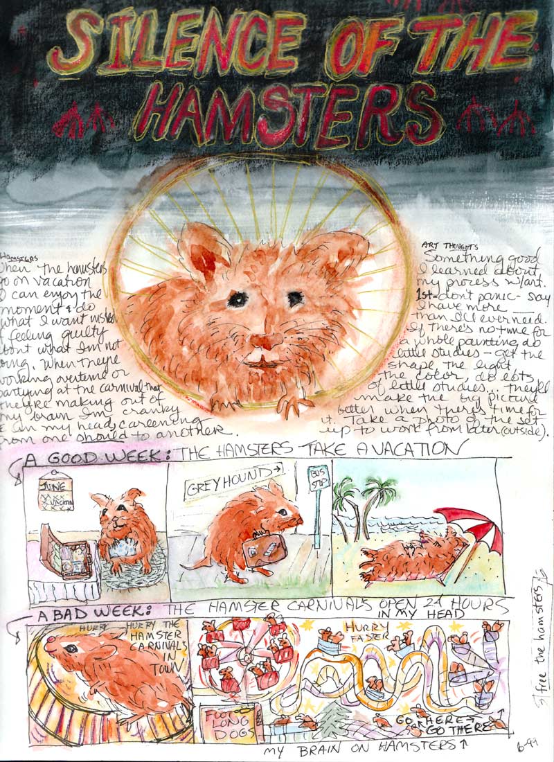
In yesterday’s post I wrote about what I call “Hamster Brain” (when my mind gets stuck spinning in a hamster wheel of “shoulds” and I can’t figure out what to do next and so do nothing). I was going through an old sketchbook and found this illustration I did in 1999 on a similar day of “my brain on hamsters.”
When I read the journal entry it was interesting to see that I’d figured out back then what was really going: a fear of not having enough: not enough time, and maybe not enough talent or skill either as I faced the artist’s version of writer’s block…that icky fear that seems to come around when I finish one project and am faced with the blank canvas/sheet of paper. I’ve learned to encourage myself and turn off those critical voices but every once in awhile they sneak up and get me when I’m not looking.
Today was so much more enjoyable, even though it was pouring down rain. I did my errands, went to the gym, and painted. Sometimes it takes a hamster-brained day like yesterday to make me really appreciate an ordinary day that is joyous just by the absence of negativity and blocks.
4/14/07 In bed in a hotel where the roof was leaking through the chandelier and in the closet so the hotel staff came in and hung a blue tarp over the chandelier.
————————-
Today’s post are the little drawings I do each morning upon awakening of my dreams the night before. These are all from the past week. I draw them in what I call my AM/PM notebook (a square Handbook Journal Co. notebook that I write/draw in each AM & PM) using a Liquid Expresso pen. I bought three of these notebooks and a bunch of these pens and don’t much like them but for morning scribbling they’re fine. The ink dissolves if it gets wet which I forgot when I colored these tonight with water-soluable colored pencil and then couldn’t wet them without the ink running.
4/15/07 Marcy and I were in Santa Cruz jogging along a path by the beach. She got ahead of me and I kept calling, “Wait up!” but she got ahead of me and disappeared and I was all alone.
4/16/07 (The night before the Virginia Tech shootings) Dreamt a gunman came into my office and at gunpoint demanded I type some names into the database. People kept coming into my office and I mouthed “Call 911” so they did but the police were idiots and the gunman got away.
4/18/07 I thought a bad guy had broken into the house but it turned out to be the boyfriend of a Swedish roommate (don’t have one) and the jingling noise I heard was his ID tags on a chain around his neck. When I went in the bathroom the sink was full of little cubes of his shaving cream which I threw in the trash and then discovered it wasn’t the trash but was my roommates clean laundry which I’d now messed up.
4/19/07 (a super busy dreaming night!)
1. At a Japanese restaurant with a pool running through it that the waitresses walked back and forth in to serve food with their skirts pinned up in their waistbands.
2. Giving a talk in a high school class about why students shouldn’t smoke marijuana before school.
3. Riding my bike side-saddle carrying a boy from the class who was a friend of my son.
4. A bunch of Brian’s friends in an old car pull up in my driveway to spend the day hanging out in their car while I’m cleaning house.
5 . (below) I’m trying to get home and wander into a Siddha Yoga retreat center where they’ve just locked all the doors and they won’t let me leave while they’re doing their chanting.
6. (below) I’m still trying to get home and walk through a little boutique but the only way out is to climb up a shelf and go through an opening in it but my feet are too big to fit on the shelf/steps.
7. (below) Still trying to get home…there’s two high chain-link fences I have to get over. I literally fly over the first one and lose momentum and have to climb over the second one.
4/20/07
1. I meet a cute guy at a Catholic church where I’m sketching in a back pew.
1B (above #2) I invite the guy home for dinner but then he turns up his nose at my spaghetti made from a jar and complains about the cat hair on my table cloth.
2. Cody has a funny robot thingee that makes me laugh hysterically. Then he’s selling my supplies of toilet paper and other stuff from Costco that I keep on a shelf in the garage to a friend of his. I spent a lot of time laughing in my sleep last night.
If you’re still here reading this (amazing enough in itself!) I’d love to know:
(1) whether you find the dream explanations of interest or if I should just post the drawings (or neither); and
(2) whether my dream explanations feel like “TMI” … too much information…too revealing or personal, even though I leave out WAY more than I share here.
Monotype and colored pencil on Arches 88 paper 6″x8″
(To enlarge, click image, select “All Sizes”)
This is the second monotype I made of this scene from this sketch. Monotypes are one of a kind, so if you goof it up, you start over from scratch. With this kind of “reductive” monotype, you spread the ink on the plate (a piece of plexiglass) and then using Q-tips, rags, pointy things, and/or fingers, you wipe away the ink in the places that you want to be white or where you want to apply color later. It’s sort of like carving a woodblock or linoleum block except that instead of ending up with an image you can print repeatedly, once you press the paper on the ink to make a print, you have nothing left.
The first monotype I made of the scene printed too lightly and when I tried to press it again (by hand using a flat disk called a baren), the plate slipped. So all my work creating the image was lost because it made an off-register double image that was still too light (see below). So I wiped all the ink of the plate, reapplied it, and starting over, removing the ink to create the image above. When it was theoretically dry I applied colored pencils.
It’s double-vision image is sort of interesting, so I might still play with it a bit, adding some color and seeing what happens. The thing I love about monotype is that forces you to let go of control and play and experiment.
A note about inks: I used water-based Akua Intaglio ink on these, and though I like the way the one at the top turned out after being colored, I didn’t like this ink. It continues to smear and is still water-soluable weeks after it was printed. I’ve found that oil-based inks are much nicer to work with, make a darker image, don’t dissolve if you add watercolor and dry more quickly than this ink. To my surprise, they clean up with a little vegetable oil and some soap — no need for solvents.
Black water-based printing ink & colored pencils on Stonehenge paper, 7×9 inches
(To enlarge, click image, select “all sizes”)
Today I experimented with making monoprints, having been inspired by Belinda del Pesco‘s amazing monoprints, andKris Shank’s woodcuts. This is the same candle lantern I drew and posted a couple days ago. I’ve drawn it so many times now — for each monoprint you have to do the drawing again. I think some of the others were better drawn but this one was dry and I could add color, so its the one that gets posted.
I’d never made monoprints before and didn’t know anything about how to make them so I read a few articles on the internet and then went to the art store. I bought both water-based and oil-based printing ink and a brayer to roll it out with and some print-making paper. I tried lots of different approaches and had a good time learning what works and what doesn’t. My usual way of learning things is quite different: read lots of books, research all the details, make sure I have all the right equipment and supplies and know what I’m doing before I do it. This time I just experimented, letting it be an adventure, saying “let’s see what happens if…” I made many interesting mistakes and a bit of a mess but since I wasn’t too attached to the outcome it was a great day.
There’s several approaches to doing monoprints and the one I liked best was to apply the ink on a sheet of acrylic and then sort of carve away and push around the ink using various implements, none designed for that purpose (stumps, rubber clay tool, coffee stirrer, paintbrush handle). Once I had the drawing done, I put a sheet of paper on top of the plastic and used my rolling pin to press the paper and ink together. The water-based ink dried fairly quickly on the paper so I was able to add colored pencil to it this evening. I tried applying watercolor but it melted the ink. I think I’ll be able to add watercolor to the oil-based prints once they’re dry. I made half a dozen prints. Two were complete flops and the rest were not bad for a first try.
I also bought a couple of linoleum blocks and carving tools so I’m going to try that next. Then it’s back to watercolor — I have several paintings just begging to be painted.
Judith by me, Ink and watercolor (Micron Pigma .08) in 9×12 Aquabee sketchbook.
Painting group tonight in my studio but only three of us could make it. Susie wanted to work on a still life so Judith and I decided to draw each other. We took turns posing for a 5 minute sketch (below) and then drew each other’s faces as we were drawing each other (above).
(Click image to enlarge, pick “All Sizes”)
Above: Judith by me, 5 minute ink sketch in Aquabee 9×12 sketchbook.
(Click image to enlarge)
Above: Judith’s 5 minute sketch of me (colored in afterwards). Ink and watercolor pencil in 12 x 16 Aquabee.
(Click image to enlarge)
Above: Judith’s longer sketch of me, slightly cropped (sorry Judith, I removed the “cocks comb” as Susie said it resembled, that you drew growing out of my head that was really a weird pillow behind me)
Ink and watercolor pencil in 12 x 16 Aquabee.
I find that drawing someone’s face is like caressing them, getting to know them on a deeper, more intimate level. My mother always told me it’s not polite to stare, but drawing gives you a chance to stare and really see, and among friends, it is a real gift!

 Journal 2010, Book of Spells & Unspells")


