My favorite parts of this painting are where I put the paint down and left it alone (like in the little white dish and teabag). I don’t know what comes over me at the end of a painting session when I start adjusting things that don’t need it. The spoon had been fabulous but after a “teensy” fix that wasn’t, and led to repainting, it lost it’s zing.
One of the many things I’ve learned from the Peggi Kroll-Roberts videos is to use a mirror to look at the painting to check for problems. You stand with your back to the painting and hold up the mirror as if to look at yourself. I’d heard of this technique before but didn’t really “get it” until now. Problems with values, perspective and unequal sides of an object really stand out when you see your work backwards in the mirror.
View from the easel of the set up
The teapot was my gift at my office’s “Silly Santa” gift exchange. Everyone brings one wrapped gift, we draw numbers and select from the pile in the order of the numbers drawn. You can pick a new gift or steal from someone who has already opened one. It’s always fun with much laughter and misbehavior.
My friend Kathryn Law wrote on her blog about the workshop she took with Peggi Kroll-Roberts and about Peggi’s instructional DVDs. The videos focus on the things I most wanted to learn, especially creating strong value patterns and making rich painterly brush strokes, along with loosening up and having fun. I ordered the videos and watched them. Wow!
The Buddhist proverb, “When the student is ready the teacher will appear” is so true. I had to have tried and given up on so many other approaches to oil painting to become very clear on what I didn’t want, what I did want (working with the freedom and looseness I have when I sketch) and what I needed to get there (all the things Peggi teaches).
Watching Peggi demonstrate and explain what she’s thinking and doing as she does it is such a rare ability in painting teachers in my experience. Her videos answered many questions I’ve had for so long. I’ve read dozens of books and gotten great advice from artist friends, but until I watched Peggi’s videos, I just didn’t get it.
I’d almost given up oil painting in frustration but now… Yippee! Oil painting is fun again!
About the painting:
While bosc pears aren’t as pretty or colorful as other types, when I saw the way they were sitting in their container, one seeming like it was “striving” to reach, copy, or catch up with the other, I had to paint them. I used the techniques/tools I learned in Peggi’s videos and really enjoyed the painting process (and the results).
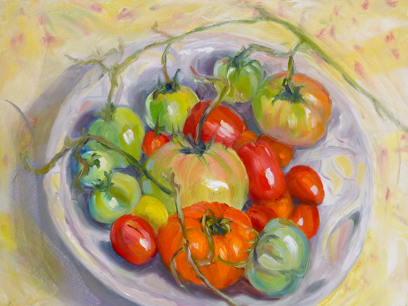
After wishing I could hit “rewind” to get the tomato vines/stems and patterned cloth back in the November Tomatoes oil painting, I realized that I could just paint them back on thanks to the wonders of oil paint.
For reference material I used the photo of the original painting and the tomato vine/stems that I’d snipped off but still had (having saved them for my cats to play with). I experimented first in Photoshop, “painting” stems on the photo of the previously “finished” painting to try to come up with a design that carried the eye around and not out of the painting.
Then I mixed up some stem colors and had fun swirling them on the painting. I worked a bit more on tomatoes, shadows, added some color and reflections in the bowl and painted the background again. I think it’s a happier picture now, and one that presented me with many learning opportunities. So I’m happier moving on too.
November Tomatoes in Raku Bowl; oil painting on board, 9x12" (click to enlarge)
UPDATE 12-11-10: I revised this painting again and it’s posted here.
At the end of the season we harvest the crops (or in my case, tomatoes). The last green stragglers are picked from their shriveling vines and set near a window to ripen. And that leads me to think about my own ripening as an artist; reflecting on which artistic pursuits have borne fruit, and which are still hard and green despite my best efforts.
After working in a realistic style in watercolor for years I began to explore other media, eventually focusing on oil painting, determined to gain comfort and competence with it. The path felt wide and long because I’m attracted to so many painting styles, from classical realism to impressionism and even expressionistic figurative work.
But as I get closer to competence with oils (while still far from mastery) I’m beginning to narrow the path and here’s why….
Oils vs. Watercolor
I found that trying to paint in oils in the same detailed, realistic style I enjoy so much in watercolor felt like work, not fun. But why, I wondered.
I needed to draw and paint something fun and refreshing after the ordeal with the last oil painting. I reached into my still life cabinet and pulled out this fun little pitcher. This gave me the idea to draw my complete inventory of still life items, one at a time. And that gave me the idea to draw everything I own. I wonder….
BART Snoozing, ink & watercolor
The day before I’d drawn these two guys snoozing back to back on BART. The coppery paint mixture worked perfectly for them too.
Painted Pumpkin Painted, oil on Gessobord panel, 8x10"
On Halloween I got inspired to paint a pumpkin but the only pumpkins left in the grocery store were huge warty-looking ones and two smaller ones with cartoon faces painted on them. I chose one of the painted pumpkins whose paint was peeling and asked if they’d sell it at ordinary pumpkin price, which they did.
I took it home, washed off the silly face, cut it open and set it on a black plate on my drawing table to make a preliminary sketch:
Halloween Pumpkin sketch, ink on paper
Then I set it up on the table by my easel inside a box made of black foam core with a strong light shining in from one side. I sketched the composition on my Gessobord panel, mixed some colors, and began painting with the intention to work quickly and directly.
But after three hours I gave up and scraped off the panel. I just couldn’t get a clean orange and everything looked chalky, horrible and dead. I emailed my friend Kathryn Law, a brilliant painter who gave me some excellent advice about mixing colors (including that orange was tough to mix from cadmium yellow and red with oils), along with inspiration and encouragement.
The next day, unwilling to accept defeat, I attempted the painting again, this time draping an olive-green cloth over the black foam core. Everything went so much more easily; what had felt like work the day before felt like fun. At Kathryn’s suggestion I used larger brushes and was more generous with the paint. I tried to put down a stroke and leave it. I kept in mind the way I enjoy sketching, and tried to keep that sense of adventure and freedom. I finished the painting and went to bed happy.
The next day I saw a few things I wanted to fix but had to go to work. I left my pumpkin still life set up for three days while I went to work. When I came back to the pumpkin today it was smelly, collapsing, gross and growing stuff:
Gross pumpkin photo
Ewww! Tossed the pumpkin in the recycling bin and washed the plate. I guess the painting will have to be done as is, though I’m tempted to work on the plate a bit to try to make it look shiny.
Tuesday night we met at Cathy’s house instead of a public place where moving every two minutes with a timer ringing would be a nuisance. We started on her deck to the sound of burbling water and birds singing and lovely sights all around and warmed up with an untimed sketch. Drawing this little bonsai on the table in front of me was just what I needed to unwind from the crazy day. The sun went down and it was nearly dark when I painted it.
Then we went inside and started the timed two-minute sketches.
Cathy’s Berkeley Craftsman style home is a serene oasis decorated with simplicity and a Japanese zen style. Open space and emptiness balances still-life displays of special objects, art and her wonderful collections. She set the timer for two minutes and said “Go” and we moved through the house, our eyes and pens devouring tender new morsels around every corner every two minutes.
I added the watercolor at home later for these two sketches.
After each set of 6 two-minutes sketches we met back at the dining room table to look at each other’s sketches. When I saw Sonia’s calla lily and apples sketch I realized I’d missed that corner. I liked that display so much I chose to ignore the two-minute bells and spent six minutes enjoying drawing this one.
I’ll post the rest of the sketches after I add color to them. I am soooo lucky to have such great, dedicated sketching buddies!
I used random items from my junk drawer as still-life subjects to test paper for binding my next journal. The paper I’ve chosen is Legion Multimedia Aquarelle 300 gsm (a little thinner than 140 lb). An employee at my local Artists & Craftsman store suggested it when I was unsuccessfully seeking the Fabriano Soft Press 140 lb recommended by Shirley of Paper and Threads.
Legion Test #2
Legion Multimedia/Aquarelle
I was delighted to find that the texture of the Multimedia/Aquarelle paper is perfect for writing on with the finest of pen points (unlike my current journal’s Arches CP paper). It took watercolor washes and multiple layers of glazes beautifully without buckling, pooling, or pilling. Color lifted off easily when rubbed with a damp brush.
The paper is nicely sized to prevent the paper from soaking up the paint, but not so extremely sized as the Arches 90 pound cold press that practically resists the ink.
It has two deckle edges and is relatively inexpensive. The Legion Multimedia/Aquarelle paper cost $2.69 a sheet at my Blick store while the Fabriano Soft Press 140 lb paper was $4.99 a sheet. Unlike the Fabriano, this paper is also available in 90 lb weight which I will try next, but I think that will have to be a special order through Artists & Craftsman since Blick only carries the 300 gsm paper.
“Use any painting and drawing media you choose on this fine quality, crisp white paper! Multimedia/Aquarelle Paper consists of 100% cotton fiber, is acid-free, and has a neutral pH. The paper is 140 lb (300 gsm) weight, and has an uneven textured surface. Available in two different surfaces — Cold Press and Rough. Cold Press is available in sheets and pads, Rough is available in sheets only, and comes in 200 lb (380 gsm) weight.”
I tested the paper for grain direction and it runs the long way, making it possible to tear it down for a journal just the size I like: 5.5″ x 7.5″, with no waste, which is not possible with the Fabriano whose grain runs the short way.
I finally was able to buy a sheet of Fabriano Soft Press (which has a similar surface texture, between hot press and cold press) and tested it too:
Fabriano Soft Press 140 lb: Test #1
Fabriano Soft Press
The Fabriano Soft Press paper had some things in its favor but ultimately the cons outweighed the pros in my mind. It seems like good sturdy paper, and the paint lifted OK without surface damage, but it was slightly less pleasant to write on with a fine-point pen, even though the surfaces of the two papers are very similar.
Since the grain runs the short way (which means the pages will need to fold the short way) you either end up wasting some of the paper or have fewer size options for the book. Also, the paper is thicker and stiffer, which means fewer sheets per book or a thicker, heavier book. And it is more expensive.
But what bothered me the most was the sizing. According to Blick:
“Fabriano papers are synthetically sized both internally and externally so that no animal by-products are used.”
In fact, Fabriano uses an acrylic sizing as opposed to the organic sizing (gelatin) that other companies use. I found that juicy washes on this paper took forever to dry and I assume it has to do with the non-porosity of acrylic sizing.
Fabriano Soft Press Test #2
Despite waiting and waiting and finally using a hair dryer before adding the next layer of glaze, the paint still wasn’t dry and glazes bled into each other.
I also tested the Arches 90 lb Cold Press in my journal (below). Washes, glazing, lifting worked fine, but just isn’t pleasant to use with a fine point pen.
90 lb Arches Cold Press test
I’m looking forward to binding my new book and then giving the Legion Multimedia Aquarelle paper a true test of its journal-goodness and whether it really is the “perfect” watercolor journal bookbinding paper for me.
I’m guilty of anthropomorphizing when I draw or paint. I always seem to see human shapes or body parts in inanimate objects. I see tongues, hips, elbows and other body parts in flowers, plants, fruit or even lampposts.
So when I set up this still life, the two paired pears with one alone behind them reminded me of junior high, when two girls would whisper to each other about another, who would be left out of the conversation. Sometimes I was one of the gossipy whisperers; just as often I was the one left out.
Girls having a sleep-over would phone a friend and try to get her to say mean things about someone who was there, secretly listening in. Then after she’d said, “Mary’s butt is too big,” Mary would speak up and say, “Hi, This is Mary. Thanks a lot!” The next week it might work the other way around.
I learned the hard way not to say things about people which I wouldn’t want them to hear. The lesson gets reinforced regularly by a weird sort of karma that happens to me. It almost never fails that if I do speak about another, they unexpectedly appear, often from behind me, just like in the painting.
About the painting
I painted this on a day when I just had a couple hours and wanted to paint with oils. I didn’t take time to plan the composition and did very little with the set up, originally using my black light box as the background. This is how it looked originally before I revised the background, made some adjustments between the two front pears, and glazed the painting with Indian Yellow.
Pears-Original painting
I thought the original version seemed cold and uninviting. I like it better now, with the softer, warmer feel and the rounded shape of the “table top” instead of the harsh horizontal line.
Most of their decorative squash buddies had grown unsightly fuzz and gone off to the compost bin. But these three were still pretty and when I looked around for something to sketch last week, they cried out “Choose Me! Choose Me!” So I did.
I wanted to paint today. And I didn’t. I had a headache that wouldn’t go away and a bunch of boring, annoying chores to do. I had to return a jacket to Costco that was so wonderfully, fuzzy green but unfortunately, also oddly misshapen). The gas tank “empty” light in my car had been on for days (my least favorite chore, second only to dragging the trash cans out to the street, which I pay a neighbor boy to do).
I needed to go to Target for cat litter (and since Fiona only recently decided to start using the litter box again for ALL of her needs and not just some, I didn’t want to discourage her with a dirty box.) And I wanted to take a walk before the predicted week-long deluge of rain started.
So I sacrified a day in the studio that probably would have been a struggle anyway, feeling crummy as I did, and took off on a long walk to Radio Shack in Albany to buy new ear bud covers for my iPhone since one had disappeared.
Hints of tobacco and toilet?
On the way home, I stopped at Peet’s Coffee to sip and sketch. I saw this sign from across the room and thought “that can’t be right!” It was advertising their new coffee, Sumatra Blue Batak, claiming in fancy script that it was “Smooth and full-bodied” and had (what I thought I read) “…hints of tobacco and toilet…” . Huh!? I squinted and looked more closely and saw it said “hints of sweet tobacco and toffee” Even with the toffee though, I’m not sure I’d want to drink coffee that tasted like tobacco. Ick.
I completed all my errands, the headache is almost gone, and with Monday and Tuesday off, I still have two days to paint and enjoy being cozy in the studio while it rains.
Sorry to bore you with my stupid day and list of chores. Maybe I should have just posted the picture and then shut up?


