Categories
Art supplies Drawing Food sketch Glass Ink and watercolor wash Life in general Sketchbook Pages Still Life

Ginger for a Tummy Ache: Sketched with Namiki Falcon

Ginger Ale and Saltines, Namiki Falcon pen, Carbon Platinum Ink, and watercolor
Ginger Ale and Saltines Namiki Falcon pen, Carbon Platinum Ink, and watercolor

Today was a bad news, good news day. It started with a migraine that eventually passed enough to work most of the day (despite the internet going down, fixing that and then a little later the electricity went out long enough to shut down the computer with several projects in progress). The migraine left behind a tummy ache. I couldn’t deal with the supermarket so went to the little health food store and bought some natural Ginger Ale, organic saltines and candied ginger (all supposed to be good for tummy aches).

Candied Ginger in an Egg Cup

The good news is that this morning my reliable but grumpy mailman delivered my new Namiki Falcon fine point fountain pen and this evening I felt well enough to fill it with ink and give it a spin. I LOVE IT! The nib floats like a dream over the page with control and flexibility and a really nice fine line. It’s the best pen I’ve ever used. UPDATE June 2011: After using the pen for a few weeks I discovered that I didn’t really like it that much and sold it. I felt I had too little control of the ink flow, which went to fast for me, even with the extra fine nib. I’ve gone back to my Lamy Safari extra fine point which I LOVE!

The other good news is that with these sketches I finally finished filling the Moleskine watercolor sketch book that I’ve so detested using during the interim between binding sketchbooks. Tomorrow I get to start using the one I bound a couple of weeks ago. Yay!

Categories
Drawing Faces People Sketchbook Pages

Sketching Sketchers and Doodling Meetings

Doodling to Stay Awake at Meeting

On my first day back to work after being sick for weeks we had a staff meeting. I wanted to put my head down on the table and nap so doodled to stay upright and awake. Later I pasted the page in my sketchbook with the added note about antibiotics.

Sketching Sketchers #1

Then my first night back at Tuesday night sketching (at the Bread Workshop) after I drew my food I sketched the sketchers at my table. I had to add that shading to the right of Amy’s face to “erase” the splotch I made by her nose that looked like a booger.

Sketching Sketchers #2

I added one too many lines, which lead to more lines to try to fix them, in Sonia’s hair which had been perfect until I did that. I made a note to remind myself to STOP at “good enough” and not keep going.

Categories
Landscape Oil Painting Outdoors/Landscape Painting Photos Places Plein Air Sonoma

Viansa Vineyard: Final Touches on Final Plein Air 2010

Viansa Vineyard, 11/2010-1/2011, Oil painting, 9x12"
Foggy Morning at Viansa Vineyard, 11/2010-1/2011, Oil painting, 9x12"

My plein air group had our last meeting of the season in November at Viansa Winery in Sonoma. I’d made a good start on the painting plein air, but it needed work. Today I got tired of looking at the unfinished painting and completed it (above), using both brushes and palette knife.

I’d set up my easel at the edge of the parking lot and had a great view of the vineyard. But there were so many interesting things to see that I included all of them in my original painting below (except maybe the cars and the birds and bees—that’s some progress I suppose).

Viansa Vineyard, unfinished plein air

There are some passages in the painting I liked, especially the top fourth, but there were some problems too: the strong yellow diagonal line leading you out of the painting, the bright gold triangle top right, the green line of bushes beside the purple road, both of which weren’t needed even though they were there in real life.

Viansa photo reference

This is the photo I took at the beginning of the painting session. The sun and fog and clouds kept changing but the overall impression I had of the day was sunny.

A previous Viansa painting can be seen here. It’s nice to see the progress I’ve made since then.


Categories
Berkeley Drawing Food sketch Ink and watercolor wash Painting Places Sketchbook Pages

The Draw Your Food Diet (at The Junket and The Bread Workshop)

Turkey & Swiss at The Junket, Lamy Safari, Carbon Platinum Ink & watercolor in Moleskine Watercolor
Turkey & Swiss at The Junket, El Cerrito. Lamy Safari pen, Carbon Platinum ink & watercolor in Moleskine

Whenever we meet to sketch at a cafe we always try to sketch our food before we eat it and we always joke about what a great diet it would be to do that at every meal. It not only helps to slow down eating, but it also helps to speed up sketching! This leads to looser, more playful sketches which I think are more fun to make and to see.

Sonia and I met for lunch at The Junket, a deli in El Cerrito Plaza. My Turkey and Swiss Sandwich on a sourdough baguette (sketched above) was the best I’ve had in years. It was my second choice though, as we originally ordered Chicken Dumpling Soup. But when I saw them spooning it into a bowl, it had the consistency of gloppy, yellow gravy. I asked if it was cream-based (Sonia is allergic to dairy) and they said no, they knew it wasn’t because they reconstitute it with water. Um…no thanks. I switched to the half sandwich and Sonia got salad and we were happy.

Grilled Veges & Brown Rice at the Bread Workshop, ink & watercolor in Moleskin
Grilled Veges & Brown Rice at the Bread Workshop. Ink & watercolor in Moleskine

On our next Tuesday night sketch-out we met at the Bread Workshop. They had contacted me the week before to ask if they could use this previous sketch I did there to illustrate a newsletter they are sending to supporters and I gladly said yes. They reserved a large table for us with a view into the bakery so that we could draw the bakers working.

I wasn’t much up to that challenge as it was my first night out after being sick for two weeks and my sketching felt rusty. You can see Micaela’s wonderful sketch here and Sonia’s here and here. The food was fantastic: my grilled veges (above) were so flavorful!


Bread and Baker at Bread Workshop, ink & watercolor

This was the extent of my drawing bread and bakers. The Bread Workshop are advocates of sustainable foods and practices and ranked as one of the top ten greenest restaurants in the Bay Area. Everything I’ve had there has been delicious and they were playing great music that night, going from George Benson to Billy Holiday to Tom Waits in succession.


Categories
Art theory Oil Painting Painting

Painting Value Studies with Peggi Kroll-Roberts DVDs

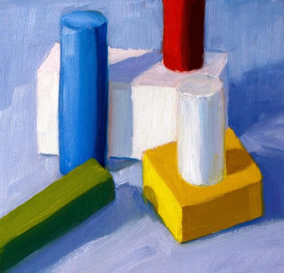
Block Study 5, from value to color
Block Study 5, from value to color, oil on canvas, 9x9"

After viewing and savoring my Peggi Kroll-Roberts DVDs, I’m doing the exercises she teaches in them, starting with value studies. To keep it simple and focus on values I used colored blocks for my subject. Above is the last study of the day in which I tried to apply to color what I’d learned by doing the gray-scale value studies below.

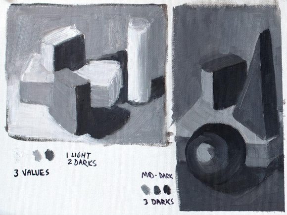
Value Study with blocks # 1
Value Study with blocks # 1, oil on canvas, 9x12"

One of the huge new (to me) things I learned from the Simple Value Plan DVD is that when you make a value plan for a painting, you can choose a range of values for the painting, such as making it high-key (mostly light) or  low-key (predominantly dark), rather than copying the values as you see them. Kroll-Roberts compares this to playing music in different keys.

She recommends making a value plan before starting a painting by simplifying and grouping shapes in the image into two or three values, with 1/3 light and  2/3 dark or vice versa for a more interesting design. In the study above on the right I used only mid to dark grays, for a low-key, predominantly dark study.

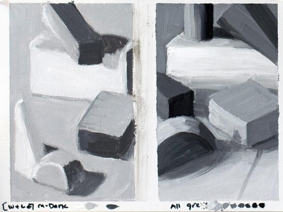
Value Study with blocks #2
Value Study with blocks #2, oil on canvas, 9x12"

Another tool she demonstrates is to first mix a value scale and put it at the bottom of your value plan study as I did above on the bottom right, and select your values from that scale. You can see the 3 blobs of paint at the bottom of most of these studies that indicate the values I intended to use.

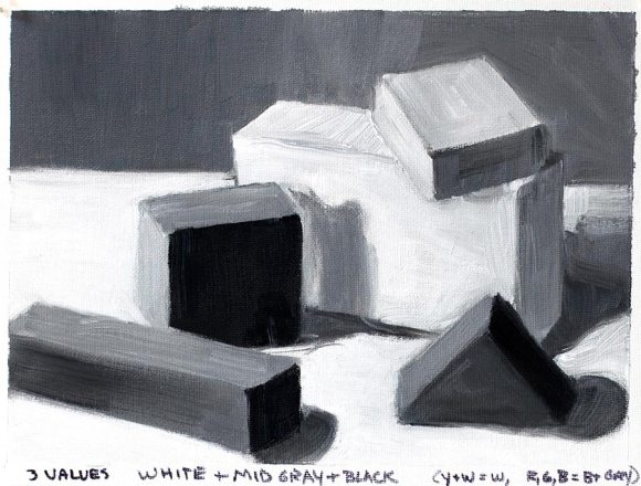
Value study with blocks #3
Value study with blocks #3, oil on canvas, 9x12"

Above I wanted the study to use the full value scale, black, white and mid-gray. I noted the colors of the blocks and how I was interpreting their values (yellow and white blocks and beige table top = white/gray; red, green and blue = gray/black,  depending on if they were in light or shadow). I did some more adjusting of value once I had it blocked in so there are more than 3 values.

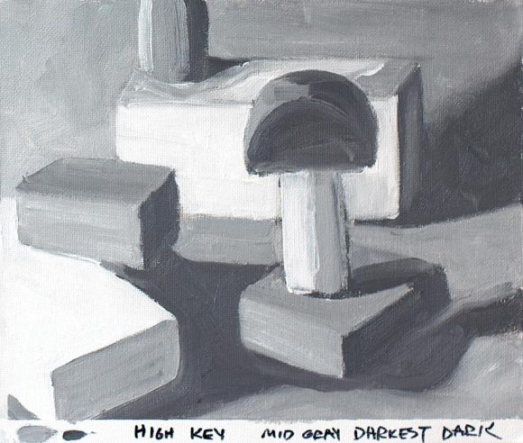
Value Study with blocks #4 - High Key
Value Study with blocks #4 - High Key, oil on canvas, 9x12"

On Peggi’s DVD High Key Value, she demonstrates creating a high key (mostly light values) painting by simply selecting the values that are mostly very light. I tried doing that with this study, and I think it works, but could have used an even lighter “darkest dark.”

Categories
Definitions Drawing Ink and watercolor wash Life in general Painting Sketchbook Pages Still Life

1.1.11: Going Analog* in 2011

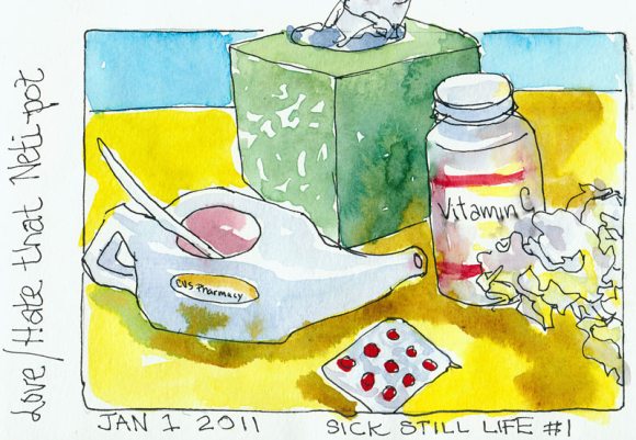
New Years Day Still Life #1

All those 1’s in today’s date: 1 a good number for beginnings. So even though I’m still under the weather, it felt important to focus on my goals for the new year, the accomplishments of the past year, and to start the year right with a little sketching.

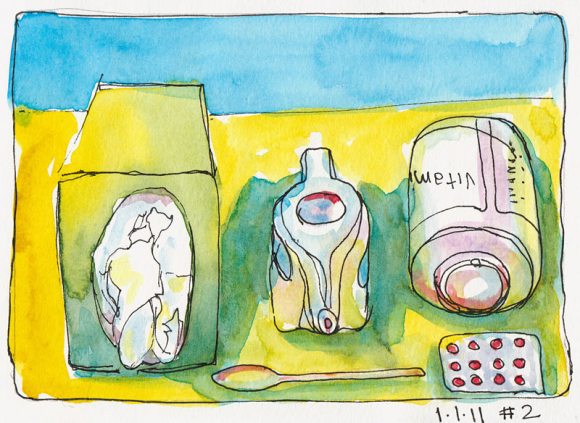
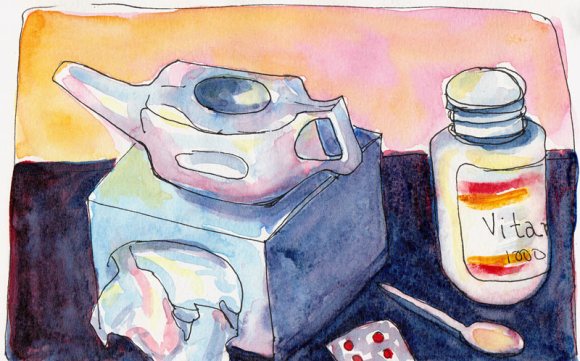
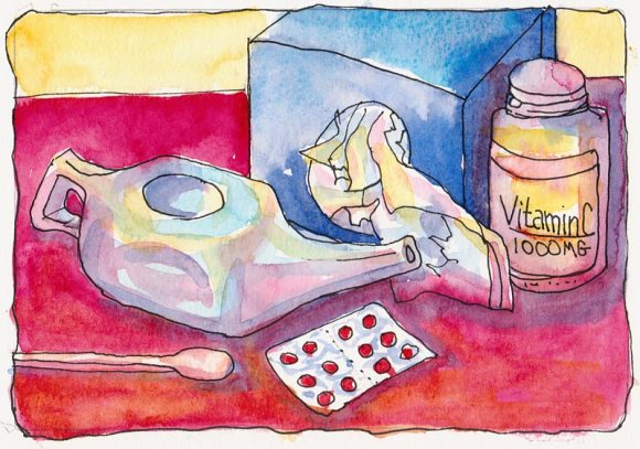
I grabbed some of my new best friends to pose for me: tissues, Vitamin C, Sudafed and my Neti pot with which I have a love/hate relationship. It really helps, but it’s weird (leaning over the sink you pour salty water in one nostril and it flows out the other).

New Years Still Life #2
New Years Still Life #3
New Years Still Life #4

I’m very grateful to have finished the year with a clear understanding of where I want to go with my art, how to get there, and a feeling that it is a reachable destination. A couple of months ago that seemed impossible but thanks to the advice and encouragement of our wonderful community of online (and in person) artists who have supported me through my questioning, frustration, and struggles I seem to have found my way.

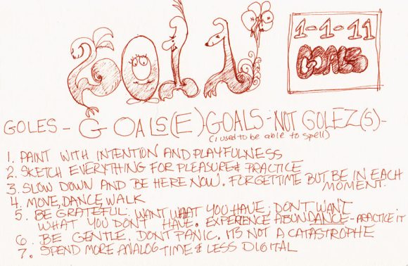
2011 Goals
2011 Goals

I wrote in my journal about the year past (not shown), and more or less doodled my goals for the new year, appropriate since they’re all about being more playful and in the moment. Being in that doodling, right-brained place, I wrote “goles” and thought wait, that’s wrong, tried golse, wrong, is it golze? No! Oh yeah, GOALS! Sheesh! I used to be a champion speller.

I want to be a more analog* person in 2011, less digital*. I want to move my body, not my mouse; I want to draw and paint with intention, a sense of adventure, and playfulness; I will spend less time on the computer. I want to slow down and appreciate each moment instead of rushing because “there’s not enough time.”

I want to experience the feeling of abundance that comes from “enough-ness” which you get by wanting what you have and not wanting what you don’t have. And I will practice being gentle: to myself, the earth, and others.

*Analog vs. digital makes sense to me, but technically really doesn’t in this context:

Analog describes a continuous system like a clock in which the hands move continuously around the face. Such a clock is capable of indicating every possible time of day. In general, humans experience the world analogically. Vision is an analog experience because we perceive infinitely smooth gradations of shapes and colors.

In contrast, a digital clock is capable of representing only a finite number of times (every tenth of a second, for example).  Computers are digital because they consist of discrete units, a series of zeroes and ones, called bits that are either on or off. (from Webopedia).

Categories
Lighting Oil Painting Painting Still Life Studio

Pomegranate Pom-apalooza

Pomegranate Revealed, oil on board, 9x12"

Happy New Year! Thanks for hanging out with me this past year! Even though I’ve had a nasty cold all week I managed to get in some pomegranate painting between nose blowing, naps, and chicken soup breaks, but not nearly as much as I’d hoped to do over my year-end vacation.

Pomegranate value study in oils
Pomegranate value study in oils, 8x5"

I only had enough energy to be in the studio for a couple of hours a day but fortunately the pom waited nicely for me. I started by doing a value study in oils (above), trying to sort out where the darkest darks and lightest lights are and just how dark and light they are.

Pomegranate quick study, oil on board, 5x7"

I did a small study next since I knew I didn’t have more than an hour or so of painting energy. I had fun with this and feel like I’m starting to find a way to get loose and sketchy with oils.

Pom photo under Reveal bulb
Pom under Reveal bulb

I used a GE Reveal light bulb in my lamp which gave everything a pinkish-lavender cast and that’s why I named the painting “Pomegranate Revealed.” GE says they are “specially made to filter out the dull yellow rays produced by standard incandescent bulbs.” I’d bought it originally thinking it would simulate daylight but it doesn’t at all. I usually use a fluorescent 5000K bulb 40 watt bulb (equal to 150 watts) which does a better job of producing clean light.

Pomegranate Revealed - Cropped to 8x10"
Cropped in Photoshop to 8x10"

When I compared the final painting and the studies I realized I liked the original composition with less background better so I experimented with cropping the painting in Photoshop. It’s not hard to cut the board down if I decide to crop it for real.

What do you think? Do you like this cropped version or the “final” version at the top of the post better?

Categories
Drawing People Sketchbook Pages Subway drawings Urban Sketchers

Wintery Rider on Way to Work

Wintery Rider on BART

There’s something about this sketch that really says winter in Northern California to me: bundled up, boots on, bare trees out the window, and a sense of quiet.

Now that I only work in the office two days a week I have fewer opportunities for sketching on my 13 minute subway ride but always enjoy the adventure of trying to sketch someone, not knowing if they’ll get off in a minute at the next stop.

Categories
Drawing Faces Ink and watercolor wash Life in general Painting People Self Portrait Sketchbook Pages

Nose-pons: How to stop a runny nose


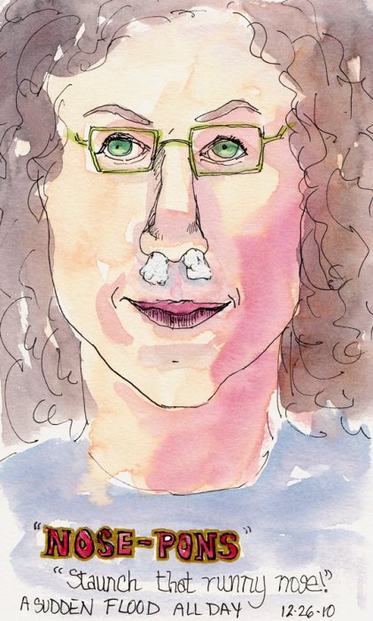
Nose-Pons: How to Stop a Runny Nose


Yesterday, despite feeling otherwise perfectly fine, my nose turned into a broken faucet that wouldn’t stop running. I was trying to paint and it was becoming impossible to work for more than a few seconds without sneezing, wiping, or blowing my nose.

Necessity is the mother of invention: the only solution was to stop the flow. So I made little nose “tampons” by tearing a sheet of Kleenex into about thirds and then folded and rolled it into a size that would fit my nostrils and I was set. I could paint for at least 10 minutes before it was time to replace the nose-pons.

Today it’s turned into a real cold with the full range of symptoms which is sad because it’s a rare sunny day and I’d planned to paint outdoors. Instead I’ll be indoors bundled up, drinking tea and chicken soup.

Categories
Albany Life in general Oil Painting Painting Places

Santa and Christmas Sleeping Rough in the Park

Santa version 6, oil on panel, 8x6
Merry Christmas Santa (version 6), oil on panel, 8x6

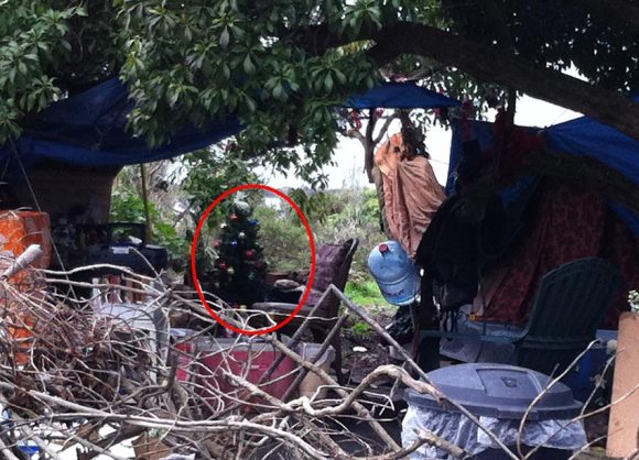
People are living in the park known as the Albany Bulb again. On a walk we saw more than a dozen homemade shelters, tree houses and tents hidden away in the brush, this one (below) complete with Christmas tree.

Christmas at the Bulb
Christmas at the Albany Bulb

Although I no longer celebrate Christmas with trees and gifts myself, I always like to get out my Santa (at top of post) that was given to me by a wonderful former student who died not long after in a motorcycle crash. The funny, cheery Santa always reminds me of the value of generosity and the transitory nature of life.

I hope Santa finds the homeless families living in the park and makes their Christmas bright. It can’t be much fun camping out in the mud, pouring rain and wind we’ve been having.

And I hope all of you are having a wonderful winter holiday too!