Categories
Art theory Flower Art Oil Painting Painting Rose Still Life

Blowsy Rosies

Blowsie Roses, oil on Gesobord panel, 6x6"
Blowsy Roses, oil on Gessobord panel, 6x6"

Blowsy. [Adjective: (of a woman) Coarse, untidy, and red-faced.] That’s just what these roses were when I picked them from my poor neglected rose bush: brightly colored but messy and past their prime; yet they were just fine as my model.

It seems like once I gave myself permission to work on a painting as long as I wanted to, I’ve started being able to finish them more quickly. And it’s not just the small size;  I’ve spent hours and days on other 6×6″ paintings in the past.

It could have gone even more quickly than the three hours I spent on it, had I left some of my earliest brushstrokes alone. I just find it hard to believe they were right the first time, even though that was my goal with this painting: to put down the right strokes with the right color, temperature and value and then leave them alone. (Or scrape off the stroke immediately if it’s wrong and replace it with the “right” one, rather than adding more and more paint, which eventually leads to making mud.)

I also tried to focus on using warm and cool colors to shape the form, along with the dark and light values. I’d also like to cite my inspiration for this painting, Kathryn Townsend, whose flower paintings mesmerize me.

Categories
Art theory Flower Art Oil Painting Painting Still Life

Baby Hydrangea: Little Pitchers Have Big Ears

Baby Hydrangea, oil on panel, 6x6"

I’d heard that saying before, “Little Pitchers Have Big Ears,” but without giving it any real consideration, assumed it had something to do with Little League baseball pitchers. Wrong. According to The American Heritage New Dictionary of Cultural Literacy, “Adults must be careful about what they say within the hearing of children. The saying refers to the large handles (ears) sometimes attached to small vessels…” like this little pitcher.

My other reference for the saying is the refrain in John Prine’s touching song, “Sam Stone” about a Viet Nam vet returning home.

Hydrangea and pitcher preliminary sketches

I was looking for flowers to paint and this little lavender hydrangea was hiding at the bottom of the bush all by itself. I did the value/composition sketches above and set about painting, completely forgetting the first step that I usually find helpful: doing a quick and simple 2-value block in using thinned paint in one color (usually Ultramarine Blue) first.

I think it worked out OK anyway, and in the next painting I did (still waiting to get photographed) I remembered to do that.

Categories
Art theory Flower Art Oil Painting Painting photoshop Rose

White Roses in Creamery Bottle (and painting process stuff)

White Roses in Creamery Bottle, oil on linen, 8x8"

(Available)

Strauss Family Creamery is a Marin County dairy that produces organic dairy products served in old-fashioned glass bottles from happy cows that graze on sweet grass in the hills by the sea. I enjoy their bottles as much as their cream in my coffee.

I started this painting with a goal to complete it from life in one 3-hour session, as so many plein air artists and daily painters do. I had somehow come to believe that I “should” be painting that way too. But while I met my time goal, I didn’t like the results (see original version below). And that’s when I finally accepted that it’s better to take as much time as a painting needs, and relax and enjoy the process rather than try to rush to keep up with someone else’s “rules.”

If you’re interested in seeing how I got here from there, click “keep reading” and stick around.

Categories
Art theory Daily Paintworks Challenge Drawing Food sketch Ink and watercolor wash Oil Painting Painting Sketchbook Pages Watercolor

Stacked! (Stacking the Odds in Your Favor)

Stacked, painting of apples and lemon stacked a top each other, oil on Gessobord, 10x8"
"Stacked!" oil on Gessobord, 10x8"

One way to the stack the odds in your favor with most endeavors is to rehearse. So before I attempted the oil painting above, I did a little thumbnail sketch, a full-sized value sketch, and a watercolor sketch (below). I also took photos just in case the paperclips and scotch tape holding it all together failed (but they didn’t–the stack is still standing!)

Stacked, ink & watercolor, 7x5"

I did the watercolor sketch first with the fruit sitting on my drawing table and the grey studio wall as the background. I love ink & watercolor. So immediate and so fun!

Stacked, value study with Prismacolor cool grey markers, 10x8"

Then I set up the fruit stack by my easel and did this value and compositional sketch. I wanted the sketch to be the same size as the painting so I used the Gessobord as a template, tracing around it on the sketching paper. Once I had the drawing the way I wanted it, I used Prismacolor cool grey markers (30%, 50% 80%) to shade the values. It was easy to transfer the full-sized sketch to the Gessobord with a sheet of blue Saral Transfer Paper between the sketch and the board, then drawing over the sketch with a stylus.

I revised the background by hanging a dark gold/green cloth hung behind the still life hiding the gray wall.  Now I’m wondering whether to repaint the leaves. What do you think? Is it better to leave them kind of soft and blurry so they don’t attract too much attention. Did you notice them before I asked the question?

(Painting available here)

Categories
Painting Still Life

Leftover Lunchroom Apples (AKA the Zombie Apple Painting)

Leftover Lunchroom Apples #2, oil on board, 8x8"

This is one of those zombie paintings that despite my best efforts to kill it, just wouldn’t die. I painted it again and again, changing the background colors, the shapes of the apples, the colors of the apples, the shadow shapes and colors. And in between painting sessions it sat there on my easel taunting me.

I was determined to finish it today no matter what. So I photographed it, imported it into Photoshop and experimented there with colors and shape variations until I found a scheme I liked. Then I applied those changes in paint on my canvas. (I was tired of the actual background colors which were the same as Apples, Delicious.)

Update 6/12:  I asked a friend to be an innocent bystander and give me his honest opinion of the painting still on the easel. He said, “Uh, well…what are they?” When I said apples he said “Really? They don’t look like apples. But I like the red color.” FAIL? Yes.

It’s probably better to make many paintings instead of getting stuck painting the same one multiple times. But I get determined to figure out what is making me unhappy with a painting and to try to resolve the problems. Sometimes I discover there’s a fatal flaw in the composition or drawing that can’t be fixed with paint (and I fear this is one of those?). Then I just try to learn from that mistake for the next time and accept I’ve gone as far as I can.

I’d like to give the apples one more try (on a fresh canvas), to see if after all this practice I can do a fresh, quick painting that flows instead of lurches along in true zombie fashion.

Categories
Art supplies Art theory Drawing Every Day Matters Ink and watercolor wash Painting Plants Sketchbook Pages

Last Day of EDiM: “Fresh” Hydrangeas and L.L. Bean “Flashlight” Hat

Baby Hydrangea for "Something Fresh" EDM #112, ink & Watercolor, 6x4.5"
Baby Hydrangea for EDM #112: Fresh, ink & Watercolor, 6"x4.5"

I’d never been able to sketch this hydrangea plant before because once the teensy little buds open they shed piles of equally teensy little petals and make a big mess. But this one was so fresh I was able to cut and draw it without the mess. (Although it did end up making a mess anyway when my cat ate one of the leaves and then delivered it later to the rug.)

EDM #120 Flashlight (L.L. Bean Pathfinder Flashlight Hat), ink & watercolor
EDM #120 Flashlight (Hat), ink & watercolor

The cue was to draw a flashlight. My favorite flashlight is my wonderful L.L. Bean Pathfinder Cap. It has two LED lights in the brim. One points straight down and is perfect for lighting your sketchbook when painting when it’s dark, and the other points ahead to light your path. You just squeeze a spot on the brim and it toggles between down, ahead or both. When painting in a dark pub it perfectly lit my sketchbook page but nobody could tell where the light was coming from. Someone came over to try to figure it out because it just looked like my page was illuminated.

The hat is sitting on a plaster “Planes of the Head” cast, a tool for learning how to really see and draw heads (good article about this here).

Although I wasn’t a faithful follower of  “Sketch Every Day in May,” it reinforced how much I enjoy drawing. Some of the cues sounded boring but I discovered that no matter how dull a subject may seem, drawing it rarely is.

Categories
Art theory Daily Paintworks Challenge Oil Painting Painting Still Life

Boxed Coffee Scoop (A Silly Purchase)

Boxed Coffee Scoop and Cork, oil on panel, 5x7"
Scoop and Cork, oil on panel, 5x7"

Peet’s Coffee is selling coffee scoops in three sizes that measure exactly the right amount of coffee for their French press coffee makers. Although I was happy with my French press pot and coffee scoop, I couldn’t resist the promise of the perfect cup of coffee.

Haha. It holds exactly the same amount that I already use. And it’s too wide to dump the coffee into my little French press pot without some of it landing on the counter and the handle is too short to comfortably scoop out of the bag or canister. So, while useless in the kitchen it is earning its keep as a model in the studio.

Value study/under-painting for Scoop and Cork, oil, 5x7"

This week’s Daily Paintworks challenge is to do a value study using only burnt umber, and to vary the amount of dark, medium and light so that there is a majority of one, some of the other, and a smidgen of the other. This is done by applying a thin layer of burnt umber, wiping it down for mid value, painting in the darks using only burnt umber, and wiping with paper towel or q-tips dipped in mineral spirits for the highlights.

I was going for a majority of dark, some middle, and smidgen of light. Not sure if I accomplished that. It seems like there’s almost as much middle as there is dark. I’ve done plenty of value studies and monochrome paintings, but I’d never done it this way before and enjoyed it. I like the way the finished study kind of glows but used it as a the under-painting for the painting at the top of this post.

Categories
Art theory Drawing Every Day Matters Ink and watercolor wash Painting Sketchbook Pages

Sweat, Salt and Scissors

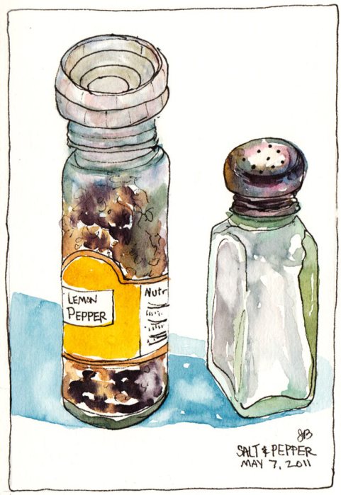
My Lemon Pepper and Salt Shaker, ink & watercolor, 5.5"x7.5
My Lemon Pepper and Salt Shaker, EDM #104, ink & watercolor

Drawing is the foundation of most picture making and it’s a skill that requires regular practice and study. I’m determined to improve my drawing skills and the Every Day in May drawing challenge came at just the right time to inspire this daily practice.

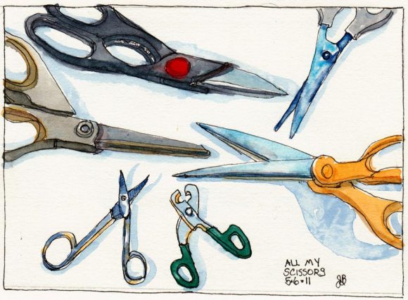
All The Scissors I Own, ink & watercolor, 5.5x7.5"
All The Scissors I Own, EDM#105, ink & watercolor, 5.5x7.5"

I’ve long enjoyed just starting somewhere on the page and letting the details and story expose themselves in my sketch as my eyes explore the subject. I like the “just see what happens” approach. That is a lot of fun. But it doesn’t work well when I’m trying to fit a scene onto a page, or realistically capture a place or people or both.

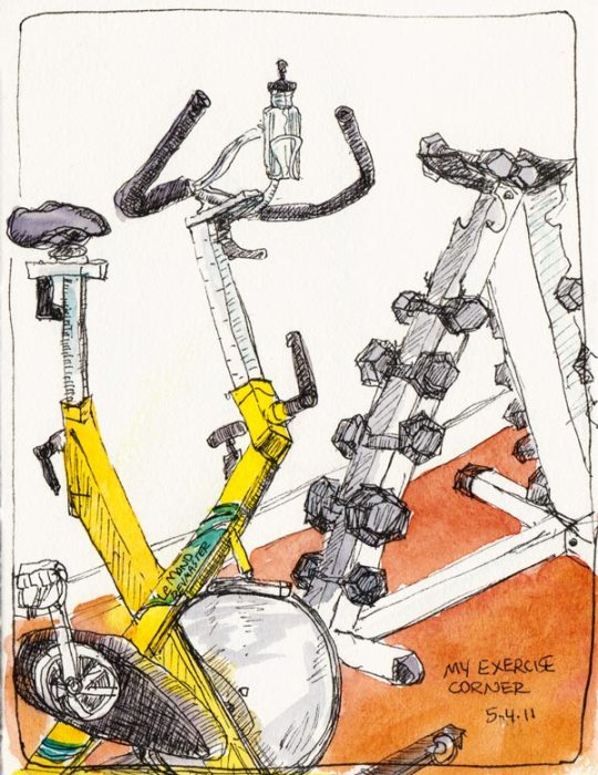
My Exercise Corner, ink & watercolor
My Exercise Corner (drawn sleepy and without using the strategies described below so it's wonky and didn't fit on the page). EDM# 103

That requires some comparing, measuring, careful checking of angles, drawing imaginary (or penciled) “plumb lines” to see what lines up with what, noting where the top, bottom, sides and midlines are in the subject vertically and horizontally, and marking those same spots on the page so that it all fits. And of course there are lots more…perspective, line quality, etc.

I just wasn’t willing to do most of that before, but now I am. Even more surprising than my willingness is how enjoyable it is and how it’s starting to become second nature.

I don’t want my drawing to be pefect—I love imperfect wonky drawings—they’re so much more interesting and lively than perfectly realistic ones.  I just want the darn picture to fit on the page and the proportions to be at least almost right, and to be able to draw more quickly and accurately when I need to.

Categories
Art theory Oil Painting Painting Still Life

Apple Can Brush (huh?)

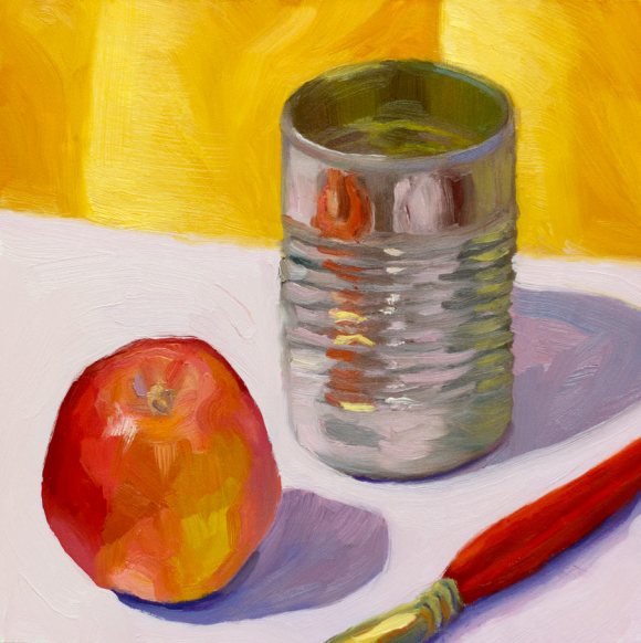
Apple Can Brush, oil on panel 8x8"
Apple Can Brush, oil on panel, 8x8"

I know the title sounds like random word salad but since the still life objects are equally random I think it is fitting. The tin can in the painting is from a can of Trader Joe’s Split Pea Soup.

I was fidgeting with the can while the soup was warming in a bowl in the office microwave and in the process removed the label. I was struck by how pretty the can was and so to my office mates’ amusement, I washed out the can to take it home and paint it. It needed companions in the composition; an apple was handy as was a paint brush.

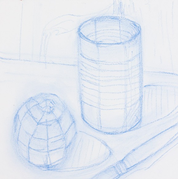
Apple Can Brush, drawn on panel with pastel pencil

I focused on seeing planes values, and putting the paint down and leaving it. The picture above shows the way I sketched out the composition with the planes on the panel with pastel pencil before painting.

I really enjoyed the process and the results. Can’t ask for more than that!

Categories
Daily Paintworks Challenge Oil Painting Painting Still Life

The Color of White (Cool)

White teapot on wrapping paper, oil on panel, 6x6"

The Daily Paintworks‘ challenge last week was to paint a white object sitting on patterned fabric using only primary colors and white. For this attempt I decided to use some turquoise, patterned wrapping paper instead. The wrapping paper had clever little snowmen all over it but after giving one snowman a try, I realized I didn’t have the patience or interest to try to paint all the details on them (top hat, scarf, etc.).

So I gave myself permission to abstract the snowmen into the circular, swirly shapes I saw reflected on the teapot. Since it was meant to be a painting exercise, I didn’t get too concerned with perfecting the painting. I just wanted to experiment with seeing reflections and building the form of a white object on a cool background.