Categories
Oil Painting Painting Sketchbook Pages Still Life

Pile Of Persimmons

Pile of Persimmons, Oil on Gessobord, 8x8"

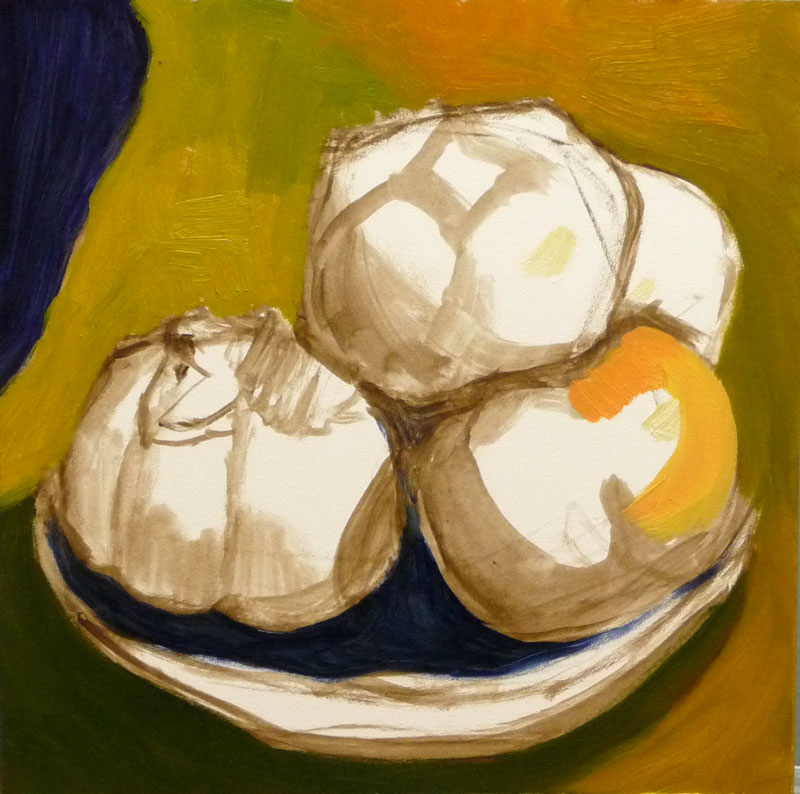
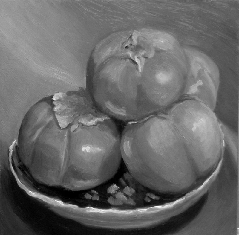
This was so pleasurable to paint. I experimented with doing an underpainting in acrylic first to put in the darks without having to wait for paint to dry. Then I tried to focus on values and color temperature, but  I think I got sidetracked by all the interesting shapes of light, color, reflections and hazy surfaces  (they were organic persimmons and some of the skin had a kind of filminess like blueberries have).

I’m also working on trying to see and mix just the right color of paint, and apply strokes once (instead of guessing, putting paint down, scraping it off, trying again). Last night when I realized I’d been painting for an hour with dirty brushes and not mixing specific colors but just using random paint left on the palette I dragged myself away from the easel and went to bed, finishing the painting this afternoon.

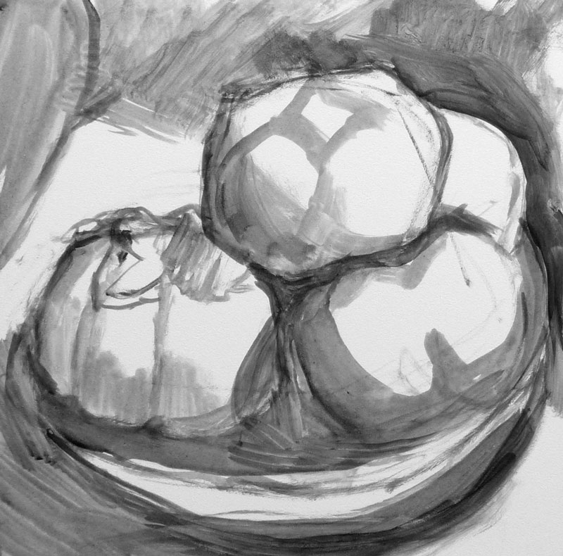
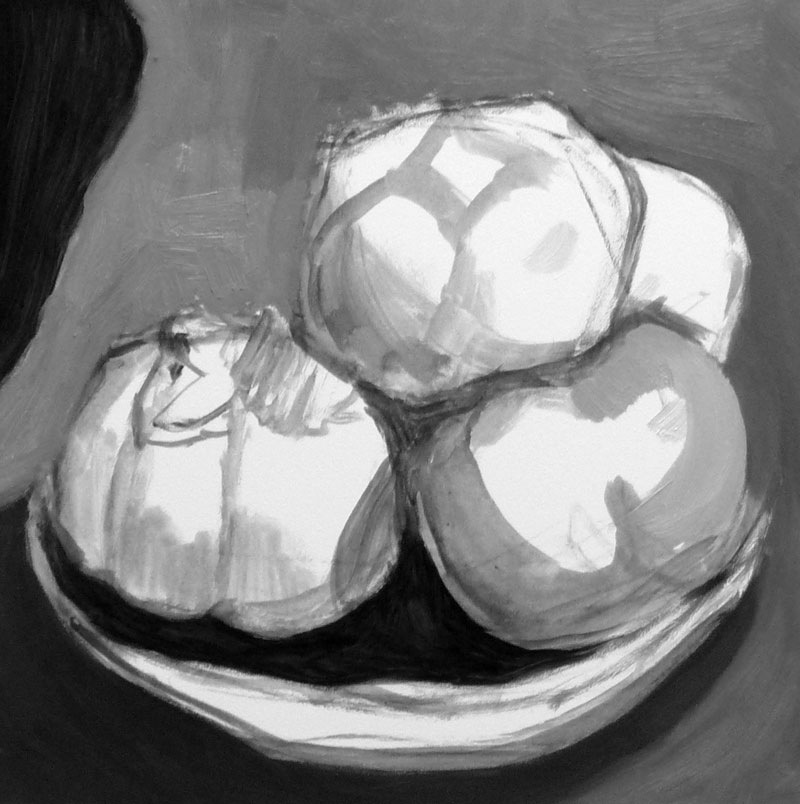
I’m pretty happy with this one but would like to try again getting closer with color temperature changes and stronger values. Below are the steps I took along the way, including a change in composition. Although I liked the rich dark in the corner, it was drawing too much attention to itself.

If you click on one thumbnail you’ll be taken to a big picture with another thumbnail to click to go to the next.

Categories
Other Art Blogs I Read Plants Sketchbook Pages Watercolor

Just a Value Sketch (Persimmon)

Persimon-value sketch

Above: Watercolor in Raffine sketchbook

Below: Original photo and grayscale version
Persimmon photo persimmon-grayscale

(Click images to enlarge, select “All Sizes”)

I was inspired to focus on value studies by Katherine Tyrrell’s post about “the best ever workshop” she attended and her instructor’s “constant and particular emphasis on the huge importance of values when painting light.” For tomorrow’s watercolor class I’m going to ask my students to do some value studies and wanted to have one prepared in advance so that’s what my post is about today.

Value studies can be so helpful not just for figuring out the values that actually exist in the reference material, but also for deciding how to change the image before painting it. It gives you a chance to consider where values need to be different to help the composition and for that matter, how does the composition need to change to be more successful?

It seemed to me that my original photo, while bright and colorful didn’t have much of a range of values so I tried to increase the contrast by adding stronger darks when I did the value study. Then I converted the original photo to grayscale to compare to my 0ainted version. I think somewhere in between the two might be best. I scanned the pencil drawing before painting it, so it will be easy to print it again and paint it again, if I decide to.
I’ve found that students usually grumble about having to do value studies–it seems too much like eating enough fiber or flossing teeth. I guess value studies just don’t seem that sexy (I hate it when people use the word sexy to describe things having nothing to do with sex like cellphones, cars, and now painting…but somehow that word works here…though now I’ve probably now increased my spam by using it…) in the way bright wet-in-wet washes or painting glass or thunderclouds are. But there’s nothing that captures light in a painting more than really nailing the values and getting those darks and lights in there.

I took this picture today when I was taking a nice walk in the Berkeley hills with my sister just after it had rained. It was supposed to rain all day today and I was all set for a cozy day at home in the rain but instead it was hot and sunny….in November?