It was an important meeting. The participants were brilliant experts in their fields. Yet I still couldn’t resist sketching my way through the meeting.
Meeting people 2
I only had my work notebook and a fat roller ball blue ink pen in the conference room with me. During a break I grabbed a black one but it was still weird to draw with compared to my usual extra fine point pen.
I actually captured a likeness on a couple of these little gesture sketches.
I saved two rose buds to paint when I pruned my roses last week (in case winter ever comes to the San Francisco Bay Area—it’s been ridiculously hot and sunny). By the time I could get back in the studio, one bud had opened and my order of M. Graham and Schmincke gouache arrived. Although I planned to test the new gouache by making color charts first, I knew the roses wouldn’t hold up much longer. Also included in my art supply order was a new Rotring Art Pen.
I tried out the gouache and pen in the sketch above. I also wrote a quickie review of the Rotring Art Pen and offer some technical information about gouache by experts on the subject. If you’d like to know more about gouache or the pen, please click the “Continue reading” link below.
I enjoy sketching on BART, our subway system (which has been in the news since New Year’s Eve when BART police shot and killed a defenseless, unarmed young man which was captured on cellphone video and led to protests and rioting in downtown Oakland). BART’s headquarters are in the building where I work in downtown Oakland. To keep people safe inside, the building has been on “lock down” the past couple of weeks, with I.D.s required to enter the building to keep those of us working inside safe. There’s been no trouble though, with way more media and police around than protestors.
Old Man, Big Ears
On BART this morning, this old man made a great model. He barely moved and had the most gigantic ears I’ve ever seen.
BART Rider
This would probably be better if I darkened all of the area around her but I liked her pointy nose.
If only there was a rewind button to click at the end of a day to get a do-over. I planned to paint all day but didn’t get in the studio until dinner time and finally added watercolor to these two sketches from Saturday’s International Sketchcrawl. They are mostly from our wonderful lunch at Hog Island Oysters in the Ferry Building.
We shared a 12 oyster sampler: two of each of the six kinds of oysters they had that day, served on crushed ice and garnished with curly red seaweed. Then we shared a bowl of amazing clam chowder with the clams steamed in their shells on top of the soup and a sparkling fresh salad of baby greens. Even the sourdough bread was sensational. A cold wheat beer for me and champagne for Martha only added to the perfection.
Hog Island grid
That big fish is mounted on the wall, not hanging over diners’ heads as it appears in the picture. Martha gave me the idea of doing a grid at lunch which was fun, although a little frustrating because I had to work so small. These were drawn in my small watercolor moleskin so each grid section is only a couple inches across.
We spent so much time at our table that we felt too guilty to stay longer to add watercolor. There was a line of people waiting for seats and we were hogging a primo window seat. Here’s what it looked like pre-watercolor:
Hog Island grid, ink only
I love this photo Martha took of me sketching at the table. While we were at the table we used our iPhones to connect by email, text message and Facebook with other sketch blogger friends participating in the Sketchcrawl, Lisa in Texas, Marta in San Diego and Shirley in New York.
The weather was perfect in San Francisco for Sketchcrawl 21. Martha and I kicked off the day sketching this old dude playing off-key clarinet behind the Ferry Building. Children seemed to love the music and the pigeons looked happy, doing their funny pigeon wobbly-neck dance to the music. I’m guessing his fancy tuxedo pants were left over from better days.
As we headed to the only open table across from the musician to sketch, a young man with a perky little dog started to take “our” table. Without realizing I was thinking out loud, I said, “No, guy, don’t sit there!” He turned around and looked at me in surprise.
I was so embarrassed! I apologized and explained, “I didn”t meant to say that; I thought I was just thinking it.” He was very nice and insisted we take the table, which we did, with me still apologizing. I better be careful or I’m going to turn into one of those crazy cat ladies who wanders around talking to herself all the time (if I’m not already there!)
By 10:30 a.m. about a dozen sketchers had gathered. That number grew to 80 by the final meet-up in Golden Gate Park. Some of us (Martha, Yoko and I) stayed around the Ferry Building to draw so never made it to the park. Note our cool Sketchcrawl T-shirts.
Martha, Jana & Yoko
End of day meet-up in Golden Gate park (below).
Sketchers at Golden Gate Park End of Day Meet-Up
Photo by Jim Mitchell
We had a fabulous lunch at Hog Island Oysters in the Ferry Building. I’ll post those pictures tomorrow after I add watercolor; we hogged the Hog Island table too long to start painting after we’d sketched all our food before eating it!
After lunch we took a stroll in the sun hunting more sketches. We walked out on a pier where we drew and painted these Pilot Boats (used to transport pilots of big ships between land and the inbound or outbound ships that they are piloting). Who knew they had special boats designed for just that purpose! Since they’re so tiny compared to the huge tankers and container ships, I guess that orange mast-looking thingee on the boat is actually a sort of crane for the pilot to ride down on.
Pilot Boats, ink & watercolor, painted on site
Here”s a picture of our sketchbooks and our interpretations of the same scene.
Martha & Jana sketch boats, Ink & watercolorActual Pilot Boats with sketchbook
It was Martha‘s idea to hold up the sketchbook in front of the scene, trying to get the boats the same size in both. She is so much fun to sketch (and lunch) with! I’m sure her sketches will be appearing on her blog, Trumpetvine Travels, shortly.
On the last dayof vacation before returning to work, the world outside my windows looked raw, blustery and wet after a frost-covered morning. Hibernating sounded good, but I was feeling uninspired and blah and could tell if I stayed home I was just going to mope around. Since I needed to pick up my my sunglasses from the optometrist, I decided to walk up there.
I almost turned back after the first couple of blocks. My ears were cold and my feet were complaining. But I kept going and eventually began to perk up and enjoy myself. By the time I got to Peets Coffee (a mile later and across the street from my eye doctor’s office in El Cerrito Plaza) I was feeling enthusiastic and cheerful. With a hot latte in my hand, I sat at a cafe table outside Peets and sketched this odd chain restaurant across the street.
I ate there once when it first opened (I was curious about the new restaurant in my neighborhood) and enjoyed it, but have never been able to get anyone to go back there with me. With so many unique and trendy restaurants in the Berkeley area, I suppose there’s really no reason to go to a “big box” version of an Italian restaurant, though people do seem to pack the place on weekends.
But I’ve always had an aversion to stupid business names, and the name “Macaroni Grill” irks me. I keep picturing the chef trying to grill slippery macaroni and cheese, with all the noodles falling through the grill grates. When I was a kid I remember being annoyed by a hair salon named “Lipstick Beauty Parlor,” which I thought made no sense.
New Sunglasses
While I was waiting at the optometris’ts office, I started sketching a stand that holds many pairs of eye glasses. There were too many tiny, overlapping details and I wasn’t really interested. Fortunately the optician arrived with my glasses so I stopped. When I got home, instead of leaving a partially messed up page I turned the page 90 degrees and added a quick sketch of my sunglasses (from memory) and then stuck myself in them.
I see something that inspires me to draw every time I take a walk. On this sunny winter walk, neighbors were out tending to their gardens, and flowers were blooming in unexpected places, like surrounding the fireplug above on a busy street corner.
Cactus Trimming Day, Ink & watercolor
There’s a house a few blocks from mine where the front lawn was replaced long ago by a hundred different kinds of cacti and succulents. I wondered how they managed to keep the various spikey things trimmed and on this day I found out: carefully, with very thick gloves and shovels.
They’d trimmed their enormous Nopales (or Prickly Pear) cactus and piled up the “paddles” in this old wheelbarrow. As the husband and wife worked they acted like it was completely normal for me to be standing in front of their house for 15 minutes sketching their wheelbarrow. I’m not sure what they ended up doing with the pieces of cactus. As I finished sketching, the husband piled a few paddles on his shovel and walked off down the street with them.
Ready to party
Later I passed this cheery scene in someone’s driveway. I didn’t see anyone around, but the brightly colored chairs and containers of (?) on a tray looked awfully inviting.
My next door neighbors were pruning their roses for winter so I asked them to save some for me to draw (they were going to throw the still perky roses in the recycling bin). I started by trying to paint them in oils but was having a terrible time mixing the right colors. I scraped off the paint and went to bed, planning to try again the next day.
When the cats knocked the vase over during the night I was actually relieved, thinking the roses would be too funky to paint since all the water was on the floor, not in the vase. But these were some tenacious roses, and were still fine so I decided to try sketching them in watercolor (above and below). I also consulted one of my books on flower painting that said roses were shaped like teacups, so I added a few of those tilted at the same angles to the sketch to help me understand their shape better better.
Blood Red Roses, Ink, Watercolor & Blood
I’d just finished the sketch (above) and was writing about how hard it is to mix the highlight color of “blood red” roses in oil paint. At that very moment, my nose started bleeding for no reason at all and it dripped onto my sketchbook! Now I feel like a real Avant-garde artiste, painting in blood!
P.S. A little pinching of the nose and it stopped.
Red Roses, Oil, 6x6"
Mixing a light red color in oil paints
It’s hard to mix a warm, light red in oil paint because when you add white to red oil paint, it makes a cool pink. This is because all white oil paint is cool (meaning it tends more towards a blue than a warm color like orange or red). But the color of these roses in bright, warm light was a hot pink. It’s easier to get a warm, light red in watercolor because you use the “white” of the watercolor paper to show through and “lighten” the red, not white paint.
To get help with the dilemma I sent an email to Diane Mize at Empty Easel since she and I had recently corresponded about color charts and she’d written an excellent article on Empty Easel about how to mix correct color in oils. She validated that mixing a light red is challenging and offered some good suggestions, including using Naphthol Red, which is a more intense red than the cadmiums (which quickly lose strength in white).
I tried making the lighter areas of the rose thicker, using a palette knife, since those raised areas will catch the light and reflect it making it appear lighter. I also intended to make the dark areas on the roses more neutral and cooler, so that by comparison the warm light area would look even more brilliant. But the roses finally died and that put an end to the painting. My favorite part of this painting are the leaves at the bottom left.
I spent New Year’s Day sorting through the piles of sketchbooks and paintings I completed in 2008 and preparing the studio for 2009. My bulletin board is now a blank slate, ready for new work to go up. I gathered all the oil paintings that hadn’t gone directly to the garbage (121 survived) and sorted them into the piles you see above.
On the left are the 68 paintings heading off to the garage as a sort of purgatory zone. Next year they’ll probably go in the trash.
The middle stack of 42 are now shelved in the studio. These are the paintings that show progress and bits of success, but that I don’t want to hang on the walls.
The last pile on the right (plus the standing canvas of me) are the 11 paintings from 2009 that I like, imperfections and all. Also shown above is the presentation folder into which I inserted my oil paint color studies. I refer to these charts quite often and will be making more for new colors I’m experimenting with. It’s handy having them in this binder.
Sketchbooks completed in 2008
Above are the sketchbooks I completed in 2008 (and cheating just a bit, the first week of 2009). Half of them were actually started in 2008, but the other half were left over from previous years, when I was working in multiple sketchbooks at one time, without finishing any of them.
2008 and 2009 Art Goals
I just reread my January 1, 2008 artgoals:
“My art goals for 2008 are also very simple: to enjoy myself by exploring whatever directions I find interesting, challenging, exciting, pleasurable, fun. No lists of shoulds, no rules other than play, practice and enjoy the journey.
My hope is that by this time next year I will have earned enough competence with oils that I can comfortably and freely work in the medium most fitting to the subject or idea I want to express, whether it be ink, watercolor, oils, goauche, or monoprint.”
I think I did pretty well in following that plan, pursuing many art adventures, including a considerable amount of plein air painting, sketching and and lots of study and practice in oil painting. I studied independently, with books, videos and with teachers and just tried to put those “miles on my brushes” as they say.
I still don’t feel completely competent with oils; I know what I don’t know, but I know what I do know too.
Goals for 2009:
1. Begin my 10,000 Days of Art project and make each of those days count. And again, the same hope as last year… “that by this time next year I will have earned enough competence with oils that I can comfortably and freely work in the medium most fitting to the subject or idea I want to express, whether it be ink, watercolor, oils, goauche, or monoprint.” Also I’d like to do morewith goauche and monoprint this year.
2. Do something I learned from my best friend Barbara, an amazing ceramic artist and art blogger:
Ask each day: “What can I do to enjoy myself today?
(I know this sounds a bit self-indulgent, but it’s often hard-earned and provides the “filling of the well” necessary to be able to do good for others too.)
Since enjoying myself always involves drawing, painting or other art-making, I intend to have a very enjoyable and artful year.
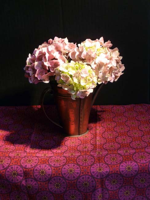
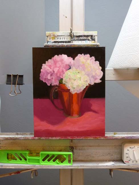
These humble but persistent hydrangeas were still blooming outside my kitchen window, despite suffering through drought then rain and cold. Their leaves were few, gray and blotchy and the stems were bent and woody but the flowers just weren’t giving up.
While I worked on the painting I was thinking about humility. I’ve discovered that being humble is a good antidote to procrastination.
When I think that I have to be “good” at something (especially painting), it creates fear that I won’t be. Then I find myself either procrastinating or, if it strikes while I’m painting, reworking a painting again and again because it’s not “perfect” yet.
I’ve found that the best way to step out of that rut of perfectionism is to focus on being honestly humble and not worry about being good, better, best, or perfect. All I have to be is humble little me and like the hydrangeas, just hang in there and shine forth.
About the painting:
I was trying to see and paint light and make good use of color temperature and value contrasts to model the form. I started by doing a monochrome underpainting in acrylic, but didn’t really like the way the acrylic paint kind of ruined the wonderful texture of the ArtBord. Here are the steps along the way:
1 & 2 are photos of the still life set up, the second in black and white to look at values.