
Here are my Wordles and dreams for January 1-3. Above is the two-day spread for January 2-3 and below are the individual pages for all three days with some comments.
Here are my Wordles and dreams for January 1-3. Above is the two-day spread for January 2-3 and below are the individual pages for all three days with some comments.

Continuing from the previous post, here are the rest of December’s Wordles and Pictures and dream sketches.

In October 2022 I returned to journaling my dreams along with normal journaling stuff, and then in December I started illustrating the daily Wordle after I solved the puzzle.
This post is a collection of some of those early sketches. After this, I’ll just post 2-page spreads at a time. Sorry to overload with this one but I wanted to try to get caught up.

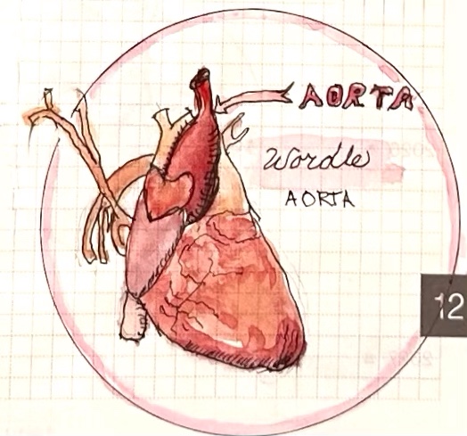
The day I first illustrated a Wordle. It was TAPER but my one rule: I can do whatever I want. So I went with a Malayan TAPIR.

I cropped and blurred out some stuff for privacy but you still get the wild cabbage-baby dream!

When I started my blog, JanasJournal.com in 2006, it was an illustrated daily journal where I shared my world and my creative journeys through many different media. Now I’ve returned to my journaling roots and I’ve found inspiration from a surprising source: the daily Wordle puzzle, which I solve and then illustrate each day.
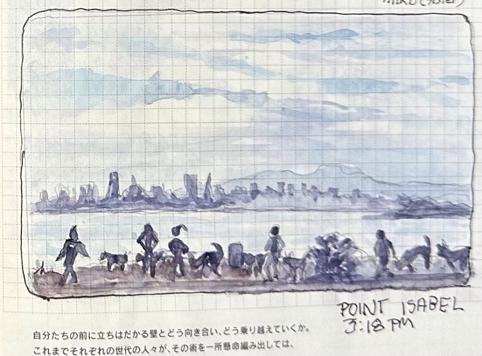
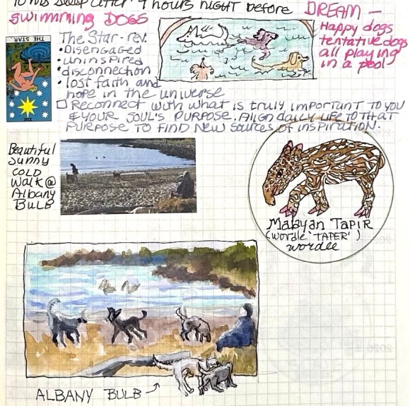
While my journeys may have become more interior thanks to the pandemic, illustrating where my imagination and dreams take me keeps me entertained. But I’m also including sketches from places I go in real life, like Point Isabel above, a huge park along the SF Bay where dogs can run free, roll in the grass, splash in mud puddles and rinse off in the bay.

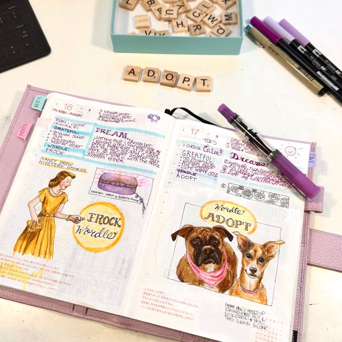
I’m using a page-a-day Hobonichi “Cousin” journal with weird, very thin, lightly-gridded paper along with fountain pens, drawing pens, watercolors and Tombow markers.
I will share more about the materials as I get the backlog of 3 months of journaling, dreams, Wordles and pictures posted.

By the time I was done with the drawing for this painting I was really bored of the subject and couldn’t motivate myself to paint it until the idea of pink poodles prancing on the page popped up.
Those pink poodles reminded me of how much fun I used to have drawing and painting anything that amused me, back in 2006 when I started this blog as a daily sketch journal 17 years ago.
From my crazy dreams to local dive bars to what was in my fridge, it was always fun. I’m doing that kind of sketching again, and will be posting them soon. Meanwhile, back to this silly portrait.
I was super tired the day I painted it and couldn’t come up with an interesting limited palette so I challenged myself with just two colors: WN Permanent Rose and Winsor Blue Green Shade. It wasn’t a great combination for a portrait but it was perfect for pink poodles.
I had a hard time getting an accurate scan of the painting which has a bit more turquoise color in the background and a little warmer color pink on the poodles and her skin. But even the correct colors are still pretty weird.

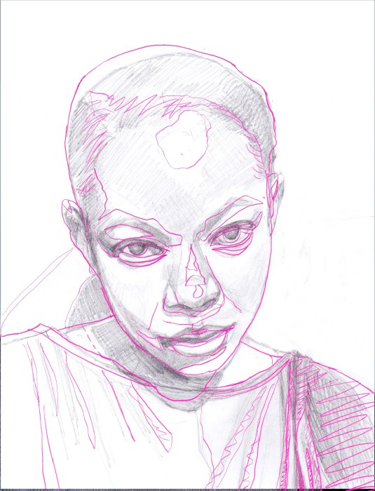
You can click on the image above to see an enlarged version of the preliminary sketches, the corrections needed and the reference photo.

When I saw the reference photo of fantastic artist Richard Banks in a Sktchy watercolor class, I wasn’t immediately inspired but decided to give it a try anyway. Maybe because I had nothing invested in the outcome, just in the learning process, I ended up liking the painting for what it is.

My first attempt at drawing him was pretty far off so I didn’t try to correct it, I just started over. I was satisfied with the second attempt above.

Even though his photo was mostly cool colors, I decided to try to use the Zorn Palette and see if I could make it work. The pigments I used were WN Ivory Black, Utrecht Cadmium Red Light, Holbein Yellow Ochre.
I did cheat slightly and did a preliminary very light wash of Winsor Blue/Green Shade over the whole sheet of paper. Typically with the Zorn palette, the black is used as a blue but this Ivory Black seemed way too warm for it to work.

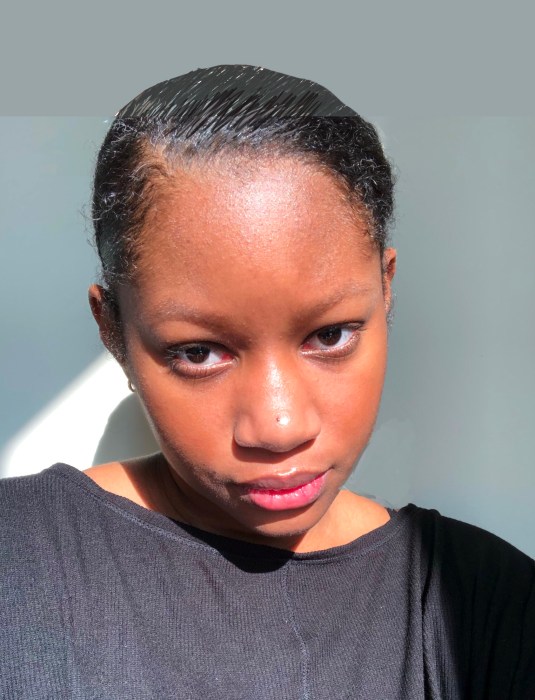
I watched the interesting class taught by Kirsten Britt on Sktchy and then, as usual, I painted the subject completely differently than was instructed. Kirsten’s work is beautiful but is all about splotches (here’s her version on IG).

I used an odd limited palette for this one which made it a little challenging. The pigments are DS Perylene Scarlet, DS Cobalt Teal and WN Raw Sienna. It wasn’t possible to get any real darks so I stuck with a high key painting.

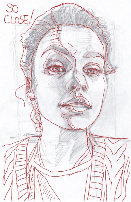
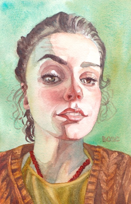
I got very close with my sketch, even with the camera distortion; I only needed a few small adjustments.


I signed up for a Sktchy Watercolor class to see what I could learn from their teachers. I planned to make myself try the teachers’ different approaches and I did attempt the super loose, wet in wet approach Dritan Duro, the teacher for this class demonstrated, but tossed the crappy results and started over, doing things my way.

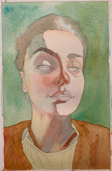
Interestingly, the 3-color limited palette I used for this painting was the same as the one I used for my painting of Dorothy, even though the two women look nothing alike. It’s a fun challenge to work with only a 3-color limited palette. (WN Raw Sienna, WN Perm. Alizarin, Winsor Blue Green Shade).
Above is my final sketch and below is my preliminary sketch, scanned into Procreate, with a tracing of the photo over it. I used it to check my drawing and then made the corrections to the final sketch above.

My first thought was, “Dorothy from the Wizard of Oz, all grown up,” and, as the saying goes, “rode hard and put away wet” when I saw the photo (below) on photographer Earthsworld’s Instagram.
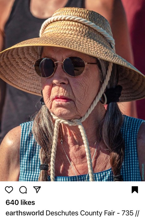
My second thought was “I must paint her!” I contacted Earth (his real name) and he gave me permission to paint from and share his photo. Then, while the painting was in progress I came across the cartoon below on Instagram by artist WadeHate.

It was too perfect, another image of Dorothy all grown up. He was kind enough to give me permission to share this artwork.

The original photograph had a background I didn’t want so I experimented in Procreate with different backgrounds. I probably should have just left the background white (below).

The deep orange I chose didn’t please me so I tried washing it off. That left an “interesting” peachy color and a paper surface that was not going to respond well to more paint layers. So, peachy pink is how it shall remain.

When I checked my initial sketch I was delighted to see how close I got on my first try, and how few corrections were needed (above). It’s so nice to see progress, whether it’s in drawing or painting or both. This painting also went really well (except the background).

My granddaughter Sadie loves to swim (and play soccer, basketball and read books, too). At the end of the season, after winning many races and awards, to fundraise for her team she swims lap after lap and people pledge $ per lap.

Trying to paint Sadie from this photo led to me giving up on oils and going back to watercolor. As was my way with oils, I tried repeatedly, persistently (obsessively?) but couldn’t make it work. This watercolor isn’t perfect, but it captures the joy of the moment and that makes me happy.
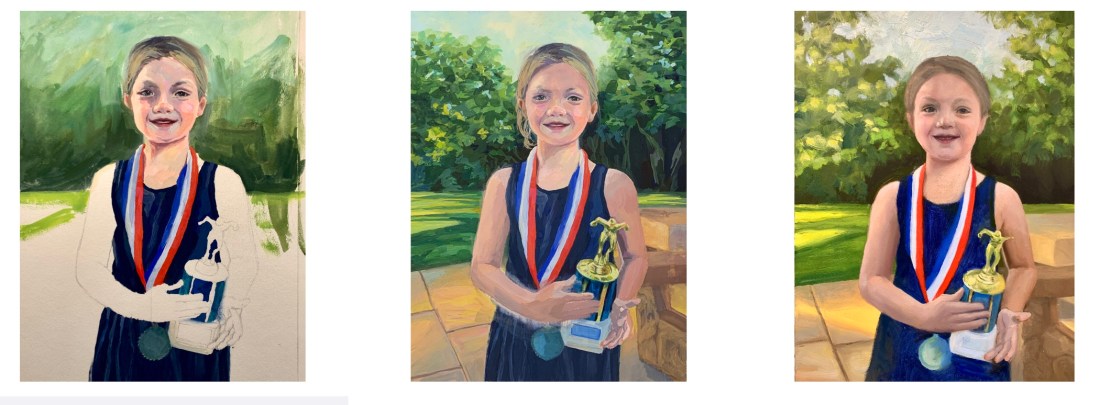
With watercolor I’m able to paint to a certain point and then happily call it done. Watercolor doesn’t allow you to keep fiddling forever like oil does.

I again used a limited palette because it’s fun to see what I can do with only 3 colors. This time it was DS Hansa Yellow Medium, WN Permanent Alizarin and WN Cobalt Blue.
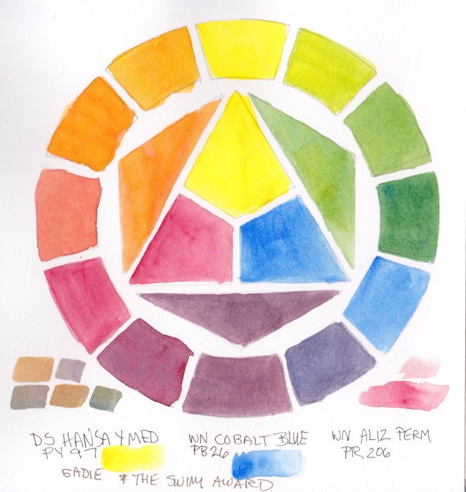
I used to think it was really weird that artists limited their palettes. I thought one needed every possible color in order to capture color exactly. But now I prefer the harmony a limited palette provides and don’t really care about capturing exactly the colors in real life. I’m not trying to be a photocopier.
